


VampyrRabbit
-
Posts
1,001 -
Joined
-
Last visited
Posts posted by VampyrRabbit
-
-
The gold triangle in the Pittsburgh logo represents the golden triangle of the center of Pittsburgh and has been a shade of gold every time it's been on a Pens sweater, so on option C it looks really strange and stands out more than if had been in the black and gold.
For that reason, A or B are my choices. -
I like the Royals set and the Monarchs tribute uniform. I would like to see the powder blue uniform with a matching helmet and for the Royal blue home alternate, the Black alternates have matching caps and helmets, and look all the better for it.
-
 1
1
-
-
15 hours ago, GFB said:
Johnny Canuck is a cartoon. Exaggeration is perfectly acceptable.
Next you’re going to tell me that penguins don’t wear gloves or skates or that the Padres swingin’ friar is never going to hit for power because his base is off.
The problem I had with the Johnny Canuck logo wasn't that it was a cartoon (it's what he started off as IRI after all), it was the oddly proportioned right leg, which was fixed with the RR logo.

As for the Penguin, he lost his scarf way back in 68, poor guy.
-
 1
1
-
-
1 hour ago, WestCoastBias said:
Looks like a Wembley knockoff. They kept the massive foul territory from the Coliseum though lol
Well, New Wembley did replace an absolute s***hole that was ill designed for the primary sport that was played there and had long passed its expiration date.
-
1
-
-
3 hours ago, Sykotyk said:
NBA has teams like Orlando, Sacramento, Salt Lake City, Oklahoma City, San Antonio and Memphis. NHL has American markets such as Raleigh, Columbus, Northern NJ (by identity, if not by playing location) and San Jose. NFL has Jacksonville, Buffalo, and you can kind of say Green Bay even though that's Milwaukee in absentia. Meanwhile, MLB's only market to themselves among Big 4 teams is San Diego. And that's only because the NFL left. MLB is so bad, that they have, currently, four markets with two teams (soon to be 3) because they need a ton of people with a ton of money to remain solvent.
Buffalo has two teams in the big four (Bills and Sabres), so NFL and MLB have the same number of markets to themselves (Jacksonville for the NFL and SD for MLB).
Also pretty sure that Newark is in Northern NJ.
-
11 hours ago, coco1997 said:
Yeah, I can't understand not liking the O's cartoon bird. If anything, MLB needs *more* whimsical logos like that.
It's fun to imagine the kind of logos teams like the Marlins, D-Backs and Rays would have if they came about in the '60s instead of the '90s.
The OG Marlins had a great logo.
I would love to see Tampa Bay, for their rebrand, come up with a fun Cownose Ray logo.
-
6
-
 3
3
-
-
On 2023-05-23 at 12:21 AM, seasaltvanilla said:
Besides being their ugliest logo, switching to the spaghetti skate look would make the Canucks the third Canadian team to use some variation of red, black, and yellow/gold.
They were the first though, as they first wore that combo in 1978, when the Flames were still in Atlanta and the current Sens franchise didn't exist. Not that they should drop blue and green.
-
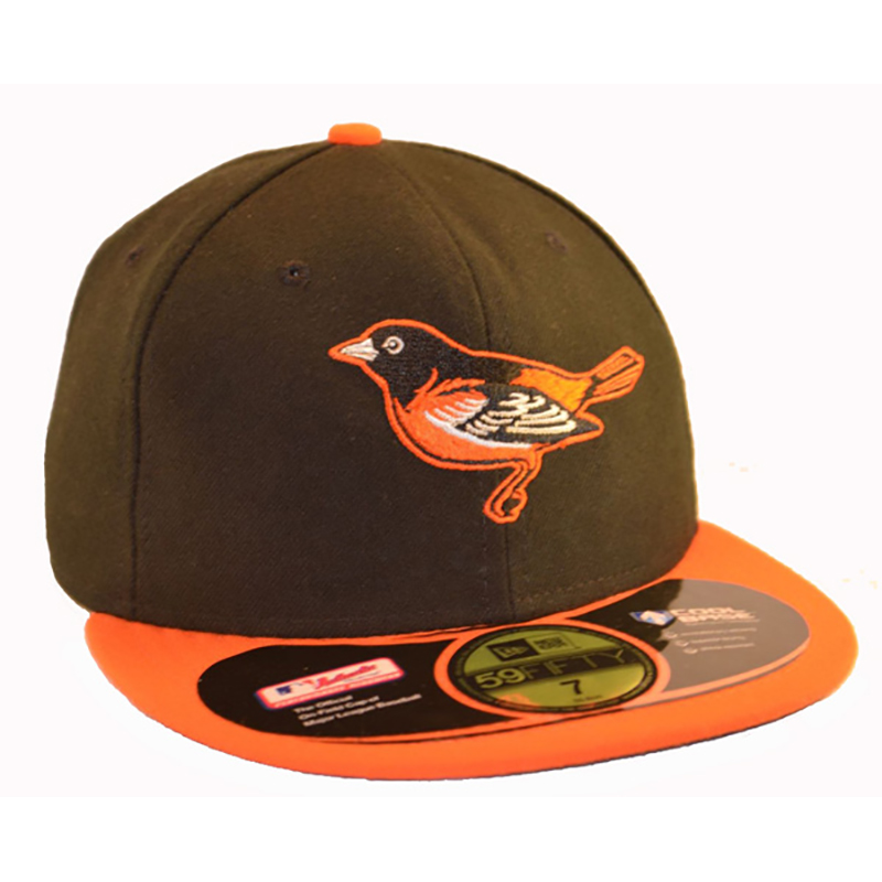
32 minutes ago, ltjets21 said:
This is the best hat the orioles have ever worn.
It would be, if the front two panels were white and the cartoon bird was on the front.
-
4
-
 4
4
-
6
-
-
The cuff trim and chestband are huge improvements, and the stripes on the pants look great. I do think either the cartoon or realistic bird would work better as a sleeve patch than the B.
The sock design looks great, but I would probably just use the cap B instead of BIRD.-
2
-
-
10 hours ago, Sodboy13 said:
I recommend reading this part over and over again until the "NO" in your head is so loud you can actually feel it exert a slight pressure on your brain. Kicked my workweek off right.
The next expansion fee for MLS will probably be around 600 million and if Phoenix Rising want to hold a home game in MLS with a kickoff time before 7pm then they will need an indoor or a rectractable roof stadium, so I expected that was the answer.
-
On 2023-05-23 at 1:06 AM, MNtwins3 said:
The only miss that comes to mind is the Dodgers
They did whiff on the Brewers too with the 414/MKE cap, the 414 in the cap wasn't clear and the button and bill were mismatched.
-
6
-
 1
1
-
-
I would go with A, I think it looks cleaner without the football laces.
Also, if you've got the time, wordmarks for each team would be nice.-
1
-
-
4 hours ago, MJWalker45 said:
But wait! It gets worse! If FIFA is actually copying the NFL, this set will continue into the future.
https://www.footyheadlines.com/2023/05/all-future-fifa-world-cup-logos-to-have.html
So, is it time to say the branding for this World Cup sucks s*** like a fly on a cowpat, or do we still have to be patient?
-
3
-
3
-
-
4 hours ago, neo_prankster said:
Should I put the black back on the logo?
The circle was black originally because it was supposed to represent a puck, so it makes sense for it to be black.
-
On 2023-05-20 at 10:09 AM, Walk-Off said:
- Currently, Arizona law requires any broad-based sports betting license not held by an Indigenous community in Arizona to belong to a professional sports organization located within Arizona (or the owner of said organization).
- Alex Meruelo holds an Arizona sports betting license that he was allowed to obtain only once he bought the Coyotes.
- If Meruelo lets the Yotes move out of Arizona, he has not become the owner of any other pro sports entity in that state by then, and Arizona's government has not loosened its criteria for sports betting licenses, then he will lose that license.
How about Meruelo buys Phoenix Rising instead and finds the money to build a stadium and enter MLS, finally letting the NHL take the Coyotes behind the toolshed? Is there any chance of that happening?
-
2
-
58 minutes ago, the admiral said:
"AFC" as in "American Football Club"? I thought "American football" was "handegg." That wouldn't work.
The women's soccer names are a little corny, but at least they're relatively true to North American sports conventions, which I think is more important than respecting sport-specific conventions. Hockey is a Canadian sport but there's a Swedish team called HV71. You get the picture.
Even if there are going to be teams called "[city] FC" officially, they should still have well-known nicknames. What am I really supposed to call Nashville FC, Charlotte FC, Cincinnati FC, St. Louis City FC, etc.? It's boring.
Charlotte FC is nicknamed The Crown, but it would have been so much more memorable if the team had chosen the actual Charlotte Crown name that was on the shortlist of the eight considered names. Charlotte Monarchs was also on that list too, along with probably the most interesting one, Charlotte Fortune, an awesome name with a double meaning, but no, instead the choice of David Tepper was the banal one.
-
The Northmen look great, not much change to the logo was needed and the Reese's colour scheme is brilliant.
-
54 minutes ago, the admiral said:
May it one day replace the terrible cartoon bird.
I love that terrible cartoon bird. Plently of teams have a letter on their cap, few rock a bird that has taken several bong hits.
-
9
-
1
-
-
For the Astros set, I think an orange billed batting helmet for the road, and using a navy cap with orange bill for the home alt (with matching helmet and navy socks) would be improvements to a pretty good set.
Fully on board with bringing back the Tequila Sunrise as an alt, but the wordmark and start of the sunrise look too low down, with the star looking like it would be barely above the belt if the shirt was tucked in. Moving them up so the horizontal centre of the A on the Astros wordmark is inline with the armpits would fix that. -
3 minutes ago, mcj882000 said:
Do they have a plan to replace, and not just renovate, the building that the Whalers deemed too old in 1997? If not then zero chance, and I say that as a would-be Whalers fan.
Even if he does have that, those only slightly improve the odds, Bettman is almost certainly going to do all he can so the Coyotes can have another chance to make things work in the Sun Valley over taking the NHL back to Hartford.
-
24 minutes ago, Krz said:
Footy headlines lol, I’m talking about what raysox sent. The wave for LA, the star for Dallas, the sunburst in Miami. If it was just the logo in different colors I’d be disappointed but each city has a whole identity within the logo now.
Problem is that identity is in that s*** logo with the JPEG of the World Cup, and for most it just amounts to pretty much a new colourway because only a small shot of those animations are in it, and those small snapshots they aren't all that distinct for most of them. So it is more or less just a different colourway for the logos.
But the bigger problem is that those colourways are in that logo, which is like having a bitesized portion of a nice dish served out of a potty training bowl.-
3
-
-
6 hours ago, Krz said:
Honestly, I really like pretty much everything. The font is unique, presentation is modern and memorable, and I think the city specific elements will develop more overtime.
We've seen the first city specific elements for the first time, and they are just different colorways.
-
1
-
-
I would not be surprised if there isn't a relocation. Never underestimate the power of the Sunk-Cost Fallacy. It has Bettman by the balls.
The Coyotes are going to continue shambling around the Valley of the Sun like a zombie, feasting on bad contracts and yearning for the sweet release of death.
-
2 hours ago, mcj882000 said:
but I don't think anything will ever top "city gets to choose between having an NHL team or having a landfill; city chooses the landfill." Just grade-A stuff from these carny clowns.
With the Coyotes, it was a choice between a landfill and a dumpster fire.
-
3
-
1
-


2023-24 International Club Soccer Kits
in Sports Logo News
Posted
The new Gunners home looks good from the front, but those large contrasting panels on the back do not look pretty, a big drawback with the adidas template introduced in the 2022 World Cup.