


VampyrRabbit
-
Posts
1,001 -
Joined
-
Last visited
Posts posted by VampyrRabbit
-
-
On 2023-06-26 at 5:19 PM, MJWalker45 said:

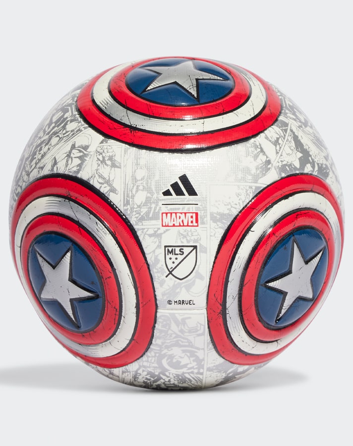
This design without the Marvel additions would make for a pretty good MLS regular season ball.
Without the Marvel additions, it would just be a plain white ball with an adidas and MLS logo.
-
 1
1
-
-
So back again, this time with a design for La Roja.
Redesign for the Chile National Football Team, this is a Factory Pomo inspired style, which the colouring of the main shield of the Coat of Arms of Chile and the shape of the crest (volantín, traditional Chilean kite) I've chosen here lends itself to. The star on a blue and red background is in a guñelve, a symbol of Chile and above it is a copihue, the national flower of Chile.
The colours used are candy apple red, navy blue and white, with copper (the national metal of Chile) as a supporting colour. The font used is a modified version of Hermona, and the two versions use two different layouts of the initials of Federación de Fútbol de Chile, with the latter having an anticlockwise reading, I wasn't sure if the first one would be read FFC.
Comments would be cool.-
 1
1
-
-
If the Pilots remained in Seattle, do Nintendo still purchase them? If they do, then the colours would probably still be changed to navy and teal, as the Pilots would have been as bad in the Down in a Hole Dome as the Mariners were and there would have been as little backlash to dumping the blue and yellow as there was in this universe.
Would the Twins be renamed the Charlotte Knights upon going down south? I can imagine that the city of Charlotte, desparate to prove itself, would have wanted the team named after the city.-
2
-
-
1 hour ago, fouhy12 said:
As a Boston sports fan, I can tell you that the marathon is pretty ingrained in the culture. They do it on Patriots Day every year, a regional holiday celebrating the start of the Revolutionary War. Everyone gets off school, and the Red Sox play at 11am that day to coincide with the race. Then, ever since the bombing in 2013 and subsequent David Ortiz speech and Red Sox championship, it has become a bigger part of the culture and became even more tied to the Red Sox.
If you don't think the Red Sox should wear a jersey for it, that's fine. But it is absolutely something the city cares about, and the design absolutely nails the goal. You'll see nearly as many City Connect jerseys as regular ones at points in the crowd.
I can't think of another city in the world that has a connection between a marathon and it like Boston does. It makes perfect sense for a special jersey.
-
8
-
1
-
-
On 2023-06-30 at 2:40 PM, TrueYankee26 said:
I like Liverpool's away kits as a United fan
They were inspired by the 1995-1996 change kit, which is best known for being worn when Manchester United beat Liverpool 1-0 in the FA Cup final in a victory that confirmed the second double for Man U and was the exclaimation point on a season that showed that Man U were the new dynasty and the dominance of Liverpool was a thing of the past.
Hence why it's pretty surprising that Liverpool based their new kit on one that was worn when the team were firmly in the shadow of Man U, and the original wasn't exactly a looker as well. So I was absolutely creased at this quote by Robbie Fowler on the new kit.
Quote“I have fond memories of the 1995-96 season because of the iconic white and green away strip and for scoring my most goals in one season”
Mate, that kit was worn when Cantona secured the second double for his team. People don't remember you scoring all those goals anywhere near as much as they remember Manchester United clawing back a 12 point deficit to win the league and then winning the double for the second time.
And speaking of unpleasant green and white kits, The Toon have launched their new change, and once again, it's in the colours of their overlords, with black added for good measure.
-
2
-
-
On 2023-06-30 at 3:39 AM, monkeypower said:
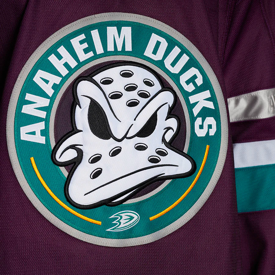
Like I said, it's a little Easter egg for the fans and the franchise who understand and recognize the significance of the dates. Yes, it is the same franchise but the Ducks as a franchise have always viewed the team in two distinct eras. I didn't realize we're dealing with legal documents of establishment that need to be followed to the letter.
If you really want to get specific here then, it should really say Est 1992 because they were awarded the franchise in 1992.
Embossing Est 1992 would have a lot been better than Anaheim Ducks Est 2006, as the word established implies that the original team shut up shop and a new Ducks franchise was created, the team only changed owners. It didn't suspend operations or the original team moved to a new city, so Anaheim Ducks Since 2006 would have been much more accurate.It's a perfectly valid criticism of the Jersey that Anaheim Ducks Est 2006 is on it and the use of the word Established. It's also fine not to like that there is a script on the stripes at all.
QuotePeople doesn't have to be so obtuse and/semantic about what's essentially a jersey Easter egg for the Ducks fan who understand what it is trying to mean and what the dates mean.
It tries, and due to the inaccurate use of Established, it doesn't work. If they wanted to acknowledge the two eras, then a far better solution would have been to print 1993 - 2006 in the colours that were introduced in those two years, or create a logo that does a much better job of combining the two eras than the one used on the front of the new jersey to place on the sleeves.
As for the jersey, it's mid, but it should have been a lot better. Not having an inaccurate date embossed into one of the sleeve stripes would have made this jersey better, as would having the Original crest on the front. As noted earlier, none of the Jerseys that the Ducks will use next season will have Wild Wing on the front, which just feels wrong and the new crest has serious problems.
Spoiler
The centering of the font is pretty poor (just look at the capline and the baseline of the lettering and the teal ring), and by not making the font curved to fit the roundel ring, it looks really awkward, and due to the increased size more so than the 1995 shoulder roundel. Just look at the I and M in Anaheim and also the D in relation to the U, that looks really nasty.
The jersey is okay, but it could and should have been a lot better. Wild Wing on the front and 30 anniversary patches on the sleeves would have went a long way.
-
10 minutes ago, monkeypower said:
They did cease to exist as the Mighty Ducks of Anaheim. No, they weren't refounded, but they did cease to exist as the Mighty Ducks of Anaheim in 2006.
Like I said the other person, the Ducks have a unique franchise history and they are choosing to acknowledge that unique history. People doesn't have to be so obtuse and/semantic about what's essentially a jersey Easter egg for the Ducks fan who understand what it is trying to mean and what the dates mean.
It's still the same organisation, the team still existed and weren't refounded as an expansion franchise. They already acknowledge that history with the Duck foot logo being incorporated into the main roundel, and the critism over the Est 2006 is justified.
People also have a right not to like script embossed into the sleeve stripes. -
20 hours ago, monkeypower said:
One sleeve says "Mighty Ducks est 1993" and the other sleeve says "Anaheim Ducks est 2006".
It still says est 2006, and it's still wrong - the team didn't cease to exist as the Mighty Ducks of Anaheim and then refounded in 2006. It's the same organisation, and the designers still f***ed up by putting est 2006 on the jersey.
I like the idea of embossing the sleeve stripes, but for stuff like the waves on the new Sharks jerseys, not an inaccurate foundation date. -
I can totally buy that the Coyotes have 6 sites for a possible arena that won't require a public vote. That's because they will be told to f*** off before it gets close to that stage, and they can easily find 6 more.
-
Feel like it's a familiar story with the new Man U shirt - great colours and a nice print on the shirt, but those damn side/back panels.....
-
It's hard to recognise trends during an era, and exactly when and how they start, but if the Simplification of Brands is one, then the Twins rebrand has to be near the top in terms of that trend style. It's so clean and feels like it is going to have a long shelf life.
There are some things that I would change (bringing back the red button on the home cap, adding a red billed alternate cap, making the cream and navy Twin Cities alt just cream and navy), but all in all, it's a really great set.-
4
-
-
5 hours ago, upperV03 said:
The Blazers just unveiled their new G-League team’s name and branding and it is incredible:
I dig it, very 70's vibe with the font.
-
2
-
-
I dig the Pittsburgh uniform, but wondering if I would dig it more with a Steel Grey cap with a gold bill.
-
So glad the owners decided to veto the move, NoVa would have been an awful place for a Ballpark and the attendance would have been as bad as the Rays because who in their right mind would subject themselves willingly to the DC area traffic? And in this timeline, no Minute Maid Park and no Nationals Park.
The jerseys are nice though, I like the cuff trim.
Will there be a set for the proposed Fury expansion team?-
1
-
-
50 minutes ago, nash61 said:
Re: Warmup jerseys
I think they had gotten so watered down by the end, that had the big Pride controversy not happened, I don't think people would have really cared.
Like, who is going to miss these?
I love the Los Yotes and Rat Fink inspired Sharks warmup Jerseys. If I was at the Shark Tank and saw the team wearing those, that would make my day. It's a great tribute to the art and style of the California Hot Rod scene.
-
1
-
-
13 minutes ago, neo_prankster said:
I feel like some of the NBA logo changes that took place during Tom O'Grady's tenure as the league's creative director could count as Factory Pomo, right?
Definately for the Suns and Bucks, though the canned Clippers rebrand was probably the purest expression of the style. O'Grady was definately into the style.
-
2 hours ago, Digby said:
Love this topic, I am similarly petty/annoyed as that Tumblr post about the collective misremembering of what passes for meme 90s aesthetic these days. I don't feel like those main two aesthetics hit sports design as deeply. The OG MLS year always sticks out as the ultimate of 90s sports design, but it's something else... obviously the Revolution were grunge. MetroStars stick out as being pretty factory pomo, and looking at it again I suppose San Jose Clash were sort of up that alley, as well?
The Nike Uniforms also had a Factory Pomo feel to them, especially the ones for LA, San Jose and NY/NJ, with the high contrast and jagged lines.-
1
-
-
10 minutes ago, pepis21 said:
But you're talking about 2013-2023 logo and this logo is indeed good and even better than good. Now they switched to basically alternate logo with slapped text underneath. Utah Jazz made same mistake in last year
Utah was far, far worse. They blanded out their entire brand.
-
2
-
-
I wish there were colour vs colour games in the NHL. San Jose vs Vegas might work as one.
-
5
-
1
-
 1
1
-
 1
1
-
-
I think a brown cap with a red bill would fit the alt better than a red cap with a brown bill.
-
1
-
-
2 minutes ago, pepis21 said:
Why they did that? WTF is wrong with this league?!
Not sure, I think the logo is really nice as it is and the Fleur de Lys and wrought Iron style detail at the top of the logo looked good.
-
For some reason, Venezuela made the ball in their logo transparent in a move that FH describes as "Subtle"
Don't know about you, but I have the feeling FH would describe someones house getting toilet rolled as "Subtle*-
1
-
-
The Pelicans have revised their logo for next season.
-
 3
3
-
 1
1
-
5
-
 2
2
-
 1
1
-
-
Well done on a well earned victory.


2023-24 International Club Soccer Kits
in Sports Logo News
Posted
Mistake on the Mothership article concerning the new home Frankfurt shirt -
The Moody Diva has worn a similar style of stripes before, in 1988-89.
