


VampyrRabbit
-
Posts
1,001 -
Joined
-
Last visited
Posts posted by VampyrRabbit
-
-
2 hours ago, MJD7 said:
Is that true? I dind't know that. I'll see if I can pull off a more Nationals style font.
I recall reading it somewhere, can't remember where, also the font does have a very San Diego feel to it with the curves recalling the architecture of the Mission.
Looking forward to the Nats style font versions.-
 2
2
-
-
I like the colours for the Pandas and the DC Road Alternate looks great, but I think it could do with a more "Washington" Font, as the scripts the Padres use were inspired by the Gaslamp Quarter of SD, and I wonder what it would look like with the scripts that the Nationals use or used.
-
I concur with the critique on the home and away and the lack of contrast. Also, dubbing the alternate "Black and Tans" is a massive yikes and would anger any fans of the team who are Irish or have Irish ancestry.
-
8 minutes ago, JuicedSportsNow said:

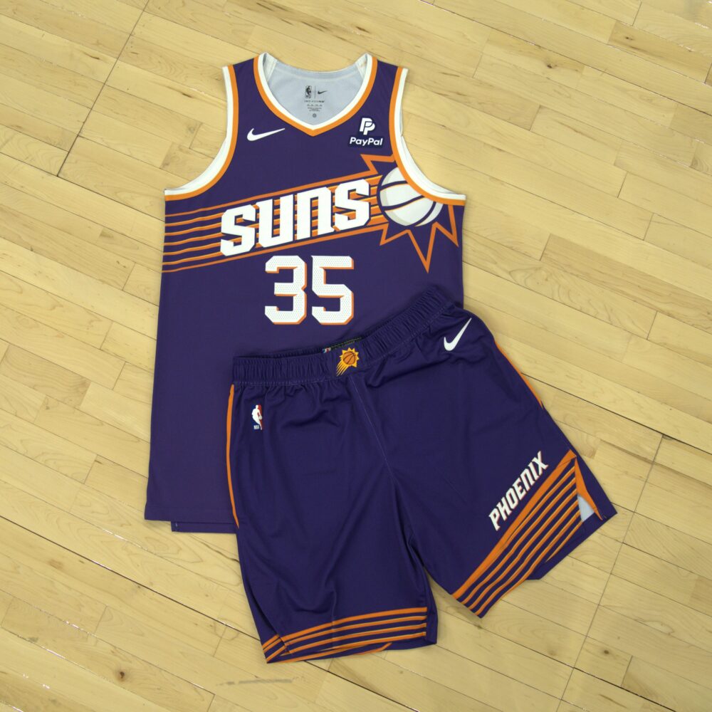
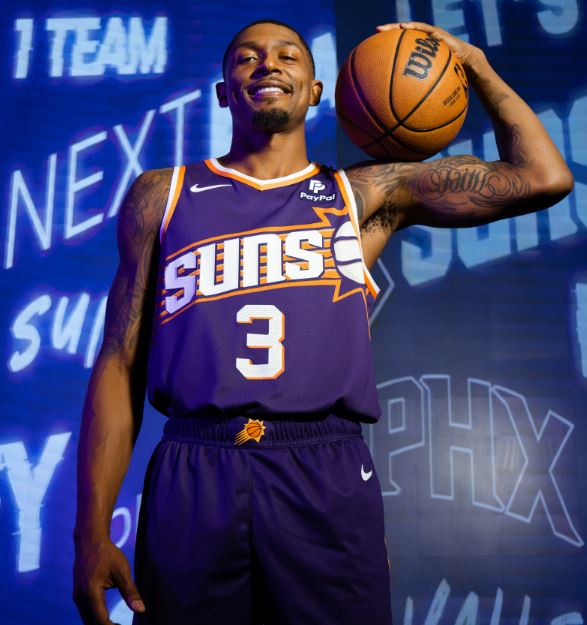
Is it just me, or is the shade of purple darker on the shorts than the jersey? And if it is, then how have Nike not managed to colour match the uniform properly?
-
Both of the green and gold colour schemes are good. I prefer the darker green though.
Just a heads up - on the darker green Threshers patch and ASG patch, there is still some of the previously used green. -
On 2023-07-24 at 1:18 AM, BBTV said:
Thanks. While the mothership is no better of a source than Wikipedia (and the part you posted isn't attributed to anyone), this part is actually attributed to someone and supports what you said:
“It was nice to bring it back and at that point, just textile and fabrication and production processes had changed where the purple on the helmet would match the purple undershirt or the belt was the same color as the sock,” Rossini said. “Even in five, six years, it’s amazing how that process had improved, where you’re like wow, we can nail this uniform.”
Now they can actually get the colours to match, the Diamondbacks should bring back the Purple, Copper and Arizona Turquoise, the finest colour combination that Peyote can buy.
-
4
-
-
The Threshers name, logos and colour scheme seem totally at odds with the age of the ballclub and Chicago itself - the two shades of green seem so out of place for an over 100 year old team and one from Chicago. The name and logo feel more like a team that started in a much smaller midwest city than Chicago then moved, and the colours used feel more like the ones used for a late 90s/early 2000s expansion franchise than one of the oldest teams in the league.
Two shades of green is a difficult combo to get right, and I don't feel like both of the combos here come close, the dark shade is literally just green on the RGB scale when it needs at least some blue on that scale so it doesn't look like crap, and the lighter green first used has the same problem. The second shade used is less nasty, but it still looks far from pleasant. I would just change the colours to something else than two shades of green.
-
2
-
-
7 hours ago, MJWalker45 said:
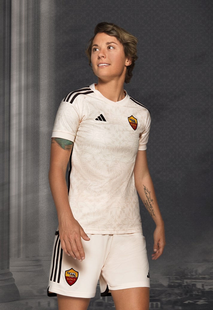
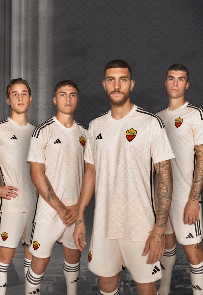
Full Roma away kit
I don't like this as much as I do the new home and third. Probably because black is used for the trim instead of red and cream and red is a great colour combo, and the current full logo is used instead of the Lupetto.
-
1
-
-
On 2023-07-26 at 2:22 AM, DCarp1231 said:
Buffalo Can-Ams (showing unison between the two countries)
I think Bisons would have been the name chosen if Buffalo had gotten an MLB team.
-
2
-
-
Not feeling the rebrand in the least, mostly because the Avs don't need one, prehaps just a refresh like you did with the Penguins and NJ, and have a really nice uniform home and road as it is, it just needs tweaks to keep things fresh. This rebrand is pretty bland compared with what they have and the navy and burgundy seems too dark. The Alternate is decent and my fave, probably because it keeps the colours and the style of the current set.
The Penguins reworked logos are nice, though the main skating penguin loses almost all of its whimsy, but I much prefer the striping on the 1980-86 uniforms and the 1992-97 jerseys, which have far more "heft" and also a lot more gold. Reducing the amount of gold on the home and the road feels like a backwards step, and the blue doesn't really add anything.
The VGK set is near perfect though, and the home and road for the Devils are also great. -
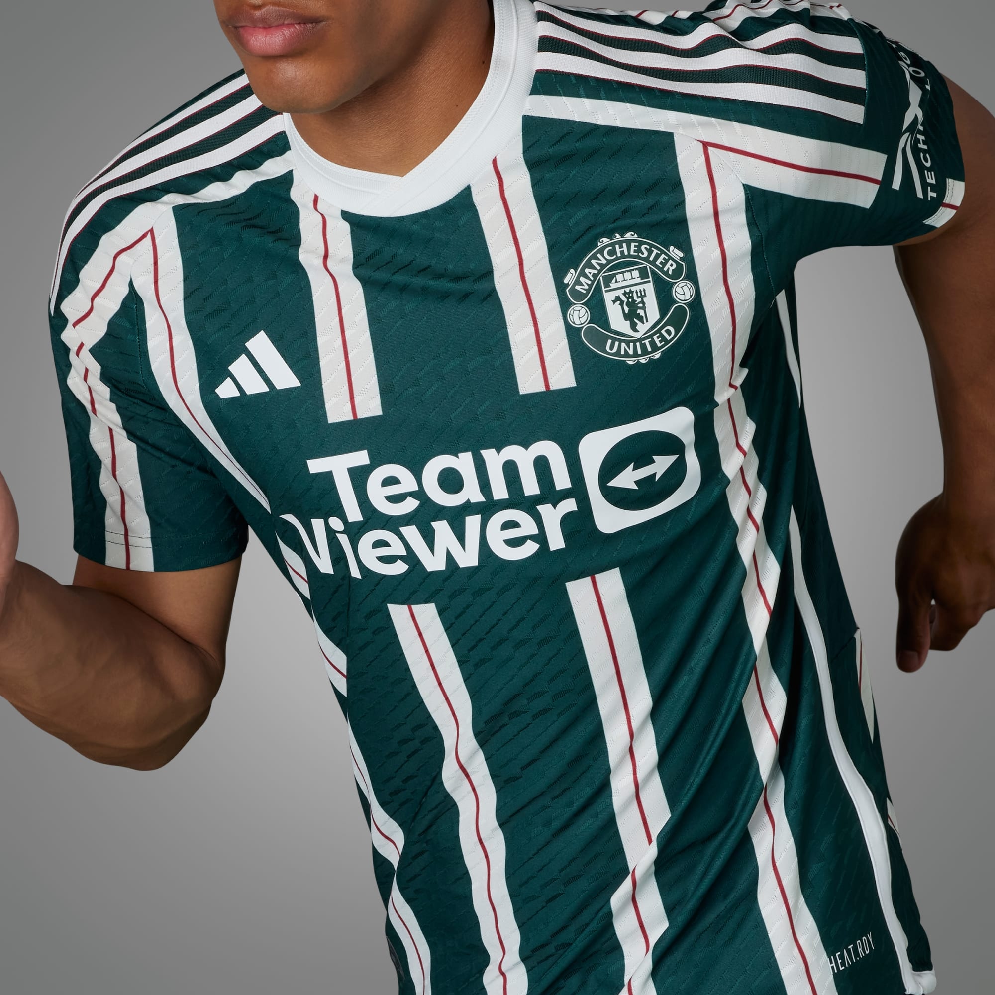
15 minutes ago, aawagner011 said:
That part makes sense. But it doesn’t make sense why there are two versions of the match worn shirt.Match worn sponsor is larger and intrudes into the outer stripes all the way to the pinstripe.
Retail authentic has smaller sponsor with full outer stripes:
Larger TV logo on the matchworn is probably the reason.
-
51 minutes ago, aawagner011 said:
Now I am confused. I have seen multiple images with the Team Viewer ad applied as a direct heat press with the stripes intentionally broken off as part of the adidas design. I have also seen multiple images with the ad as one big patch applied over the stripes.
The one with the heat press is the matchworn version, the big patch version is the retail one.
-
1
-
-
On 2023-07-18 at 11:42 PM, officeglenn said:
Looks like Gill Sans and Gill Sans Bold. Honestly, if it's something British, Gill is a good place to start.
 On 2023-07-19 at 12:00 AM, Sport Billy said:
Thanks
I think it is probably that font, but it needing a fee does shed some doubt. Mike Ashley was probably too cheap to pay for font that needed a license.
-
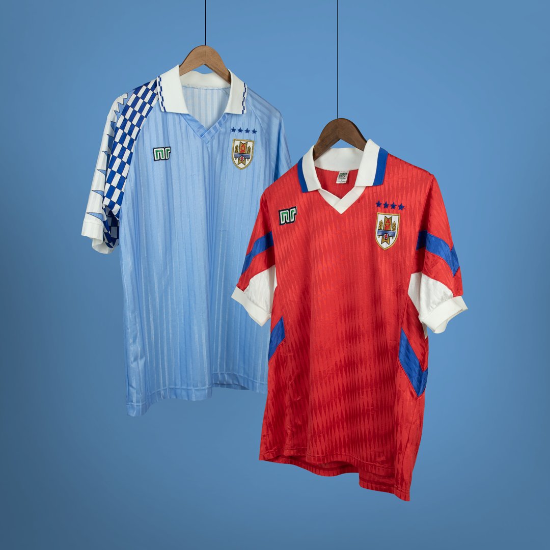
Home for Uruguay is good except for the Puma logo being framed instead of the Uruguay badge, which is far more deserving to be framed than the manufacturer logo.
1 hour ago, raysox said:I saw this red jersey when looking for inspiration and I loved the designs of it. It isn't puma, but I dont think the manufacturer exists any more.
NR still exist, but they don't supply any big teams anymore and mostly do retro products, usually from the 1980s.
-
Southampton 3rd kit, with a graphic that represents the New Forest near the city and described by Footyheadlines as "Subtle".
-
1
-
-
On 2023-07-20 at 8:39 PM, johne9109 said:
I was going for that they would just change the team name as the rest of the branding would still work and not really need to be changed.
The gold triangle in the Pittsburgh logos represents the Golden Triangle of the city, so upon relocation it probably would be changed to either a different shape or colour, or replaced with something specific to their new home.
-
12 minutes ago, BBTV said:
What's your source for this being the reason? I thought it was just realitively-new owners wanting something that was theirs.
From the Mothership -
QuoteTeal and purple are notoriously hard to match across fabrics and textiles. For a while, the team could get away with T-shirts and helmets and jerseys that almost but didn’t quite match, but within a few years of the team’s debut, the technology to display those imperfections on TV did exist, but the technology to fix those imperfections did not.
-
1
-
-
10 minutes ago, Coltsfootball2016 said:
Is it teal or turquoise, I never see those two colors at the same time.
Both of the shades of blue/green the D-Backs used were called Turquoise. The dark shade that the team used in their original branding was called Arizona Turquoise, which was dropped along with purple due to being very hard to consistently match across fabrics, and the shade the team introduced in 2014 which was a lot lighter and less saturated.
-
1 hour ago, monkeypower said:
Not current Red Sox, but the Red Sox of the time. A lot of Angels history was a slightly different West Coast Red Sox.
That Red Sox look only lasted for seven seasons, starting in 1972, before Boston went back to the headspoon, while the Angels wore a variation of that look from 1973 to 1992. For most of the time the two teams have been in the MLB, the two teams have had distinct looks.
-
1
-
-
6 hours ago, monkeypower said:
Those throwbacks make them look like the Red Sox.
Of course, the all navy cap, headspoon, lack of front number and the Tuscan Font on that throwback uniform totally make them look like Boston.
-
 1
1
-
-
6 hours ago, vtgco said:
The branding for the new USL League 1 team in Spokane has been released.
Glad it's not "Spokane FC" but this name and the logo leave a lot to be desired.
I know it's supposed to be Spokane Falls, but honestly the logo looks like Nevada.
That logo is so bland, not a fan of the font and the waterfall could have been far better represented than by four blue lines and three white lines.
-
 1
1
-
-
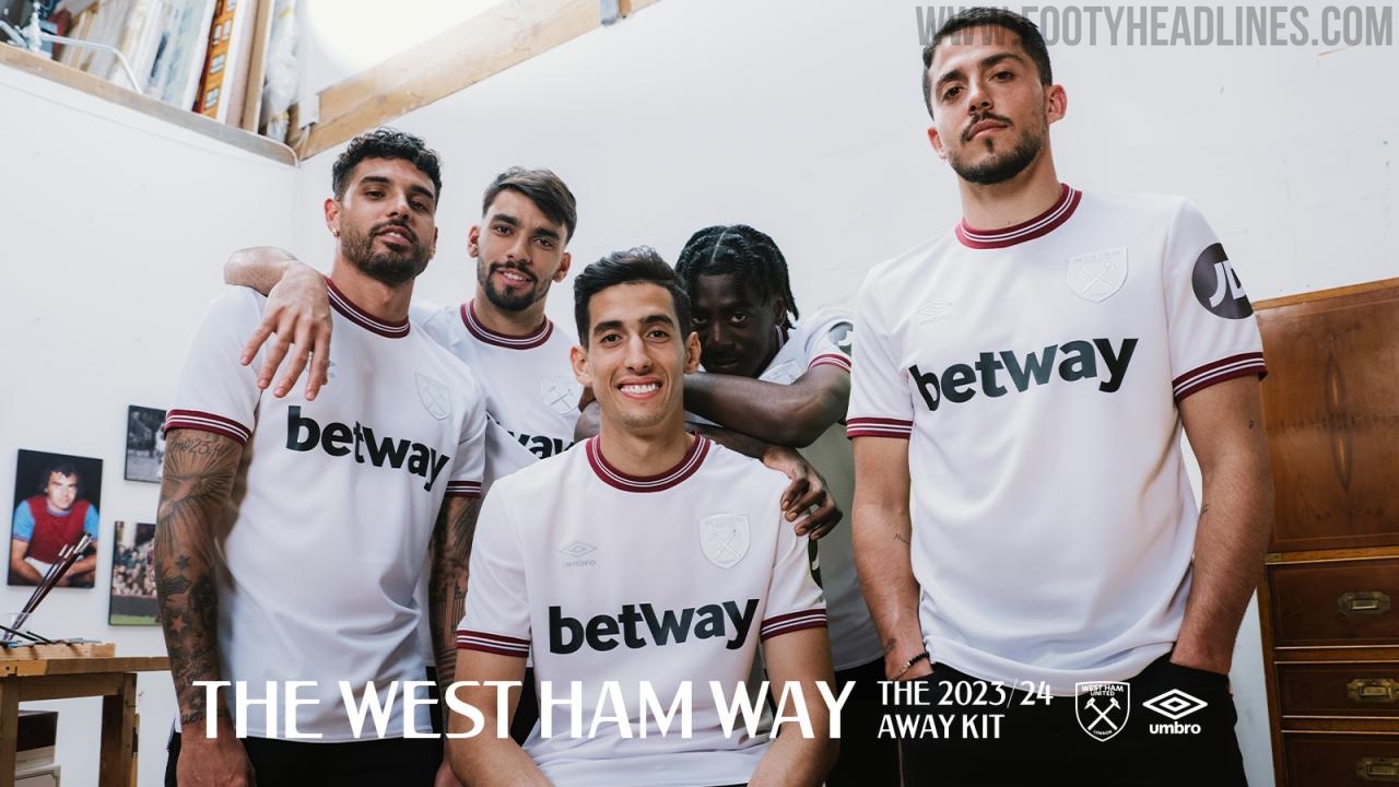
The Hammers have had a brain fart and decided to greenlight making the crest iridescent and therefore invisible a lot of the time. Funny how the sponsors were having none of it and are rendered in black.
-
3
-
 1
1
-
-
Luton Town will wear a kit inspired by the 1973-74 outfit when playing at the Old Girl this upcoming season.
-
1
-
-
5 hours ago, raysox said:
Colombia 6/20
For Colombia I looked at a a lot of kits for inspiration, but ended up doing something different and introducing a top split torso and navy sleeves. This might be more Ecuador than Colombia, but I thought the color blocking look nice. I made a gradient-ish look made by skewed bars. For the clash kit, I took the colors from the main kit and changed the hue and tone slightly for all of them and designed from there.
The home is good, I like the collar especially and this is the first home adidas shirt you've made that isn't blighted by huge back shoulder panels. The change kit has nice colours, but the shorts really should be a different colour other than wine red, as it doesn't pair that well with the shirt and socks and it's also the colour of Venezuela.
-
1
-


.jpg)

/cdn.vox-cdn.com/uploads/chorus_image/image/67010720/1006048688.jpg.0.jpg)


NHL Revamp Series 32/32 - Detroit Red Wings
in Concepts
Posted
I think you've made a mistake with the colours on the home and road - The stripes for the home use orange for the hoops on the front of the sleeves and hem, and a orange-ish red for the back and the hoop on the stockings, and the edge of the collar on both uniforms uses both the orange-red and orange.