


VampyrRabbit
-
Posts
1,001 -
Joined
-
Last visited
Posts posted by VampyrRabbit
-
-
On 2021-11-26 at 2:45 AM, El Scorcho said:
The big problem with the Norwich logo is the removal of the black. Those shades of yellow and green don't contrast enough and the whole thing looks a bit washed out.
I'm generally very supportive of football clubs upgrading their historic logos with what are effectively modern redraws, but they either needed to retain the black outline or deepen the green to get adequate contrast.
The launch display with the hanging flag sort of texture over it just amplifies this lack of contrast issue.
I don't think there is a issue with the colours, but if they wanted, they could have lightened the yellow - They did play in lighter shades in the 1980s.
But they really needed to get rid of the black from that logo - along with the ugly renderings of the castle and lion, it was one of the two major problems with the crest and it's good that they've finally done something about it. Also, Norwich dropped the black shorts in 1971 and in modern times, white has been used as a third colour more often than black and was used for the beloved Bird-S*** Kit.
Majestic.-
 1
1
-
-
Its okay, I like the three volcanoes and it certainly beats the nineties AF previous logo. Still, can't belive there are no circles anywhere in the design or that they didn't make the shape circular, considering how iconic the Stone Spheres are.
-
More crests for three more teams.
Logo for Chicago Fire, I'm not a fan of the "fire crown" logo or the new one just launched. This uses the Florian Cross from the original logo, which is part of the original logo design that should really have been kept.
At the centre of the logo is the Flag of Chicago, possibly the most Iconic city flag in whole of the US, partially surrounded by a red C. On the left branch of the Florian Cross is the municipal device of Chicago, as found on the Chicago Theatre sign, and the right branch is adorned with a heart, to represent the one of the nickames of Chicago being The Heart of America, and it's position of the city being at the heart of the US Rail network.
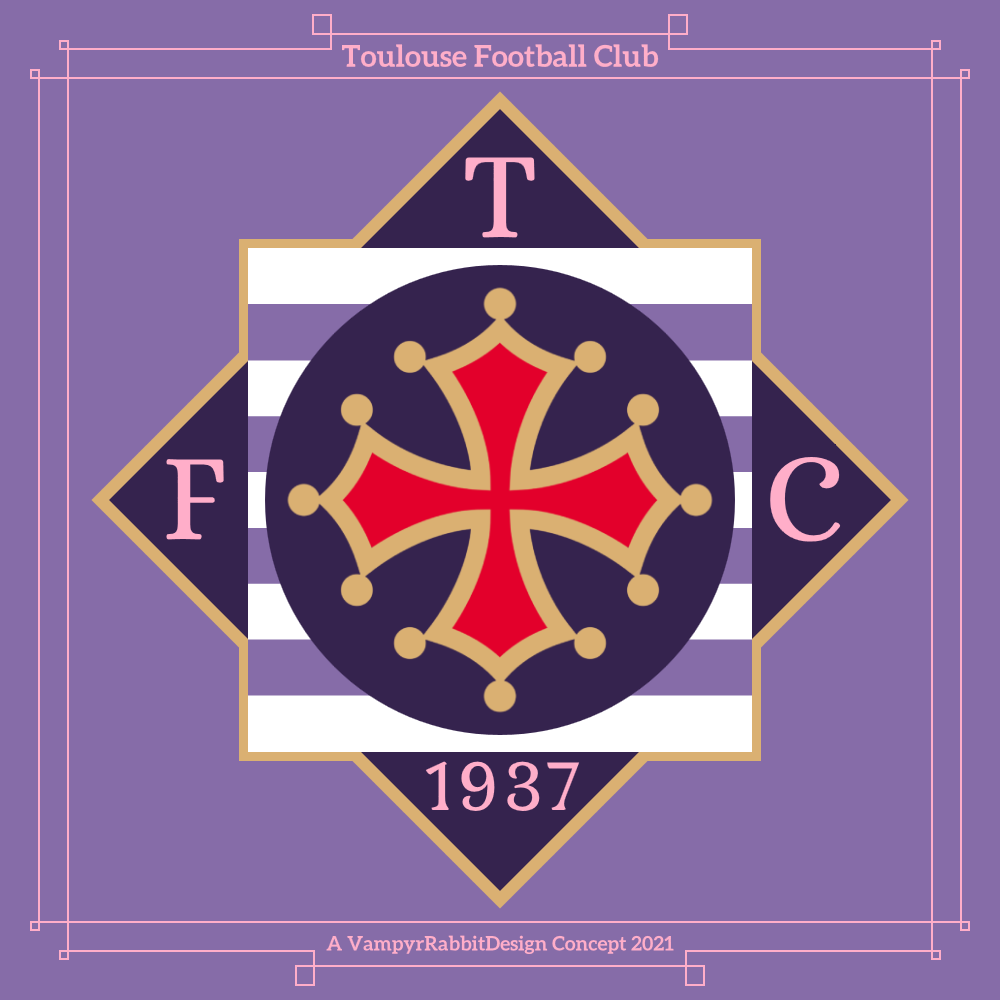
Crest for Toulouse FC, the current logo had everyone thinking the team was about to be brought out by City Group, so I decided to give them something more distinctive and pretty leftfield, and used the Occitan Cross instead of the full coat of arms for the sake of simplicity.
The outline of the crest is taken from a decoration from the Capitole de Toulouse, and the white and violet stripes are a nod to the distinctive architecture of Toulouse, known as Le Ville Rose (the pink city), as is the colour of the lettering and date of foundation.
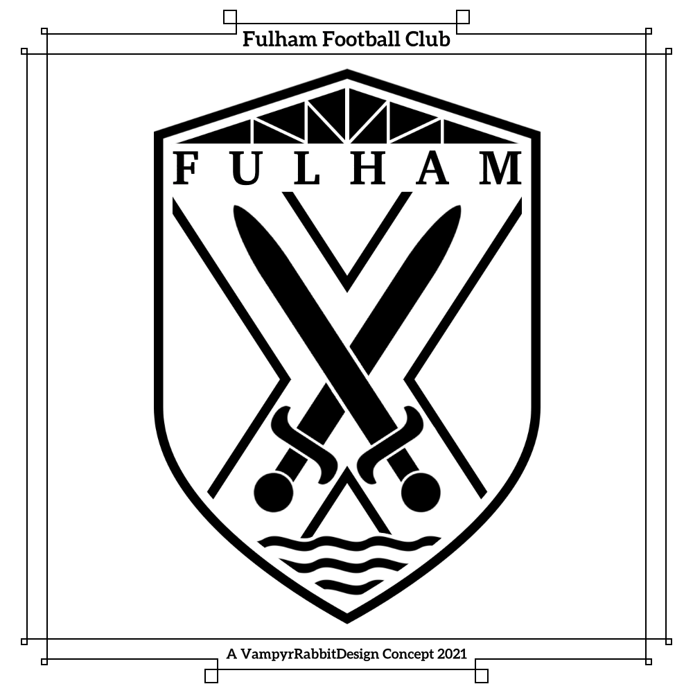
Crest for Fulham, this has the Cross and the Crossed Swords from the coat of arms of Fulham, and the waves at the bottom represent the river Thames. At the top of the crest is a representation of the gable from the Haynes stand of Craven Cottage.
I've seen loads of redesigns for Fulham, and most of them have been really good and included the cross and the crossed swords. I wanted something a bit different, hence the cross being just an outline. I put just the "Fulham" to try and keep it resonably non cluttered.
-
4
-
-
Hi, I like to redesign soccer logos as a way to unwind. Here are a few I've done since I decided to make a start. I always wanted to try my hand at redesigning them, but never got round to it or just span the wheels so to speak....until a few weeks ago.
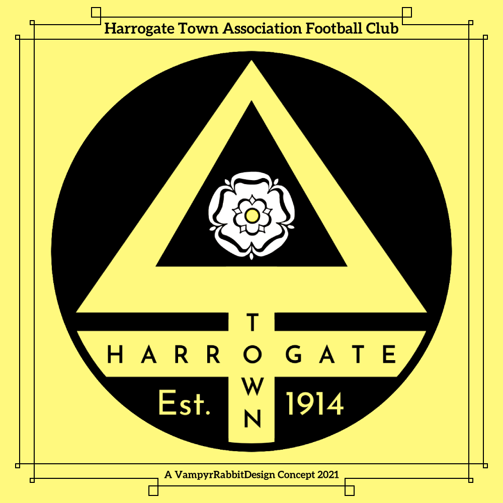
First up, Harrogate Town. They traded their old crest (which was almost identical to the coat of arms of Harrogate) for a new one when they turned professional in 2017, and like many new emblems, it was done in the "English Style" in one similar to the new Manchester City logo (Roundel, date of formation on midline of surround, many outlines). I decided on something that moved away from "English Style"
As far as I'm aware, there aren't any other clubs in England that have an alchemical symbol as part of their crest, and Harrogate are nicknamed the Sulphurites. So I've used an alchemical symbol for Sulphur as the centrepiece for the crest, to reflect the nickname of the team and the springs that the town of Harrogate is known for. I also used a more "Brimstone" shade of yellow, and a font that feels "Yorkshire". The white rose is also larger on this crest, and the date of the teams foundation is on the crest, rather than their admittance into the West Riding (of Yorkshire) league.
Redesign for the Corsican club Bastia, their Current logo has black outlines on everything and the emblem of Corsica isn't the focal point. The only black outline is the one around the shield with the Moors Head. The star is a nod to the teams earlier name of Sporting Étoile Club Bastia, which is the name they had when they reached the final of UEFA Cup in 1978 and won the Coupe de France in 1981.
The shape of the shield was taken from a carving in the Citadel of Bastia. And last for the time being, Oxford United. This is sort of an update to the crest that the team wore between 2001 and 2015, but with the yellow the dominant colour and the horns breaking through the roundel.
The Desmond Morris designed Ox head is timeless, so I left that well alone, and used the shades the team wore in 1985-87, when they made their way to the top tier of English Football for the first time and won the League Cup.
-
3
-
-
On 2021-06-24 at 12:52 AM, Sidney said:
Here is one of my rebrand I've done a long time ago about my hometown football (soccer) team Les Girondins de Bordeaux. You'll see the normal logo and the alternative? I've used elements of their past logos. It's a different feeling but I'm really happy with the result. C&C are appreciated. And the symbol on the top "The biohazard" symbol is the city icon of Bordeaux, it's "Le chiffre de Bordeaux" the shield of the port composed by 3 moons.
C&C are ppreciated
This is a lot nicer than the current logo (and especially the awful 2020 logo).
Do you think it is possible to do a logo for G de B that incorporates a representation of the Chaban-Dalmas Bridge?-
1
-
-
Could you do a set for England please? Here are some suggested colours -
Home - White 3 lions on Navy Helmet, White Jersey with Navy Trim, Navy Pants
Away - White 3 lions on Red Helmet, Red Jersey with Navy Trim, White Pants


.svg/180px-Fulham_FC_(shield).svg.png)


.png)


Reimagined Soccer (and other) Emblems (Chile)
in Concepts
Posted · Edited by VampyrRabbitDesign
Stoke City redo added
Cheers, Soon as I put together a template, I'll probably do some kits with these logos. And now that you've mentioned it, perhaps scarves too.
Some more designs -
Redesign for Stade Brestois 29 (the number refers to the department number of Finistère) , the centre of the shirt has an Ermine, symbol of Brittany, with a pair of crossed sword blades beneath, referancing the team being known as The Pirate Team. The Ermine and the red V form a chevron, in referance to the earliest kits that Stade Brestois wore, and the rope represents the maritime heritage of Brest.
1903 was the founding date of Armoricaine de Brest, the precursor of SB29.
Stoke City have a crest that is 20 years old, but has no symbolism except for the red and white stripes, which considering so many teams in England play in those colours, makes it look really generic. I wanted to change that. The team traditionally had black as their third colour, but blue was introduced on the current crest by the former Icelandic owners in 2001 (and eventually made its way to the first team shirts), but they left in 2006. I changed the blue back to black, and added local symbolism to the crest, with the two Bottle Klins and the Staffordshire Knot.
The six stripes represent the six towns that make up the potteries, and the font used for the name and the Latin Motto (which means "Strength United is Stronger) is one similar to that used for the Gladstone China sign.
Another version, this one has just the name and the date of foundation (in the same font), and a white inner outline.
Redesign for Örebro, I used the O with the umlauts as the logo shape because it gives a distinctive outline, and it also looks kind of like a face. Mostly because it definately looks like a face.


Inside the O is a representation of Örebro Castle and one of the nearby bridges, inspired by the logo of Orebro castle.