


VampyrRabbit
-
Posts
1,001 -
Joined
-
Last visited
Posts posted by VampyrRabbit
-
-
2 hours ago, Dynasty said:
So I'm guess they're scrapping red for purple, based on the pics? I don't know any other car company that uses purple, so it at least creates distinction.
The revised H logo is only going to be used on EVs, it may get phased in on their other Automobiles. Honda is not going to get rid of red for their motocycle branding though, the company will still be associated with that colour due to the Super Cub. -
19 hours ago, letsgomets1212 said:
Looks like it's going to be phased in, initially appearing on EVs. Thoughts?
https://www.motortrend.com/events/2026-honda-0-series-ev-branding-h-badge-history/
The logo for Honda Motorcycles is going to stay, the company is not going to get rid of the wing logo. -
1 hour ago, Ridleylash said:
Funnily enough, they also didn't seem to have an issue with the Kraken raising a banner using the same trademarks they now claim the team is infringing at that time, either.
They probably should have filed papers then. After all, you miss 100 percent of the shots you don't take. -
2 hours ago, Coiler said:
The black looks like a very dark shade of brown: Is it just the color contrast and my eyes?
Also the White Sox taking from that very successful juggernaut, the Kansas City Royals. (/sarscasm)1 hour ago, coco1997 said:
Nope, it's black! It's not a super saturated shade, though, so I guess it might look very dark brown.
It's RGB value makes it look dark brown. Its the same shade UMass use in their logo.-
 2
2
-
-
15 hours ago, pepis21 said:
And this is what Leeds claimed:
Yes, the number of Leeds Fans the club claimed to consult was in the linked article and that tweet was in a video clip in said article.
15 hours ago, pepis21 said:and this is why I'm sceptical even if FA now requries fans consultations.
If the Club Supporters trust comes out and states that they weren't consulted, then you should be sceptical of the claim from the club. That is why you should also take the claim from Villa (ie Chris Heck) over the new crest and consultations over it with a huge pinch of salt due to the amount of uproar and the fans contacting the FA. For the roundel logo, there wasn't any huge uproar from Villa fans and nobody contacting the FA, so the research and consultations that Villa said they did for that crest were probably true and taken in much better faith than the claims made over the Leeds logo and the new Villa logo.14 hours ago, Pabig93 said:I miss that Leeds logo. It was really cool and they should not have rejected it.
The response by the Leeds fans was overwhelmingly negative, that is a good reason why they were right to reject it as the main logo.
-
1 hour ago, pepis21 said:
But if they want to go with that worse version of previous logo then it's better to comeback to previous logo. By the way AV claimed to consulting this newer change with fans, but honestly after Leeds fail (they claimed to consulted with fans as well) I'm kinda sceptical about all those consultations and voting.
The Leeds United Supporters Trust wasn't consulted over the Gaviscon logo. For the Villa logo, it's the new version that the fans claim was done without due consultation and as far as I'm aware, there were no concerns raised with the roundel logo.
1 hour ago, pepis21 said:By the way Aston Villa still using previous logo on their website and roundel is a good logo (although I'd only make star white or yellow to display it more), but people ruined it by comparing to Chelsea.
That decision to have the previous logo on the website, and for most media outlets, and to just have the roundel on the shirts and training gear, is due to Chris Heck, the Villa’s president of business operations. It was confirmed that the roundel won the vote for the new crest on November 11, and Heck was appointed in May 2023. The former Philadelphia 76ers president is the person at the club who wants the old crest back, or a worse version of it, 92 percent of voting fans be dammed.
-
On 2024-01-07 at 8:31 AM, kerlonmoura said:
Personally, on top of the rebrand being extremely controversial, when I look at the old logo it reminds me of the successful Juventus and the new one just evokes feelings of mediocrity.
The team has won 3 Scudettos while wearing their new logo, and if they win it this season, that would mean they have won more than half the league championships they have played while wearing that crest. It's very premature to associate that logo with failure when Juve look to be getting back to dominating the Italian game, and continue to be one of a handful of Italian clubs to build and own their own stadium, which gives them a massive advantage over their rivals who won't be able to claim that for quite a while yet.-
 1
1
-
-
The Flyers really need some black. The jersey would be great if the spot in the flyers logo was black along with the 2nd and 4th stripes on the sleeve and the 2nd stripe on the hem.
-
4 hours ago, monkeypower said:
The Victoria Royals of the WHL unveiled these third jerseys last week. Minus the outline numbers and adjusting the shade of blue, what about something like this for the Lightning?

Add the lightning to the pants, plus the victory stripes, and that wouldn't be a bad Bolts uniform.
-
1
-
-
How many fanbases would welcome back pullovers though? The only one that I can think of that would be for going all in on pullovers would be Cincy due to The Big Red Machine.
-
7 hours ago, pepis21 said:
People who say "Chelsea rip-off" probably don't know Aston Villa crests history. Anyway all they need to do is back to this and just it:
That can't happen, and it shouldn't happen for a number of reasons. And going to that leaked crest, with it's triple outline, drop shadow and awkwardly placed team name would be an even worse decision.
First off, the fan vote on the new crest, which was conducted after a survey of 12,600 fans and a number of focus groups with supporter clubs, also included a question on if they would like to keep the current crest. Only 8 percent of fans voted yes. More than 21,500 people took part in the vote, and they voted overwhelmingly for a new crest. Changing back to the old crest, or a modified version of it when 92 percent of fans want a new one would be a very bad decision and cause considerable ill feeling.
Second, in the consultations, the fans wanted ASTON VILLA to be on the crest instead of AVFC, and Claret and Blue should be the dominant colours. They also said that Yellow was too prominent. The previous crest has AVFC on it and a yellow lion, which are two big points of contention when it comes to that crest.
Thirdly, going back to that crest would just be kicking the can down the road. Overturning the results of a vote in which 92 percent voted for a new crest will not go down well (and it hasn't with many supporters) and there would be renewed calls change the crest. And any vote on the club crest, a roundel design will always beat any other style. As soon as the two proposed crests were unveiled, I knew the roundel would win and by a large margin, because of 1982.
TLDR - Going back to that crest, or a worse version of it, after 92 percent of fans voted against keeping it would be a very bad decision. -
This is more or less what I pictured when I suggested the OG Marlins and if it was a full set, it looks great with the tweaked orange and blue, and good call on the script for the road, to me any individual letter wordmark for the Marlins which isn't Art Deco inspired just feels off.
1 hour ago, coco1997 said:- One distinct feature of the Marlins’ road uniforms were the contrasting sleeve & headspoon piping, a detail I preserved here and also applied to the other two jerseys.
I make a suggestion that the single stripe contrasting sleeve and placket piping is called "The Doby Style" from now on.
-
Not bad. Considering its CPCP, how about thickening the letters of the lockup slightly, adding a third colour, then adding outlines to the lockup while keeping the separation, so its CP CP?
-
Villa should keep the roundel, the proposed crest looks really unpleasant with the yellow lion with drop shadow, typeface at the bottom and triple outlined shield.
Villa were the team that popularized Claret and Light Blue as colours, it makes far more sense for the crest to be mostly those two colours and for the lion itself to be claret. The claret lion also stands out far more on the light blue than the yellow.
It's also ironic that after the accusations that the Villa roundel crest was a rip off of the Chelsea logo, they gave the lion a drop shadow in the new proposed crest similar to the Chelsea lion.
-
1 hour ago, colinturner95 said:
The Skating Dutchmen pretty much keep things very simple. The home and away jerseys exemplify the ideas of Total Hockey, with a double stripe headlining everything. The alternate evokes a sense of national pride, using the flag colors and a sash design reminiscent of the 2006 Euro designs.
C&C welcome!
The home uniform detail shows a picture of the Canada logo.
I agree that the split numbers that the National Football team used are just the best.-
1
-
-
49 minutes ago, CRDesigns said:
Happy Friday everybody. Today I have Ottawa!
This one is largely inspired by the NHL100 / Heritage Classic jerseys and their current home/away set. I will forever believe that the Sens need to use gold in their actual jerseys so it has been added here.That is a fine Jersey. Love the Barberpole striping and the use of what I feel is the best Sens logo on the front.
-
1 hour ago, Kevin W. said:
I mean, it's more than a decade too late to the roundel-as-primary trend and they have a perfectly good black jersey that they could've referenced...
If you mean the original Bolts Jersey, then this one does reference it with the arm (and presumably hem) striping echoing the Victory Stripes on the original.
And yes, there was a trend for roundel crests in the late naughties, but now it's only the Blue Jackets and Ducks (current anniversary season shirt) that use that style, so I don't think that it's a problem for the Bolts to use a slightly modified version of their current shoulder patch as the main on their new third.-
1
-
-
The leaked TB Jersey looks good, and I'm glad that there is striping on the hem (you can see a white stripe in the bottom left corner of the picture).
-
2 hours ago, CRDesigns said:
I combined the away jerseys with the fisherman look, utilizing an unused prototype logo (that i personally LOOOOVE).
It's a great logo, just that it's got a representation of Brooklyn Bridge and the Isles no longer play in that Borough and Brooklyn isn't in Long Island (Nassau and Suffolk Counties), so it doesn't really work as a main logo and the team had a very unhappy time in the Barclays Center in terms of attendance. If it had the Fisherman, lighthouse or just the usual Isles logo on the front and numbers that followed the seam stripes it would be a great jersey.-
1
-
-
11 hours ago, CRDesigns said:
Happy New Year everybody! Thankful for all of the growth and support I had over the past year.
Today I have New Jersey for you all!
This one is a tweaked version of the Jersey Knights WHA jerseys, a callback that I would love to see the Devils do irl sometime.
Feedback appreciated, as always!
It looks too similar to the home jersey of the Devils and uses the same colour scheme, which is a problem for a number of jerseys in this series, namely Carolina and Montreal. Using green instead of black would distance the jersey from the home. I do like the striping though, the Devils really have missed hem striping. -
12 hours ago, ruttep said:
Not too bad looking of a Winter Classic
Not a fan of the combination of Vintage White and the Ice Blue, to my eyes they kind of bleed into each other and aren't that pretty together. I would have probably used Shadow Blue instead of the off white for Kraken and I prefer the Ironmen tribute over the WC jersey, though I'm sure I'm in the minority on that.
Vegas just looks dull apart from the socks, which look great, and the uniform would have looked much sharper with white rather than the off white.-
1
-
-
On 2024-01-01 at 4:59 PM, coco1997 said:
Are you referring to the Florida Marlins or the Miami Marlins of the International League? If it's the latter, I totally forgot about them, but I suppose they deserve to be included in this series, huh?
The latter.
-
1
-
-
Cincy looks good and I like the use of the current script and number style, which is a really nice one without the drop shadows that the Reds continue to use for some reason.
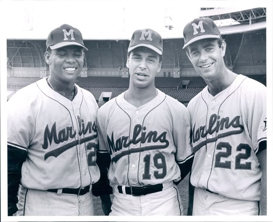
Are we going to get the OG Marlins?-
1
-
-
The Brew Crew looks great, kudos for using cream instead of white. Wonder what the road would look like with the Power Tool style Milwaukee script.
-
1
-


2023-24 NHL Jersey Changes
in Sports Logo News
Posted
The lack of any hem striping and the three stripes give a practice jersey vibe.