


VampyrRabbit
-
Posts
1,001 -
Joined
-
Last visited
Posts posted by VampyrRabbit
-
-
2 hours ago, Ferdinand Cesarano said:
On MLS: we've long since passed the point where the top MLS teams are worth more than the bottom NHL teams. Right now, all but five MLS teams hold that distinction, with the top MLS team being more valuable than half of the NHL's teams. Despite anyone's fantasies to the contrary, MLS is a major league in the U.S. and Canadian sports landscapes.
The dumpster fire in the desert does skew that somewhat in terms of NHL values vs MLS Values. The Arizona Coyotes, who with a value of 500 million, are worth 150 million less than the 31st most valuable franchise, the Buffalo Sabres, and for whom the Debt/Value is 62%, almost twice as much as the New York Islanders, 2nd in terms of Debt/Value.
In terms of value, there are 21 MLS Franchises that are worth less than the Buffalo Sabres. -
2 hours ago, Chewbacca said:
Is it bad that I absolutely love the Stars alternate jersey? I think as a third jersey, it is really cool.
As long as you're not being a dick, like what you like.
It's not really my cup of tea, but I understand why people like it and the idea behind the uniform, and it's a lot better than the Mono for Monos sake Oilers and Devils alternates, and the Canes almost mono now home uniform.
-
18 hours ago, OnWis97 said:
As I understand it, if the Twins ever move (a likely occurrence next time the team comes to the taxpayers with their hands out), the original AL team's history dies with the relocation (well, officially it gets put on hold).
I doubt the Twins are going to move. Minn-StP is the #15 biggest media market in the US, all the markets above them have at least one MLB team or two, and moving to a market that has one team is going to require an absolutely massive relocation fee, probably the biggest in history.
-
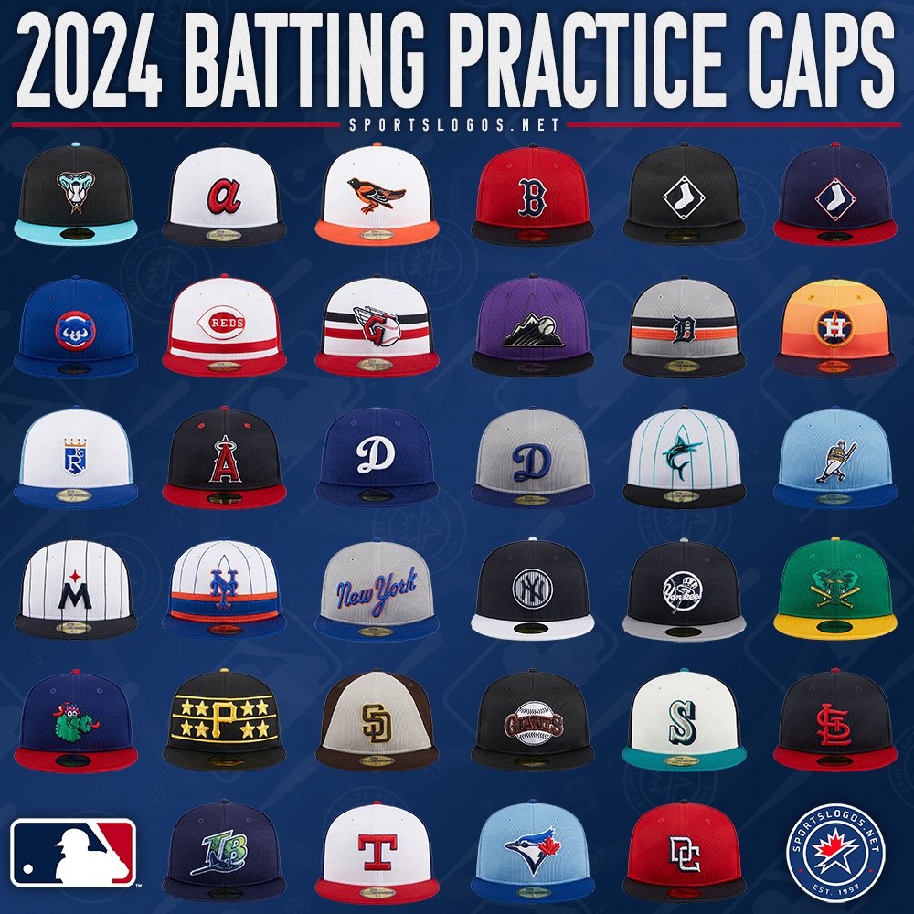
Full collection of BP Caps from the Mothership.

For the D-Backs, the mothership article mentions bronze, but the color was called metallic copper by the team.
-
 6
6
-
-
On 2024-02-12 at 5:40 PM, hereandthere said:
Plain back, as was to be expected. Would have worked better if the blue was a few shades lighter or a bit desaturated IMO. Or even better with a matching back, of course. But nonetheless a very nice kit.
It's okay, but it could have been a lot better, by putting the gradient on the back as well as the front and by having that design on the back panels instead of making them black, and with a better gradient.
There isn't much contrast between the 2nd and 3rd shades of blue on the gradient in comparision with the contrast between the Carolina Blue and the 3rd shade or the 1st and the 2nd. The 3rd blue also looks out of place, it looks close to the same brightness as the 2nd blue but more cyan, like it was taken from a different white to Carolina Blue gradient.Using the Trucolor value for the Carolina Blue and using a gradient generator with six modes, I came up six gradients and it looks like the third shade of blue on the gradient was swapped for another shade for some reason for the new Charlotte Jersey.
Looking at the jersey and the gradients, I have a hunch that the team swapped out the 4th shade of blue in the gradient for another shade of blue for some reason that was more cyan and also brighter. If true, then I have no idea why unless they were concerned they were using a shade too close to that used by the Tar Heels.
-
28 minutes ago, Digby said:
I don't think these copywriters have ever seen ripples in water before. Also a miss to go with navy shorts again, this one would benefit even more from the red shorts. But, I suppose this is nitpicking in the grand scheme.
Translation - "We thought the pins made out of dots were a bitchin' design feature which is why they are on the shirt, but as a team from New England, the marketing department for the Revolution needed to make up some nonsense about how it's linked to the revolutionary history" - dude from design team.
-
4
-
-
28 minutes ago, MJWalker45 said:
MLS probably refuses to use the actual logo since it wasn't part of their properties.
The inaugral MLS shirts had a monotone version of the USL crest on the inside.
-
 1
1
-
-
3 hours ago, kiwi_canadian said:
No new arena for the Wizards or Capitals:
Virginia senator says bill for new Wizards, Capitals arena is dead
After the Rhinos were aborted in 1997, it looks like Virginia isn't getting an NHL team any time soon. -
If that Sounders jersey is legit, then the team is going to be using a pea soup shade for another two seasons at least, and the shade of blue for the stripes is a different shade than the one on the anthem jacket.
So it looks like the team came up with a new colour scheme with the rebrand, and apart from the badge, it's not going to be used on the pitch this year, and with the last three change uniforms not using green or blue and the team not getting a third kit this season, it could be 2026 untill we see the Sounders take the field in the new colours.-
 2
2
-
-
1 hour ago, Digby said:
Feels very disconnected to me from front to back
Thats a problem with most of the shirts that have used this template, but the new Charlotte FC home might be the design that suffers the most with it.
-
49 minutes ago, Survival79 said:
Add the navy to yellow gradient to these and make them full time?
I would keep the purple to gold gradient, it should go well enough with the navy trim.
-
2
-
-
16 hours ago, kreativekun said:
let me know what you think, which jersey is your favorite? which jersey you don't like?
you can give me suggestion on what team or brand to do next
Just like the adidas and puma jerseys, the decision to use the same font for all the teams means that everything ends up with the same air of sameness. The best is probably Club America for the pattern on the sleeve, which helps that design to stand out from everything else.
Not using different fonts and not utilizing the actual wordmarks that some teams have really lets the designs here down. All of the designs would be improved hugely with the use of different fonts for teams and if a team has a bespoke font/wordmark like Spurs or Real Madrid, using that instead of the same one for each team, which is just plain lazy. -
5 hours ago, ruttep said:
For the first time in who knows how long, the Carolina Hurricanes are wearing white helmets with their white jerseys by their own choice, and of course the only reason they're doing so is to play Whalers cosplay.
This organization's uniform decisions are a complete joke.
Is there any other team that throws back to a former identity in a former city as much as the Canes do? -
31 minutes ago, tigerslionspistonshabs said:
You can't put Elmont, New York in a class of it's own lol. It's essentially a hamlet in the 9th largest metropolitan area in the world.
That was kind of the point, if you put Tempe, Anaheim and Newark and state that Omaha is bigger than all of them and don't take into account that they are part of much larger metro areas, then by the same logic you should have name dropped the places the Isles and the Golden Knights play too, though the former is a Hamlet and the latter is an Unincorporated Town instead of cities.
-
1
-
-
On 2024-02-03 at 8:29 PM, Dilbert said:
Ive mentioned before, IMHO, Omaha could potentially be the next Oklahoma City for the Big 5. It has a great track record supporting the teams and events they do have. Plus many still see Omaha as the small middle of nowhere midwest town. Omahas population has been on a big rise since the 90s. Its the 40th largest city in the US, ahead of Anaheim, Buffalo, Miami, Newark, Pittsburgh, Raleigh , St Louis, St Paul, Tampa, and Tempe.
Of those 6 potential expansion cities, Omaha is in the middle population wise.
4. Houston
37. Kansas City
38. Atlanta
40. Omaha
64. Cincinnati
117. Salt Lake City
Omaha also has a population bigger than Elmont, New York and Paradise, Nevada. Just going by the population of a city, and not taking into account the area the city covers and the actual metro population can be incredibly misleading. That is certainly the case for Omaha in comparision to current NHL markets.
Going by area, Omaha is the third biggest in terms of those mentioned citiesTampa - 175.83 sq mi
Raleigh - 149.60 sq mi
Omaha - 146.28 sq mi
St Louis - 66.17 sq m
Pittsburgh - 58.35 sq mi
Saint Paul - 56.10 sq mi
Miami - 56.07 sq mi
Buffalo - 52.48 sq mi
Anaheim - 50.88 sq mi
Tempe - 40.15 sq mi
Newark - 25.88 sq mi
And those cities by population densityNewark - 12,903.8/sq mi
Miami - 12,284.47/sq mi
Anaheim - 6,899.22/sq mi
Buffalo - 6,893.41/sq mi
Saint Paul - 5,994.02/sq mi
Pittsburgh - 5,471.26/sq mi
St Louis - 4,886.23/sq mi
Tempe - 4,521.34/sq mi
Omaha - 3,658.41/sq mi
Tampa - 3,376.4/sq mi
Raleigh - 3,148.33/sq mi
So Omaha is third from top in terms of city area and third from bottom in terms of density. It also has/is in a smaller metro area population wise than any of those other cities. And while it's population did grow a lot during the 90's, 00's and 10's, judging by estimates for 2022 it looks to have slowed a lot.
On 2024-02-03 at 9:37 PM, BottomlessPitt said:Metro Population
7. Houston
10. Atlanta
32. Cincinnati
33. Kansas City
48. Salt Lake City
58. Omaha
TV Market
6. Houston
7. Atlanta
27. Salt Lake City
34. Kansas City
37. Cincinnati
73. Omaha
Metro population and TV market are a much better indication than by the population of the main city of a metro area, and by those numbers, Omaha is way down the list and the arguement that it could support an NHL Franchise because it's the 40th largest city in terms of population and ahead of *8 cities that do have a NHL team (the Panthers don't play in the city of Miami and the residents of Tempe said no to the Coyotes) is a pretty weak one.*Edit - The Coyotes do play in Tempe for the time being, so that should be nine cities.
-
1
-
-
On 2024-02-05 at 6:23 PM, MJWalker45 said:
Game times won't be locked in until the draw, but we have the full stadium calendar.
And to what should be the surprise of no one, the US gets almost everything past the round of 32.16 hours ago, GDAWG said:Due to FIFA Rules, the NFL Stadiums and BMO Field will be temporarily renamed:
- AT&T Stadium (Dallas Stadium)
What exactly was wrong with "Jerryworld" or "The Death Star"? -
5 hours ago, LMU said:
They called both shades of purple used ( 4b3048 for 1993-1994 through 1998-1999 and 512a44 for 1999-2000 through 2005-2006) just purple. The reason for the change to a slightly different shade was probably colour matching, as the team changed to black pants and bucket for 1996-1999 and then changed back to purple for both in 1999-2000, which suggests the Ducks had an issue with getting the shades to match with the old purple, then resolving it for the 1999 - 2000 season.
Both purple shades were more red than blue, unlike most big 4 teams who used shades that were more blue than red.9 hours ago, ruttep said:
It was their 1992 throwback jersey, so not sure, but maybe
There were a number of variations of the Barberpole in terms of crest, jersey striping, sock striping and pants striping between 1937 and 1955, so it shouldn't be too hard to find a version the team hasn't worn as a throwback. They could also wear a version of the white jersey from 1940-1955 or their first jersey from 1926-1927, as they haven't worn them for a Winter Classic and those were used as the home uniforms back in the day (1951-1955 they used the white jersey as their home).
-
On 2024-02-02 at 8:02 PM, MJD7 said:
After discussing with @Marlins93 in the MLB 2024 Uniform/Logo Changes thread, I started to become more convinced that going back to teal really is the way to go for the Marlins. True to my comments, though, I kept pink as an accent, but went with a more pastel shade inspired by @VampyrRabbit's "Factory Pomo" Marlins logo, which keeps the Marlins' identity close to its 90's roots, which I appreciate.
I also think the Marlins are a rare team that doesn't really need a road gray jersey, so in its place I added a pink alternate inspired by the Nationals' recent raglan-sleeve pullover.
I might make this my "standard" Marlins set, I'm still a bit conflicted whether to keep the current "Marlins blue." Let me know what you think!
When choosing that shade of pink for the logo (which I am going to tweak when I have the chance), It was only intended to be used as part of the Marlin on the main uniforms, just a nice little tie to the masterpiece that is the Miami Art Deco district along with blue. I like the home, road and alternate (though not a fan of the pullover alt), though I would prefer them with just black and teal, with the pink just on the Marlin.7 hours ago, MJD7 said:I had this idea of an adjustment to the Brewers’ City Connect, instead of limiting the “beer foam” stripes to the sleeves I translated it to the whole jersey. Thoughts?
p
Make the stripe cream and move it higher on the shirt and match the sleeve stripe with it, and put the BREW CREW script on the stripe.
-
1
-
-
6 minutes ago, upperV03 said:
As a non-Atlanta fan, I think that immediately becomes the best away shirt in their short history. The flag tie-in feels natural and the color scheme is really pleasing. When I first saw the description of the shirt last week, I was worried the pheonix would have a distorted line graphic like the dragon on Seattle’s Bruce Lee shirt. Thankfully, it’s executed in a clean and clear manner instead.
The shades of blue and the gold used are great too, in the photos at least they've got them just right so the powder shade of blue doesn't clash with the gold and it looks a lot nicer than the sky blue and gold Philly change shirts.-
1
-
-
29 minutes ago, pepis21 said:
And this is what in my opinion make these wordmark great, because they are unusual and unique compare to standard outline.
That makes those wordmarks both, but they also look like someone made an error in photoshop that left both logos with filled counters.
-
1 hour ago, pepis21 said:
If you don't like Clippers wordmark, there are also two less known versions with Los Angeles wordmark. One with blue numbers:
and second with white numbers:
That script still has the same problems as the Clippers one with the white outline filling most of the counters.
-
1
-
-
16 hours ago, Ferdinand Cesarano said:
So they're considering Omaha and its half-million population, and not the similarly-sized Quebec City or Halifax?
As the lady from The Whitest Kids U'Know used to say: oh, hell no!
The league isn't considering Halifax due to it's isolation and the economy of Nova Scotia, which is 7th in terms of GDP for the Canadian Provinces and Territories. The Scotiabank Centre also only seats 10,000 people. As cool as it would be to see the Highlanders take on the Ducks in a defictionalized team battle, it's not going to happen. -
31 minutes ago, raysox said:
NCAA
The bastard offspring of the NCAA and TNT logos.
-
 2
2
-
-
3 hours ago, fortunat1 said:
This is a really strong concept. The color scheme is fantastic, and I think that the talldeco font compliments the cursive script well.
I like the inclusion of the compass logo, but think it could be removed from the wordmark, and be saved for the shorts or waistband as a standalone logo. It just seems a little out of place since the primary logo already has a nice composition of imagery, and the cursive script doesn't need much more flair.
I think you could also play around with the weight of outlines on the ship and script, just to see what you think looks best. I think the clipper could go for a black outline as to look more consistent with the rest of the logo, but I understand that it may look off due to its close proximity to the seams of the basketball. A thicker orange outline on the script could also be an improvement, but it's nice as is too.
I don't think any of these suggestions will really make or break the concept since your initial showing is so strong, but I'd love to see how you feel about them. Great work all around! Really excited to see the uniforms!
Thanks, this is actually my first Basketball concept, but it won't be the last. I probably will use the compass from the wordmarks and logos and use it as a waistband logo, and maybe give the script a thicker outline. I loved the Factory Pomo font used on the 1993 rebrand and I was always going to use some form of it in the concept, and stoked that it went with the traditional Clippers script.
I'll cook up the uniforms over the weekend.


.jpg)


 p
p


MLB Reverse Relocations! (Brewers/Pilots 2/20)
in Concepts
Posted
The NY Giants look awesome, though I would like to think they would have an orange squatchee for the home and road cap and an orange billed alternate cap in this universe, the SF Giants orange billed cap I have is one of my faves.