


VampyrRabbit
-
Posts
1,001 -
Joined
-
Last visited
Posts posted by VampyrRabbit
-
-
21 minutes ago, CaliforniaGlowin said:
Wouldn't a yellow jersey be too close to Boston's city?
The Cubs and Royals both had a navy jersey with powder blue as a secondary colour of their CCs.
-
 1
1
-
-
On 2023-12-20 at 5:31 PM, WBeltz said:
This is objectively the right take. I would say add some details (head-spoon trim, white cuffs, etc) and it would look more than serviceable for an alternative uniform.
It wouldn't, a Navy Yankees jersey with a white headspoon is a non starter due to it's association with one of history's greatest monsters, Bro

-
 2
2
-
 3
3
-
-
51 minutes ago, coco1997 said:
GRAND RAPIDS RIPPERS (est. 1894)
This one was the precursor to the modern-day Cleveland Guardians.Can't go wrong with navy and powder blue. Well, you can, but it's pretty hard.
-
1
-
-
3 hours ago, Digby said:
This should be good. Seems hard to believe that's quite accurate given the history with Stephen Ross and MLS, but I've always thought teal would be a smart tertiary color for the Inter Miami palette -- still got fingers crossed for Adidas to just rip this off:
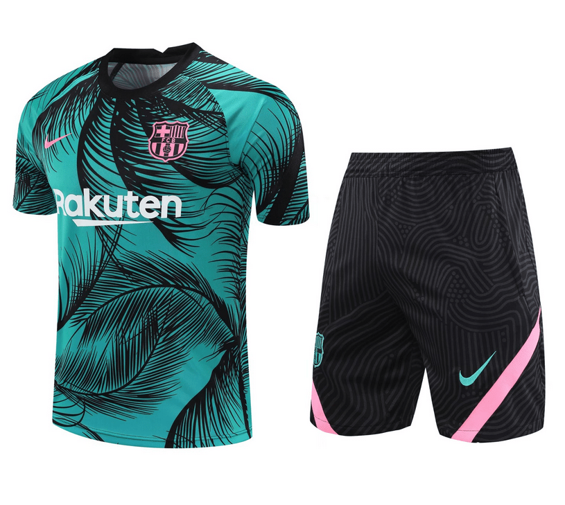
Given how othodox the design of the Miami kits have been, probably due to David Beckham being one for understated designs, it's unlikely that the 3rd is going to be as outlandish as that Barca training kit. It's much more likely to be pretty plain with a subtle (and I'm talking actually subtle, not what Footyheadlines calls subtle) detail like the heartbeat on the cuffs of the outgoing home shirt, the embossed herons on the first home or the waves on the current change.
-
On 2023-12-24 at 5:58 PM, Morgan33 said:
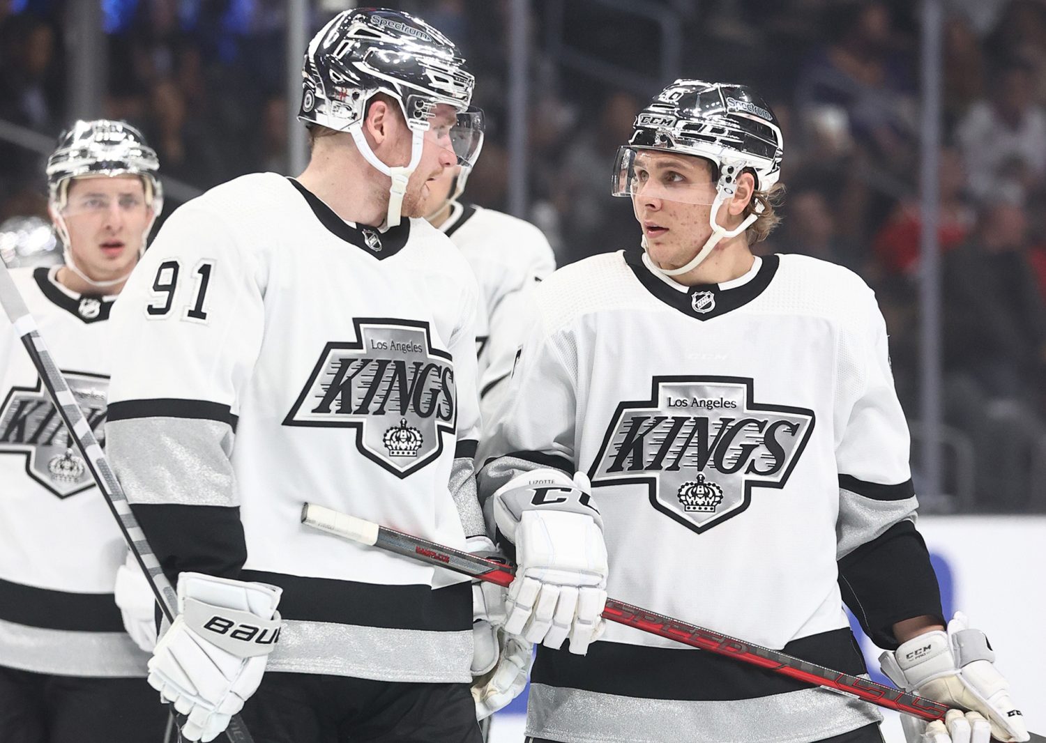
The Kings have never had a sufficient crown logo... All of them from the "forum blue" version to the one that sits in their current, pencil-point, logo have been overly fussy and detailed. They just need a simple crown on the front of their jerseys, perhaps with a subtle regional tie-in.
They do have a simplified version of the crown from 1998 onwards, but it might be too simple.
-
1
-
 1
1
-
-
Love to see the 'huskers with a gold brimmed cap, and with cream as the base colour instead of white.
-
1
-
-
9 hours ago, VancouverFan69 said:
The Kings only ripped off the Raiders. Their first NHL season was the NBA Lakers' first season in purple(Forum blue) and yellow-gold after years of wearing double blue and white.
Sacramento Kings changed their scheme to black, purple, silver and white in 1994, and the LA Kings changed to the same colours for the home and away for the 1998-99 season, though with different shades for the purple and silver. Though LA did come up with the Burger King for the 1995-96 season and I think parts of that monstrosity might have been concieved before the Hardwood Kings made their colour change, including the decision to reintroduce gold and purple.
8 hours ago, Mr. Krabs said:If we're being reminded of the fact that the NHL prefers teams to have the same front crest logos on home and away uniforms, will they pressure the Hurricanes to do this rather than the three different ones they have now?
Perhaps they should.
-
Out of the three full time looks the Rays have had, the 01-07 is my least fave, The forest green and black just doesn't look right for Tampa and the metalic blue doesn't contrast or compliment the green well. I also think the change from double to single piping is a downgrade from the 01-07 set.
-
1
-
-
2 hours ago, MJWalker45 said:
These designs are approved a minimum of 18 months out so that they can have them ready to wear 2-3 months prior to the start of the season.
Could have fooled me, the leaked Miami home looks as though it was done in 18 minutes then the designers went to the pub.
-
3
-
-
22 hours ago, McCall said:
Are we sure these aren't simply some type of fashion jersey? Seems either edited as @hendocfc mentioned or simply not authentic game jerseys. Would Miami really be going away from the polo collar?
The jerseys look legit, and given that Miami started off wearing home shirts that had a Henley Collar, then it shouldn't be a surprise that they have gone away from the collar style on the 22-23 home shirt as well as changing the shade of pink again.
And if these are the new home shirts, then it's not a shock that they are pretty plain. Adidas know that they are going to sell a f***ton of them no matter what thanks to Messi - why bother with any fancy design elements? -
One of the best things that Nintendo did when they bought the Mariners was change the team colours to navy and teal. That said, I do like the home and the alternate, though the original Seattle Script looks nicer than the one you've used.
-
2
-
-
11 hours ago, Mingjai said:
It was definitely for both. They’ve definitely used the wheat for a retro feel.
Considering that they call it wheat and most of the jerseys that the Wild have worn have been pretty modern and in line with the trends at the time, and the retro scheme for the Wild is now white, green and gold due to the North Stars, it comes across a lot more as a tie in to MN.
-
1
-
-
15 hours ago, chcarlson23 said:
Well the Minnesota Wild have cream/off-white on their home sweaters as a full time look, and there doesn’t seem to be any complaints from the league there.
Though the Wild don't use the wheat colour for a retro feel, rather to evoke the landscape of MN.
-
2
-
-
41 minutes ago, coco1997 said:
How does everyone here feel about the Yankees' apparent decision to not participate in the City Connect program? I get that the team has been historically committed to the "sanctity" of their brand, but still I think they could do something tasteful and within the parameters of their identity that would make most Yankees fans happy. I don't think anyone's suggesting they wear magenta and seafoam green like the Padres.
If their heart is not in it and it would just result in something like the half baked Dodgers CC, then just let them be. Similar story with the Tigers.
-
2
-
-
17 hours ago, WBeltz said:
So does that mean the LAFC leak is legit? If they are using 2022 WC template for the MLS shirts.
Maybe. Could also be a prototype and quite different to what ends up as the finished version.
-
1
-
-
6 minutes ago, throwuascenario said:
It's pretty crazy they haven't moved to either Quebec City or Houston.
Alex Meruelo can't run casinos in AZ if the team moves out of state.
-
Unlike Boreham Wood and Banbury, I don't think the Chesterfield crest is an improvement over the original. It doesn't look like there is a representation of the Spire on the crest. I also don't think the striping on the kits work either with two of the three stripes being the same shade of orange. Maybe try using a shade between the crimson and the orange for the middle stripe.
-
1
-
-
2 hours ago, raysox said:
Thanks everyone.
Small update but I have officially finished this in the back end, including two small redos of Manchester and Bristol.I would be interested in a tweak for Newcastle with a shade of teal closer to that found on the wings of a Magpie. I like the uniforms as they are, but I feel like using an accent colour more faithful to the shade of teal would make it even better.
-
5 hours ago, Davidson said:
Souths Logan Magpies. Another Magpie logo. A little different this time, hopefully.
It's got the same problem as the Western Suburbs logo in that the magpie looks far more like a European Magpie instead of an Australian Magpie.
-
2 minutes ago, dont care said:
What black?
The black on the cap logo.
-
2 hours ago, FiddySicks said:
not to mention that the color palette was PERFECT for a Phoenix Area team.
So was the original, the teal, black and copper tied into the state metal and mineral of Arizona, and the purple tied into sunsets. It was also the best colour scheme that peyote could buy, and it being so loud was perfect. I would put forward the 2001 home sleeveless uniform as the best use of purple and teal in sports, that uniform was awesome.
The new set is good, but I would take an update of the original set over it without question. -
3 hours ago, ruttep said:
Regarding helmets, a bigger problem to me is chrome helmets.
These need to be banned:
A masterclass in how to turn something classy into a chintzy nightmare - just add those metallic monstrosities to the uniform.
-
17 minutes ago, seasaltvanilla said:
I always liked the db snake head, wouldn't mind seeing that back.
That was a great logo and actually looked like it was introduced along with the A logo rather than with the 2007 rebrand.
-
5
-
-
2 hours ago, coco1997 said:
How did you feel about the original D-Backs uniforms? Those were off-white too, but purple and turquoise wasn't exactly a traditional color scheme.
That uniform is beautiful, the A is one of the best in all of sports and I dig how the teal and the black is bordered by the copper, as oxidization of copper produces teal and black compounds. And the off white worked too.
-
3
-


2024-25 NHL Changes
in Sports Logo News
Posted
There are a lot of problems with the current Tampa Bay uniforms, but the logo is simple but looks good on a jersey. It's fine as it is, but TB could use the bevelled version of the Lightning Bolt they put on their 30th anniversary patch on the front of their jersey.
A crown isn't generally meant to be simple, its a symbol of prestige and power, and generally its more ornate than the LA Kings logo I posted. It feels to me like it is a bit too spartan for a team named the Kings and from LA and the opposite of the crown the team wore during the Forum Blue and Gold years. I'm sure there is a happy medium between too sparse and too ornate that would be just perfect on a Kings Uniform.