


VampyrRabbit
-
Posts
1,001 -
Joined
-
Last visited
Posts posted by VampyrRabbit
-
-
The patch also looks like it was designed in 5 minutes by taking the MLS shield, adding some text in a bog standard font then putting a stroke around the two. It looks lazy as :censored:.
-
 1
1
-
-
That crown looks an awful lot like the Sacramento Kings, though the team did play in KC before moving to the Californian capital.
I think there are too many uniforms, considering the amount of games played 3 should be the most and like the Baseball Royals, the use of black feels very BFBS and you could stand to lose that uniform and the all gold. -
47 minutes ago, shaydre1019 said:
They stated multiple times that it's a modern interpretation of past sounders kits. Pinstripes from '83, dark green and light blue from '74. Solid green back is a rule, not a choice.
Also the green is supposed to be the updated rave green. I think the photography and different materials may just make it look a little bit off.
It still doesn't feel like an anniversary kit nor a modern interpretation of those kits, it's not really accurate to call the stripes on the new jersey pinstripes when they are at least 4 times the thickness of those on the 1983 kit, and the solid green back becomes a big issue when you use stripes of that thickness and consisting of two colours. The rule of one colour backs is a rule that shouldn't exist, and MLS should either create a new name and number font that works with striped backs and those with tonal patterns, or let teams use a custom font that does the same. As the current MLS Font doesn't work with striped backs, it not fit for purpose.There are still too many shades of green and blue, and adidas should have done a far better job with colour matching.
-
1
-
-
7 hours ago, Chewbacca said:
I wouldn’t be surprised if we see the Blues bring out a St. Louis Eagles-inspired sweater for the Winter Classic.
I would be, the team lasted for a single season and were absolutely rank rotten, and the stale cherry on top was that they were the only team to play in an arena with racially segregrated seating.
-
10 hours ago, shaydre1019 said:
Idk how this kit is getting any hate, it might be the best of the season for me.
It should be easy to understand how and why there are people who don't like the kit, it's not like they haven't stated the reasons for that. The colour mismatch between the logos and the shirt, the use of too many shades of green and blue, the main sponsor, the shade of green used, that it's supposed to be a 50th anniversary kit yet doesn't really hark back to the NASL kits the team wore, the solid green back, the "retro for retro sake" design that doesn't recall the NASL kits and the striping layout and colours are all reasons given to why people don't like the kit.-
6
-
-
5 hours ago, MJWalker45 said:
interesting! I wonder how many fans actually try doing something like this with these jerseys? If I was FCC I might see about exhibiting some of the designs somewhere in the stadium during the season.
The fans can easily turn it into the FC Cincinnati "AEW Canvas Kit" by doing what one Cincy resident does every Wednesday by bleeding all over it.
-
 1
1
-
-
18 hours ago, Dilbert said:
I get Omaha vibes from the proposed new Omaha arena. Most sports in Omaha are played in suburban venues and not in Omaha proper. The Storm Chasers and Union Omaha are in Papilion. The Lancers and Beef are in Ralston, and the newcomer Iowa Rampage are in Council Bluffs, Iowa across the river. The exceptions are Creighton, UNO, College World Series, and the new Supernovas volleyball team.
I got Cleveland Barons vibes from the location of the planned arena because only an idiot would put a venue that far outside the city, they would struggle to draw flies to a :censored: convention in that location. -
On 2024-02-12 at 2:08 PM, maxwasson said:
This one took a while, but we're finally onto the soccer/association football portion of this series, starting with a rollback rebrand of the MLS' Sporting KC back to their original name the Kansas City Wizards which they were known under from 1996 to 2010.
The team were known as the Kansas City Wiz for their first season before the electronics store The Wiz threatened legal action.

The team changed the name to Kansas City Wizards for the 1997 season. It was probably for the best that the team changed their name to something other than Wizards given that the team were near the bottom in both attendance and merch sales, and that Wizard is a rank in a certain organisation.
I do like the Kelmscott font for the Wordmark, but not for the player name as it's pretty hard to make out, though the 1 is pretty clear (though 1 is almost always worn by a goalkeeper and almost never by an outfield player). I also feel like there should be more colours on the shirt if you're going back to the Wizards name.-
1
-
-
3 hours ago, Digby said:
Not every team needs to do a municipal flag kit, also, but if Atlanta must do so, I will also note that their flag is a medium-dark blue and a deep, mustardy gold
It's 25 years since the Thrashers started play, so it's only right that Atlanta pay tribute to such a monumentous occasion by wearing a sky blue jersey with a bird on the front.-
 1
1
-
-
23 minutes ago, MrOrange said:
the special color combo seems fitting for an classic anniversary - even if it's not their usual color palette.
When every other team has brought out a jersey with a dark base colour with gold trim over the past decade, it stops being special and feels more like a boilerplate example of a anniversary jersey.
-
1
-
-
San Jose Earthquakes new away
As a 50 year anniversary kit celebrating the teams history, it does a better job of that than the Vancouver change and Seattle Home, with the NASL colours and the period logos.
And while it has the huge back panels, they don't look nearly as out of place as most other shirts using the template due to San Jose being able to use side panels.
And with the red side panels and the black hem/side trim, there is also a nod to the 81-82 kit.
-
5
-
 2
2
-
 2
2
-
-
8 hours ago, Bmac said:
They're working on building a 18-19k arena that would serve as the USA Volleyball training headquarters (something that is actually far more likely to happen) and house the NHL team. The problem is that this buffoon is trying to place the team in Gretna, a small city half an hour outside downtown Omaha.
Getting huge Cleveland Barons vibes with the location of that proposed new arena.
-
2 hours ago, tBBP said:
Wanna stop by for a second to say to all those who swear up and down that yellow should never touch white: take a good look at this. 1) it ain't illegal, not even in the "rule" of tincture; and 2) when done right it can be mighty effective. (Also works for a team with a nickname inspired by space...)
12 minutes ago, GFB said:
The adidas stripes are single-color, so the yellow-and-white rule doesn’t quite apply here. If the stripes or numbers were navy trimmed in gold, then it’d be a “violation” of the rule (not really, but you get the picture)
The three stripes on the shirt and shorts have a very thin dark blue outline, while those on the hose look to be just gold. Also on the mothership the writeup describes the pinstripes as gray, but they are actually dark blue.
And with the crest now using just the one shade of gold, the GALAXY script has lost it's underline, which the team should have accounted for and moved the lettering to the midline of the scroll.
-
2
-
-
1 hour ago, upperV03 said:
I didn’t see anyone post a picture of the full Whitecaps kit yesterday, but it’s too good not to share:
White shorts/navy socks would be a more fitting combo for the Caps’ kit history, but I love the Chelsea-esque combination. I can’t remember another MLS team wearing a kit combo like this, at least not as a first choice combo. I’ve long thought Orlando would be a natural candidate to wear a Chelsea-esque kit combo for their primary kit.
It's not bad, just that the Whitecaps are a team who have had the chestband on most of their jerseys and it seems a miss that their 50th anniversary shirt doesn't have one, and that the team aren't using a version of the 79-84 logo, though that never appeared on the jerseys back then.
It's also using gold as an accent colour for a dark anniversary jersey, and that feels so overplayed at this point.-
1
-
-
13 hours ago, upperV03 said:
They made no mention of it in the kit unveiling, but within Adidas Seattle’s new kit is apparently dubbed “The Macklemore Kit”. It helps to explain the nauseating stripes and the ridiculous hipster shoot. This is straight from the head of club football apparel at Adidas:
Now why didn’t the club make mention of it during the unveiling? Probably because they’re saving it for a future tie-in or someone within the club realized how embarrassing it was.
Could be the latter, but it's probably the former for this time next year when they unveil their new change with a photoshoot in front of that wall covered in Bubblegum.
-
30 minutes ago, GFB said:
The back of the shirt should be the darker burgandy as well then... doesn't change the principle , imo.
It looks fine with the lighter burgundy and I prefer that shade for the socks and shorts, though it would probably look better with white shorts.
-
4 minutes ago, GFB said:
I dislike it when the shorts match the lighter color in a tonal pattern. This top (which is perfectly fine) needs dark burgundy or light blue or even white shorts.
The back of the shirt is the lighter shade of burgundy, which is why the shorts are that colour. -
-
9 minutes ago, tBBP said:
I get the point--and what is that written into the side piping?--but it still kinda looks like bleach blots...
L'Étoile du Nord - The Star of the North.-
2
-
-
11 minutes ago, SSmith48 said:
FC Dallas, I'm sorry, but...
Its hard to make a half and half MLS jersey work due to the one colour back. Props to Dallas for originality but they were up against it from the get go when they decided to go halfsies and they haven't made it work now.
-
3
-
-
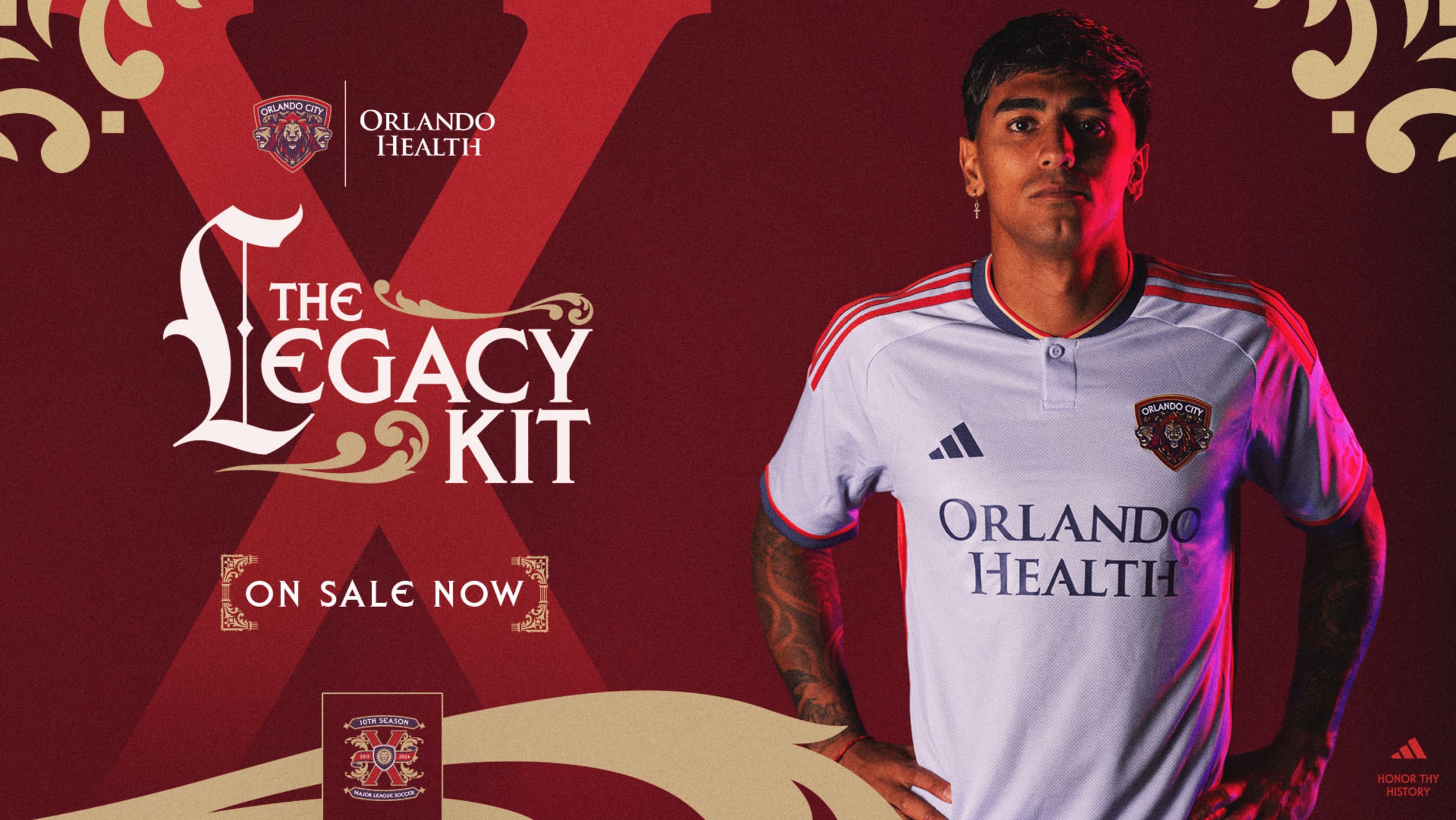
1 hour ago, aawagner011 said:
Orlando has dropped. I didn’t realize the color is lavender. I thought it was white. The tweets below have a video showing it with lavender shorts. Also a nice look at the original crest and the updated one that’s used on this shirt. I hated the original crest, but seeing the modern update, think it’s kinda nice.
The updated USL badge is nice, as is the base color and the collar, but it's spoiled by those absolutely horrible huge back panels and the cuffs not matching the collar.
15 minutes ago, officeglenn said:Chicago Fire primary kit:
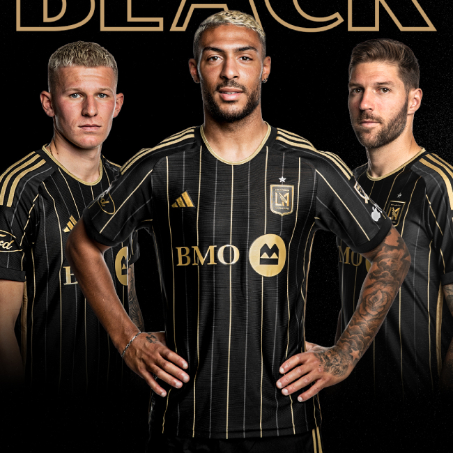
Finally red for the home is back, along with the chestband. Long overdue return to a look the Fire should never have left.15 minutes ago, officeglenn said:Officially official LAFC home kit, which they unveiled earlier this morning despite tweeting earlier this week that it would be launched on Saturday:
LAFC look great from the front, but the back just has to be one color because the official MLS name and number font dont have outlines and weren't designed with them in mind.
-
1
-
-
2 hours ago, upperV03 said:
The badge is very vibrant and modern, yet it’s slapped on a kit that attempts to be overly retro-for-retro’s sake.
Yet despite that attempt and that it's supposed to be celebrating the 50th anniversary of the Sounders, it doesn't recall any of the kits the team wore during the NASL days. The Sounders did wear stripes in the NASL, but that was for one season and the original team folded at the end of it, and the stripes on it could barely have been any thinner.
And for some reason, it looks like the MLS logos that will be slapped on the jersey will be using another shade of blue teamed up with the pea soup shade of green, and yet another shade of blue for the Orca logo on the back.
-
1
-
-
7 minutes ago, Cujo said:
This is VERY surprising to me. I would love to see this list, if possible.
4 minutes ago, Ferdinand Cesarano said:
It's not that surprising when you take into account the money pit in the Valley of the Sun. The Coyotes are 150 million behind the second last team (Sabres) in terms of value, and if the team was sold to owners who relocated the team to a new market that got behind the team, there would be 21 MLS teams with a lower value than the Buffalo Sabres. -
10 minutes ago, aawagner011 said:
The Sounders shirt was dragged through the mud before it released. I’m here to offer a different opinion. Seeing the full kit with shorts and socks, this thing is a banger. Might be kit of the year. The pastel colors look fantastic and amazingly retro. I’d even venture to label it their best ever kit. I think this is a classic example of not judging a kit just off of the shirt but the entire package with shorts and socks. It’s also one of their first kits where my eyes don’t bleed from the neon colors. Fantastic!
The colors on the crest not matching those on the kit and the solid green back of the jersey still drag the kit down IMO.-
2
-


.jpg)
.jpg)
.jpg)


.jpg)


VRD NHL Design Thread.
in Concepts
Posted
So this is a thread with designs for the National Hockey League, just like it says on the tin. All of the designs here use the NHL Puck logo from the 1990's (I dig that logo), and all teams will get a home, road and alternate.
Vancouver Canucks
Seattle Kraken
Toronto Maple Leafs (Road V2)
Washington Capitals (V2)
New York Islanders
Buffalo Sabres
Colorado Avalanche (V2)
New Jersey Devils