


VampyrRabbit
-
Posts
1,001 -
Joined
-
Last visited
Posts posted by VampyrRabbit
-
-
1 hour ago, hendocfc said:
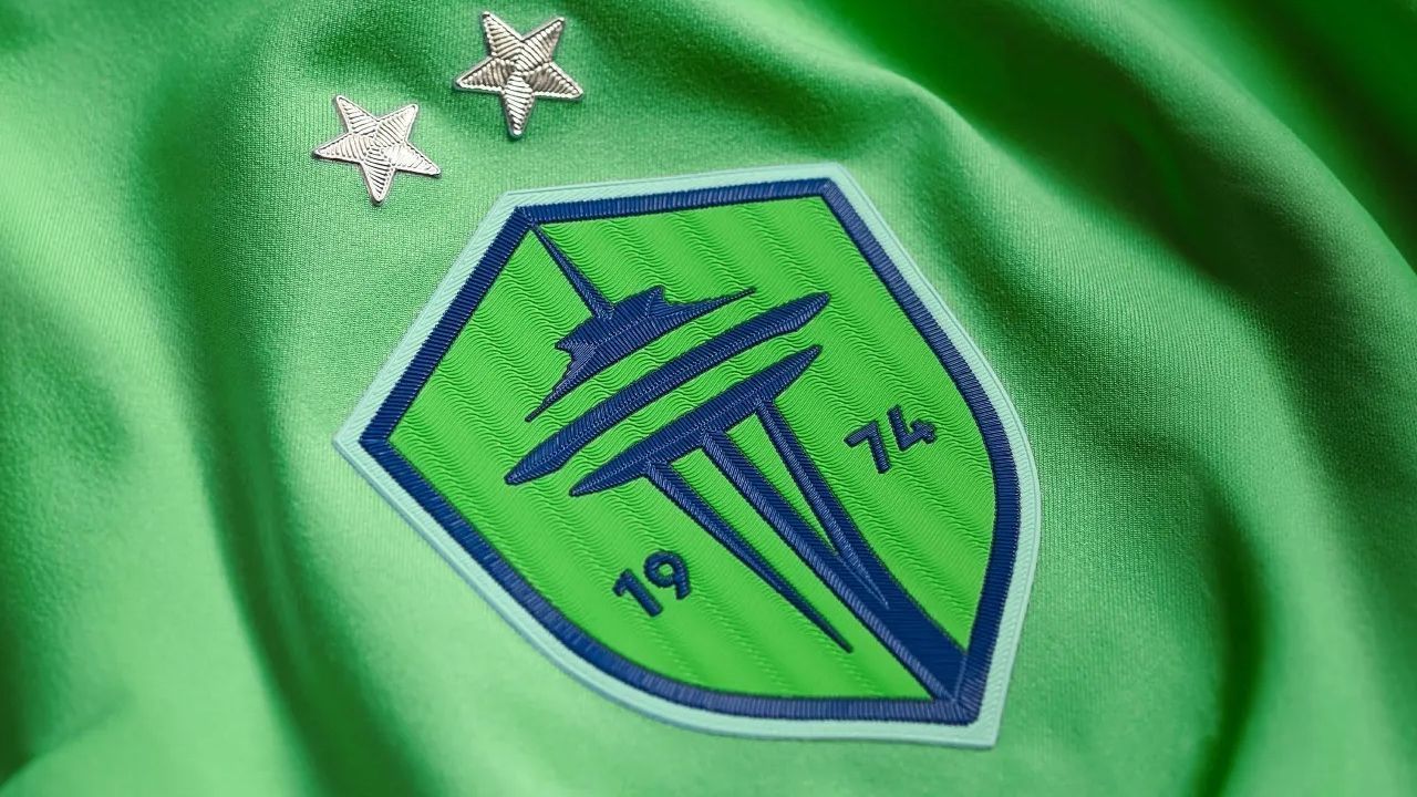
That article has an error - as usual with those folk! - the colour is called "Semi Solar LIME" not "SLIME" and it's pretty similar to this

Don't get your hopes up about the template though - if that LAFC top is indeed fake, which I suspect it is, all MLS tops should use the "if Midjourney was given a "design an adidas football shirt from 2007" prompt" template!
Semi Solar Lime is the shade for the shirt, not the crest FTR. adidas does use a colour called Semi Solar Slime though.
If you're right, then good job Seattle will be using Semi Solar Lime, which is a lot nicer.
-
I think this has potential. I would stick with the Teal and Black, maybe make the teal either slightly more green than blue or slightly more blue than green.
-
42 minutes ago, CRDesigns said:
And for day 21, the theme is National Team! I created a very unique jersey for Japan with a crest inspired by their Soccer team.
You mean you took the Yatagarasu from the JFA logo, removed the sun/ball, and replaced one of it's legs with a J/Hockey Stick and a puck. The striping that looks like the bastard offspring of the first Ducks Jersey and the Flames pedestal jersey is quite original and probably the best part.
The Kings Jersey is excellent and the Burger King rules. It also has shoulder patches, which I don't understand why many of your designs go without and with which many of your designs (including Japan) would be improved.
-
For those of you who were hoping that Seattle would change the shade of green on their jerseys, word from Scuttlebutt is that is just what is going to happen. But it's going to be to a shade called Solar Slime Green.
-
 1
1
-
 1
1
-
 2
2
-
 1
1
-
-
7 minutes ago, tBBP said:
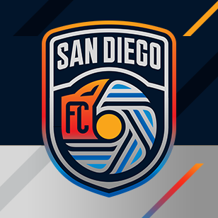
Now, with all that said...I done been to San Diego a time or two, and navy and chrome are the absolute LAST colors I think of then I think SD. I don't know how much of the "azul" has to do with the NFL team that used to play there and now plays about 100 miles up the 5 or if they chose that dark navy base to show off the other three or four colors.
The Navy could have something to do with the US Navy being the top employer in San Diego too.
-
19 minutes ago, vtgco said:
Now that the team has released its vector logo, here's the less aliased version, both in the original colors and in teal and sand like @VampyrRabbit wanted:
The logo looks great in teal and sand, love the different shades of teal and the golden gradient. Love it.
-
4
-
-
2 hours ago, Sykotyk said:
If they can't reproduce the logo shown online and in video.... They shouldn't have used that logo.
I'm sure they can, but they realised that the crest looks a lot better without all the crap on the grey and white bits, and therefore decided not to put it on there.
-
It looks like for merch the crest won't have all that s**** on the grey parts, and the name and swirly thing will be white.
-
1
-
-
It's an improvement, the addition of the various shades of gold/orange and getting shot of the crap on the grey. I also like the Mission/Gaslamp style arch under the team name, and the main motif looks much more like a wave.
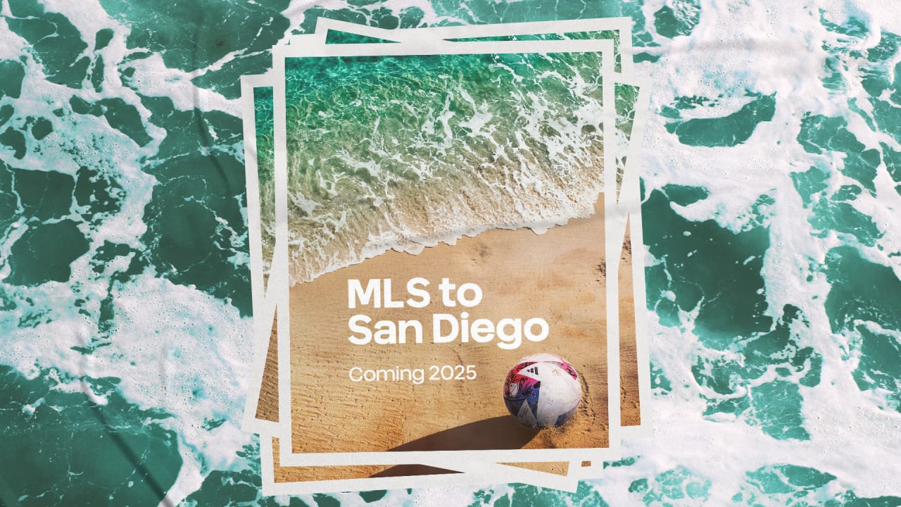
I would love to see a series of cleaned up redesigns, one with the colour scheme the team uses, and the one the team should have gone for, the teal, gold and white like the photo announcing MLS to San Diego.
-
3 hours ago, MJWalker45 said:
That San Diego badge is bad, but I actually like the Columbus badge. It's not a roundel, it kept the team colors and the pennant design is a bit different. That C in the badge could use a change though, I'll admit. That San Diego badge is more useful for a league design than a team's own badge.
The Roundel made some sense for Crew though, as it formed an O for Ohio and it did keep the shape of the first logo for the team in the form of a container for the foundation date. Nothing wrong with a roundel if it's done well, and it strays away from the sterile "City Group" style.
-
5
-
-
That logo had better be a red herring someone intentionally leaked to throw off the scent, because it is absolutely wretched.
-
3
-
-
20 minutes ago, TaylorMade said:
Nothing about that logo says SD to me. You could just as easily put "NEW YORK" or "TULSA" on it and have it work equally
Or rather, have it suck just as much.
-
2
-
-
On 2023-10-07 at 1:41 PM, McCall said:
Actually it's the more accurate shade. Google "Arizona Turquoise".
The shade the Diamondbacks used was still within the colour range for Arizona Turquoise though.
On 2023-10-07 at 5:09 PM, SFGiants58 said:I tried to make that '98-'06 set work in modernity.
I maintain that the "db" is way better than the snake swallowing the ball.
The db Snakehead and the A look like they were designed by the same people and took the same inspiration, and those two feel like a natural fit, far more than the original snake sleeve patch or either of the D-Snakes.
-
2
-
-
And now for another English team, Sheffield Wednesday.
The Owl that was introduced in 1973 is a classic and one of the most beloved and longest lasting of the minimalist logos that were introduced in that time period in English Football, and lasted until 1995, when it was replaced by a design that had a SWFC monogram repeated.
The classic Owl returned in 1999 inside a shield and this design lasted until 2016. That year, the new owner of the club, Dejphon Chansiri, in just one of many questionable decisions he has made at the helm, decided to bring back the crest used between 1956 - 1973 (which never appeared on the shirts) almost unchanged. To my eyes, the crest on the shirt looks so retro its retrograde, and has design features that make it look highly dated such as black outlines around almost every feature.
The designs here bring back the Owl as the centrepiece. The shape of the owl is the reason for the 20 degree rotation, to minimise empty space, and there is a clear Factory Pomo influence with the designs featuring the team name.
A version with two quarter rings.
And the owl in a roundel with just two stripes and the date of foundation. The font used for the name and numbers is Loxley.
C&C Would be cool.
-
1
-
-
Couple of Logos for teams that do still exist today, one radically different from what the actual team uses, and another that is an update of an old crest.
Rodelindo Román are from Santiago, and currently are owned by former Chilean international Arturo Vidal. The team play in the district of San Joaquín , the central motif of its seal is used as the main feature. The font for the team name is Belgrad and Lady Ice is used for the date of foundation.
Liga MX side Puebla have had a variation on their "Ribbon" logo, but in 2016 introduced a new crest that had the Angels and the Cathedral from the city emblem. That logo didn't last long and probably for the best, as it had too much going on like fade effects, bevelled stars and a football on fire for some reason. This take is simplified, with the date of the teams foundation on a sash, which is the teams signature jersey feature.
The font for the name and number is Valley.
C+C would be cool.
-
2
-
-
32 minutes ago, raysox said:
that's interesting, could you explain more?
The Bull Ring is a market area in the heart of the city that dates from the 12th century and is the site of St Martin in the Bull Ring, the original Parish Church of Birmingham. The Birmingham Bulls BAFA team took their name from the area.
-
1
-
 1
1
-
-
The Bulls look good. I would love to see the Bull with a ring through it's nose, as a nod to the market area the team is named after.
-
On 2023-10-13 at 6:32 PM, vtgco said:
Lens looks so good; a big upgrade on any of the IRL logos. I think it's a bit more dynamic and well-composed than your old concept for them too, though I did like the double-diamond container for that one. Not necessary, but it could honestly go even more dynamic by having the top of the lighthouse break out from the top of the diamond...
Thanks! I decided to go with just the diamond for the remaster, the problem with the container was the amount of empty space it left, so one diamond it was. Making the miners lamp any bigger would squeeze out the R and the L and I wanted the symmetry. I'll probably try a version with the top of the lamp emerging from the crest sometime.
And now onto a team that sadly no longer exists.
Centro de Ensino Unificado de Brasília Esporte Clube (Unified Teaching Center of Brasília Sports Club), better known as CEUB, were active from 1968 to 1976 and played three seasons in the top level nationwide championship. Their logos weren't anything to write home about, but they did have a pretty distinct design for their jerseys, blue with blue and gold stripes on the sleeves.
The arrow from the flag of Brasília takes centre stage, with the clubs initials (in LadyIce font) and an old school football. The stripes are horizontal for the top of the crest and vertical on the bottom, as well as the striped sleeves, CEUB played in vertically striped gold and blue shirts.
C+C would be cool.
-
1
-
-
Doubt that calling a team Pioneers would fly, and if NHL did expand to Portland, they would either be called Rosebuds or another name would be chosen. The colours and design are nice though.
The Thrashed Jets jersey looks pretty cool.
-
The teal accents on the mags really needs to be darker, more saturated and with the green and blue on the RGB scale closer together to really imitate the colour accent of a European Magpie, as the colour looks washed out.
This is a promising start though and I do like the designs of the uniforms.
-
On 2023-10-09 at 5:39 PM, Brian in Boston said:
As a supporter and season ticket-holder since Day 1, I have to say that I'm just not feeling this. While I welcome the return of the club's badge to where it ought to be - positioned over a player or supporter's heart - the rest is leaving me cold.
I've always wondered what pinstripes might look like on an LAFC kit. Now that I know, I'm not a fan. I much prefer the subtlety of the black-on-black sublimated patterns that marked our inaugural and current jersey designs. The art deco motif on the present version is my particular favorite (though the positioning of the crest isn't optimal).It's almost certainly not real, the actual design could be (and probably should be) quite different from that shirt.
-
On 2023-10-03 at 12:25 PM, Friedrich Stuart Macbeth said:
Would you be able to fit in the club's initials and the word Prepared inside the gas lamp shield crest?
I wasn't able to fit the motto inside of the gaslamp shield due to the shape of the lion and the angle of the V at the bottom of the shield, but I was able to fit the intitials in there.
I prefer the standalone Lion.
On 2023-10-03 at 6:59 AM, vtgco said:Villa looks great in this shield shape (and better than the linked concept since now it's maroon on blue!) I like the broken V; it makes me curious to see the top two corners get "broken" as well even though it doesn't form a letter.
Sure thing.
Onto another design I cooked up, this one for French side RC Lens.
The vibe I was going for here was to create something that wouldn't look out of place on a 1920's workers rights poster. This takes the mining lamp from the current crest and makes it the centrepiece, the shape of the shield was inspired by the pattern found on the Gare de Lens, which was built to resemble a steam locomotive. The font used for the initials and the name is Antonio. There is a lot of black on the crest, but I wanted the red and gold to work together more, hence the beam of light and the inverted colours on the inner outline.
-
1
-
1
-
-
The first concepts are beautiful, the green for the Sounders works wonderfully with the blue and cyan, and the crest for Reign looks great with the incorporation of the space needle summit with the crown, the raindrop and Tahoma. Great job.
-
1
-
-
11 hours ago, CRDesigns said:
Love the Sounders redesign. I honestly like what they came up with, but you took those improvements and made it even better. Nice work!!
Thanks!
On 2023-09-29 at 7:29 PM, vtgco said:As for Italy, I like the use of the old-timey ball, and your version definitely looks more like an "i" than the original, but the composition of the original lopsided-dot certainly feels a tad more dynamic and might be worth a shot. Definitely a hard logo to work with, but you've done well with it.
I tried a more lopsided I logo.
I would probably still go with the inline i.
Couple of more redesigns, first up are Tolouse FC, this is a redo of a logo I did a while ago -
This is a redo of an earlier design of mine, used Caniste Semibold for the font, made the outline around the crest thicker, and put a gold outline around the Occitan Cross roundel.
And another redesign, this one for Aston Villa.
This is basically the lion from the current logo (with a few modifications) in a shield shaped like a gas lamp, as with the runner up in the recent fan vote. The yellow lion on light blue doesn't give the best contrast, so now the lion is claret, and claret and light blue are the only two colours on the crest. Aston Villa were the team that popularized that colour combination in English football, so it's only fitting that those are the only two colours on the crest. The inner outline is broken to create a V for Villa.
C+C would be cool.-
1
-
 1
1
-


.jpg&f=1&nofb=1&ipt=2d212c096a5ba2fe9dc61ccabe05ed9b0e83c08eb3e42ad3ce4d17f186640c43&ipo=images)
More Seattle Sounders and Reign Concepts (西雅图的足球!!!)
in Concepts
Posted
It would be great if Seattle did wear retro shirts for their 50th year, like the home and away, would probably have used the shades of blue and green used on the shirt on the new crest too. Not sure about having two blue shirts though, maybe black would be a better bet for the third.