


VampyrRabbit
-
Posts
1,001 -
Joined
-
Last visited
Posts posted by VampyrRabbit
-
-
1 hour ago, gosioux76 said:
This is something I'd never considered, having both MLS and Liga MX teams in the same metro. It's only a 30-minute drive between Caliente Stadium and Snapdragon, according to Google Maps. That's really interesting.
It's one of the reasons why I never thought MLS would grant a franchise to San Diego, with the Xolos. The team drew around 25 thousand per game pre covid and had quite a large following in SD. That, along with two teams already in Southern California and the Xolos being well established, is why I never thought that MLS would come to the city.
-
 1
1
-
-
1 hour ago, Burmy said:
Case in point: Austin Bold FC thought they could co-exist with MLS' Austin FC; however, that arrangement only lasted one season, with Bold FC on hiatus ever since, hoping to get a new stadium built in Fort Worth.
So I could see SD Loyal make a move to build a new stadium somewhere in North County (Oceanside, Escondido, Carlsbad, etc.)
If they want to stay in the USL Championship, they will probably have to leave the city of San Diego. The team isn't setting the world on fire in terms of attendance, drawing got harder when the Wave came to town, and that task is going to only get more difficult with the arrival of MLS. You also have Xolos of Liga MX in the same metro area vying for Soccer fans.
Sooner or later, Loyal will have to make a choice between staying in the city of San Diego or staying in the USL Championship. They can't have both. -
1 hour ago, LMU said:
“Re-engaging”
Translation: they’re showing up at city halls in Mesa, Scottsdale, Goodyear, and Surprise with gift baskets.

Glendale - "how about the rent you still owe you cheap f***ers?
-
1
-
-
Just now, McCall said:
Why would their owner not pick the same colors as the NFL team, that he also owns, and that aforementioned MLS team shares a stadium with?
True, but Teal and Purple is a nice colour scheme and one that would have been unique in MLS, and there were already two black, white and blue teams in MLS (San Jose and Montreal). I like the current CLTFC colours, but would have loved to see the team be called Charlotte Fortune and wear teal and purple.
-
with this being the first World Cup expanded from 32 to 48, an oversaturated mess would be fitting.
-
3
-
-
2 hours ago, GriffinM6 said:
Hopefully they use these colors. The MLS could use some teal.
Charlotte chose Carolina Blue and Black instead of going with Hornets colours, Seattle chose Rave Green and Galaxy are going to stick with white, navy and gold. San Diego could, and I say should, be the team that carries the teal torch in MLS. Go all in on the colour.
And hopefully they will come up with a much more inspiring name than FC San Diego. There has been a glut of Citys, Uniteds and FCs in MLS, would be a nice change if they went with something else.-
3
-
-
Tonight the Yotes are going to rock up at the now Desert Diamond Arena trying their best not to fall over, asking
"Well tell me do you think it'd be alright,
if i could just crash here tonight?
You can see I'm in no shape for driving,
and anyway I got no place to go"
-
2
-
-
Sorry, I mean't horizontally not vertically in my original post, which I edited and also added rotating it 180 degrees. Dumb mistake on my part, my bad.
Also, the original logo for the Wheels looks pretty modern, would never have guessed it was a 1970s design.-
1
-
-
On 2023-05-05 at 6:33 PM, Digby said:
I haven't minded recent Liverpool kits, but it's nonetheless very refreshing to see them in a simple shirt that's just white and red, no weird darkened shades or trendy tertiary colors.
Home kit is going to be traditional, meanwhile the away is going to be a take on the 1995-96 change, which I have a hard time contimplating just why, because that season was awful for Liverpool as Man United confirmed that they were the new powerhouses in the English game when they won the league after clawing back a 12 point deficit and then beat Liverpool in the FA Cup Final, with Liverpool wearing their green and white quartered shirt.
-
I find the d hard to read as a wheel and smoke, the wheel is clear enough, but the smoke trail doesn't read as one to me. Perhaps flipping the trail Horizontally or rotating it 180 clockwise could help with that. I also think the pavement texture is a bit much and takes away the spotlight from the tire tracks, which look really good and would probably be enough on their own.
-
2
-
-
1 hour ago, coco1997 said:
How's this?
The addition of the buckeye leaf on the sleeve and the replacement of black with the navy is quite the improvement. It's what the Reds CC could have, and should have been from the start.
-
1
-
-
The new script and number is an improvement over the black script and number and improves what is a decent uniform in which the cap is the best part.
Other than using the navy the team used for their road uniforms in the early part of the 20th century and using the inner collar detail on the sleeves, I don't think there is anything else that would improve the design of what was probably the biggest let down of the CC series except for The Dodgers.
-
1
-
-
2 hours ago, flyersfan said:
The red stripe at the base of the hat is a really neat element. Wouldn't want to see it on most teams but its creative and works here.
also are city connects just the baseball BFBS?
The teams with the black jerseys so far are Reds and White Sox, the leaked Orioles CC jersey was black. The Pirates might also go with a black Jersey. So far, thats 3 teams with a black jersey, and 2 of those teams have had black alternates and the other has used it as an accent colour for many years (though there are no shortage of people who want the Reds to dump the black or at least get it off the home and road uniforms), and another team who may release a black jersey.
For the teams that used black as an accent colour on their CC, Seattle used black as a nod to the Steelheads for their uniform while the colour has been the one constant in the Arizona colour palette since the team was founded.
Out of all of the teams that have used black so far for the CC, the most BFBS is probably Cincy, as they used a f***ton of it and it just seems like it's BFBS. -
49 minutes ago, Old School Fool said:
This just reminded me how much I like this jersey and wish the Cardinals would stop screwing around and wear it in games. Their cream alternate has always been lame to me.
That huge white outline looks wretched on the red uniform. The cream uniform with the headspoon looks far nicer and doesn't need a massive outline for the birds and bat, though as a home alt I wish it had the Cardinals Script instead of St Louis.
-
1
-
-
8 hours ago, seasaltvanilla said:
Hasn't stopped the Angels with their red on red on red jerseys.
It should have, those jerseys are awful.
-
1
-
-
The home and road look great, the return to the classic D on the Jersey for the home and getting rid of the white outline on the road script are both very welcome. The tunnel belt loops look good, though I wouldn't have minded the traditional number of loops for the uniforms.
The navy blue alternate feels a bit superfluous, though it is nice. Love the classic road grey and 84 blue alt, and the stirrups and sanitary socks would look great with the home uniform. -
I like the Reds CC except for the black CINCY script and player number. Aren't those two of the things you want the most visable on a Jersey?
-
1
-
-
Good call on the colours, deep purple should be the colour for Colorado with a dash of a secondary colour. I do like the headspoon on the home and would help to distinguish them further from Arizona for the home and the sleeveless look works pretty well.
-
1
-
-
The home uniform looks great, the purple and silver work well together and is the nicest out of all of the jerseys.
The second alternate isn't easy on the eye, the black, silver and purple don't work all that well with the green and the purple to black batting helmet does not go with the rest of the uniform, I'd just have a solid green helmet.
-
I'd always thought that the tower was part of the Big Owe.
Great job for the Expos.-
1
-
-
3 hours ago, tigerslionspistonshabs said:
If Houston gets a franchise one way or another, would they share the Toyota Center, or build a new arena?
Ask the city to build them a new Arena.
-
For the yotes, getting booted out of Glendale should have been enough to have NHL finally know when to fold and move the franchise to someplace else. If the Coyotes continue to be a dumpster fire, then new digs in Tempe will just be kicking the can down the road.
-
5
-
-
On 2023-05-03 at 4:31 PM, FiddySicks said:
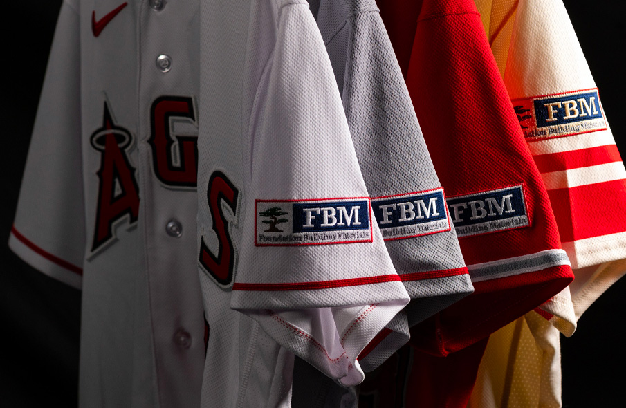
Well, one good thing about the Cardinals sponsor patch is at least they’re matching the background to the uniform. I don’t think any other team has done that yet.
The Halos recoloured parts of their logo to match the base for the Rome, Road and CC. It still sticks out and is majority navy when their wordmarks are majority red.
-
1 hour ago, WestCoastBias said:
I hope Arizona figures it out.
With those clowns, it's hope in one hand, crap in the other and anyone can see which is going to fill up the fastest.


:format(jpeg)/cdn.vox-cdn.com/uploads/chorus_image/image/53908767/652162572.0.jpg)
 The Halos recoloured parts of their logo to match the base for the Rome, Road and CC. It still sticks out and is majority navy when their wordmarks are majority red.
City Connect tweaks (Mets Redesign, Tigers, Guardians & Cardinals 5/22)
in Concepts
Posted
I like the navy set more, but the black is also pretty great. Love the wordmark and sleeve design.