


VampyrRabbit
-
Posts
1,001 -
Joined
-
Last visited
Posts posted by VampyrRabbit
-
-

With the sleeve ads, my guess is that if the Fish do wear the teal pins, they'll wear the version with sleeves and not the sleeveless version.
-
On 2023-02-02 at 12:45 AM, seasaltvanilla said:
The problem with a wheat away jersey is the helmet mismatch looks awful.
And why the hell have white??
That's an arguement against shoddy colour matching if it's actually possible to get a half decent match for the helmet and the jersey. If thats the best the company making the helmets can do, then yeah, then just go with white or a pale colour they can actually match.
-
23 hours ago, kerlonmoura said:
Looks like the Quakes pattern continues on the back panels:
That shirt feels as though The Quakes weren't sure if they wanted to be a mostly black team or a mostly blue team for the next two years, and came across a pretty unhappy medium.
-
 3
3
-
-
1 minute ago, coco1997 said:
Give me THIS:
Ideally, the Marlins would have teal pinstriped home and road greys, a teal alt, an OG Marlins throwback and that pullover would be the City Connect.
-
1
-
-
6 minutes ago, BadSeed84 said:
You haven't seen the leaked city connect for Seattle yet.
It makes perfect sense then. Well, the hat, not the decision to pass over on the many other sources of inspiration for the City Connect in favour of an absolutely rotten team that played in possibly the most aptly named stadium of all time.
-
1
-
-
39 minutes ago, NashConcepts said:
Don't think anyone's posted this but the MLB 2023 Clubhouse collection is out, and there's a lot of surprising design choices here:
You left out the most surprising of them all, this one is downright baffling.
I have absolutely no idea why this exists.
-
9 minutes ago, insert name said:
as if these clubs don't already make a ton of money.
But with these ads, they could make a f***ton of money if they desecrate the jersey with one.
-
38 minutes ago, DCarp1231 said:
Still a firm believer that TB should rebrand to Sun-Rays, but only if they get an open stadium built.
I’d also love if either the Mets or Yankees had a subway system themed City Connect uniform.
An open stadium in Tampa for Baseball would be absolutely brutal in an area renowned for baking, high humidity temperatures for much of the year and frequent lightning storms. The new stadium (preferably in or near Ybor City and not built with Taxpayers money) would have to have a retractable roof.
So does this mean that Arizona are going to keep the Teal trimmed white uniform as one of the 4?
-
2
-
-
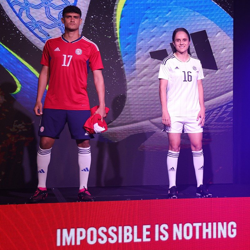
17 hours ago, officeglenn said:
New Adidas kits for Costa Rica officially unveiled -- notably using an older template than the one worn by countries outfitted by Adidas at the 2022 World Cup:
The home does get socks with the new adidas logo, so thats something I guess.
Nothing really to write home about and the monotone crest on the change looks cheap. Hopefully CR get a newer template and bespoke detailing sooner rather than later. -
On 2023-01-31 at 10:20 PM, tBBP said:
(That said, when is CF Miami--can I call them that, instead?--going to do something about that pale shade of pink??
They changed the shade of pink last year when they changed the shade from one they called "clear pink" to a shade they call "true pink" and they are probably going to stick with that shade for the forseeable future - they'll probably leave the vice colour to the Heat.
Personally, I don't mind the "true pink" - it looks a lot nicer than the clear pink when combined with black and it does recall the buildings in the Art Deco district of Miami.Considering that Miami are the "Art Deco" team in the east, I've no problems with the shade Miami chose in 2022.
On 2023-01-31 at 10:20 PM, tBBP said:I'm gonna guess that this go-round yellow is the new black in MLS??
As of the leaked and released changes, right now we have
Charlotte - Violet
RSL - Yellow/Gold
RBNY - Some gross shade of greenish yellow
Seattle - Tomato Soup red
LA Galaxy - Teal
Nashville - Black
DC United - White with cherry blossomNew England - White with red sash
Miami - Black
LA - Some gross shade of greenAnd also we have
Colorado - Not sure at this stage, might be blue, might be yellow, might be orange based on the teaser pic.
So it looks like black and yellow are even at this stage, but yellow might edge ahead.
-
On 2023-01-31 at 8:02 AM, vtgco said:
Love the jerseys for DC! No complaints other than I wish the blossoms were a touch more visible on the road. Those colors are really nice!
I like the added cherry blossom, the new "United" font is solid, and the new shield works alright on the logo. However, the Capitol doesn't work well for me so high up there, and I'd rather see it lowered with the point just above the eagle's head, or incorporated into the flag somehow (arched striping?), or removed entirely. The "DC" could be in the same font and line as "United," or you could shrink the flag stars and put the D & C between them.
Cheers, those are all pretty good ideas for the DC Crest, I'll definately come back to them.
On 2023-01-31 at 8:02 AM, vtgco said:Lol I do think that's an issue with the Rapids logo though
I'll probably do something about that.
And from the US Capital to the Capital of California.....Sacramento Republic
I'm not a fan of the current Republic logo, which has so much empty space and a vertically squished star, and no quails. This version has two of the state birds either side of an unsquished star, and the date of the teams foundation. The font used for the date of foundation and the Republic script is Dealerplate California, the one used for Sacramento and FC is California Signature Duo.
The claret and cream used here were taken and tweaked from the current logo, and as the team hail from the state capital of California, gold is added as a third colour.The first choice is claret with sash, but this time the sash contrasts, and either side has tonal pinstripes. The Jock Tag is a representation of Tower Bridge front-on with the Motto of Sacramento, Urbs Indomita, within the arch. On the back of the shirt and on the hose is an SR monogram, with the S using the Dealerplate California font and the R using the California Signature font.
The change is a mostly colour flipped version of the home, with the option of claret shorts.
The third has green sleeves and sash, a nod to the nickname of Sacramento as the City of Trees, and two shades of blue to recall the skies of California.
It's a shame that Sacramento looks likely to miss out on the MLS despite it looking pretty likely the team would be chosen during the last decade, and we won't get two Californian teams rocking the sash. Hopefully the flame won't go out and MLS pulls the trigger on Sactown, hopefully sooner rather than later.
-
3
-
 1
1
-
-
The black and orange uniform looks great, not too sure on the violet one.
-
And 7) New franchise has zero chance of getting back original franchise name and logo.
-
6 hours ago, gosioux76 said:
I don't buy into any of that. The Padres were mediocre-to-bad for nearly their entire existence as a primarily brown franchise but that didn't stop people from clamoring for the color to return. I find the whole idea of uniforms as symbols of futility to be strange. They're clothes. The teams stunk because the players stunk. They'd have been just as bad had they been wearing Yankee uniforms. Such things can be evaluated separately.
Even so, I wouldn't advocate for just returning to that look, and especially those colors. But taking something that blends together the team's various eras, including that excellent and often overlooked '80s look, could be successful.
The Padres got to a World Series while wearing Brown and had 5 winning seasons while wearing that colour. The Mariners never got to the postseason wearing navy and gold/yellow and had just one winning season, and they weren't even the first crap MLB team wearing blue and gold in Seattle. Considering just how massive the turnaround was when the Mariners changed to their current colours and how bad they were, it's hard to separate the look from those woeful teams.
There wasn't any team wearing brown in the MLB, but there were no shortage of teams using navy, hence wanting the Padres to bring back brown. It's a bit different to Seattle having not one, but two absolutely wretched teams playing in blue and gold.
Those colours should stay in the past, we agree on that. But I do agree that some parts of that look could be brought back as part of a refresh of the teams current look. -
2 hours ago, tBBP said:
How the NEXT Pro team got a better crest than the parent club???

(Well except for the F and C being split on two sides like that....
The Huntsville City crest is also better than their parent clubs (Nashville FC), I would also put forward the crest for Colorado Rapids 2 as being better than their parent by Virtue of eliminating many of the excess outlines.
-
2
-
-
1 hour ago, gosioux76 said:
Maybe it's just me, but I think the Mariners' look from the '80s was under-appreciated. The use of lower-case letters, the Expos-like sleeve and shoulder striping, the trident M were all unique.
I could see some of those ideas reapplied in a Padres/Twins-esque update. The trident and nautical star symbols can easily work together as part of a branding package. And I like @the admiral's idea of pairing Navy with a more attractive green.
Problem with the trident M is that it's a symbol of bad luck, and the team were rotten. No matter how good the look was, it's hard to separate it from a crap team that turned around its fortunes when they ditched it. That and Navy and Yellow/Gold are the definative colours of The Brew Crew.
The striping in navy and Teal could work though, currently the single headspoon outline isn't exactly inspiring.-
1
-
-
If the Ducks stay with the Orange and Black, then they could do a lot worse than do something like this. Pretty nice, only change I would make is an all black collar on both jerseys.
-
For my money, Seattle should stick with the teal, as it works really well with the navy, and that colour combo fits a team called the Mariners like a glove. And it doesn't look like either the Diamondbacks or Marlins are going to bring it back into their main colour scheme any time soon.
Along with the Nautical star and baseball emblem, the colour scheme is one part of the identity of the Mariners that should be kept. It's the uniforms and wordmarks that really need a spruce up at this point.
-
8
-
-
On 2023-01-25 at 6:05 AM, edjb93 said:
I'll admit, I'm surprised with this choice, but I'll try to give justice to the Rhinos.
Thanks. I just love violet/purple and teal as a colour combination and while I understand why Hampton Roads doesn't have a team in the majors (spread out with no real dominant centre and crisscrossed with bodies of water, transient population with the military and tourism being two major employers in the area) and why the NHL decided not to pull the trigger, I do wonder what might have been and would have loved to see the purple and teal jerseys in the league with (to me at least) that so bad its good logo.
-
1
-
-
With the Galaxy and Red Bull change kits, looks like you have a demonstration on how you can get teal, gold/yellow and red absolutely spot on as a colour combination and how you can absolutely s*** the bed with it.
-
1
-
-
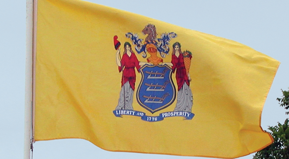
52 minutes ago, radchad said:
Seeing the colors, what immediately jumps to mind is the New Jersey flag
Well, they do play there.
-
1
-
-
On 2023-01-27 at 10:34 PM, vtgco said:
Agreed. Looks way better with the red.
I'm usually on board with the Charlotte Hornets / SJ Earthquakes model of resurrecting old names, and "Dallas Tornado" is certainly a better name than "FC Dallas" IMO...
But keeping the bull logo almost as-is, as nice as it is, with such limited Tornado-themed branding doesn't really work with that name in my mind.
To be honest, you could probably just use that excellent D + tornado logo as the primary crest! Or if you're really hoping to keep the logo mostly as-is, you could at least change the Burn flame to a tornado... I'm also curious if the years could go to the left and right of the bull, with the "Dallas" below "Tornado."
Other than that, the jerseys are excellent! Hopefully Chicago doesn't look too similar to that third though. Funny coincidence about the Centennial Hall pattern lol.
Thanks, I did try to get the years to the sides of the bull, but whatever I tried, it always looked off-kilter due to the font and the size of the red space. I was also fine with the crest not having any Tornado imagery (similar to how there are no rapids on the current Rapids logo), but I was curious to see how the D and Twister logo looked as the primary crest.
SpoilerI actually like it more than the sets with the Toro logo. And I did see the FC Dallas home with the pattern before I designed them. The pattern is awesome and I was going to use it for all three uniforms as it was just too nice to use just once, but when I decided to go all in on a Tornado reboot and added a fourth colour to the mix, I just used it for the third as a major design feature as adding the pattern on the home and change would have looked too busy. I would be lying if I didn't say I wasn't inspired by your home design, and I should have given credit. Sorry for not doing so.
As for The Fire, I'll probably be sticking with the red shirt with a white chestband, as that is the definative look for the team, and out of all the original 10 MLS teams, the Fire got the closest to a timeless look and brand at the first time of asking. As for the second closest........
D.C. UnitedMost of the current imagery was kept, the eagle stays mostly intact, with the star from the second logo above the DC lettering, with the outline of the capitol dome above it. The shade of red used is a more cherry shade and on the bottom bar is a simplified pink cherry blossom from the logo of the National Cherry Blossom Festival. The font for the United script is Bubble & Thunder.
The home is in the traditional black, with red trim on the cuffs and collar. The chestband has a block gradient woven into the shirt that goes from cherry red to white, and on the inside of the jersey, there is a hangar effect that has "THE DISTRICT" and cherry blossoms from the crest. The jock tag is an outline of DC with a cherry blossom outside. The first choice shorts and socks are black, with red shorts (with three white hoops!) and white socks if D.C. want to party like it's 1996.
The change is in pink and washington blue, with a sublimated cherry blossom pattern on the front.
The third is in white with the same woven block colour chestband as the home, with red shorts and white socks as the first choice.
D.C. United had a strong brand that only needed slight tweaks from the get-go, and I wanted to add some imagery from the Capitol and the Cherry blossom festival to their brand.-
2
-
 1
1
-
-
55 minutes ago, MJD7 said:
I guess this means the old wordmark will still be above the scoreboard? If they were going to the trouble to renovate the scoreboard, I don't understand why they wouldn't have just slapped the new wordmark on there, too.
Interesting. I definitely would have dropped the cream fauxback first, but this isn't the worst move. I'd rather have seen other teams drop their gray jerseys before the Mariners, since silver is actually a team color for them, but I can see why they did it. Hopefully teal gets more games as a road alternate now.
A lot of people online seem to be criticizing the 4-jersey + City Connect limit, but I applaud the move in general. No team really needs any more than that.
@CC97 also mentioned on Twitter that the Rangers & Diamondbacks will have to drop jerseys from their rotation, since they each have more than 4. For Arizona, I imagine it'll be the turquoise (or maybe, on the contrary, they'll go all-in on it). I'm curious which jersey the Rangers will drop, though. My guess is it'll be the red.
Considering just how bad the Pilots were, and the Mariners were while navy and yellow were their colours, I would have gotten shot of the cream, no question.
-
10 hours ago, Digby said:
Sorry to interrupt the Dadbook and "soccer is boring" posts, but we have a slightly better view of the Quakes kit. Looks better than I would have expected, honestly.
That's more or less the same pattern found on the current Real Madrid change, right?


.jpg)
MLB 2023 Uniform/Logo Changes
in Sports Logo News
Posted
It is, and it also looks out of place by not having a white outline.