


VampyrRabbit
-
Posts
1,001 -
Joined
-
Last visited
Posts posted by VampyrRabbit
-
-
1 minute ago, MJWalker45 said:
A game played 50 years ago should not be the reason you don't avoid a kit clash. Yellow shirts would probably work as well though.
A game played 50 years ago that ended in one of the most humiliating defeats in our history is a good enough reason never to wear that kit or that colour shirt again, which was also in the main colour of local rivals Sunderland.
Yellow and green were our change colours for years and bringing that colour combo would go down well with the fans, but that has been on the shelf for almost 30 years. -
On 2022-08-05 at 2:39 PM, aawagner011 said:
This was the best Arsenal away strip in the last 15-20 years.

And it was released the same season as one of the worst Arsenal home shirts - no all white sleeves and blackcurrant as an accent colour for the first time on the home.
QuoteThey should have just rolled out a red top and called it a day. There's not more contrast there than the white jerseys.
As for Newcastle wearing a red shirt, that will never happen again after this match. The red numbers on the home are traditional and should stay, but absolutely no way should The Toon ever wear red for the change. Maroon or burgundy is fine, but red should stay buried.
-
I like the Bucs Uniforms. Have you tried doing the Creamsicle with cream and Bucco Bruce? It seems only natural.
-
The Cleveland Sleeveless is nice. I was expecting Arizona or Florida/Miami to get the Suns Out Guns Out treatment considering they did win the World Series with sleeveless shirts in their rotation and go back to 1948 for Cleveland (and it would be amazing if you did), but I do like the sleeveless look for the Guardians.
The Columbine Rockies Jersey is wonderful.
-
 1
1
-
-
Detroit is good. The Preds look good, I wonder how they would look with one colour name on back, a navy yoke on the road and for the striping 6 slightly larger navy lines instead of 7 with gold or white in between.
-
8 hours ago, MJD7 said:
I love everything about Colorado except for the inclusion of gold/sand. Adding those colors takes away the “cold” feeling of Colorado for me, maybe because sand & gold are both colors generally associated with warmer areas. Plus, as @coco1997 said, it ends up very similar to your Charlotte concept, which I liked that color scheme for. I’d be interested in seeing a strictly purple concept or maybe purple & light blue, playing off of the alternate away uniform.
Using the Lions font for the Tigers works surprisingly well! I would have never thought of that. I do miss the orange on the away uniform, though.
For the Astros, I would consider making the “H” on the cap white, it kind of gets lost in the star.
Using the Royals script from their original logo is a cool idea, I don’t think I’ve seen anyone do that before.
Looking forward to what you have next!
Thanks, for Colorado, I added the gold mainly because of how well purple and gold work together, and the other pro teams from the state have warm colours in their palette - Burgundy for the Avs and Rapids, Orange for the Broncos and Gold and Burgundy for the Nuggets, so the Rockies are the odd team out in that regard. Having said that, just purple or purple and light blue could be cool - I'll try something along those lines.
The H on the cap for the Astros was given the gradient as there wasn't any white on the stirrups and it would have looked out of place on the road and alt uniform when worn with navy pants, so no white star. I still think the H is clear considering the H outline and the blue/orange contrast, but I could try a white star, but it probably will require adding white somewhere on the stirrups for colour balance.
As for the Tigers and Royals, I wanted a font with a Motown connection and the Lions one fit the bill, and the Royals script deserves to be on at least one Uniform in the Royals set. I ended up using it for 3 (or 5 depending on POV) of them.
6 hours ago, johne9109 said:Love it, I really enjoy how sports design has really come into an era of even the smallest things having meaning and that's exactly what you did here.
I really like the sleeve logo you came up with here; I don't know of the hear works on the socks here though. Maybe if thy had the crown as well it would look better, but that's just me. Overall another great set.
Thanks, I kept the crown off the socks as there wasn't any gold on the cap, so none on the Stirrups either, I like it when the stirrups and the cap match, or at least have the same colours, so it was just the heart.
Onto Los Angeles......The home and road are pretty much the same as the current ones for the Dodgers, the only red on either set is on the front number. The cap and helmet logo is the one used from 1972 through 2011, which has slightly slimmer lines than the current one. On the inside of the collar is printed "IT'S TIME FOR DODGER BASEBALL".
Biggest change is that the Dodgers get a road alternate, one that isn't the same as the normal one except for Dodgers on the Front instead of Los Angeles. Instead, this one is based on the powder blue uniforms the team wore in Brooklyn in the 1940s. A blue Los Angeles script replaces the white Brooklyn one, and the numbers get the same treatment as the home and road.
So that's the Los Angeles Dodgers. Next up, it's the Fish from the 305.
-
3
-
-
The changes made a big difference. Really good.
Another change that would improve the concept is to just get rid of the white from the crest entirely. From a distance the white and old gold bleed together, and getting rid of the current black boarder and making the white outline black would make the crest look even sleeker.-
1
-
-
On 2022-08-03 at 11:41 AM, johne9109 said:
Very modern, but in a good way. This could easily replace their current uniforms. Any particular reason you went wheat over grey for the road uniform? Not saying it looks bad it's just a different look for the Astros
Thanks. The colour for the road is according to Encycolorpedia is a "very light shade of orange", I decided on the colour as one of the (now pretty old) nicknames of Houston is The Magnolia City and their 1980s road uniform was cream with a pinkish tint, so it's not totally without precident. I decided against going with gray for the road as Orange was the dominant colour for the trim and numbers.
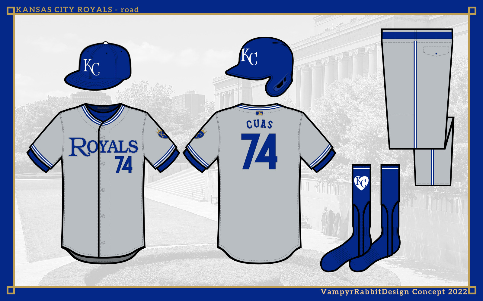
Up next, it's the team from the Heart of America.The home and road are both pullovers, I've changed my stance on them during the last month and for some teams, I think they make sense. The Royals are one of those teams, and get one with two buttons. The trim is inspired by the 1973-82 and 1983-91 uniforms, with the home jersey script used from 1969 to 2001. The sleeve patch is in the shape of a heart with the starred crown from the batting practice logo, and on the inside of the baselayer is the "KansasCityRoyals" script.
The alternates are a blue jersey with headspoon piping and road grays. The script is taken from the original Kansas City Royals logo.
The blue jersey can also be worn with either sky blue or gray for the road.
And for special occasions at home, a Monarchs tribute uniform.
So thats the Royals. Next, a trip to LA.-
3
-
-
On 2022-07-31 at 8:44 PM, coco1997 said:
Rockies - Oh, this is an interesting concept. I LOVE those scripts. I guess my only gripe is the color scheme is very similar to the one you used for Charlotte. But in a vacuum, it’s a beautiful design.
Tigers - I like that you added the Negro League throwback to their regular rotation. Removing orange entirely from the road set makes them look too much like the Yankees, IMO.
Cheers, when I first decided to do this series, neither Colorado or Charlotte would have violet and gold as colours, but given the nickname of Charlotte and how violet and gold work together, we have two teams with a similar colour scheme, three if you count Arizona and their alts. But I felt like the yoke for Charlotte, Copper and Sedona Red for Arizona and violet sleeves for the Rockies set them apart enough along with the identities.
As for Detroit, I felt the headspoon and lack of cuffs set them apart from the Bronx Bombers.
And onto Space City.....For Houston, I decided to go all in with the gradient used on the City Connect, and Astromax, a space style font for the wordmarks, names and numbers. The shooting star and the outline of Texas make a return, and the H and Star is on the cap, but given the gradient. On the inside of the baselayer is SPACE CITY in Alien League font.
The alternate is navy, worn with white pants at home and navy pants on the road.
Thats the Astros. Next up, its the City of Fountains!
-
4
-
-
The Nats are good. I do think the interlocking DC logo should be on there somewhere, it's a nice logo and would look good on the sleeves.
As for the Reds, getting rid of the black would lift the set. The team have worn just red for much of their history and then there is the Big Red Machine. It's also odd seeing a Reds set without either a Pullover or a Sleeveless shirt considering the Reds are one of the first teams that come to mind when you mention either. -
Bruins - Looks pretty good, though the numbers on the back could be closer together.
Sabres - I know your hands were tied somewhat with the Sabres, but it's a pretty good effort. I would have made the collar mostly gold though.
-
1
-
-
42 minutes ago, charger77 said:
I hope whoever gets the contract can fix the mess that Adidas made of lace up collars.
Those lace up collars were truly wretched. They looked too low down on the jerseys and usually looked like afterthoughts somehow.
-
The gap between the two numbers on the back looks way too big, bringing them closer together wouldn't go amiss. And perhaps adding an outline or two to the numbers. I would also make sure the hem trim on the front and back matched too, it's higher on the back.
Overall, this is good and probably what the Ducks will do second time around.-
2
-
-
On 2022-07-25 at 2:35 PM, johne9109 said:
I don't mind the Rockies current look, but a redesign wouldn't hurt them I like the thought you put into the new colors. I can't say I am a fan of the sand color for the Rockies, but you make it work here. I'm wondering where the font comes from. Does it have some tie to Colorado that I'm missing? It reminds me of Willy Wonka when I look at it (mainly the cap logo). Overall a cool design great work; I just personally wouldn't use it for the Rockies, but could easily be used for another team with a different identity
Thanks, the font is Western Inspired and when I started the series, I was always going to give Colorado wordmarks that had a western flavour and Sacred Bridge fitted the bill along with Tuscan names and numbers.
So, from a team that I felt needed an overhaul to a team who I feel have a timeless home and a very solid road that needed just a little tweak, the Detroit Tigers. Fun fact - the first Baseball Jersey I brought was a Tigers home (Majestic).
Not gonna lie, that may have played into my decision not to mess around with the home.
For the Tigers, I kept the home uniform pretty much the same. The biggest change was going back to the previous D on the shirt as I really dig that quirk on the uniforms and the shirt D is a very solid design and as for the rest of the uniform, the classic Tigers design was so simple and elegant that I decided to keep it mostly unchanged.
The concept for road was to combine the no nonsense look of the 60-71 road uniform with the wordmark and headspoon of the current uniform, so it gets the Detroit flowing script with just a grey outline. Orange and Gray as a colour combo isn't really my cup of tea, so there isn't any on either set and the Motor City Kitties go back to being a one colour team.
The names and number font is that used by the Detroit Lions, I liked it so much I thought the Lions could share.
For special occasions, a Detroit Stars tribute. For me, the Detroit Tigers are one of those teams that don't need alternates and aside from a Negro League tribute, two uniforms suffice as those two uniforms include one of the most iconic and elegant uniforms in baseball history.
So thats the Tigers. Next up, we go to Space City!-
5
-
-
Man, those silver armpits look brutal.
Any reason why the Jets got rid of shoulder logos?-
1
-
-
Rhode Island Riptide sounds good, and fits the nautical theme and also the history of Rhode Island pretty well.
I would just stick with the emblem on the flag, maybe make the 2023 script a little bit bigger. Overall, this looks pretty good. -
On 2022-07-29 at 2:12 PM, coco1997 said:
Having said that, I disagree about the need for pinstripes. The D-Backs have now been a non-pinstriped team longer than they were a pinstriped one, and I think the Rockies own the purple with pinstripes look. Of course, if Colorado ever decided to move away from pins, that look would be up for grabs.
The Rockies never beat the Yankees in 2001 in the World Series wearing pinstripes, and I have to give the nod to Arizona . Though the two teams do have quite different looks - Colorado with black and silver, and Arizona with Arizona Turquoise and Copper. I think both teams can wear purple pins. Remember that part of the reason Arizona moved from their original colours is that they were hard to colour match and HD was on it's way. If the tech had existed back then to match the colours better, Arizona might have kept the Turquoise and Purple.
SpoilerColorado had a much easier time colour matching than Arizona did.
I do think going back to Purple and Arizona Turquoise is the right choice for the Diamondbacks, it's a great colour combo, having said that, it does need the right shade of copper to tie the colours together and separate them as they bleed into each other, and either Porter Paints or Gliddens choice of Copper Kettle would be a great choice. Both work well with both the main colours.
I wouldn't even bother with either wordmark, and just use the A, as it's far more evocative than both the D-BACKS or the ARIZONA wordmark, with it's Southwestern style and the four peaks. It also keeps the two main colours separated.
-
6 hours ago, johne9109 said:
Washington Nationals
Now for the throwbacks I could see some people being upset at the Nationals wearing Expos, but there's really no other option for the Nationals and I think it's nice getting to see the Expos every once in a while. The MLB allowing the Nationals to wear Expos uniforms in real life lends credence to this choice as well. I know it's a Hurricanes wearing Whalers incident, but overall I think it will be positively received.There was always the 1924 Senators uniforms, going back to or a tribute to the Homestead Greys. Either would have been better than the Expos Uniforms, for Montreal fans it's a painful reminder that their team, for all intents and purposes, no longer exists, and for the Nationals, why are they wearing a uniform of a team that played in the second worst stadium in baseball and had a cheapskate owner?
Either a throwback to one of the few times the Sens had a winning season or a Negro League tribute is better than a team that played in Montreal. For me, revisiting the Baseball history of DC would be preferable to the team wearing an Expos shirt.
The other uniforms are okay, but are a bit let down by the solid colour socks - stirrups you've used, as it has for many of the teams here. I understand using solid colour socks with no detail for some teams (The Yankees), but for others, it just looks like a missed opportunity for alternate logos, the DC interlocking logos would have looked good on the non-Expos uniforms. -
Red, Black and Silver is a good colour combo, but probably not the best one to put on a Helmet if you play in the desert
Does the Big Roomba get built in this universe?-
 2
2
-
-
On 2022-07-23 at 6:19 PM, coco1997 said:
Great work on Cleveland. Using "G" over "C" helps set the Guardians even further apart visually from other the Cubs and Reds. I'm also a big fan of those sleeveless alternates and the choice of "Cleveland" script.
For the Buckeyes-inspired alt, maybe make the uni off-white?Thanks! Strictly speaking, the C is actually over the G for the cap, helmet and stirrup logo. I did an off white version of the alt and it does look good in cream.
On 2022-07-23 at 11:54 PM, MJD7 said:The Guardians look great! I love the idea of the contrasting sleeves on the alternates to maintain the contrasted striping effect.
If it were up to me, I would keep the Guardians’ real-life wordmarks and cap logo, but that’s a matter of personal preference. The logo you came up with is clever, too.
Cheers! I did want to use the Knuckleball G and the Guardians Script, but they didn't mesh well with the C/G. Not a big fan of the new Cleveland script or the cap logo, but I do like the Guardians wordmark and the Knuckleball G, which is a really nice piece of design.
I'll probably do a set with the real life wordmarks sometime except with the Edgewater Park sign (the Cavs can share) in place of the Cleveland Script, because they are pretty nice.
So, moving on to Denver, we have the Rockies. I'm not a fan in the slightest of the current look the Rockies have with its not particulary pleasant colour scheme and oh boy, do they have the most dated set of logos in the league. So I decided a rebrand, with all new logos and script, with only the violet pins kept.The pins are kept, but are joined with violet sleeves with two stripes in two shades of gold (or Colorado gold and Denver omelette), with matching stirrups. The font used for the script, shoulder logo and the CR logo is Sacred Bridge and the one used for the names and numbers is Barbaro. On the inside of the baselayer can be fond "Colorful Colorado" in many different colours.
The alternate home jersey goes all in on the violet and gold combo, while the road alternate uses a light shade of blue, inspired by the Columbine, the state flower of Colorado. Only the Colorado sand is used for the uniform, as Denver omelette does not go well with light blue.
Thats the Rockies. The next destination is the Motor City!
C+C would be cool.-
6
-
 1
1
-
 1
1
-
-
Not feeling the dark gray for CBJ at all, it's one colour too many and doesn't do anything for the other colours. The navy pants are an improvement though.
Philly and Rangers look solid.-
2
-
-
These designs are pretty good, The Halos look good with the return of Navy and getting shot of the black for the Rockies was the right call. I do think that you could do a lot more with the Stirrups - all solid colour apart from the Angels when there is a lot of potential for logos, stripes and other cool stuff.
-
3 hours ago, johne9109 said:
Here's the Angels with pinstripes. Can't say I like it (doesn't feel very Angels) The throwback logo I used for the Dodgers I made actually, but looking up the PCL Angels logo I can see where you thought that.
10 hours ago, johne9109 said:I don't know if it's my screen or your screen but they are all one tone.
I am absolutely certain they aren't. Unless Photopea, Paint and GIMP are really playing up on my computer, there are two shades of red on that cap for sure, and all the other Angels Alts you have posted. It's got the shade used for everything except the front two cap panels, the player name and belt, and the more pinkish red used for those parts.
For everything else posted, one shade has been used, but in this case there are two different shades and it sticks out badly.
10 hours ago, johne9109 said:These feels more constructive; you've really explained yourself instead of ust coming through every so often saying this is bad or that's awful. As far as the alternates I enjoy the 90's logos and these are my concepts I can put what I want. And the 90's logos have wings which are also indicative of angels; halos aren't the only imagery for angels.
The teams nickname is The Halos, and every single uniform the Angels have worn has had a halo on it somewhere, the 1997-2001 sets had one on the sleeve as part of the alternate logo. It just feels incomplete without one. I would be interested in seeing them with the same shade of red used throughout, a halo somewhere and the one thing that would hugely improve the set, navy numbers, names and wordmark for the home alt.
-
4 hours ago, MDTrey4 said:
I appreciate the feedback on this one. The 39 is there as their established year, I must've forgotten to put that they're one of the oldest teams in the league. I can definitely add the second and third stars to the socks, they were more meant to match the sides of the shorts.
As for a third jersey, these two were made a long time ago before I was thinking of thirds for every team. Recently, I've been toying with a cherry blossom themed one.
Cherry Blossom sounds great. With a white and red home and a blue alt, a third is justified.


2022-23 International Club Soccer Kits
in Sports Logo News
Posted
Mistake on the mothership article on the shirts for Ligue 1 -
LOSC didn't win anything that season, Montpellier shocked French football by winning their first title and Lyon won the Coupe de France. It was the previous season that Les Dogues did the double wearing a very different shirt to their 2011-12 shirt (though they did wear the 2011-2012 kit when they lifted the League Trophy)
2010-11 home
2011-12 home (pictured here lifting 2010-11 League Title)