


BuckDancer
-
Posts
72 -
Joined
-
Last visited
Posts posted by BuckDancer
-
-
So they stupidly chose to wear those hideous black alts in the playoffs last year instead of their modernized 2017 red jerseys, and then to make matters worse they dropped their best looking jersey since their original set all together and made the ugly alt the new home jersey. Then when they make the playoffs in the first season with these black jerseys as their new homes they use the retros for the playoffs?
So, at this point it is pretty much inevitable that they just end up going back to their cup era look, but will they keep the black jersey and make it their alt again? If so, will they go back to wearing the black alt during the playoffs again just to keep messing with us?
-
6 hours ago, spartacat_12 said:
I liked the updated 2D when they unveiled it, and have a St. Patricks Day hat with the logo on it. Most of the fanbase however, seemed to never fall in love with it. When discussions about the logo were happening leading up to the rebrand, anytime I'd see someone suggesting they use the updated 2D instead of the original they'd quickly be shot down by the majority, so I can see why the team went the safe route and brought back the old one relatively unchanged.
I think the ideal logo is something in between the two. I like the cleaner, bolder lines of the updated version, but it also felt like it was missing something without the coming from the back. Something similar to the logo on this concept/mockup would be great.

I like that update, but the problem l've always had with that sens "winged" logo, especially the original, is that it feels kind of off centre. My eyes are naturally drawn the middle of the logo so I end up just being pulled in by the big red crista in the centre and the part of the helmet that connects to it. The 2d 2007 version puts the head/face of the centurion as the focal point.
-
 3
3
-
-
2 hours ago, SenatorJake said:
That concept has been done on this very board dozens of times. It does not, in any concept version of it I've ever seen here or elsewhere, "blow their current look out of the water". In fact I'd argue it looks kinda cheap, especially after years of seeing that unused logo plastered on some pretty shoddy team-branded merchandise.
But to each their own, etc...So you prefer their current logo over the unused 2007 version?
-
4 hours ago, the admiral said:
Other way around, the Jets took their design from the crappy modernized Rags. I think John Ferguson literally brought the uniform stock with him to Winnipeg.
I stand corrected.
-
22 minutes ago, throwuascenario said:
No, you're misunderstanding what I'm asking. I'm not asking if they should switch. I'm saying, assume the following scenario.
This offseason, the Montreal Canadiens announce that they are unveiling a brand new uniform. It doesn't have the center stripe and has a different logo on it. They were this for 10 or 11 seasons before they realize that fans like their old uniforms better. So they decide to go back to their exact classic uniforms with the CH logo and the blue center stripe.
The question: In this scenario, is going back to their old look lazy?
No I wouldn't call going back to their old look lazy. Remember, I said I like it when teams explore their branding until they finally have a look that is iconic and timeless, which the habs do. If you look at their uni history you can see that they slowly alter and tweak their unis every few years until they finally get that look they have generally worn ever since 1977.
http://www.nhluniforms.com/Canadiens/Canadiens.html
So if the canadiens did that and it was somehow better sure I would support it. But if they messed it up, which is the more likely case, and went back to their classic look I wouldn't see that as lazy, I see that as something similar to what the blues did, messed up their look with the reebok takeover, but fixed it up by going back to the pre edge look but better. Same thing for the rangers when they switched in '76, but went back to their classic look by '78.
Even the bruins in a way went back to their old look during the edge takeover, remember they were wearing this?
http://www.nhluniforms.com/Bruins/Bruins26.html
Which was ok for the time, but the look they have now is basically a modernized version of their 60's jerseys, but less dated, altered colors on the yokes, more detailed logo with serifs, updated bear shoulder patch, waist stripes moved up.
-
4 hours ago, throwuascenario said:
I don't think that the Blues' current uniforms look dated, nor do their originals. I just think that their current uniforms have a much worse color balance and that navy is honestly not needed anywhere in their scheme at all. It's way overused in their current uniforms. Get rid of the navy, up the yellow, and their currents would be better than their originals. If that was the case, they should continue to use them because they're better. Not because they once wore the originals so they should be out of the running.
I actually feel the exact opposite about the Sharks. To me, the overly-cartooned 3D shark is way more dated than their original logo. The logo is actually the thing that puts their originals above the currents for me. The old logo or a new 2D logo on the current jersey would be their best look IMO.
So let's just say that Detroit, or Chicago, or Rangers, or Canadiens, changed their uniforms next season to something totally new. There was outrage but they changed nonetheless. In a few years they realized they made a mistake and wanted to go back to what they wore before. Would it then be lazy to change back?
To me, the Avalanche made tweaks to their jerseys which is much different than a new uniform. The Hurricanes did not make tweaks between their original and 2017 uniforms. They're completely different uniforms. That's the difference. I just think the Hurricanes are one of the teams that totally got it right the first time. Every time they've altered their brand since has made it worse, with the exception of the 2017 Adidas reds, which were an improvement over both what came before it and after it. But far worse than the originals.
I do think small tweaks can improve them. For instance, on their current throwbacks of the 2006 uniform, the bottom stripes curve on the back. I actually love that look and it's something that wasn't original to them.
I'm also saying all this as someone who hates throwback uniforms (with rare exceptions). If you don't think it's good enough to be your full-time look, it's not good enough to wear ever.
Lol, the NBA will approve a uniform that doesn't inclue any of your team name, city name, team logo, team colors, or team typefaces (so literally anything that distinguishes it as your uniform) but will restrict you from using your own old uniforms. What a joke of a league.
Well I guess we'll have to agree to disagree on the blues and sharks.
I feel the way about the blues use of the darker blue similar to how I feel about the flames using black, I thought it was a nice addition that helped modernize the look compared to their previous gold, white, and red/blue palette. The blues and flames retro jerseys seemed more dated than other retro/classic looks from that time, specifically the 80's flyers, which was one of the few looks from that time that really was a true modern classic design. I think that's why that look lasted well into the 2000's unlike many of these other 70's/80's looks I've been critical of (flames, blues, oilers, kings, current flyers) which didn't last past the first half of the 90's and showed their age a lot more compared to the lindros flyers uni. I try to picture the flames wearing their '89 cup unis or the blues in their original unis in the year 2003 and it just looks terribly out of place and very dated, when I think about the flyers wearing their 80's uni in that era or even today it works, probably why they didn't drop that look unlike the blues and flames.
For me the sharks original logo has just way too many outlines, the tape on the stick doesn't even go all the way around, the lack of detail, no shading on the shark compared to the new one which has that subtle S design I really like. Even the new fin logo is a big upgrade from the original. And I love the new wave pattern too. Those original sharks jerseys remind me of tampa's first unis, very big stripes, feels kind of "heavy" or blocky", logo feels too early 90's, not really sure how to explain it, but it just feels old to me.
If those classic teams changed their look, I would probably be against it, to me they already have that timeless look I talk about so there is no NEED to modernize/make any drastic changes, what they have now is timeless. We're talking about mostly 06 teams who have been wearing these unis for 40-50 years now, the rangers changed their look at one point if I recall to a Winnipeg jets looking jersey back in the 70's, they went back to their classic look and that was a good call. They had also spent decades prior going back to the 1920's refining their jerseys like other 06 teams and some newer teams like the blues, and now have that iconic look that never really needs to be changed much. When I talk about teams who need to keep exploring their brand identity I'm talking about teams who still haven't found that iconic, timeless look. The rangers, red wings, hawks, ect. looked great in the 60's, 80's 00's, today. Never looked out of place. I can't say the same for some of these other teams who have now gone back to an old look decades later. So if they did decide to change their look, they had better come up with something just as iconic, if not then yes stick to the current timeless look.
As for the hurricanes, again I guess we'll just have to agree to disagree. I think some tweaks can be made to improve on the original look. Even adding the new warning flag shoulder patch and playing down the black on the white jersey would be nice.
2 hours ago, Ridleylash said:And some fanbases, like Arizona or Edmonton, just want the classic without a whole lot of altered design elements. But at the same time, sometimes you can improve a look by fiddling with the design a bit; take a look at the Flyers, who managed to improve already-excellent jerseys in the 80's just by fiddling with it a little. Ottawa's another great example where they fiddled with their dark jerseys in the 90's and improved them dramatically by adding some white into the color mix.
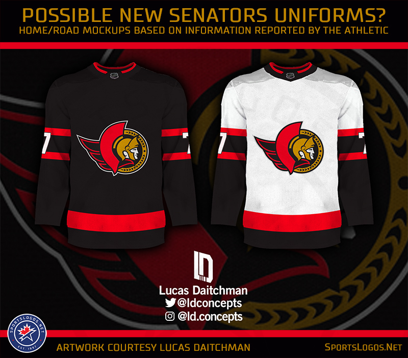
Good examples, another thing I would add to Ottawa is that new 2d centurion logo which they never ended up using. That was a great, new, modernized, updated version of their original logo. I think most here on these board would agree that the new 2d logo is superior and should be their current main crest instead of the old '92 logo. That logo, on a jersey similar to that of their 2000-07 black alternate, but in red, and maybe a new updated S shoulder patch would blow their current look out of the water. That's the kind of tinkering and little tweaks that I'm advocating for, not just pulling out an old look that doesn't hold up that well today.
-
On 4/4/2023 at 11:22 PM, throwuascenario said:
I think that both the Blues and the Sharks are wearing worse uniforms now than they were at one point before. If they switched tomorrow to their respective old uniforms, they would be switching to a superior uniform (in my opinion). There's nothing lazy about upgrading your uniform. It simply doesn't matter whether or not you've worn them in the past. They're just better uniforms. There shouldn't be some uniform police saying they can never go back to a better uniform (in my opinion).
Yes, that is the best they could look. They were the perfect uniforms for them. The 2017 set was miles better than they're current garbage, but was worse in pretty much every way than the set it was based on. It was basically the original set stripped of all character. There's nothng you can do to "evolve" that set but strip it of character and bastardize it. So just wear them as is.
To further understand your position - do you think all teams should be changing uniforms every few years? The Canadiens? Rangers? You seem to be implying that uniforms need to evolve or else they become outdated. Or it specifically teams that mistakenly switch away from uniforms that for some reason means they should never be able to bring them back?
Just to make things clear, I'm not trying to police anything, just my opinions. If the blues want to pull out the old '67 retro thirds they wear now as their new jerseys they can. I just think it's a bad call with what they have now. Their current look is something that feels much less dated, more modern, yet still feels "classic" and not like a trendy experimental fish stick type jersey. The sharks old jerseys suffer from the same problem, especially the logo, looks too dated. Compared to a team like chicago or montreal whose jerseys are timeless.
No, I don't think teams should have to constantly change their unis. Many teams have gotten it right and have no need to change. The hawks, blues, original vegas, rangers, canadiens, red wings, pre adidas devils, and others look great. I think that's the main point of the argument, a lot of teams should keep exploring options with their look until they finally get to that definitive identity that stands the test of time.
The hurricanes for me are one of those teams, I see them much like colorado, they just need to keep exploring and updating their original look to bring it into the modern era. Would I be upset if colorado just straight up brought back their original look? No, but again, I think what they did over the past 6 years in toning down some of the more 90's/dated aspects of the jerseys (new shoulder logo, simplified numbers, loss of black) and fixing some of the inconsistencies (home jersey striping) has worked out well for them overall, and there is still work to be done. Now you may argue that the avs lost or were stripped of character when they got rid of the yeti foot or the old font with two outlines, but I think it was a good call. I think carolina and other teams should look to do the same instead of just outright bringing back the exact same thing they wore 25 years ago.
-
4
-
-
5 hours ago, throwuascenario said:
I don't understand this take at all. Every team should look as good as they can. It doesn't matter if the uniform they're switching to has been used before or not.
I think you're arguing that teams shouldn't use old designs because of nostalgia. I totally agree with that. I think the Coyotes and Senators made that mistake. They picked uniforms that are not their best look because they used them before. That's bad.
But it's also bad to say that teams can't use old looks because they've used them before. Buffalo and Edmonton switched back to uniforms that happen to be their best look. There's no reason they should be precluded from having done so just because they used them in the past. We've seen both teams try and try again to improve on their original looks and they never have. To think they will given more time when they've had 20+ years is foolish. They never will. They never should've switched them in the first place and never should again now that they're back. It's not lazy for them to wear their best look.
In the same vain, I would cry with joy if my Hurricanes switched back to their original look full-time. They, like Buffalo and Edmonton, have never improved upon it and should give up trying. To think that their beautiful original uniforms should be banished just because they once wore them and switched away is absurd. That is their best look and what they should always look like. It would absolutely not be lazy for them to announce this offseason they were going back to them.
It's not against nostalgia as much as it is against not really trying to work with something more modern and/or create something new or a new take on an old classic that holds up better.
The blues, avalanche, sharks, jets among others all could have went in a more safer direction and just pulled out something old out of the closet (60's blues/original sharks/wha jets, rockies inspired jerseys) much like the sens, yotes, flames, ect. but thankfully they didn't. As much as I like the blue/gold blues look and the '91 sharks look, I think most would agree their current unis are superior and were a wise choice, while still having those retro jerseys as optional thirds.
The hurricanes may have looked their best in their original set, but is that the best they could look? I don't think so, I think they could easily come up with something more modern and even better than what they wore back then. Which is what I thought they were going to do in 2017 when they introduced that modernized red jersey with the sublimated flag pattern. But now that they gone ahead and messed that whole thing up and have an incoherent uniform set that will likely just give way to another old favourite instead of a more modern classic.
That's my issue, too many teams not really trying to work on their present look, refine it and keep making it better, carolina is great example, and just throwing in the towel and wearing a retro set instead.
-
2
-
 1
1
-
 1
1
-
-
1 hour ago, the admiral said:
The Blues' current uniforms and pre-Edge uniforms are still fairly different designs, and the current ones are worse, with yellow stripes on white and white numbers instead of yellow. It's not quite the system-restore that we saw from the Senators, Coyotes, Flames, and the Buccaneers over in the NFL.
'ate Pronger, 'ate the Blues, simple as, but those little details but this ahead of what they wear now.
I agree, they shouldn't have dropped the yellow numbers, but I still think their current set, especially the 2014-17 version is better. The equal size waist and arm stripes and matching sock stripes, straightened arm stripes, all navy collars, ect. just looks more coherent and cleaned up.
-
3
-
-
39 minutes ago, spartacat_12 said:
You keep referencing the Blues, but they did exactly what you're complaining about. Here is what they wore pre-Edge:
And here is what they started wearing in 2014:
My complaint is teams like arizona, calgary, the pens or others using looks they haven't been using in decades after messing up a decent look in the reebok era, instead of just fixing the mistakes from 2007.
The blues didn't really go back to an old look in the same sense as the other teams. I don't think you understand what I'm saying. The blues have pretty much worn the same thing since 1998, albeit in slight variations. What I'm talking about is St. Louis' jerseys didn't transition over well in 2007 like many other teams, but wisely stuck with their modern look and fixed the edge era mistakes and improved upon the 1998 originals with straightened arm stripes, better sock stripes, adding separation between the gold and white on the blues jersey, little things like that, instead of just dropping it all together for the 70's light blue/gold look or some other retro look. You can't compare the blues to a team like the oilers or sabres who had long since dropped those 80's jerseys.
A similar comparison that I would draw here is imagine if the NJD's fixed their current jerseys by going back to their cup era 92-17 jerseys or an even more improved version of it. The devils never really dropped the look, just messed it up when they switched over to adidas. What my issue would be is if they just said "well, the black and red just isn't working anymore" and then they just decided to go back to red and green 80's era devils look instead of just fixing their superior, more modern look.
-
1
-
-
7 hours ago, IceCap said:
"Going with an older design is lazy" is a limiting outlook and it's how you end up with pointlessly darkened colours, silver accents that don't add anything, or piping to nowhere.
If a team decides they need to change their uniforms up all options should be open to them. Maybe that means a whole new design. Maybe that means an update of a classic or existing look. Maybe it means a straight re-adoption of an older design.
Refining a classic look doesn't have to be bad, of course. It's baseball but my Blue Jays took their WS era identity and tweaked it enough that it works as an update. And it's probably one of baseball's best looks.
But on the other hand... not every attempt to update a classic identity has worked. More teams have botched it then pulled it off tastefully. And so I'd rather a team be firm in saying "this is our classic look and it's what we want" then let themselves get talked into some of the nonsense we've seen.
Point of order... the Sabres actually did what you're advocating for. Their uniforms are not their classic design. They gave the logo a subtle but necessary rework and the striping is all new.
I just wanted to touch on this.
You're basically saying "screw what those fans wanted, my design philosophy trumps them."
Dude. If Calgary Flames fans want them to look like they did in the 80s then they probably should. It's when the team was their most successful anyway.
Obviously design is subjective and no one uniform is going to be universally beloved, but it's hard to fault a company for giving their paying customers what they'd prefer.
I'm not saying screw the fans and what they wanted, it just seems a lot of these teams had decent modern looks going into 2007, messed them up with the reebok jerseys, and instead of fixing the mistakes like the Blues did and coming up with something more modern and just as classy just went back to an old design, albeit a popular one. I guess what monkeypower said sort of fits with what I said, there are probably a lot of teams who could have come up with a more cleaned up/modernized look that still would have been popular without just straight up falling on an old favourite.
Arizona had a plethora of options to go with when they just decided to go back to those super dark/dated 90's unis. I've seen dozens of concepts that are far superior to what they have now. Blending eras, colors, patterns, anything would have been better than just dressing up like it's 1996. The Avs on the other hand toned down their jerseys, modernized the font, simpler shoulder patches, fixed up the mismatching striping on the socks and the mountain stripes on their home jersey.
Even on these boards I see people talking about he wild just dropping their look and adopting the NS look full time and slapping their logo on the jersey. Again, a popular look, but is this really the best they can do? Worst part is it isn't even a wild jersey. Seems straight up lazy instead of constantly looking to improve what you have now, which they can easily do but instead are too focused on putting out ugly third jerseys that never even see the light of day.
-
1 hour ago, spartacat_12 said:
I mean St. Louis basically just went back to their pre-Edge jerseys, with a slight change to the sleeve striping, so I don't think they're really the best example to try and prove your point.
Also, the teams you've mentioned all tried doing different things with their brands before realizing the fans wanted something close to the old look. The Sabres did a big departure with the switch to black/grey/red, then tried doing an "evolved" version of the original set with the navy blue & silver, before eventually returning to royal blue. Edmonton went navy & copper, and also tried orange at home with navy blue. The Canucks tried 2 completely different colour schemes before reverting to blue & green.
That's what I'm saying, a lot teams developed their look like the blues, had it close to right pre edge, then messed it up, but the blues went back to it and fixed it up. A lot of other teams had it right pre edge too, but when the look didn't crossover well onto the new templates most just went back to the 70's or 80's look which I think was a mistake for many of them.
Another team I would give as an example would be the sharks, could have easily just went back to the 91 set, but instead went all in on the teal and a more modern striping pattern with sublimated waves and stuck with their current logo instead of the more dated old logo.
The caps are also in need of a refresh, and I think a modernized version of the screaming eagle in red, which was very successful with fans and sold well, would the best move forward, instead of going with the old 70's jerseys.
Carolina also seemed like they were finally going to get things right during the adidas change when they brought in a more modern looking version of their old red jersey, but they messed that whole thing up and now have a completely incoherent look and will just likely go back to original set instead just like the yotes and sens did instead of a more modern take which they almost had.
Edit: I really like what the oilers were doing bringing back the navy blue with the orange, I wish they at last made a navy jersey instead of an orange one. Teams like calgary didn't need to drop the black and go back to the 80's, they just needed to fix the mistakes of the edge era. I remember when colorado were wearing their edge jerseys, a lot of folks wanted a rockies/flag inspired rebrand based on their current third jersey, but once they fixed them and brought back the mountain stripes everyone loved it.
-
 1
1
-
 1
1
-
-
1 hour ago, spartacat_12 said:
Almost every example you've provided has been extremely popular with the respective fanbases, so it sounds like you just want teams to change for the sake of it. Maybe this just shows that most teams got it right on their first try and never should have changed in the first place.
Did you really want to see the Flyers go off the board and come up with something the fans would hate?
The fact that they're darkening the orange should've been a sign to ditch the nameplates altogether. Is it really that hard to make out the name on this jersey?
I'm not questioning whether some of them were popular choices, I'm saying a lot of these were generally lazy decisions, especially arizona and ottawa.
I like when teams keep refining their look, a team like St. Louis for example, has throughout the decades introduced numerous looks from their original 60's light blue/gold look, to their 80's darks blue and red, the angled jerseys in the 90's, and then they kept refining their '98 look until they got what they have today. Which I would say is probably their best look and a modern classic. Now they could have easily just jumped on the old school trend after messing up their look in 2007 like many teams did and just went back to an old 70's or 80's look like their current third retro jersey. But thankfully they did it right and just fixed their mistake, which I wish many teams had done instead of the retro jersey return, and ended up with someone even better than what they had pre edge.
-
3
-
1
-
-
So they just lazily pulled an Ottawa and grabbed some old look and managed to make it worse while fixing none of the problems?
Really goes to show how barely anyone has any good and new ideas anymore. Half the league has just lazily gone back to either wearing some old look (sabres, flames, oilers, pens, coyotes, isles) or a downgraded version of it (sens, flyers, kings, canucks, devils).
And then there's Carolina...
-
1
-
1
-
-
Option 2 is the best! Love the revision you made on the white jersey.
BTW, what is the color of the outline on the roundel logo? It isn't cream or yellow, it looks to be some kind of gold? Did the wild ever use that color?
-
2
-
-
On 3/13/2023 at 12:18 AM, DTConcepts said:
An alleged prototype of an unused Minnesota Wild alternate jersey found its way to Twitter yesterday.
I hope the rumor mill is right and the Wild are dredging up the North Stars' brand, because this jersey is just not good. Except for the captain patch.
The Wild have a great brand, they are just terrible at figuring out how to use it. These jerseys they keep churning out are terrible. Enough of these baseball logo/wordmark, faux backs with generic striping and now weird dark colors that lack contrast. Why black? The Wild to my recollection have never used black and it looks terrible considering they already have one of the best color palettes in the league.
Sad thing is I could post dozens of great Wild concepts that use their colors and iconography far better, but unfortunately all they know how to deliver is sub par third jerseys.
-
4
-
-
40 minutes ago, throwuascenario said:
Or y’know, just wear their 1997-2007 home and away uniforms for the rest of time .
BTW: The Hurricanes have worn 12 different uniforms in the past 10 years, with only 2 of them matching. Their current roads and this year’s reverse retro that they wore for 2 games. So they’ve worn 11 different jersey designs with 5 different logos and never had a matching home and away design.
The Minnesota Wild have had the same problem but for much longer. 15 years without a matching road and home uniform since the 2007 reebok take over.
Over the past decade they have worn 9 uniforms including two faux backs, the rbk version of their original road, their current road, current home, two north stars RR's, winter classic and stadium series jersey.
None of these jerseys have had the same striping pattern and logo as another expect their two RR's.
-
Why the Hurricanes didn't just make a matching road uniform in 2017 during the Adidas rebrand I'll never understand.
-
6
-
-
Golden Seals and Rockies.
-
1
-
-
To be fair, both the Panthers did their big rebrand and the Penguins went back to their dynasty era set in 2016-17 right before the switch to Adidas. And the Ducks themselves did their rebrand in 2006-07 right before Reebok took over.
-
1
-
-
Do the Avalanche count as a weather themed team?
-
I'd really like to see more color vs. color match ups. Imagine the sharks in teal vs. the flames in red, or the flyers in orange vs. the blues. Of course you might run into trouble with color blind people.
-
4
-
2
-
-
The new yoke you created on the road jersey ends up matching the striping pattern, not sure if you meant to do that but it works well.
-
I'll never understand why the Wild's home jersey isn't EXACTLY like that. 10/10, not a thing I would change and if they adopted that look they would be a top 10 looking team in the league.
-
1
-


2022-2023 NHL Jersey Changes
in Sports Logo News
Posted
Never liked the green jersey from the day it was released in 2017. Probably the most dissapointing aspect of the 2017 adidas reveal.
Why not just make a matching green jersey? The logo looks great on the green jersey with no chest stripe. Not only is the home green unnecessarily inconsistent with their white jersey, but for some reason the numbers on the arms don't even match the numbers on the back. Why is there a red trim on the back numbers but the arm numbers are plain wheat? It looks like they forgot to add it or something.
DT Concepts did a great jersey design a few weeks back which blows their current set out of the water.
And here is another great one by Lycan38 with red numbers on the road jersey.