


BuckDancer
-
Posts
72 -
Joined
-
Last visited
Posts posted by BuckDancer
-
-
I wish more teams would evolve their brand similar to the St. Louis Blues. If you go to the nhl uniforms website and look at the aesthetic history of the Blues you see a nice evolution to their identity decade by decade. From light blue and gold in the 60's and 70's to the switch in the 80's and early 90's to a darker shade of blue and the addition of red, the angled red and blue mid 90's set and finally the late 90's - present dual blue and gold look. Then they kept refining that look until they got it perfect in 2014.
The Blues could have easily just lazily fell back on nostalgia and went back to their current retro third jersey as the basis for the current look after botching their jerseys in 2007 (like so many others), but thankfully they decided to right the wrong and not only revert back to their 1998 pre-edge look but improved upon it and continued to move their brand forward and now they have a modern classic that need not be changed any time soon. The San Jose Sharks accomplished the same thing this year. They also could have easily just went back to their original look and called it a day, but thankfully decided to fix all the problems that have been plaguing them for a decade and went with something unique with those sublimated wave patterns, modern yet traditional and loyal to their established identity.
I think way too many teams are just relying on nostalgia, pulling something old out of the closet and throwing it on instead of coming up with something modern, classy and original. Arizona, Ottawa and Calgary come to mind as the greatest offenders.
-
 2
2
-
 1
1
-
-
I hope this isn't true, their current color scheme works a lot better with their identity. Darker green and red over the brighter green and yellow in my opinion fits far better for a team who's identity is about the wilderness. Plus the darker forrest green helps distinguish them from the dallas stars' bright green. The wild just need to make a matching home jersey and keep the north stars jersey as a third.
-
6
-
1
-
-
That sounds good.
-
1
-
-
Definitely an improvement. What do you think about including the salamander logo somewhere, maybe the shoulders or a hangar effect?
-
North Stars please.
-
1
-
-
4 minutes ago, Ridleylash said:
Honestly, if the Canucks wanted to do a different take on the Skate for their third...they already had a different take to use:

I always preferred those, especially the yellow jersey, over what they wore in the 90's. The black, gold and orange color combo and lack of white worked better to distance themselves from Calgary. Plus I love triangular yokes. black, gold and orange
-
It's really starting to get to the point where I have almost no faith in anyone when it comes to designing a good alternate jersey. It's so bad that honestly, many of these teams (Philly, Arizona, Toronto, Dallas, Washington, Tampa, Carolina) would have been better off using one of their reverse retro jerseys instead of their actual third as an alternate. Some of these reverse retros like Philly, Washington, Carolina and TB were in my opinion even better than their main home jersey.
-
1
-
-
That's what I'm talking about.
-
1
-
-
The teams that stick out to me that could use a revision are the stars and caps home and roads. I felt the stars logo didn't work well with the striping pattern as it was not aligning correctly. The caps jerseys are just kind of boring. To me the most interesting part is the eagle shoulder patch, but it looks out of place on a generally static looking jersey.
-
1
-
-
BTW I don't think you designed the floral pattern correctly, they are supposed to be going in opposite directions to each other and the pattern on the back doesn't follow the ones on the front.
-
1
-
-
I agree, the floral golden pattern should be continued on the waist for consistency. I still say the knights current gold jersey should have a black floral stripe pattern instead of white, since the logo has a black background with the same pattern.
-
2
-
-
Where did you get the font from?
-
Digging that Seattle third, reminds me of the fisherman jersey.
-
1
-
-
I'd go with the current color scheme.
-
1
-
-
For me, the home and road for the sens are good, but I always preferred their roman look over the barberpole/O branding. Still don't know why the sens have yet to make a reverse retro of their 2000-07 black third but in red.
-
1
-
-
For the caps just make sure that screaming eagle is used on at least one jersey. Best logo they ever had. As for the avs and lightning and would like to see some more black for both teams, especially the lightning.
-
1
-
-
Nice, I had a similar idea and felt the 'yotes should have gone with a brick red version for their new reverse retro. Not sure why they don't continue the desert landscape design on the sleeves of the RR's. Thanks again, you clearly put a lot of effort into this!
-
1
-
-
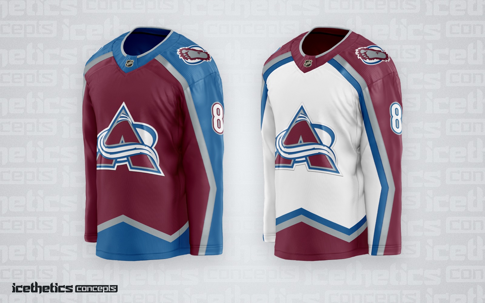
The avs really need to bring back the blue/silver stripes along the mountain on their white jerseys like they have on those retro jerseys. Would match their sock stripes and bring a little more blue to the road jersey which they need.
-
9
-
-
I always felt that 2015-20 look was underrated, especially that southwestern pattern and paw logo. Would have loved to have seen your take of their current reverse retro jerseys but in red/sand/black.
-
1
-
-
Nice update. Do you make your own fonts?
-
I prefer the original hawks. The flames could use a tweak. I'm not sure about all that white on the home, maybe drop the yoke. Coyotes and sharks next please.


Minnesota Wild by DT Concepts — Updated 2/14
in Concepts
Posted
Great main set, love the use of the shooting star on the shoulders and pants. Only things I would change is add some trim color to the numbers and not drop the yellow sun. Heritage jersey is 10/10.