


FiddySicks
-
Posts
25,295 -
Joined
-
Last visited
-
Days Won
63
Posts posted by FiddySicks
-
-
Now Denver picks Bo Nix, who has like a third round rating. This draft feels like it’s being run using AI.
-
I am not understanding the vast majority of these picks.
Daniels I already said
Maye is a weird pick when you need EVERYTHING else
Alt over Nabers
 Are you kidding me?
Now Atlanta. What are these teams smoking?
-
Man, that Jayden Daniels to Washington pick is gonna be looked at so poorly a few years from now. That dude is gonna be a big time bust.
-
 2
2
-
 1
1
-
-
Packers at one point almost switched to a look that didn’t have any stripes and used the Niners gold instead of the yellow they currently use.
In other words, be careful what you wish for.
-
4
-
-
I was gonna say his daughter too, but she was technically a kid in that show (I was also a kid at that time), and that just feels kinda weird.
-
5 hours ago, selgy said:
I believe they are going with a George Lopez theme

As long as we get to see more of Angie jumping on a trampoline, I’m perfectly fine with that.-
2
-
-
3 hours ago, SFGiants58 said:
I would sooner trust Tommy Tallarico to run an NHL team than Meruelo. So yeah, I doubt he’s gonna be able to do much with his franchise certificate.
Every time you mention this guy’s name I get The Wreck of the Concepcion from Treasures of the Deep stuck in my head.-
1
-
-
I mean, I live in a ski resort town. I LOVE the name Black Diamonds. That should’ve been the name of our team instead of “Knight Monsters”.
But this is the NHL. It’s gonna be the Yetis.
-
I think it’s safe to say that, finally, the Jets have won something.
-
4
-
 2
2
-
-
Gahh, these are SO close. Why in the world doesn’t the home jersey have the horns? That’s a pretty creative way to use shoulder stripes, but they just left it off of the primary home set
These look out of place and remind me of the Falcons lame generic uniforms. The road set is the best by far. I like the alt a lot but would like it better with white highlights in the horns instead of more red. The H Town alt is stupid. If that’s all of the ”Houston” blue you could use, why even bother? Now they have two navy jerseys that don’t match the road and alt sets. That’s exactly what they needed to avoid.
I thought I would hate these because they’re a disjointed mess. They’re still that, but I hate these because they’re actually so frustratingly close to being great. @GFB is right. These are kinda ruined by their lack of attention to detail.
-
2
-
 1
1
-
-
Had a bit to digest this and the Broncos changing kind of hits different than most changes. Their last set was around for a long time, and is sort of what got me into this whole thing as a passion. It was the first time I even realized that teams could even do stuff like that (Ironically, I kinda think this was the time that the teams themselves were also coming to that realization, too). And it was just SO different. That horse was cool as hell and those stripes were just so… Modern. It was such a home run for its time.
I think that’s what bothers me about this change the most. The last set was dated, but one of the reasons it stuck around for so long is because it was such a benchmark for what you could do with sports design. It was one of the best examples of this whole field.
And it just got replaced with… Whatever the hell that is. And it’s not even that their set is all that bad. It’s just boring yet convoluted and contrived, and derivative of a mid major college uniform that’s been done to death over the last fifteen years. Pretty disappointing change from a team that set the standard the last time they did this, IMO.
-
6
-
 2
2
-
 1
1
-
-
4 minutes ago, MCM0313 said:
The triangles represent thin air, not the developers’ rectums.
Oh no, there’s plenty of air (density TBD) in there. That’s how they can keep farting out all these dumb explanations.-
2
-
-
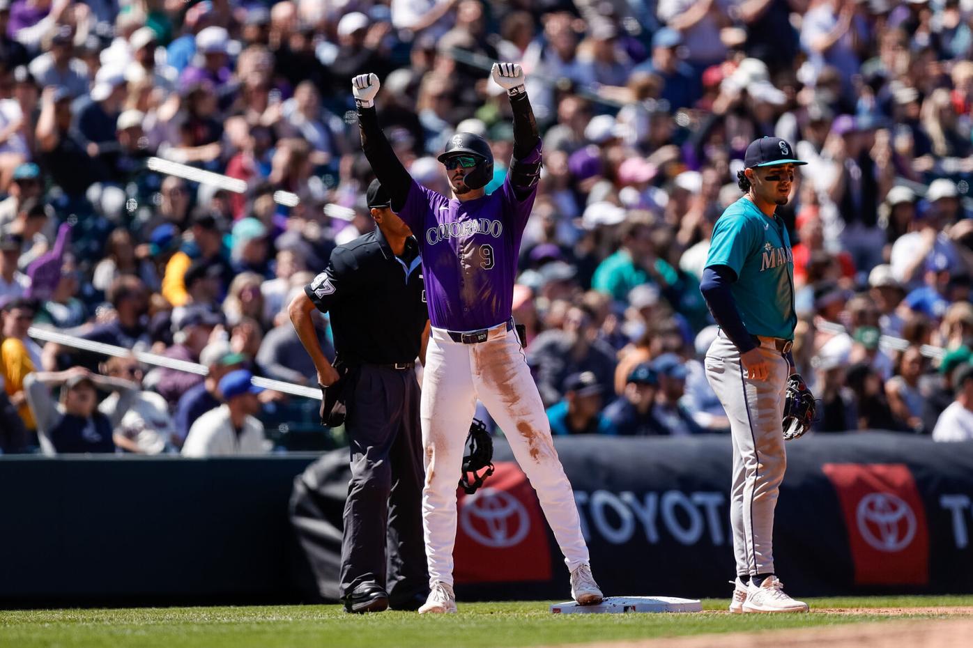
11 hours ago, SportsFan12 said:
Loved this uniform matchup in Colorado yesterday.
It’s funny seeing MLB try and do these Little League uniforms (I’m assuming that’s a dead program, yeah?), when the real little league uniforms were right in front of them the whole time.
Nothing in the world feels more Little League to me than a bright primary color on color matchup of actual MLB team uniforms.
EDIT: Not sure why I’m being “yawned” for this one. I don’t think I’m being clear. I don’t mean that as an insult. I think color on color in MLB is great. Just reminds me of Little League (which half the point of is to make kids feel like big leaguers).-
7
-
 2
2
-
-
3 hours ago, schlim said:
Yes, they represent thin air.
Also a good representation of where they pulled that example from.-
3
-
6
-
-
Meh. Not as offensively bad as I expected, but absolutely a downgrade from the previous set.
-
3
-
1
-
1
-
1
-
-
16 hours ago, mafiaman said:
Blizzard, Fury, Venom, Yetis. Seriously, it’s the NBA expansion version of Heat, Magic, and Thunder. F- choices.
All just awful choices, and all so fitting of this league.-
 1
1
-
-
Triangles are absolutely a reference to the mountain peaks in the Rockies. There are 48-74 mountains above 14,000 feet in the state of Colorado. Might wanna count those peaks… Also, six famous peaks in Colorado (Elbert, Maroon Bells, Pikes, Longs, Mt. Blue Sky, Scneffels) , six triangles on the jersey…
EDIT: Ehh, nah. That’s way more than 48-74 triangles. I’m just throwing
 at the wall and seeing what sticks at this point. I still think they’re gonna make some dumb connection like that with the stripe.
-
The Mets new CC isn’t terrible other than the cap. That mid 2000s Lids gangster rapper style with the bridges and other landmarks has gotta go.
I just can’t help but get a real strong Yankees vibe from this though. Something about the old scruffy look with the pinstripes sort of misses for NYC’s expansion franchise IMO.
-
1
-
-
35 minutes ago, sluggish_edgeboy said:
The leaked Texans primary is interesting as I can't see anyone being happy with it. Not in a condescending way or that it's so horrid, but there have been so many different routes people have wanted the Texans to go, and this won't satisfy anyone.
More red to stand out from the rest of the division? No, even less of it.
Lighter blue to lean into Oilers sentiment? Not either.
More modern and unique? Barely.
Did you think the current was fine (honestly valid take)? Well now it's gone.
Unless you think the new number font is great or think that redundant sleeve logos is the best thing to exist, then it's just a step back in every way. I don't think it's terrible, but it's got nothing going for it other than "could maybe be worse?"
Yup, this is pretty much it. It’s almost as if these clubs sometimes get it in their heads that focus grouping a “fresh” new uniform set will somehow fix the dysfunction in other parts of the business. All that does is further expose that dysfunction, and pisses most everyone off.-
4
-
-
16 hours ago, FiddySicks said:
The last name that was picked for a NHL expansion franchise was the Seattle Kraken. Whatever name the Utah team picks, I’m sure it will be terrible and reflect the unserious nature of the league they’re in.
12 hours ago, CaliforniaGlowin said: -
Oh man that Lions set is fantastic. I have a few minor nitpicks, like I wish the white/blue pants had the stripes, and they should’ve just done the small wordmark from the alt on all three jerseys. It not being there at all on the home set, then huge on the road set is a bad look. All they really needed were a few tweaks to their last set to improve it a lot, and they mostly did that. Also, that new blue helmet is gorgeous, and paired with the blue pants and black socks it may be one of my favorite sets in the league. I’m fine with the Lions using black sparingly. Keep it out of the main set and all onto an alt. It does at least have some historical precedent (recent, but still), and is SO MUCH BETTER than that terrible gray/anthracite/muffler steel colored set they had before.
Broncos looks like it’ll be mostly underwhelming with a few questionable choices mixed in (if they pair the main set with the white helmet I’m probably gonna scream). And the Texans looks like it’ll be a bit of a disjointed mess with some really good elements everyone is gonna wish they just incorporated into the rest of the set (I kinda get the feeling that dumb H logo is gonna pair with the primary home set and that’s SUCH a stupid idea).
-
6
-
1
-
-
5 hours ago, coco1997 said:
Assuming this is true, 4/29 is probably the date of the Rays' City Connect unveiling.
Oh, dead giveaway on the date. They’re obviously going to be Rodney King/LA Riots themed.-
3
-
4
-
-
The last name that was picked for a NHL expansion franchise was the Seattle Kraken. Whatever name the Utah team picks, I’m sure it will be terrible and reflect the unserious nature of the league they’re in.
-
1
-
1
-
-
1 hour ago, Alex Houston said:
Trainwreck? Really? In what ways? I've heard some criticisms of San Jose but "trainwreck" is a whole other level now.
The Sharks have one of the most wealthy owners in the league, but he’s pretty much absentee due to being based in Europe. It’s not so much a money issue as it is them expecting a Bay Area city to foot the bill on an arena for them. They’re basically playing the “That’s a nice hockey team you’ve got there. Would be are shame if they had to move” angle. Too bad that city has already publicly said they would probably be better off financially without the Sharks.
It’s one of those things that’ll probably be solved relatively quickly as long as Sharks ownership isn’t dumb enough to try and pull a bunch of crap, and realize that if they want a new building, they’ll have to pay for it. If they don’t, I could legitimately see the city of San Jose deciding to not work with them at all. A lot of cities in the country, especially Bay Area cities, aren’t going to get exploited by these teams any longer. No matter of it costs them the team or not.
-
3
-


 at the wall and seeing what sticks at this point. I still think they’re gonna make some dumb connection like that with the stripe.
2024 NFL Offseason
in Sports In General
Posted
I absolutely love them.