


sc49erfan15
-
Posts
7,693 -
Joined
-
Last visited
-
Days Won
7
Posts posted by sc49erfan15
-
-
Wow. That's fantastic! As much as cartoony anthropomorphic logos have a place in MiLB, I'm glad they didn't go that route here - at least with the primary. I'm sure a swingin' goat secondary will be included.
But man. This is great. What is the "H" logo supposed to be, though? I can't really make it out.
-
Forty dollars and a dream.
-
 1
1
-
-
Thought things were quiet for a while? Nope.
Northern Kentucky bolting from A-Sun to Horizon League
Apparently effective immediately.
Not a huge move in and of itself, but like always, there are bigger implications. This move leaves the A-Sun with only 7 teams (7 is the minimum for a NCAA autobid), and a raid from the SoCon or Big South could kill the conference. This looks like it can play out in one of 3 ways:
1) the A-Sun scrambles and raids a D1 conference for another member(s) to stay afloat2) the A-Sun scrambles to find a D2 school(s) looking to move up3) the remaining A-Sun schools look to jump ship before it sinks....I'm betting on #3. The A-Sun has basically been a revolving door its entire life - a stepping stone/temporary home for schools looking to go elsewhere. I don't think there are many D2 schools looking to move up... even if there are, is the moratorium on reclassification to D1 still in place?Remaining members of the A-Sun:FGCUJacksonvilleKennesaw St.LipscombNorth FloridaUpstateStetson -
Rhode Island Red Sox is just begging for a Rhode Island Red chicken logo/mascot.
-
Those Madden games had hilarious cheat codes! I still remember the Lions being BARRY, 49ers BAYARYA, Raiders BYBYLA, and Oilers ARABYALRLRLRLRLRLRLRLRLRLR
(I believe that was the code to get the hidden teams on SNES. I still have a soft spot for the Panthers because of that game.)

-
1
-
-
I'm actually a pretty big fan of this. The baseball sun (moon?) looks a little forced, but this isn't bad at all.
-
Haha that's true. I actually really like that helmet. It could work well with a team using a winter/cold weather-based nickname .Washington vs. Houston, 1971. Only time this matchup happened:

I don't know what it is, but I love those Oilers uniforms.
I guess the Cowboys aren't the only team in Texas to have worn a fustercluck of differently-shaded silvers.
I'd never thought of that concerning those silver Oilers helmets and how close they were to the Cowboys'. Wonder if the AFL/NFL merger had anything to do with the Oilers switching back to "Luv Ya Blue" helmets 2 years later...
-
It still looks good, but they ruined the neon sign vibe that the original updated logo had. I preferred the orange as well. Disappointing.
-
I don't think there is a separate thread for MiLB relocation, as this isn't a logo/uni change (yet...) but ground was broken on a MiLB stadium in Columbia, SC today. The most likely relocation candidate looks to be the Savannah Sand Gnats.
-
I don't see why the Coyotes need a West Coast team when they won't be in Arizona in a few years.
Plot twist: the Coyotes will be their own AHL affiliate.
-
3
-
-
That middle one looks like the hat for the South Bend Cubxpos.
-
1
-
-
I have a Black KC Chiefs Trent Green jersey like this. I'm pretty sure they've never worn something like this. Always wondered if it was just an alternate style to sell to fans or a scrapped idea? Never been able to find anything about it.

100% never worn on the field. Early 00s-style fashion jersey.
-
The independent minor-pro East Coast Baseball League has released the logos for its first three member-franchises.

I know the font isn't quite the same, but...
Also, the Niagara Wild wolf-thing looks like it's taking a beanball to the back of the dome. That can't be good.
-
Just tweeted at Bradiose asking if their Winter Meetings after-party will involve a rebranding. Their answer: "We don't mess with the #1 selling cap in MiLB!"
I wonder if that's code for "new alternate logos coming" or something of the sort. But glad to hear the cap is staying at least, one of my favorites.
What is the #1 selling MiLB hat? Lake Elsinore?
-
Echoing everyone on the SB logo, I love it. Anyone know the significance about the ivy in the main logo?
-
1
-
-
Wow, that SB logo is definitely nice. And it's good to see a logo depicting baseball being played WITHOUT swinging a bat.
I like the primary, but feel like it could've been simplified some. Starting with the C and going outward, there are 8 round "layers"...
-
The Rome Braves have a new alternate logo:
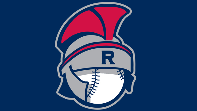
Personally, I can't unsee:

Here's what I assume to be an alternate cap:

Meh.
-
Love it. "Daytona Tortugas" came out of left field, but it rolls off the tongue very nicely.
-
A lot of these NFL pics are getting major bonus points for having actual AstroTurf in them too. That brings back memories, when was the last official NFL game played on it?

I'm almost positive it was Colts Broncos in 2004 at RCA
Right - almost. The last NFL game played on the old-style Astroturf was Colts-Broncos in RCA, but on January 9, 2005.
-
Nice find. I've seen the mockups of the original Jaguars uniforms a thousand times, but I don't think I've ever seen an actual jersey.
-
1
-
-
Yeah, you could probably make an entire thread on those planned one time only paint schemes. I didn't want to hijack this thread with a million "special" paint schemes, but thought the Richard Petty #6 and the Petty/Gordon "matchup" was relevant enough to include.
-
TheFallenHaveRisen: Do NASCAR paint scheme cars that were only driven for a season or two count? I've found some rare photos of cars that only were around for a few years.
I'd say the would, but I may be a bit biased. I tried to go with things that didn't even happen for a full year
NASCAR is a different animal altogether - forget "a season or two," there are tons of one race only paint schemes, and I'm not talking about the "special" paint schemes that are run almost every week these days.
Here's one - Richard Petty with his famous... green... #6?

That's from the 1986 World 600 (now the Coca-Cola 600, of course). The King crashed his #43 in practice, and these were the days before backup cars. Journeyman driver D.K. Ulrich offered to let Petty drive his car to continue his streak of races started (I'm sure Ulrich got a few bucks out of the deal as well), they slapped some STP decals on the green #6 and went racing.
Another that's NASCAR but also more appropriate for the thread. What's this grainy screencap?
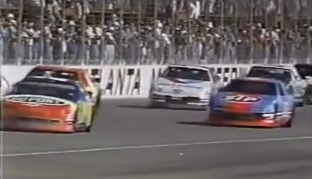
That's from the 1992 Hooters 500 in Atlanta (possibly the best NASCAR race of all-time), the only time Richard Petty and Jeff Gordon raced against each other. It was Petty's last race and Jeff Gordon's first Winston Cup start, and one of the few times during the race that their cars were near each other.
-
I can't post a pic because I don't have a VHS player, but I have a tape called "Hornets Hysteria" that reviews the inaugural 1988-89 Charlotte Hornets season. It briefly shows the Hornets' prototype uniforms - similar to the uniforms eventually worn but with "Charlotte" and the numbers in purple.
Take a pic with your phone and upload it.
I don't have a VHS player. To play the tape.
-
3
-
-
I can't post a pic because I don't have a VHS player, but I have a tape called "Hornets Hysteria" that reviews the inaugural 1988-89 Charlotte Hornets season. It briefly shows the Hornets' prototype uniforms - similar to the uniforms eventually worn but with "Charlotte" and the numbers in purple.
-
1
-


Minor/Independent/Collegiate League Baseball Logo/Uniform Changes
in Sports Logo News
Posted