


Pharos04
-
Posts
1,308 -
Joined
-
Last visited
-
Days Won
1
Posts posted by Pharos04
-
-
Quote
To honor the deep legacy of this 90-year-old franchise, the traditional burgundy and gold color scheme will remain at the center of the team's new identity. The home uniform will also retain the burgundy and gold colors, a specific reference to uniforms of the past.
…but found nowhere else in the set as a package
-
 9
9
-
-
I can’t get over the Black helmet! The W on the front just seems so tacky. It’s like they saw Dartmouth and went “that looks fire” without understand what makes it so iconic. It’s closer to the Arizona Hotshots but that at least worked.
I’d call these a train wreck but train wrecks have some semblance of cohesion. These are just awful.
-
12
-
-
-
Congrats Cincy!
-
1
-
-
30 minutes ago, DTConcepts said:
Make it make sense.
OITGDNHL-
5
-
-
and to the shock of no one this season...
-
1
-
-
I still think just playing a 5th quarter would be ideal. Guarantees each team will get possession no matter what. It isn't a score-and-it's over game, you still have to have some strategy behind it.
Tough tough loss for the Bills. Was really hoping for them to pull it through and complete the sweep.
Go Bengals
-
3
-
-
We are all aware that the Cleveland Deal has been a disaster for record books between “official” history and “actual” history.
the team that played in Cleveland one year was in Baltimore the next. Records were in a state of flux until the NFL figured it out. Newspapers not aware of the nuances would have just treated it as every other move that had happened prior because the Deal was so bizarre and unusual.
The franchise and history stayed; the staff and team and everything else moved.
Can we please not Clevejack this?
-
9
-
-
5 minutes ago, Cujo said:
Super Bowl 5
Super Bowl 41
When was the other one?
They won the NFL Championship in 68 which is what put them in Super Bowl III
-
And people say the tinfoil hats run deep here
-
2
-
-
Does that say “DC FC” and “The People’s Team”??
-
I sincerely hope not. The bright spot in the rebrand is the badge could possibly be just the Bunting-R. The excessive text has looked awful when the logo is scaled and it’ll look as bad on a kit.
-
might be the official logo turnover tomorrow -
I hate this trend of odd weird simplification.-
3
-
-
11 minutes ago, 4_tattoos said:
So what's the deal with those white Rams helmets in the background?
Can always tell who read the article on the mothership and who didn’t.
QuoteThe black and white helmets that also appear in the video, meanwhile, are simply collectables that are part of Riddell’s Lunar and Eclipse alternate lines.
-
9
-
-
Looks like they’ve already announced two new teams:
Frankfurt Galaxy
Hamburg Sea Devils
https://twitter.com/SeaDevilsHH?s=20
one article mentioned there’s still a team in Berlin. Could mean the return of the Berlin Thunder as well
-
On 1/30/2021 at 8:05 AM, Pharos04 said:
Something tells me we’re gonna get these numbers

Oh crap I may have guessed something right? Neat
-
2
-
-
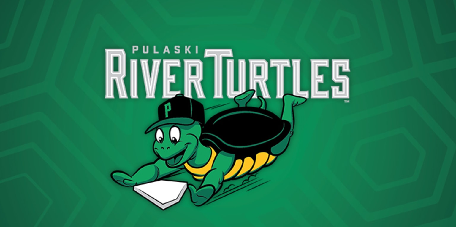
https://www.mlb.com/press-release/calfee-park-baseball-inc-debuts-new-appalachian-league-team-name
The excitement surrounding the rebranding of Pulaski’s baseball franchise culminated today with the unveiling of the organization’s new name: The Pulaski River Turtles.
With a nod to its New River Valley heritage, the inspiration behind the River Turtles name was a renewed commitment to Calfee Park’s family-friendly culture.
“When considering the name, we weighed feedback from the local baseball community, Calfee Park’s history, and our location in the New River Valley,” says general manager JW Martin. “After thoughtful consideration, we wanted a brand that represents what our ballpark is really all about. We have a welcoming, fun, family environment that puts smiles on faces. We think this brand captures that.”
-
1
-
-
Something tells me we’re gonna get these numbers
-
1
-
-
Love that they're remembering their AAFC championships too. Solid retro anniversary logo
-
1
-
-
I don't get the call for the Texans playing dressup as the Oilers. With so much issues and complaining about the bass ackwards revisionist history that the NBA does, why would the Texans get an exception?
The Texans are taking their colors from the Texas flag. the bull logo emulates the design with the solid blue and red/white. changing the Deep Steel Blue to the Oiler blue would remove that aspect of it.
Houston's team is now the Texans. The Oilers left. Should the identity have stayed in Houston? Probably. But the people there also just accepted the move like so many others before had. Which is weird as the Browns had left the year prior and there was enough of an uproar from fans in Cleveland to retain the Browns identity/history/colors/etc.
-
7
-
-
I didn’t even know SC was doing anything with their flag. Glad they didn’t go with the proposed design. Sometimes abstract works better than realistic.
https://www.cnn.com/2020/12/31/us/south-carolina-new-flag-backlash-trnd/index.html
Proposed design:
currently accepted design:
-
2
-
-
So as mentioned, the New Magnolia flag was chosen as the option on the ballot in Mississippi. But it looks like some modifications took place such as widening the red sections, made the gold borders thicker, and made the text bolder
I think it certainly helps a bit. I still like the inclusion of the Choctaw star but man, that text just hurts the overall design. Still, clearly better than a Civil War relic in the corner or just the "State Seal on Blue" which also happens to be a Civil War relic in design.
On the topic of top state flags, back in 2001 NAVA did a survey for the top State/Province/Territory flags and the top 5 ranked as:
- New Mexico
- Texas
- Quebec
- Maryland
- Alaska
While the bottom 5, to no one's real surprise at the time, were all State Seal on Blue
72. Georgia (prior to their next flag change which took place in 2003)71. Nebraska
70. Montana
69. Kansas
68. South Dakota
-
1
-
Narrowed down to final five
of the remaining, I do like the bottom left one compared to the others.


Washington Commanders to debut new NFL identity
in Sports Logo News
Posted
I'm trying to remember which unveiling actually crashed the boards and site. Was it Buffaslug?
This one I haven't been able to get onto the actual mothership for a few hours after the unveiling so this one is definitely up there