


Krona
-
Posts
1,541 -
Joined
-
Last visited
Posts posted by Krona
-
-
18 hours ago, 655321 said:
I think you need to look at merch sales before you can call anything related to the City Connect program a failure.
We're on a logo/design board, not an economic forum.
-
 3
3
-
-
I like this one from 2020 a bit better:

-
5
-
-
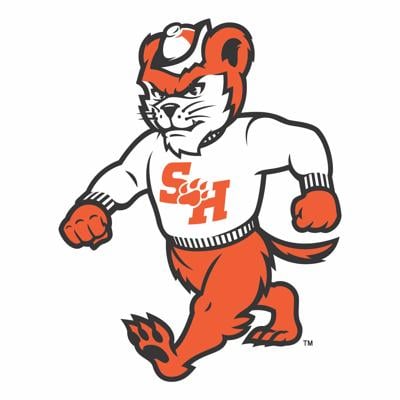
9 hours ago, MJWalker45 said:
Sam Houston State with a change to their mascot.
Not blown away by the execution, but hope this trend continues. I'd love to see contemporary interpretations of classic, albeit sorta generic logos.
-
4
-
-
43 minutes ago, NYCdog said:
The White Sox, Astros, Marlins, Nationals, Rockies (with white pants, and Rays were the best of the City Connect program IMO.
The Mets, Angels, DBacks, Royals were good, not great.
The rest all suck.
I think you're being generous. I feel like this whole thing has been a pretty big failure. A years long version of that week of late season NCAA basketball when Nike outfits a handful of teams in unis that generally suck and certainly unnecessary. Some new wrinkles on teams identities (even with the nicknames/alt identities) would've been exciting, but recognizable. Sure a team here and there would probably do something pretty out there, but would get roasted and that'd be that. I think a good measure of success would be seeing a few of these getting the "they should make those the primary!" debate going. I can't think of one coming close.
-
1
-
 1
1
-
-
15 minutes ago, Froob said:
Just wear the silver pants. No need for any alts aside the reds.
Agreed, no need, but you know it's a matter of time. Just saying I like it and it breathes from life into a stale, on the bleeding edge of dated logo.
-
19 minutes ago, Froob said:
Apologizes if this has been discussed but is there a new logo coming for the Pats?
Ugh. The reverse is much worse than the one posted on the mothership
I could actually get behind this (just the NE mark) on a white helmet fauxback
-
1
-
 1
1
-
-
Commanders is such and awful name. You just can't replace the colonized with a the colonizer's enforcers. So tone deaf. If you have to honor military (which seems like we have to in today's NFL, I'm still devoted to Redtails. No need to go overboard with the fighter pilot motif. Keep the feather on circle with either an R or a profile of a pilot. I know a lot of folks think that it'd bring up memories of a very offensive name/logo/history, but I think it actually reclaims it and over time replaces the memory.
-
6
-
 1
1
-
 1
1
-
-
The inspiration to tie-n to the skate culture: whatever. The execution: Real fellow teen/poochie understanding
-
2 hours ago, DCarp1231 said:
Different number fonts for each team (specifically block for PITT) and yeah sure it’s great
The Ravens would benefit from a simplified blackletter number set so much
-
2
-
-
6 minutes ago, NOLAPelicans23 said:
I'd rather take the current uniforms. Sticking to throwbacks or going to them because they're "classic" is lazy and cheap. Throwbacks are nice to think about for a time, but the only reason these get steam is nostalgia and the Rams' look was horrendous in the first years back in LA.
They hit on the white version of their current uniform. Replicate it as the blue with no gradient and remove the Rams patch and you have a modern look that doesn't just feed on the "Good ole days." To even use the recent rebrands, I will take the Lions trying to transform an old look over the Jets just pulling an old look (for them to lose in them and want something new again).
Still need to put a blue collar on that white jersey. I'd happily take a blockier number, but won't get greedy. Just give me the collar.
-
1
-
-
33 minutes ago, Brian E said:
during the wilpon ownership, the mets got (justifiably)murdered for caring more about the brooklyn dodgers than their own history. don't think they would have ever gone in that direction. but even so, that's not what the CC program is about. it's about the city, not the baseball history (obviously, as a baseball fan, that stinks, but it is what it is). look at this excerpt from the athletic. bunch of great nuggets in this article, by the way, including that player feedback to nike about colored pants has been that they get too hot, they thought about doing 'QUEENS' but thought it was too narrow for a fan base that is spread out:
For the Mets, the process with Nike started after the 2021 season. Nike issued a brief on what goes into a City Connect uniform, and Goldberg and Benesh filled out a 12-page questionnaire posing queries such as, “What does New York mean?” Nike sent five design concepts based on the answers, and the team gave notes or directions to scrap whatever look altogether; five more designs would follow.
Not saying they wear Dodgers throwbacks, just use the pattern, which 99% of fans wouldn't connect to the Dodgers unless it was pointed out. As for the being about the city, that's the point. Use a subway tile inspired design with the windowpane as the architecture. And also, half of these teams are misunderstanding the assignment of "CITY". It's a dumb program that could be marginally better if they lifted a dumb name that doesn't mean anything.
-
The Mets really blew the opportunity to use the old windowpane plaid the Dodgers had. Ties in with the city's history and gives the perfect backdrop to a subway tile mosaic treatment. This doesn't have to be that hard.
-
4 hours ago, M59 said:
Nothing quite like being kitted out in a uniform that says "ah, the urine sample is here"!
You might want to see a urologist

-
1
-
 1
1
-
-
12 minutes ago, Chromatic said:
Apparently this graphic was sent out to Broncos season ticket holders this morning
If that is the updated D horse logo, it’s really well done.Incredible. Start the countdown to that replacing the robohorse in 5 years
-
2
-
-
1 hour ago, LMU said:
Los Angeles Kings/Kansas City; Kansas City-Omaha; Sacramento Kings
New York Rangers/Texas Rangers
New York Jets/Winnipeg Jets
Carolina Panthers/Florida Panthers
New York Giants/San Francisco Giants
St. Louis Cardinals/Arizona Cardinals
Kansas City Royals/Cincinnati Royals (defunct)
Edmonton Oilers/Houston Oilers (defunct)
There's enough precedent.
The most recent of those was the Panthers in the 90s, most of the others 50 years+. Notice the pattern? Trademarks and lawsuits have all but made this trend a non-starter.
-
2
-
-
34 minutes ago, KouPilot said:
I've been away from the board for a long time but it does feel a little bit more negative. I think it's just a sign of the times. It does feel like 50% of nike era redesigns get redesigned in pretty quick order.
Putting on my tin foil hat for a moment, Nike seems to have a knack at putting out sets that garner 40-60% approval, leaving 40-60% wanting more. City Edition/Connection is another lane of the highway. A large majority of their clientele is living in the petri dish. There's a vibe of planned obsolescence in what they produce. Capital Rules Everything Around Me.
-
1
-
-
29 minutes ago, MCM0313 said:
I’m more intrigued by the space in (Travis?) McNeil’s surname.
Which reminds me of old footage I saw of Super Bowl XX, where the Patriots’ Larry McGrew had a similar gap after the Mc.
MC Neal's first three albums were stellar
-
1
-
1
-
-
On 4/6/2024 at 1:15 PM, The_Admiral said:
I'm going to echo what tons of people here have already said (and mocked up), which is that if the old-timey Browns are going to commit to a helmet as a logo, they should go so far back that no one could confuse the helmet with recent history: an old one-bar facemask, for instance. Lean into the concept of predating a logo rather than using the stock helmet art across the league and calling it a primary--especially when that stock helmet art is a relic of the recent, not distant, past.
Personally, I think the =B= football was halfway to the right idea, it just should have been a =C= instead.
Make this weirdo helmet happen. I was endlessly intrigued by these coaches jackets when I was a kid.
-
6
-
-
I submitted Oxen, Unique, region appropriate, a variety of ways to go thematically (pioneers, tough aggro, stoic, single or a team). Utah Oxen rolls off the tongue in a pleasant, sing-songy way. "the Ox" is a nice sub-nickname, too. And lets get a primarily brown colored hockey team!
-
1 hour ago, Chromatic said:
Maybe top 25. It’s still just a gold shield on a blue field like many other states. I definitely wouldn’t put it top 5 just because there’s an easter egg.
Hey. Don't gloss over that the easter egg is a beaver. And there's some nice, uniquely arched type om there too.
-
2
-
-
27 minutes ago, tBBP said:
Alright, so...
1) Arizona
2.) Maryland
3.) New Mexico
4.) Ohio (only because it's the only swallowtail...)
Everything else after that is up for debate, but none of them are cracking the top 4.
This is my word...and as such is beyond contestation.*
*in my Prince Edward of Wales voice*
Oregon has a unique design on either side of our flag. I think that gets us in the top 5.
-
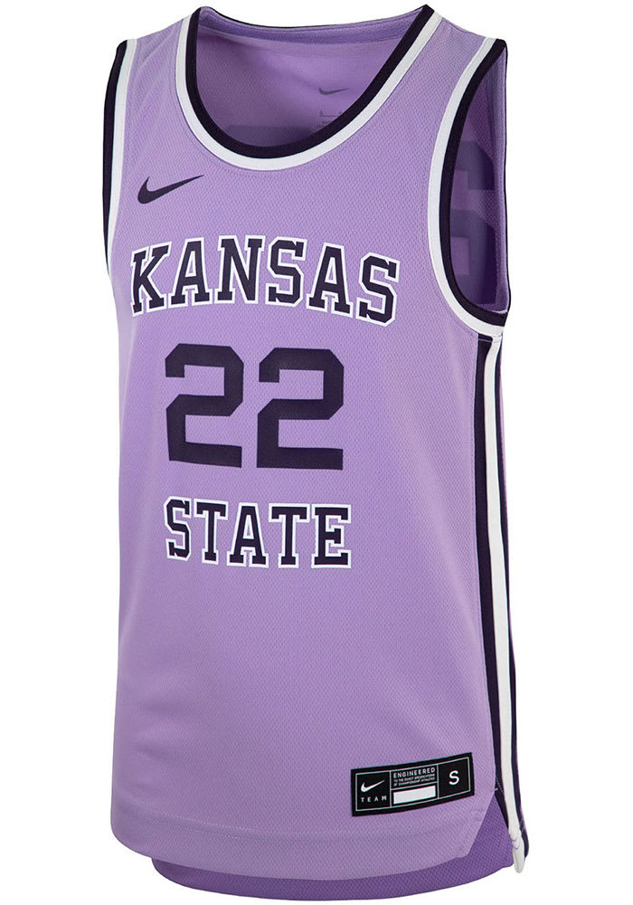
On 3/28/2024 at 7:20 AM, PK22 said:
Loved the Kansas State lavender uniforms from a few years back. Would really love a team to own lavender as a color.
The Lakers should be the first team to jump on this. The perfect bridge from the two tone blue hardwood classics and a modern city edition, which have often been real stinkers. I'd much rather see a rotation of Yellow/Forum Blue/White/ LAvender (sorry) and occasionally Black
-
3
-
-
1 minute ago, Bomba Tomba said:
Like the Saints wore, and should continue to
It's bad enough that they have this very dull shade right now, even worse when they don't even show it prominently and instead emphasize the boring ass black
They really are missing the boat. They could even do a modern, non-traditional look emphasizing wrought iron and tarnished brass with a lot of ornamental frippery and it'd be miles ahead. And that's coming from a instinct to just go back to the expansion look.
-
1
-
-
10 hours ago, Old School Fool said:
It's funny you say this because the uniforms in The Show look way better than they do in real life at this point.
I'm old and probably thinking of 2K14

-
1
-


:no_upscale()/cdn.vox-cdn.com/uploads/chorus_asset/file/20014042/80812464.jpg.jpg)
2024 NFL Changes
in Sports Logo News
Posted
Question for New Englanders: was this logo release/burying memory holed?

It seems fairly obvious that elvis was a "back to the drawing board" version of this a short 15 years later...