


Krona
-
Posts
1,533 -
Joined
-
Last visited
Posts posted by Krona
-
-
https://www.milb.com/oklahoma-city/news/okc-brand-identity-transition
OKC retiring the Dodgers identity, doing the "baseball club" thing while working on a new one.-
 1
1
-
-
4 hours ago, Green27 said:
It's so weird to see schools now moving to one logo for everything. I know the multiple schools I have worked with/for have had very strict brand guides and standards of 'this logo is for athletics only, and this one is for academics only'.
Being in Eugene, I'm sure you're well aware how athletics have supplanted academics as the primary function of the institution. It was only a matter of time, In a way, it's understandable as brand recognition goes, but it's still pretty gross.
-
 1
1
-
-
Nice touch by the browns decking out Brownie in all white at midfield
-
4
-
-
On 10/8/2023 at 9:50 AM, upperV03 said:
For the first time in their MLS history, the Timbers will have a different company’s logo on the front of their shirts next year:
Really is a shame, as Alaska has been one of the better looking sponsors in the league (even with all of the logo variations the Timbers have worn). I’ll always have a soft spot for Alaska for putting their retro logo on the Timbers’ two retro third kits.
The linked article says that the Timbers have already inked a deal with a new sponsor, so there’s no chance of them being sponsorless next year. My absolute best case scenario would be Tillamook, who T2 had as a sponsor last year:
Realistically I think it could well be Dutch Bros, who has been the training kit sponsor for a few years. I’m hoping it’s not Daimler, who is the current sponsor for T2. Their logo looks abysmal on the kits:
I'm guessing TikTok will be promoted to the front of the shirts and a new sleeve sponsor will slide in down the road. -
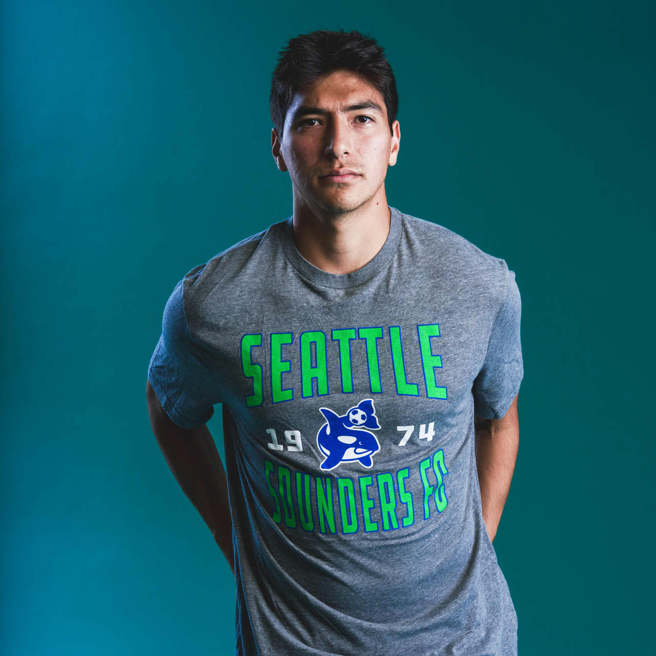
2 hours ago, YELDARBfield said:
I'm not where I can screenshot at the moment, but check out around the 1:28 mark of this video:
https://www.soundersfc.com/video/watch-the-making-of-our-brand-evolution
Assuming these are actual concepts from the process, they explored quite a few directions for this rebrand, from an orca-centric crest to the cliché MLS roundel with the former Space Needle art.
I think y'all have nailed the analysis. This is a very good modernization of a loved-but-flawed crest with slightly better colors. The alternate marks are stellar. Merch will be much improved, including this shirt I need to order very soon:

I feel like quite a few of those concepts are better than where they landed
-
Scrolling through twitter and I thought Colorado's big reveal was bringing back the sky blue. Real white/gold blue/black dress moment for me.
-
2
-
 1
1
-
-
20 hours ago, Digby said:
I mostly see blue smoke and I can sort of see some kind of icy pattern, but I'm struggling to see it as "lake water". Surprised we haven't seen more full-sublimated print styles like this in the modern NBA...yet.
Since rebranding this team has trotted out so many "Minnesota" wordmarks that feel sorta similar, not similar enough to fit together but not different enough to fully embrace an alternate brand of the City program. The middle ground, can't-commit zone. Which is it?
They should definitely make the keys look like docks!
They could've had so much more fun with this idea. I'm thinking woodsy, "Great Outdoors" vibe as opposed to something that looks like the background of a digital directory in a big city hi-rise. They missed the boat with missing boats.
-
New Temple branding coming in tomorrow
https://twitter.com/jbosack/status/1686015129433849858?s=20-
1
-
-
Bring back the ILLINOIS decals or go nuts and recreate this:
-
7
-
-
1 hour ago, MJWalker45 said:
Was this the apex of NFL mascots? LOL!!!! I think the Saints have the issue that they can't really use the pope as a mascot and what really is a saint and how should they look without pissing off everyone?
http://media.zenfs.com/en/homerun/feed_manager_auto_publish_494/bc51a27c779bbb4dd28fdb774d555a9e
Maybe this guy? J/K, but it's not as bad as the guys in England that dressed up because the Saudis bought Newcastle.
Yes. It was the apex, even if it was the most contemporary NFL thing ever (mid 80s no less!) to make a league wide mascot program. Given todays toy/collector culture, it's amazing they haven't brought the Huddles back, or at least licensed them to Funko or Super 7.
-
4
-
-
2 hours ago, BJ Sands said:
The Bears’ orange helmets are a big deal in Chicago.
Not a lot that would save this helmet (seems completely unnecessary) but inverting the colors on the C would go a long way. That shade of orange works like a lighter color, which in my mind, signals to make the darker color the outline. If they wanted an orange helmet, they should of just really mixed in up and add stripes or put another logo on there altogether. It's like they wanted to stick to tradition in the most garish of ways.
-
3
-
-
I wish KU would stop leaning on trajan so much (or at least create a custom font that takes elements from it. It tends to make everything look like a knockoff. Love this look or some variation of it
-
4
-
-
49 minutes ago, Bruhammydude said:
Something about vertical stripes on football jerseys just seems off to me. They feel more natural on long sleeves (think track jackets). They had a run in baseball with the Astros, Indians, and Mets and were okay, but there was a bit more real estate to play with. With pads they just seem to be more pronounced as shoulder decoration than sleeves. For 20 years they've been trying to solve this, from yokes (titans) to tiny logos (bucs) to wonky vertical ornaments (falcons) to weird truncated stripes (niners). The vikings may have the best solution so far by hinting at old hoop stripes, but adding a modern touch.
-
4
-
-
15 hours ago, tBBP said:
Y'all wanna know what's funny, though? Granted, it's all reteospective now since it's been well over 30 years, but there was a time when Nike wasn't king in the shoe game. As recently as the 80's, Nike was seen in much the same way Under Armour was seen about the time of the aughts: that still-challenging up-and-comer in the athletic apparel space. If you're curious as to what catapulted Nike's fortunes and ultimately shot them to the top of the game, look no further than His Airness, Michael Jordan. That marketing campaign Nike launched with him--some of y'all remember it, "It Must Be the Shoes", combined with the "Air Jordan" name and resuting shoe line--was a sheer stroke of genius on the part of the swoosh. That vaulted their profile (and of course Jordan winning all those championshops dang sure helped); after that dang near everyone wanted in on the Swoosh. All these many years later, here we are.
Just felt like bringing that up for those who weren't on planet Earth to w1tness all that live...

You did a better job of getting my point across. Nike spent nearly 10 years as another name in the business, They had their fans (many who pronounced it the same as "like", to illustrate how well known they were), but McGregor SandKnit was as ubiquitous in the culture. Funny how they didn't get strapped to the rocket until they released shoes WITHOUT the swoosh and replaced it with the jumpman. I think that speaks volumes to whether it was the logo or the marketing that people fell in love with.
-
2
-
-
2 hours ago, BBTV said:
By "accommodating", you mean "integrating it into the uniform". It's basically a team logo patch. If you swapped that Nike out for an Adidas, RBK, or Puma logo, it changes the uniform.
Nike has so many people fooled into thinking it's "just" a manufacturer logo (which is BS to begin with - my suit doesn't have the designer's logo on it) when it's not only an advertisement, but in some cases it's so tightly-integrated with the team's brand that it's hard to tell where one stops and one starts.
Would the defenders of the Nike logo being anything other than a bought-and-paid-for advertisment feel differently if their logo was uglier? What if Puma got the contract again and their logo was front-and-center on the Seahawks sleeve, the Titans sleeve (in red), or the Chargers sleeve (under the bolt)?
Or if GAP decided to make athletic uniforms like Aeropostale did a few years ago, and this was on the sleeve?
It just so happens that the swoosh is arguably the best company logo ever, and "works" in a lot of places. But we have to look at jersey advertisers as interchangeable - there's absolutely no other way to look at it. And is it really interchangeable? You could say that it was back when teams flip flopped between Wilson, Russel, Reebok, Puma, etc., but those logos were slapped on wherever on the sleeve, and not integrated into the design the way Nike has done. They all sucked, but the Nike strategy - while absolutely brilliant from their perspective (seriously - I think their people deserve raises for how they've pulled this brand-integration off) is awful from a jersey-lover's perspective.
As a designer it's the WORST logo ever. Do you know how many times I've had a client ask for "something like Nike"? The logo isn't great, the company is just dominant in their industry. If they fell into the depths of LA Gear or British Knights we wouldn't be asking why they failed despite such an iconic logo. I get it, It is an iconic logo, but only when attached to one one the biggest success stories in history. Put Lotto's logo in its place and we'd be talking about how it's instantly recognizable to 99% of the world.
-
 6
6
-
-
Lakers dropped their 75th Anniversary logo on twitter this morning
-
9
-
-
2 hours ago, gosioux76 said:
Reminds me of the Memphis Tams of the old ABA.
Which reminds me of this:
-
Kinda hope the Bengals do a white jersey without orange trim, as wasteful as it seems. (If they'd just make the primary white have more orange, even better). A cool twist would be to replace any orange accessories with light blue, playing off the icy eyes of white tigers.
-
1
-
 1
1
-
2
-
-
2 hours ago, BJ Sands said:
There is no chance these last more than the minimum five years.
With Snyder looking more and more likely to take a fall, I could see another name change in the sake of "turning the page". It's completely possible that the league grants them an exemption from the 5 year rule and we get he Red Tails identity we deserve.
-
6
-
-
It would have been a good opportunity to refresh the logo too. The uneven line weights and gold inline feels very "millennium" to me when everyone seemed to be on the swooshy orbital oval train. It really feels like a holdover from the red facemask days and just doesn't seem at home with a classic set. It suggests there should be a gold inline elsewhere on the uniform. Not sure why it bugs me so much for a team I loathe. And before anyone says it, I don't know why the black outline doesn't bother me in the same way.
-
7
-
-
New SF City kits are fantastic. Great looking clubs in the bay area right now with exception of the big guys down in San Jose.
https://www.footyheadlines.com/2022/04/san-francisco-city-fc-2022-kits-released.html-
2
-
-
3 hours ago, Waffles said:
Was wondering which Portland team would use the PDX carpet first. Looks like the Blazers got to it?
At least a team using a airport abbreviation finally makes sense
-
Posted this in the lower league thread as well:
Some more background on Vermont with extra interest to this forum. A designer owned club! A lot of great stuff in the package.
https://vermontgreenfc.com/a-letter-from-designer-club-co-founder-matthew-wolff/
-
 1
1
-
-
Some more background on Vermont with extra interest to this forum. A designer owned club! A lot of great stuff in the package.
https://vermontgreenfc.com/a-letter-from-designer-club-co-founder-matthew-wolff/


Minor/Independent/Collegiate League Baseball Logo/Uniform Changes
in Sports Logo News
Posted