


Krona
-
Posts
1,533 -
Joined
-
Last visited
Posts posted by Krona
-
-
On 1/31/2022 at 9:41 PM, itsmb8 said:
Negative. There's the dugout jacket, and the performance hoodie jacket. Last year's both were all navy, but this year both are navy with yellow sleeves.
Now for my personal opinion, the trenchcoat is bad. Also, what's with the v cut and pull string at the bottom back???
These seem to be offered for northern cities for the most part. They seem more like parkas that trench coats. My guess these are for early season/postseason when we get some chilly temps in those cities.
-
I was really hoping for some pre NBA 1920s uniform news...

-
 6
6
-
-
1 hour ago, jgiff17 said:

Woof. Like some country fried daft punk knockoff
-
2
-
-
1 hour ago, Dynasty said:
It's hard to believe that place is only 30 years old. It feels like an all-time classic, arguably in the same class as Wrigley and Fenway.
Harder to believe it's the 10th oldest park in the league and will be working it's way up. likely to6th or 7th, in the next 5 years.
-
4
-
-
On 12/8/2021 at 12:33 PM, ltravisjr said:
The Springfield (IL) Sliders of the collegiate level Prospect League has gotten new ownership and are taking suggestions for a new team name:
https://capitaloffun.com/make-your-voice-heard/
I would suggest the Homers given the Simpsons' connection.
At the very least they should bring in the Capital City Goofball as their mascot.
-
On 10/20/2021 at 10:27 AM, EddieJ1984 said:
The Rams horn is hard to screw up but they went ahead and still did!
The segment would be fine if they had used a two tone (or finish) detail like they use on the numbers and shoulders. Make the horn matte and the outline glossy. Essentially filling the blue gap with a "darker" gold.
-
1 hour ago, gosioux76 said:
Yeah, I think it's interesting to see Nike rollout the classic Nike/swoosh wordmark for throwback sets. I know Nike uses it pretty liberally on its retro/reissue footwear and lifestyle apparel, but I haven't seen it so much on team-branded performance products.
They use it on US soccer on field uniforms, which I always found odd, but I like it.
-
3
-
-
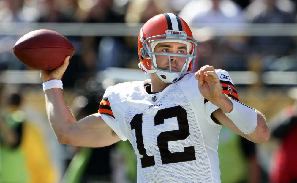
5 hours ago, bbush24 said:
I never liked the gray facemask for the Browns. I thought it was bland and have preferred either white or brown. But for some reason on the new throwbacks I really like how it looks. And I can't for the life of me put my finger on it.
I still argue that the Browns should employ all three, brown, white and grey facemasks into their set. Brown for color rush, white with the road set, and grey at home/throwback.
-
17 minutes ago, O.C.D said:
I vehemently dislike the modern approach to designing numbers. They've tried way to hard to reinvent the wheel at the cost of a well balanced uniform. I still have a hard time believing they're classically educated designers
Unfortunately I think it has less to do with trying to design a good look and more to do with a new prerequisite to have custom numbers. I recall reading (probably here) that one of the main motivators for the introduction of unique number fonts is to curb counterfeiters from producing accurate knockoffs. The Vikings nailed it with a clever tweak to a traditional look, fortified with an extra level of minutiae of doing it on the leading number. The Seahawks and Rams also have the extra layers in addition to the custom shape. I'm afraid that this is the way going forward. Bad structural design and superfluous details on top. It's going to get ugly.
-
2
-
-
The simplest thing the Rams could do that would have a sneaky big result in connecting to the traditional set is adding contrasting collars. It's amazing what a difference it makes.
-
23
-
-
35 minutes ago, the admiral said:
It wasn't inevitable. It took billions of dollars in race-riot-related property damage in response to a murder during a quarantine for a pandemic that has killed 600,000+ Americans to get the requisite pressure to change the name. Take the pandemic away, the chain reaction never starts, and they still have the Forbidden Word.
That was hardly a race riot. In fact, the most diverse public backlash to racial justice in our country's history. That capitol cosplay was more more along the lines of a race riot.
-
13
-
 1
1
-
-
12 hours ago, LMU said:
Much better guys. Now throw everything bone in a pit and never speak of it again.
Pretty amazing this didn't leak. Must've been shot months ago. Cam Akers is still 23 in the video and he changed to it 3 just after the rule change. Also funny that he's in the drop video but his jersey isn't on the team shop.
-
-
-
Is that Henry Rollins?
-
-
Right? MiLB is closing in on "sports entertainment" a la wrestling. It still functions as feeder leagues. Kinda important. You can have fun in the crowd without putting all this tomfoolery on the caps and jerseys.Crap like this is really making me start to hate minor league baseball and the entire concept of "family friendliness" in genral. Does whether or not a family finds a baseball game to be a safe an affordable outing REALLY hinge on ballplayers dressed in clown suits and ballparks being turned into glorified day care centers?
-
Well said.I like the fact that they step out of the confines of "what a baseball logo should look like" but it doesn't always work. Not sure if they are spread too thin. It seems like they are following their reputation of delivering a unique product. They are extremely innovative, but that doesn't always translate to likeable. What disappoints me is the success rate of the last couple years. You don't have to hit it out of the park every time, but it used to be 4 out of every 5 did. Not nearly as much anymore.In my opinion, the Charlotte Knights logo package is, unfortunately, another in the line of "misses" that Brandiose has turned out over the past two years.
The wordmark is solid, if imperfect. I particularly like the fact that its font pays homage to the similarly-styled lettering that graced minor-league Charlotte Hornets jerseys circa 1950. That said, within the "KNIGHtS" wordmark, I think that the presence of the "Queen Charlotte's Crown" on the "H" and the "t" being rendered as a cross take away from the mark. They clutter what could be a simple, clean, classily-rendered wordmark."
The primary/home cap logo is, again, solid, if imperfect. I love the Knight's helmet topped with a crown. What I'm not crazy about is the particular style of the stylized "C" surrounding the helmet. I'm not seeing a C "in the form of a horse's tail", as Brandiose and the Charlotte Knights claim. I'm seeing a letter "C" rendered in a font that seems not particularly well-designed and clashes with the wordmark font.
The road cap logo is a complete miss in my book. Look, I'm open to modern, stylized logos. I can be a fan of pared-down simplicity. Lord knows that after excoriating Brandiose over the "everything-PLUS-the-kitchen-sink" and "more-is-less" design ethos that I thought plagued the company's work on behalf of the Lexington Legends, Scranton/Wilkes-Barre RailRiders, and Stockton Ports, that I should welcome a stylized and simple logo in the Knights' identity package. That said, this logo isn't it. This looks like nothing so much as a crude sketch of a brainstormed idea dashed-off early in the design process. It looks unfinished. Gothamite and sc49erfan15 raise pertinent questions: Is the knight riding a jet ski or a giant, frog-like creature? Either one would be apropos, given that the knight is clearly trying to make his way through... a flowing river? And if the knight is, in fact, making his way through water, where might I have seen a similarly-stylized depiction of water? Oh, that's right... in the logo adorning the road cap that Brandiose designed for the West Michigan Whitecaps. Wow, a logo that's rudimentary AND derivative.
The alternate cap logo - featuring a stylized "K" comprised of a sword plunging through the chest of a winged dragon - is decent. That said, I find something awkwardly disturbing about the fact that a minor-pro franchise which features a dragon - Homer - as its beloved, kid-friendly mascot, will also sport a logo showing a dragon being skewered by a sword.
The batting practice cap logo would likely be my favorite part of the new Charlotte Knights identity package... if the point of the sword that forms the upper-right stroke in the stylized "K" were allowed to peak out from behind the letter's stem.
Is this logo package an upgrade over what the Charlotte Knights had? Sure. Then again, given what the Knights had been sporting up this point, that's not exactly saying much.
I don't want to come across as hyper-critical, or be accused of kicking folks while they're down, but I'm getting a "spread-too-thin" vibe out of Brandiose over the past couple of years. I take no pleasure in saying so, as Jason and Casey not only strike me as great guys, but they're also the talent behind some of what I consider to be the finest identity packages out there (Clearwater Threshers... Lakeland Flying Tigers... Myrtle Beach Pelicans... Asheville Tourists). It just seems to me that a lot of their latest work isn't up to the quality of earlier efforts. I wonder whether the fact that they've become so popular amongst potential clients means that they're being asked to do too much? If you look at the sheer number of sports projects that they seem to be working on, factor in their work with other clients/partners like Hat Club and Mishka, then add their side-projects like the Clink Room to the mix, you have to wonder whether they can give any single project the amount of attention that they used to early in their career?
-
Brandiose is picking up right where they left off last season. Turd City. I'm getting the feeling they're using embroidery tricks as a jumping off point for the identities. They make a lot of the fact that potentially cool things can be done in stitching on the clink room all the time. I admire that, but more so on fashion caps.
Too much stuff on all these releases. Too many logos. Too many custom fonts. I know its minor league baseball, but its still baseball. Have some dignity. It feels like roller hockey all over again.
-
I wish Rochester would bring back the flower city hats. Missed the chance to pick one up
-
Two words...
Cliping mask.
two words:
no :censored:?
thank you. i obviously havn't explored enough
-
This one has been plaguing me for years...im using cs2 now, still no luck. i'll try and explain this to the best of my abilities....
say i have a picture of an apple
over that apple, i have the outline of the word "apple".
i want the fill of the letters to be said picture of apple, but the negative space
around the word to disappear.
any takers?


Vermont Green launch their first ever emblem.
in Sports Logo News
Posted
Love it. Feels like a natural foods brand. Perfect Vermont vibe.