

TheRealPepman
-
Posts
1,366 -
Joined
-
Last visited
Posts posted by TheRealPepman
-
-
Pittsburgh Penguins'Vegas Gold Prototype

-
 2
2
-
-
-
Your 2021 NBA Champions...the Milwaukee Bucks (w/ NBA 75 logo!)
-
Artis Gilmore in his 2nd stint with the Bulls
-
1
-
-
Dallas Classic Redux with elements from the current floor
-
2
-
-
Heat 2000 Redux (with a little bit of Araneta Coliseum flavor)
-
Now that the Pacers' 1997 prototype uniform has been fully shown for the first time, I decided to modify the court, like this:
-
3
-
-
-
16 hours ago, GriffinM6 said:
That red line stripe though...
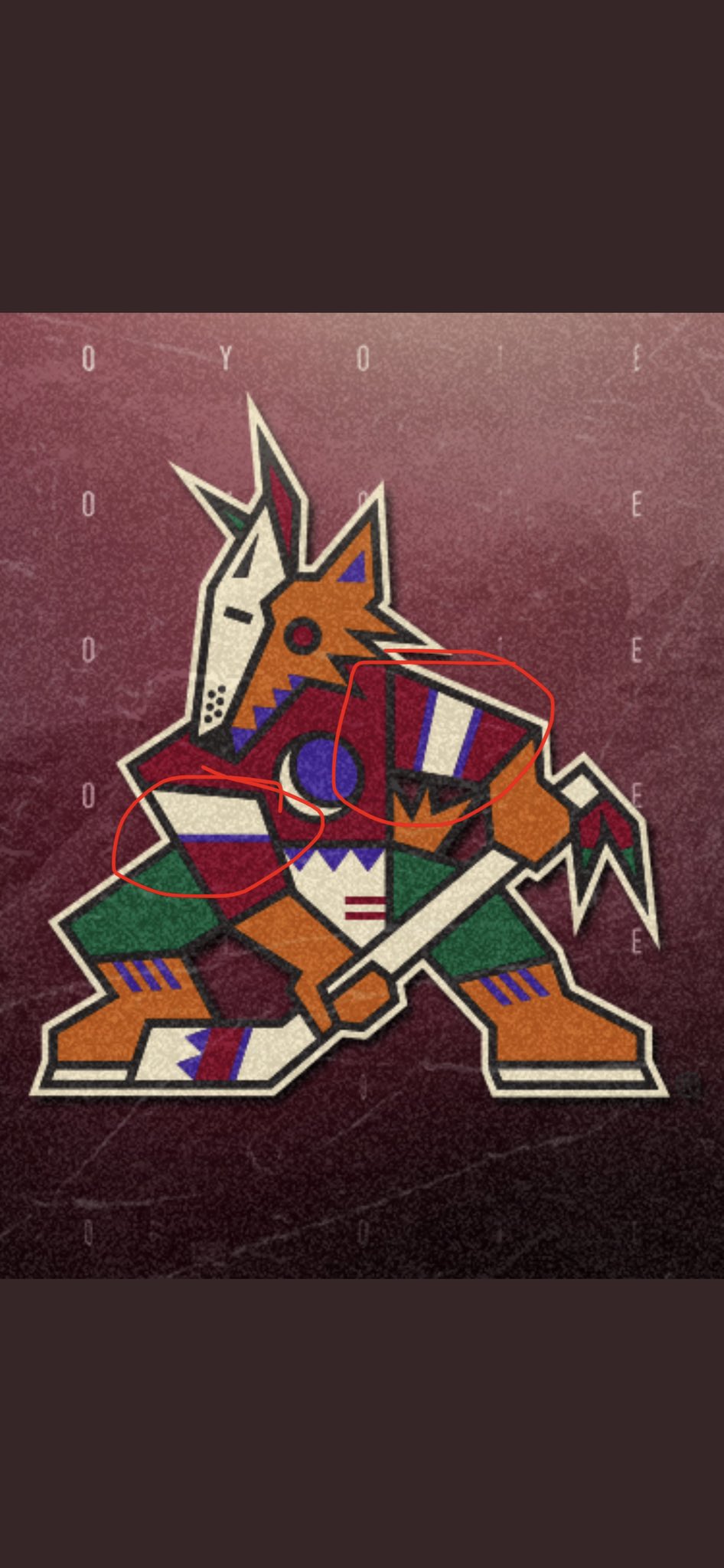
What bothers me is the Coyotes are actually using the wrong logo. Check the second picture on the tweet above, the pattern of the right arm goes Black/Beige/Purple when really it should be Purple/Beige/Purple as seen on the other arm. Like this:
And the Yotes are using the wrong logo on their Twitter icon and banner as well. I'm surprised nobody on the team notices that. Talk about inconsistency on the arm stripes SMH.
One more thing: The logo isn't outlined well too as the tail and right leg don't have the Beige outline.
-
4
-
-
The 60's and the 70's logo. (SOURCE)
-
On 7/21/2021 at 2:39 AM, packerfan21396 said:
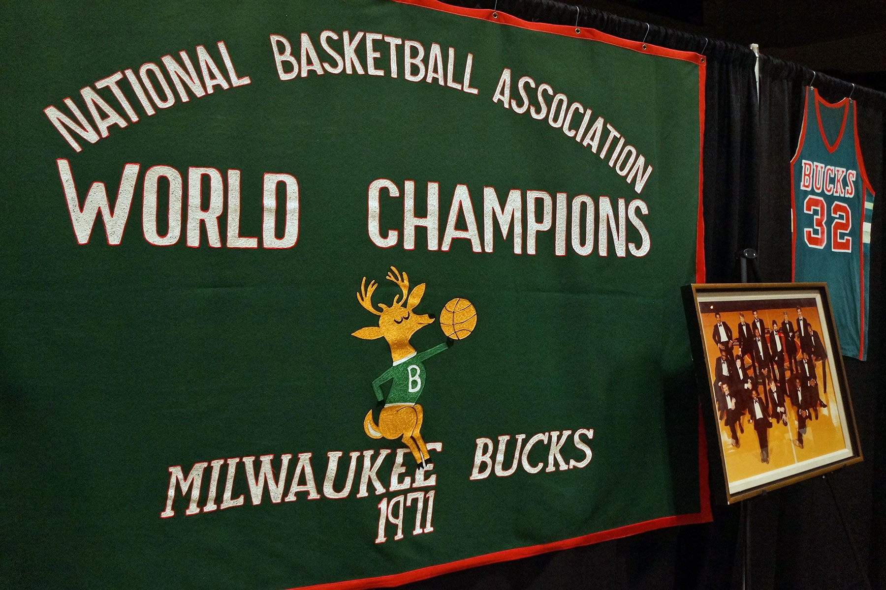
Bucks socials had a gif of the 2021 banner, so here's what the rafters are going to look like in Fiserv Forum next season:
Both banners look inconsistent. Sure, the 1971 banner is mirroring the original MECCA banner, but it doesn't mesh well with the 2021 banner.
They already changed font for the "NATIONAL BASKETBALL ASSOCIATION" and "WORLD CHAMPIONS" texts. Might as well flip the order of the "WORLD CHAMPION" text and the logo. And yes, the font for "1971" text has to be consistent with the "2021" text, too.
-
1
-
-
Mark Giordano wearing the white retro Flames jersey.
-
2
-
-
-
On 5/18/2021 at 11:47 AM, pepis21 said:
Correct me If I'm wrong but adidas already switched fabrics from climalite to aeroready and there weren't any sales at that time.
Yes they did. The Climate jerseys had the adidas logo tag in front (bottom right specifically).
The Aeroready jerseys didn't have that tag.
-
-
-
-
-
21 hours ago, Rockstar Matt said:
I still detest it. It goes against 50 years of Lakers’ history to have the purple jersey with yellow numbers and a white outline.I think it's time we see the purple jersey with yellow colors.
I mean we saw the Lakers' yellow jerseys with purple and white numbers.
-
1
-
-
TSN played me. Had I known they would unveil a new graphics package, I would have decided against posting the picture I posted a month ago. Anyway, here's the updated graphic:
I'm glad they modernized it. Looking at you, NBC and Sportsnet/CBC.
-
3
-
-
15 hours ago, prof said:
The Lakers, however, decided to hang the banner already at their practice facility.
-
1
-
-
On 12/10/2020 at 12:57 PM, Digby said:
I've thought the same! Use that navy as an alt, cook up a white version and a regular blue version. Also make the side trim normal alternating lines instead of that weird tattered effect. It would be different for the Knicks, but still fits into their general look.
I kinda like the normal alternating lines. Makes the uniform original, design-wise, from other established uniforms.
-
-


/cdn.vox-cdn.com/uploads/chorus_image/image/69614967/1310674213.0.jpg)


Unused Logos and Uniforms
in Sports Logo General Discussion
Posted
Anaheim Mighty Ducks Prototype
SOURCE