

TheRealPepman
-
Posts
1,365 -
Joined
-
Last visited
Posts posted by TheRealPepman
-
-
On 10/1/2022 at 1:14 PM, DTConcepts said:
Double posting to express my disdain for the fact that the Arizona Coyotes don't use the kachina pattern on their socks.

I can understand that the technical limitations of the '90s made it so the original kachina uniforms couldn't feature the pattern on the socks, but I think it would make the jerseys so much more consistent looking nowadays.
They should've for sure. I mean Tampa has socks like these:
-
 1
1
-
-
On 10/22/2022 at 9:36 AM, Discogod said:
The only time Allan Houston wore the Pistons' teal unis - he'd sign with the Knicks a couple of weeks later.
Reminds me of two Phoenix Suns instances: Caron Butler (2013) and Kelly Oubre Jr. (2020)
-
 1
1
-
-
On 10/20/2022 at 10:04 PM, the admiral said:
They changed the NHL on Sportsnet theme last year and I missed it.
It feels like they were like "what is the acceptable maximum amount of Rap Matlock we can do for hockey" and this is exactly how much Rap Matlock. You can have a little as long as an Imagine Dragons guy comes in and says something about "fighting for the thrill of the crowd" and then no one feels threatened.
It's a real song too:
-
1
-
-
Does anybody know if there'll be Earned uniforms for this season? Or is that series gone for good?
-
Looking through all the crazy logos and uniforms in 90’s made me wonder: had the Chicago Bulls decided to rebrand and come up with a wild-looking logo and uniform to complement it in 90’s with Michael Jordan and company, would it be well-received?
-
1
-
-
Seeing the modified Grizzlies court had me wonder: what's the rationale of putting some design on the all-spectator courtside portion of the floor? They look good but they'll never be seen on TV. That portion is usually reserved for some text or a logo placed in the middle.
And by Grizzlies' designs, I mean (credit to Kodrinsky and LockerVision):
-
4
-
-
7 hours ago, riccirulesall said:
why not unveil it like it was intended? I don't see how a leak should affect the process that much. release professional photos/videos of the entire uniform and get out the information to people who aren't in the loop at all times of potential leaks. maximize excitement and audience for the ultimate goal of jersey sales and money
Fair point, but surprises during unveilings still hits different.
-
1 hour ago, DTConcepts said:
well that was a very anticlimactic jersey unveiling
That's what we get for the jersey being leaked so early. Leaks, admittedly, are nice and generates excitement, but sometimes it's gone overboard that a team can't get to launch a new jersey in an ideal manner.
What's the best way to deal with this then?
-
On 10/3/2022 at 1:55 PM, VDizzle12 said:
I will say that I never liked the giant white circle, but it feels like it's missing something.
Couldn't they have just left the inside white like this?
NBA Live 2003 kind of did that.
Looks nice.
-
5
-
-
@eibram, will those uniforms above count for your NBA uniform database?
-
Loved the Wolves' new alts so I decided to make a complementary court. Huge upgrade for sure.
Also added a touch of parquet because why not?
-
6
-
-
On 9/19/2022 at 9:51 AM, spartacat_12 said:
One of the things people hated the most was that Reebok pushed their new templates on teams, so there were a few who ended up with almost identical designs, just in different colours.
I'd like to agree, except we've seen instances of "same template, different teams" for traditional hockey jerseys. Like:
Ok, the positioning of some elements may be different, but they basically look the same so my point still stands.
-
1
-
-
11 hours ago, sayahh said:
76th, I believe, as the 75th festivities was postponed 1 year due to the pandemic, kind of like the Olympics.
I am aware. They just emphasized the season being the "diamond anniversary celebration" season so I was just following along.
Quite honest, I'm surprised they never put any "NBA 75" logo on 2021-22 floors unlike on the 50th anniversary.
-
1
-
-
On 9/22/2022 at 12:45 PM, Conrad. said:
Bothers me that they won't paint the other side of the free throw circle to its original color. I didn't whine originally when the Jazz did it a few years back because I thought it was just a one-time mistake. But hey, that's the norm now SMH...
-
7
-
-
What is the classic serif font featured on the "ATENEO DE MANILA" text?
-
Houston Rockets @ New York Knicks
November 25, 1995
-
1
-
-
Washington (inspired by their classic era court

-
After eight years, I've finally accepted arena logos on the baseline. I mean the NHL kinda does that right? Shout out to Boston:
-
1
-
-
The jersey number font used on the pictures below. Would love to know. Thanks in advance.PLEASE DISREGARD. I FOUND THE FONT. IT'S THE FONT SEEN ON 2010-15 LA CLIPPERS' UNIFORMS.
-
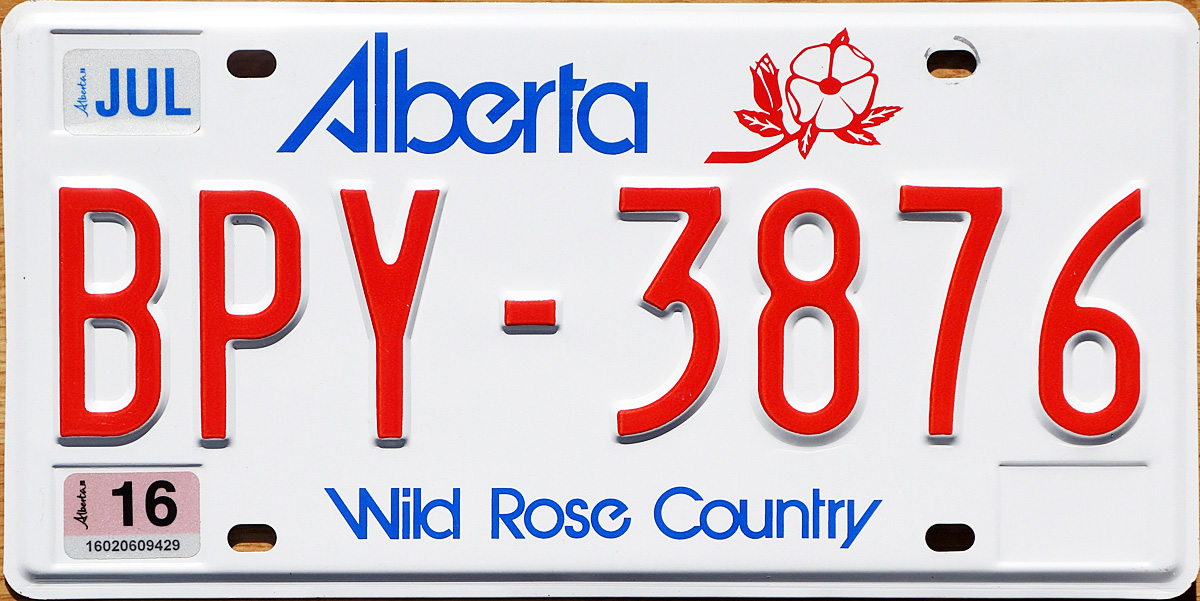
On 8/30/2022 at 1:26 PM, TheGiantsFan said:
ALBERTA
My Alberta design revives the jagged, retro wordmark that the province used on their license plates from 1984 to 2019. Complementing the angles of the wordmark is an abstraction of the mountains of Banff National Park, with each “peak” shaped like a map of Alberta. The provincial coat of arms serves as the serial divider.
---
I've only been to Canada twice in my lifetime, so I don't know too much about the Canadian provinces aside from what I learned in J.J. McCullough's YouTube videos. As I've done with the American plates, I'm opening up the comments to any design suggestions for any of the remaining 12 jurisdictions in Canada
")
Looking forward to this (relatively) quick series!
Please fix the image for the Alberta plate. I don't see anything. (I tried putting this link on two different browsers and neither browser had the image above show up.)
Thanks in advance.
-
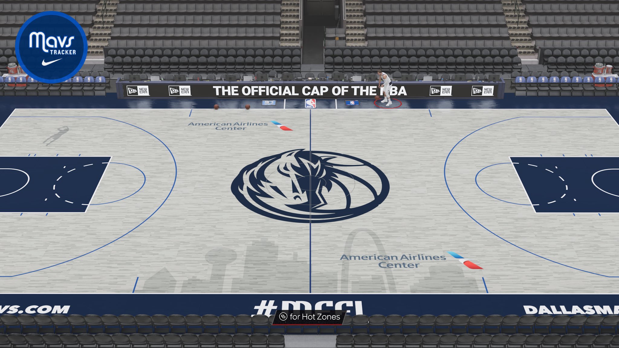
On 9/10/2022 at 7:58 AM, pepis21 said:
Indeed the floor is grey:
Dallas keeps changing courts every year and yet we have no idea who and what court was won on that 2016 design contest.
-
2
-
-
-
-
Perhaps my perspective was more from a fan's perspective. I'm just not wearing those 22-23 jackets unlike their previous iterations.
Didn't realize that. But really, all said and done, I prefer it clean like the 2017 ones.
/cdn.vox-cdn.com/uploads/chorus_asset/file/24008427/1341162585.jpg)


/cdn.vox-cdn.com/uploads/chorus_asset/file/19099196/court.jpg)
NBA Courts Tweaked by TheRealPepman
in Concepts
Posted