


monkeypower
-
Posts
4,720 -
Joined
-
Last visited
-
Days Won
5
Posts posted by monkeypower
-
-
48 minutes ago, Klondyke said:
Maybe someone here will know, have the Angels worn any type of throwback since their "LA" rebrand 20 years ago?
44 minutes ago, tohasbo said:Every now and then they break out the throwbacks for a game or two.
I think during the 50th anniversary season they wore throwbacks quite a bit.
They're worn plenty of throwbacks since the name changes.
During their 50th they wore multiple throwbacks over the course of the season (the California Angels version of the halo-hat and the Disney jerseys were not invited). IIRC from back then, each throwback era got a month and the related jersey was worn on Friday home games in said month.

Outside of the 50th, they've worn their '70s-'80s throwbacks a decent amount (especially in recent years), the '60s LA halo-hat at least once and even PCL "throwbacks" for good measure. The '70s-'80s throwbacks are supposed to be back this year too.
-
On 4/25/2024 at 8:40 PM, monkeypower said:
These are blue and not purple right? I'm not seeing incorrectly? Regardless, it definitely doesn't match the purple of the hats and belts (nor the logos nor the merch).
I have to assume this is UA not being able to produce the purple because the team did tweet something a while back about ordering purple jerseys.
The Berries also revealed a third set a couple days and I like these a lot.
-
 3
3
-
-
The Saskatoon Blades wore Berries jerseys earlier this season (same ownership) and these had more purplely purple.
-
2
-
-
3 hours ago, ORLMagic86 said:
No, they're purple. It's just a deep purple. Others have been asking the same question on the team's Facebook.
The team can call it "deep purple" in their Facebook comments all they want and it doesn't change the fact it looks blue.
But like I said, it also doesn't change the fact that it doesn't match the purple used anywhere else.
-
1
-
-
These are blue and not purple right? I'm not seeing incorrectly? Regardless, it definitely doesn't match the purple of the hats and belts (nor the logos nor the merch).
I have to assume this is UA not being able to produce the purple because the team did tweet something a while back about ordering purple jerseys.
-
3
-
-
The Riders will apparently have a fourth jersey in the rotation this season which will have three shades of green and use the logo that the team trademarked a couple years ago.
Not the official logo, but a colouring of the black and white logo found in the trademark application.
Per this article, the jersey, helmet and socks will all be the dark green.-
2
-
-
1 hour ago, Digby said:
I've always pushed for a retro ski vibe for one of the mountain-region MLS teams but it would work for hockey too. Maybe even better, as a winter sport. Especially at this current moment where REI-chic is still pretty on-trend. Maybe he got a focus group to tell him that the practice-jersey Jazz was simply too galaxy-brained to work.
I definitely think there could be something there, taking from something like these. It would fit the old-time hockey feel.
I've always thought the (New York) Jets should have branded around something like this but with vintage travel posters instead.
-
On 4/21/2024 at 10:50 PM, Sykotyk said:
St. Louis had a reason their fan support was so high. Same as Baltimore in the CFL USA debacle. Ufl/xfl/USFL should've done everything they could to get teams in Oaklandand San Diego and played into the same anti-nfl sentient that has presented itself in St. Louis.
As a non-watcher of this league, but still reads through this thread because I'm morbidly intrigued by the stories of the spring football boom and bust cycle (Will this be the one to finally work? Who knows?), it does seem like a mistake in going to existing NFL markets.
I understand it's a bit of a catch-22 of sorts of wanting to be in major markets in order to be considered "major league" and getting major league tv deals, but it doesn't seem like a great plan to be a lesser, professional and unrelated, football team in current NFL markets.
-
1
-
-
Yeah, the LDS officially ended the practice of polygamy back in 1890 and then the church leader disavowed polygamy before Congress in 1904.
Sects of Mormon fundamentalism, most prominently the FLDS, still practice polygamy but they aren't part of LDS proper.
-
-
Summer Collegiate Okotoks Dawgs unveil what they are calling
CityTown Connect jerseys.
It's an all-black version of their existing alternate jersey of a couple years, which I already wasn't a huge fan of, and I guess that hat is supposed to be a D in a wildly mismatching font? Really feels like they saw the Reds City Connects and said "we could make that work".
-
1 hour ago, LMU said:
Nah, he just went to go live on a farm and play all day with Pucky the Whale, Thrash, and Badaboum.
"Hello, Howler. Come and play with us. Come and play with us, Howler. Forever... and ever... and ever."
-
Not to make this thread even hotter with nothing new, what's everyone's thoughts on this logo that came with the new Jets set of logos?
I want to like it and I think it's clever but it might just be too minimalist?
-
5
-
 1
1
-
 1
1
-
-
I was just looking through the online shop, and while I'll wait until closer to the season for the dust to settle and potentially more options to show up to actually buy things, I'm second guessing which items are new and which are throwbacks from previous years.
-
Another name I could potentially like would be the Utah Raptors because a Utahraptor is an actual dinosaur... but that just ends up with the same issues as Grizzlies with a different NBA team.
-
While I was never as anti-previous Jets set as some people, they definitely became dated very quickly while these new old ones are classic football uniforms.
Here's the rest of the logo slick.
-
18
-
5
-
 4
4
-
-
It's weird seeing some of the discourse this is stirring up. People crying "but Auston Matthews" and "will someone think of the women and children...'s hockey programs". There's only so much money loss people can take.
There have been some positives in terms of grassroots efforts with the Coyotes but it's like people have forgotten (or just aren't aware) about just how moribund of a franchise Coyotes have been for their existence.
-
The person who posted those Jets jerseys on the subreddit said in the comments that they created the graphic based on what they were told about the uniforms and also created the various combinations themselves just to show off everything and fill out the graphic. Neither the combos nor the graphic are official.
This is what else they said.
QuoteI was given a detailed explanation of the designs of each element: jersey, pants, helmet, socks. I wasn’t shown anything but I know they match the template of the NY sack exchange throwback from last season with the exception of outlines on the numbers for the black uniform. Apparently white block without outlines made them have basically no green and that didn’t feel like the jets. Flat green numbers would be similar to the old 49ers blackouts and the numbers didn’t contrast well on those.
Quote“Jets have three sock options, all one-color. White, black, green.”
“last year’s throwbacks are untouched. Same template is being used on the home uniforms which are green. They’re a one-for-one copy of the NY Sack Exchange homes, just like the throwbacks last year that will be used for the always top now. So green sleeve cuffs with white stripes, white collar. Black jerseys are green collars and white stripes, black sleeve cuffs. White numbers with green outline. Didn’t feel like there was enough green without the outlines I think.”
“three options on pants. White pants used last year for throwback staying, and they’re being flipped green/white on the same template for a green option. Black pants have a white stripe. No green. Don’t love that there’s no green, but they wanted continuity with the top stripes not being outlined?”
“throwback helmets remaining the same. The black helmet is the same as last year, facemasks and all, but they’ve switched out the bumpers and they’re putting a white jets logo with green outline.”
-
1
-
-
Quote
The league sent a memo to its Board of Governors indicating progress in talks to move the team to Utah, but several sources warned to be careful about making any absolute proclamations. “There is a lot that needs to be done,” one said, although it is clear this is a major priority, with maximum effort and speed utilized to reach a finish line.
QuoteThe NHL is working as the broker, handling negotiations with both current Coyotes owner Alex Meruelo and prospective Utah steward Ryan Smith. Initially, the hope was to let the June 27 auction play out, but two concerns emerged: first, about what would happen if the Meruelo lost the auction, and second, the possibility of three more seasons at Mullett Arena. There wasn’t much enthusiasm for the latter.
Multiple sources indicate a real scenario is Meruelo being paid $1 billion for the team, and Smith paying $1.2 billion to purchase. But the real key is what the NHL will promise Meruelo to avoid this ending up in court.
QuoteThose same sources indicate he could be offered a five-year exclusive window to “bring back” the Coyotes as an expansion franchise — although there would be certain language stating what would need to be accomplished for him to return. (The league definitely desires a return to the market if it leaves.)
Obviously, there is a lot that still needs to happen, but a move is gaining momentum.
-
2 hours ago, Mr. Krabs said:
And remember in 2007, the Canucks started the playoffs with their regular navy blue orca jerseys for their first three games at home (including the legendary Game 1 in 4OT), and then switched to their retro stick-in-rink royal blue jerseys for the rest of the playoffs starting with Game 7 against Dallas. So they, and the Sabres that year, broke that rule. Were they ever disciplined in some way for it?
I seem to recall that somebody here found an old article that made an off-hand mention of the rule coming in sometime after 2007, so the rule wasn't in place yet.
-
1
-
-
1 hour ago, BBTV said:
I think that's been a bit of a controversial subject on these boards for years, with a slight majority favoring dropping white. I really don't know that there's any team that needs a white outline on their gray uniform, or that looks better with one than they would without. I'd be fine with the Phillies dropping their white, although it's been less obnoxious since the "standardization" of 2019.
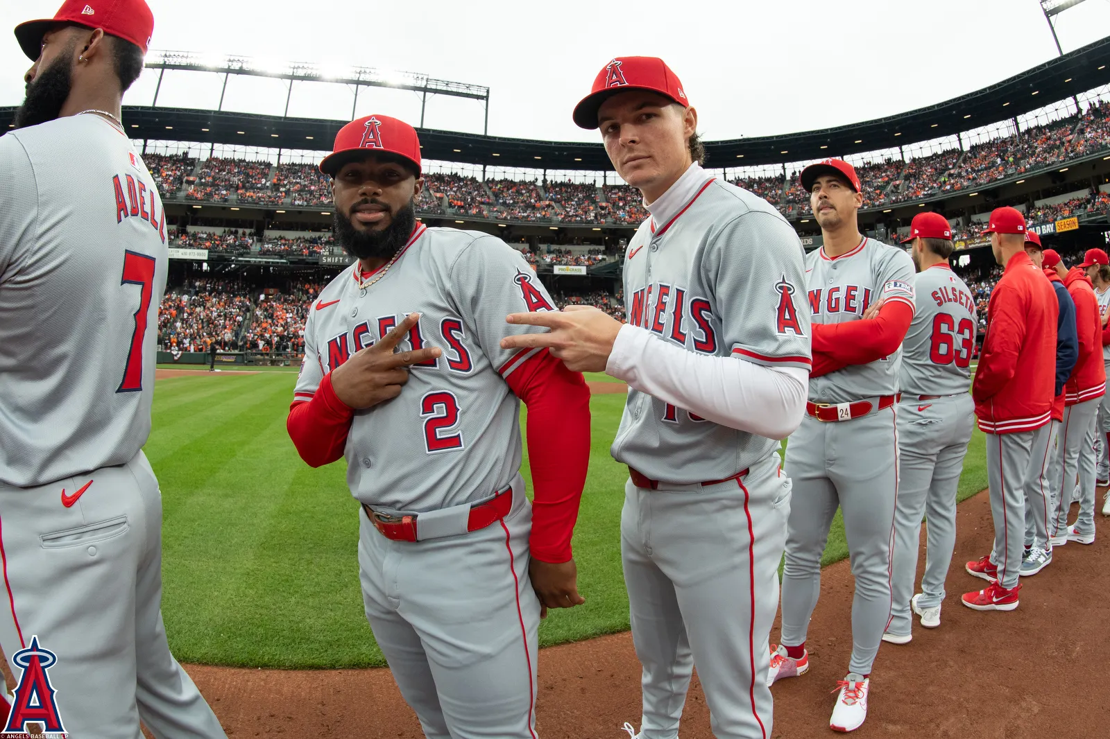
I think the Angels do and you can see it in these new jerseys where they, for whatever reason though I do have a theory why, added the outlines to the front number but not the back.
Maybe it's the fact that the red and blue shades are both dark on a grey jersey making it look drab but I think the white adds a pop to the numbers. Plus now it matches the outlines on the script whereas none of the numbers on the white nor the greys previously ever did. However, now it's only slightly less inconsistent and the red jerseys numbers don't match anymore, so one step forward two steps back.
I also think the Reds post-Big Red Machine greys look better with the white outline.
-
3
-
 1
1
-
-
3 minutes ago, FrutigerAero said:
No sport owns Easter cuz it moves. You don't have the "all families inside, during the cold" aspect of Thanksgiving or Christmas or NY day. I'm Christian and so remembrance of the resurrection isn't something that leads me to want to celebrate the day with sports. Obviously everyday sports like baseball are going to have games, which they should but I can't see it being a special draw to anyone who places significance on the date, and for those who don't as much, it's just another Sunday. Not a three-day weekend.
Mothers' Day and Fathers' Day would be more interesting to talk about, since Father's day totally should be something baseball can capitalize on.
My local summer collegiate team, the Okotoks Dawgs, have their Father's Day game as one of their premiere games along with Opening Day/Weekend and Canada Day.
-
1
-
1
-
-
3 hours ago, BBTV said:
BLUE COLLAR, because marketers will have you believe that every city is BLUE COLLAR and that everyone in every city BRINGS THEIR LUNCH TO WORK IN A PAIL. If you'll excuse me, I'm off to my management job in a downtown office building where I'm going to post on blogs about how certain athletes aren't "philly guys" because they're not BLUE COLLAR like me. Hopefully my assistant doesn't disturb me by bringing me my coffee while I'm in the middle of posting.
The brown remains unchanged.
-
I posted that Hurricanes image in the 24-25 thread before because I didn't know where to put it and mentioned there was someone in the Hurricanes subreddit who said they got the email said it felt more like a concept testing phase with the accompanying questions asking things like "do you like a stylized letter with team colors/concepts like Calgary’s ‘C’ or script words like…"


AHL/ECHL/Minor/Junior League Hockey Changes
in Sports Logo News
Posted
I saw this a while back but forgot about posting it.
In a reply, he says the jerseys were intended to look like the updated version from the beginning but doesn't state a reason why they didn't look like that last season. The mascot version and the replica jerseys used the now-current NOB and numbers which I thought was a mistake (due the thirds not being unveiled until late in the season and CSEC burning off old stock as the Hitmen have used this NOB and number style for one-offs in recent years) but it turns out the on-ice version was apparently in the wrong.
I do think they missed the opportunity to use the classic Hitmen font though.