


B-mer
-
Posts
1,730 -
Joined
-
Last visited
Posts posted by B-mer
-
-
1. love NCAA Hockey concepts, so it's fun to see your work
2. GIMME A U! GIMME A N!!! GIMME AN H!!! WHAT'S THAT SPELL? UUUUUNNNNNNNHHHHHHH! (UNH alumn, what's with the UNH hate?)
-
Here’s another swing at this with a slightly different approach. Made on my phone while killing time with power outage. I like the color balance with these and also how the logo pops off a black jersey.

-
 1
1
-
-
What do we think of a black home instead of the red?
-
3
-
 2
2
-
-
Today I travel back to 2015 and the Coyotes' new uniforms. There were elements I liked from that, but overall execution was off and I feel like the tried to hard to shoehorn in something that referenced their past while missing the mark in doing so.
Here's a slightly different approach, using a new southwestern pattern (borrowed from the Tucson Roadrunners) which also brought the sand color back to the uniforms.
-
4
-
-
Saw this app JerseyStudio posted by someone on Instagram so I downloaded it and it’s pretty fun. Great to at least capture ideas in the moment. Has some limitations but all in all fun.
Here are two choices for the Kings. I’ve always wanted them to go back to purple, black, silver, but I’ve seen plenty say they’ll never switch from black and silver as long as Robitaille is running things. So with that, here are two options, not ground-breaking in any way, but each tie in their design history. I brought the crown back to the forefront and used just the lion from the coat of arms logo for the shoulders (the image is from a hat and pulled on my iPhone so quality is funky).
ARE YOU TEAM PURPLE OR TEAM BLACK?
-
1
-
-
another idea i've had since the Edge days when they added the phantom yoke was to give it a couple of edges to mimic the shape of the logo. Not sure if i did it that well but maybe this template isn't the best to show it in that spot. The notches or points would be on the side just above each arm number.
-
I made these to give the Canes matching jerseys and also blend the current red jersey and previous white into a new set. I’m sure many won’t like the phantom yoke on the home, but for some reason I always felt it worked for them as an element from their logo in a way.
-
3
-
-
Alright, this got away from me and I don't know if i'll follow the poll idea, but i made something today.
The Tampa Bay Buccaneers
-
3
-
 1
1
-
-
OK, i think i settled on the road jersey, now i'm trying to figure out the logos. Do i want to stick with script or keep the roundel? And at that which versions? Single color script vs. multi, aviator roundel vs. navy?
-
2
-
-
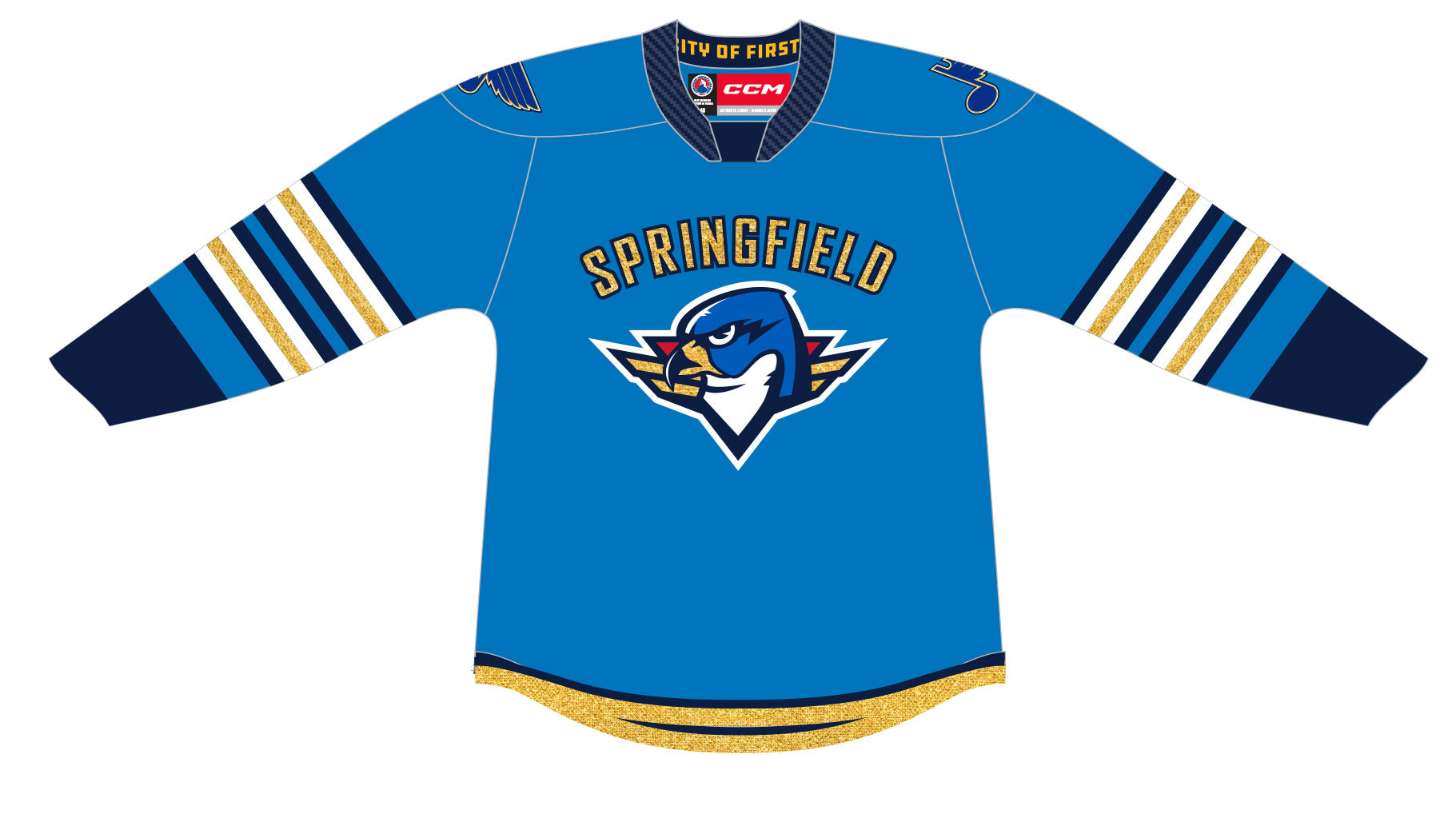
just playing around with the Jets some more. I started down this road because i really like the AHL Springfield Thunderbirds alternate, and in playing with that design i figured it suits the Jets as a tweaking of their current set. Anyways, i struggled with the white having the same striping arrangement, so instead tried this where it's a direct connection with the home version. Honestly i like the Navy and Aviator versions the most, so deciding which would be the best Home jersey and then trying to match a white one is where i'm struggling. Thoughts?
-
1
-
-
Love the Royals jersey, agree on the numbers. Gimme something like this for the Lightning.
-
1 hour ago, AHcreative said:
I'm aware, that's why I asked the question. OPs post never mentions "forum blue" only "blue." I was wondering if that was his inspiration.
oh, i didn't pick up on your question. I only mentioned making the silver a little bluer.
-
I typically lean towards forum blue, silver, black but wanted to try this route for once. I felt like moving silver up on the hierarchy would be a way to update their traditional look.
-
1
-
-
I guess i'm torn on the arm stripe positioning. Could go this way too.
-
1
-
-
I actually got the inspiration from this by seeing, or rather mis-seeing, the Devils alternate in a game highlight on my phone with the brightness down and early in the morning, and thinking the jersey was different. Anyway, here are the Kings with a standard Kings design, using the silver a little more prominently. I made the silver slightly more blue as well, and used the lion from the coat of arms logo for the shoulders. The hanger effect was just for laughs.
-
3
-
-
Full set with Home, Road, Alt, and also Reverse Retro.
-
4
-
-
Breaking News! The Seattle Thunderbirds/Totems (I still can't decide on which works best for this) have released their new alternate uniform. Incorporating design elements from Seattle sports history, this new uniform represents the city and community. The 'seattle' wordmark ties back to the Seattle Pilots, the curved chest stripe harkens back to the Seattle Supersonics, and an embossed pattern with a Pacific Northwest S glyph on the main stripe and back numbers.
-
4
-
-
So I have another idea to tweak the last concept I will post tomorrow when I can mock it, but I did also make a potential secondary logo. I saw an older concept that did this same idea with the eagle head and was both impressed and disappointed in myself that I never saw this idea. I did the navy and red part of the star differently and may still tweak it a bit.
-
2
-
-
20 minutes ago, jdavidev said:
The red dominance of the road jersey from the first set kind of feels off.
The 2nd set looks really good, but it very similar to the Panthers main set.
The third one is good (can it be on the grey background to have the colors stand on their own?), though I'm not a fan of that logo. Maybe the new capitals script could work there,
For the logo i wanted to move away from the script, so either the Weagle or the W/stars like in the second set, and i could really go either. I like the Weagle for a more modern look and i thought it went well with the "wings" from the shoulder yokes.
-
I also kind of like this design. I know it's basically what the Wild are doing with their RRs and new alt, but it works well for the caps too.
-
5
-
-
and you know what, i like these too...
-
3
-
-
And the Alternate for this set.
-
2
-
-
Not a lot to say for this one. Based on their pre-edge alternates but cleaned up with new color scheme, W-eagle replaces the wordmark, and a call-back to their original uniforms with the pants.
-
5
-
2
-
-
Going to give this the weekend to end voting. Need some more votes.
So far we have:
- Twins (MLB) - 1
- Timberwolves (NBA) - 1
- Vikings (NFL)
- Lynx (WNBA) - 1
- MN United - 2
- Saints - 1


NCAA D1 Hockey Concepts -- Wisconsin Badgers & Yale Bulldogs (64/64)
in Concepts
Posted
Great job on UConn. Without reading the description I knew you tied the design to the basketball team, and it's completely identifiable as UConn. Also love using the huskey primary instead of a wordmark. Small detail i might adjust is the pants stripe to not go as high up. On the basketball shorts you have a tucked in top to allow visibility, and with a hockey jersey it would cover up the top portion. May make it only halfway up the side of the pants so it's still visible.