


Quillz
-
Posts
3,044 -
Joined
-
Last visited
Posts posted by Quillz
-
-
Interleague play has been around since 1997, so at this point, I believe every MLB team has played the other at least once.
-
 1
1
-
-
Which is one of the reasons ads on NBA jerseys is awful. Because unlike soccer, there are breaks (too many).
-
I don't like the Steelers logo.
-
4
-
-
56 minutes ago, insert name said:
This is the cap the Indians should be embracing. If they started using this as a primary cap, there would be zero complains.
I agree. Not only is it far better than the block C they are using now, I can't think of any other team that has an I monogram, so it would be unique.
-
2
-
-
As long as we're talking about league-wide retirements, I'm still not sure Gretzky was really deserving of the honor. I understand the reasons for Robinson, that he largely transcended baseball. But Gretzky... he was just a really good player. But so was Michael Jordan. And so was Dan Marino. I realize that Gretzky was effectively the MVP's MVP, but he simply didn't face the same kind of adversity Robinson did.
(And for the record, no, Jordan's #23 should not be retired league-wide, either, no matter how much LeBron might say so.)
-
6
-
-
Here's one that might really piss some people off... I've never liked the Raiders logo. At least, not as a helmet logo. I pointed out in another topic that I just find it way too busy, has too many tiny details that are basically invisible at small sizes.
I really like how the Vikings cleaned up and modernized their classic logo. They thickened the lines, removed a lot of unnecessary detail, to produce a logo that was nearly identical yet worked much better at various sizes. Or look how the Florida Panthers managed to do the same with their (now alternate) logo. I really think the Raiders could stand to do something similar, especially with the impending move to Las Vegas.
-
1
-
-
12 hours ago, Ben in LA said:
I wish the Dodgers would have a set schedule of when they'll wear their road primaries and their alternates. When I head to Dodger Stadium South this year I want to be wearing the same road uniform that's being worn on the field. Sure, the Padres have a lot of uniforms, but at least the fans know when they'll be worn.
Oh, and I prefer the Los Angeles script.
I'm really surprised the Dodgers don't have a set schedule given how traditional they're more or less remained. I often cite the Lakers as a good example of how to do things... Whites are worn at home every Sunday and holiday, so there's never a question of when. I'd like to see the Dodgers do something similar. A good example to follow might be the Royals... They do colored jerseys during day games, dark blue at home and light blue on the road. Maybe the Dodgers could adopt something like their "LA" road jersey for out-of-state games, and their "Dodgers" road jersey for in-state games.
-
My thoughts on the socks have always been consistency. I don't really mind either look, as long as the entire team does the same.
-
2
-
-
Just now, the admiral said:
People have said the same thing about another team of mine, the Chicago Bulls, and I've watched the Concepts folder go 0-for-forever on both.
I like the '90s 49ers set a lot. I like the classic 49ers set even more.
The difference, IMO, is that the Bulls logo was already very sharp and well-designed. Even today, it doesn't have lots of extraneous details that get lost when being resized, embroidered, etc, which happens with the Raiders logo, largely because it's a fairly complex logo (text, a shield, a raider, etc.)
That said, on the same subject, I do think the Bulls logo could be tightened up a bit, again, similar to what the Vikings did with their logo. I've seen some good concepts, but most go too extreme and attempt to make the bull look more fierce or aggressive.
-
I really think the Raiders logo could stand to be cleaned up and modernized a bit. Much like the Vikings old primary, the Raiders logo has lots of intricate little lines and details that just don't look good at various sizes. The Vikings did a great job of modernizing their old primary, keeping the same general look but tightening up the lines, leaving out some unnecessary detail... I think the Raiders could do the same.
-
3
-
-
14 minutes ago, pianoknight said:
The layout is like Buffaslug knocked up the new Buccaneers jerseys.
Sarcasm aside, I HATE that quotes are no longer contained within a border. It looks like every new poster is saying the EXACT same thing since you can't distinguish between quoted text and the new reply.
Sorry guys, it's barfy.
Chris stated they were doing some work on the CSS. The stock IP.Board setup doesn't look much different from 3... Quotes definitely still appear in their own box. If they don't, then the skin was modified so they intentionally appear that way.
-
5 minutes ago, wildwing64 said:
Same here. At the moment everything is taking up way too much space on screen compared to before.
I'm also not a fan of circular avatars, but if this is something that can't be changed then I'll live.
It's a skin setting on IP.Board 4. Each skin can have circular or rectangular Avatars. I prefer rectangular, myself.
-
5 hours ago, CC97 said:
When was the last time the boards were upgraded? 2012? 2013?
We upgraded in July 2015, the last major upgrade (which this would fall under) was in 2013
Will it be possible to alter your user name / display name? Mine is just my surname; but I would like it to be my full name.
And, to reprise my earlier question: will it be possible to follow a thread on the mobile interface?Unlike the main site I have nothing to do with the coding side of things on the forum, it's basically whatever features the people at Invision Power decide they want to include. So, unfortunately at this time I do not know the answer to either question, I'm hoping it's yes to both, I'm looking forward to playing around with the new features.
It's been possible to allow username changes since IP.Board 3, there should be a setting that you can enable to allow members to do this.
-
I know a rebrand is inevitable, but I think the ram head logo is great and should stick around. Just recolor it.I agree about those Cavs uniforms; im in the minority when I say I love my NBA unis to be a bit "plain"...or clean in this instance. The blue alternate's lettering needs to be fixed IMHO though.
Speaking of thing out of Cleveland, I'm okay with the Rams using the St. Louis colors for a few years until their new stadium is built. I waited 21 years for the return of the team; I can wait three years for a new logo and uniform set.

-

Speaking of Jaws..... here he is as a Dolphin.
Here's Jaws in the wrong uniform (his first team) and the wrong number (just like above as a Dolphin).

Speaking of Jaws..... here he is as a Dolphin.
Here's Jaws in the wrong uniform (his first team) and the wrong number (just like above as a Dolphin).
You know, looking at this beautiful uniform, I'm thinking you could post a picture of the current Rams team photo and make an argument that the team is in the "wrong uniform" (meaning they should switch back to these classics full time).
These are going to come back next season when the Rams are back in Los Angeles.
is what I wish I could say, if it were a perfect world
-
 Nike Seahawks Vs Pre Renovation Vikings
Damn, wish I was at the first NFL game to ever feature flying players.
-
3
-
-
It would get too confusing with the Kings, the Lightning, and the Brooklyn Nets Hockey Department.The Blackhawks should have an alternate uniform based off their original look, with just black and white.
The Kings should go back to purple and gold. Never cared for the Raiders colors. Or at least bring back the black and purple.
After two Cups? Probably not happening.
Besides, it's not like the other options are any more original. They can look like the Lakers, the Raiders, or the Sacramento Kings.
They had the purple and gold before the Lakers, though. Although yes, it would certainly feel like the other way around. But given how many black/dark teams are in the NHL, going back full-scale to purple and gold would certainly have them stand out.
And I really hate they won 2 Cups now with current "home plate" logo. The previous one, with just the crown, was so much better. I wish they didn't move away from it (or shrink it on the current home plate).
-
It would get too confusing with the Kings, the Lightning, and the Brooklyn Nets Hockey Department.The Blackhawks should have an alternate uniform based off their original look, with just black and white.
The Kings should go back to purple and gold. Never cared for the Raiders colors. Or at least bring back the black and purple.
-
I like baseball uniforms that feature a chest logo more so than a script. The Yanks, Reds, Tigers and Nats come to mind. Other teams, such as the Giants, Royals, Padres, Blue Jays, have this as an alternate or batting practice jersey. I also like the number placement being slightly lower on the other side, similar to how the Nats do it. I dunno, I just think it creates a nice, balanced look.
I also like how some teams use NNOB for the home jerseys but NOB for the road jerseys. The two that come to mind are the Giants and Red Sox. The Giants do it right... They alter the placement of the NNOB numbers so it looks aesthetically pleasing.
In both cases, I would like more baseball teams to do this, even if it was alternate jerseys.
-
So I was asking before about the Royals using a thicker variant of standard MLB block. But now I've noticed that the Tigers seem to be using a thinner variant of the block font used by the Yanks and Braves. Are my eyes deceiving me, or do they really have their own custom variant?
-
The black was unnecessary, but I do like the captain patch near the shoulder. Wouldn't mind seeing more teams do that.
-
1
-
-
I think the original Mets cap logo

is much better than the current cap logo
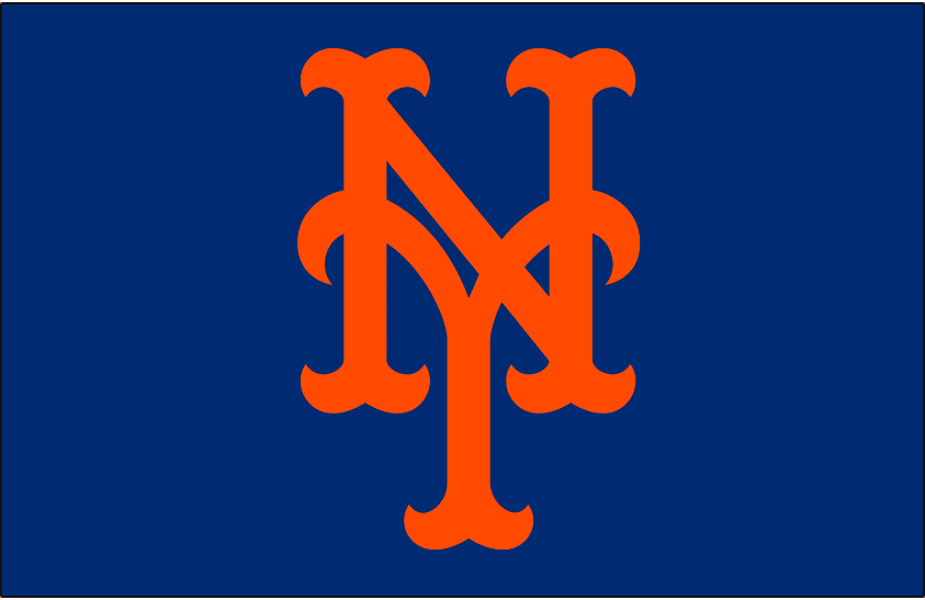
Something has always bothered me about the current cap logo, and looking at the old one, I think it's that it's too narrow. The old logo seemed to be slightly wider and better proportioned. The newer logo just feels squished and more cluttered. I almost feel like they should have been reversed, because the older one just looks better to my eyes.
-
2
-
-
I think a lot of the "artifact title" teams have now had plenty of history in their current locations that their name doesn't sound "wrong" anymore. Jazz, Lakers, Dodgers, etc. None of those names really make sense, but it doesn't matter. All have become established.
-
2
-
-
Is it an unpopular opinion to think the Phillies looked best during the 70s-80s in their maroon and white jerseys? I especially liked the "P" logo, and maroon isn't a color seen anywhere else in the MLB right now.
I agree as well. The powder blue road uniforms though? I don't know...
Yeah, I'm not big on powder blue roads, especially for teams that aren't really "blue" like the Phillies. But the more I look at their current identity, the more I feel it's just rather bland. The "P yin-yang" or "P-ball" logo, whatever you want to call it, still looks pretty good today and was a cool identity to brand around. And the red they have on their current jerseys just seems like a generic red that many other teams use. But no one before or since has used maroon, and the Phillies could have owned it the way the A's own green. At this point, doubt it will ever make a comeback, but it would sure be nice. Although I guess they felt those jerseys looked a bit too much like the Reds.

Unpopular Opinions
in Sports Logo General Discussion
Posted
Based on his post, I was under the impression he is aware there is a literal connection to the steel industry, but it's very easy to overlook, especially on first glance.
Consider this... How many random people do you think would know that a. the Steelers logo is based on the steelmark, a logo that is not seen all that much on a regular basis and b. the colors are not random, and actually have meaning? I would hazard a guess most random people would be unaware of either, which I think is what he was trying to say when he suggested the Steelers logo is "middling."
As for me, I just don't really like the logo to begin with. It almost strikes me as too generic. You could take away the "Steelers" text and give the logo to a team named the "Stars." It's an iconic logo, but there are some things about it I have always disliked.