


Discrim
-
Posts
10,844 -
Joined
-
Last visited
-
Days Won
2
Posts posted by Discrim
-
-
Unpopular opinion: I usually hate when the minor league affiliate of a team uses the same name as the major league team. To me, it's a major turnoff as a fan of that team because I see it as if I am rooting for a team that has no meaning but to provide players for the major league team.
Agreed, in most cases. Every now and then, there are some gems, like the Santa Cruz Warriors, Daytona Cubs or the old Orlando Cubs. Poor cases tend to look like MLB hand-me-downs, and in the absolute worst case scenarios, you're akin to the old Williamsport Cubs, who had a really lame cap. As in managing to surpass the Iowa Cubs' longtime caps in lameness.

I'd much rather the Houston Rockets go back to Red & Navy, as opposed to Red & Yellow.
As long as the Hawks went back to red/yellow....I do feel the Rockets could've made the red/navy/gunmetal scheme work had they gone with a more conventional uniform that was predominantly red. In retrospect, I'm somewhat surprised the late 90s set lasted as long as it did.
-
the late 90s Blue Jays set wasn't that bad, I long thought it'd been an overall tasteful take on their longstanding look. As opposed to what replaced it, the Black Jays set that aesthetically had so little in common with what came before it it may as well have belonged to a completely different team. Granted, they may have played the "we're Canada's team" angle a bit too hard (especially since the Expos were still around), but there's no way this matched the Black Jays set in tackiness.
-
 1
1
-
-
Here goes one I meant to release a few months ago, but an impromptu hiatus got in the way

Anyway, Youngstown State
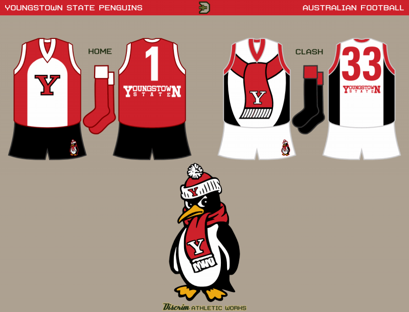
Decided to forgo a third here, so I only have the first choice of red with a white penguin stripe, and black with a penguin stripe + a red scarf. I know one thing, for the young'uns around here, I got a few fond memories of when Youngstown and Marshall were battling for the 1-AA championship in the mid 90s, which ended when the Pens' level kinda fell off and Marshall moved to 1-A.
-
Ugh. I'm not sure if this is an unpopular opinion or not, but all 3 primary colours should not be used together. It almost always looks bad.
South Australia in general, and the Adelaide Crows in particular, would beg to differ.

-
A hall of fame, eh? Sounds like a good idea....seconding eriq_jaffe, Roger Clemente and AAO. Hell, I'd recommend voting ColorWerx in. Granted, he doesn't have a huge project thread. Hell, his Nets alt concept this past summer is one of the few I recall him ever posting. All that said, though, this won't be complete without the Most Colorful Man in the Logoverse. I mean, who the hell else can you turn to when you wanna figure out the difference between the "Texas Tan" of the Durham Bulls and the Texas Longhorns' Burnt orange? There's gotta be a "contributor" wing or something, you know?
-
Thanks mamiller and lancelot...for Akron, yeah, it's a printed zipper...if not for my own impatience, I probably would've tried my hand at working it into an actual zipper, but seeing as zipper-front baseball jerseys nowadays are mainly museum pieces alongside leather helmets, belted basketball shorts and laced jumpers, it is what it is. Tech, the last time I did em the home was white with the gold sash, I figured why screw around with a good thing? Can't remember what else I considered for the clash, but the RL result would likely be somewhat more subtle in practice, what with the use of a slightly darker gold, rather than either white or blue for the hive lining. The fauxback, yeh, that was the one I put most of my thought in...I couldn't see myself completely forgoing hoops here, so it was a dash of the thin hoops that were popular in 1880s-1890s English soccer (though mine are admittedly a tad beefier than theirs, but thinner than modern hoops), a hint of Fitzroy from the same era with the chamois reinforcing, and a numberplate to round it all off.
Now for a few I meant to release earlier in the day, but things happen, and it's only just now...first up, one of those more obscure D-1 schools almost nobody posts concepts for in any sport, Stony Brook
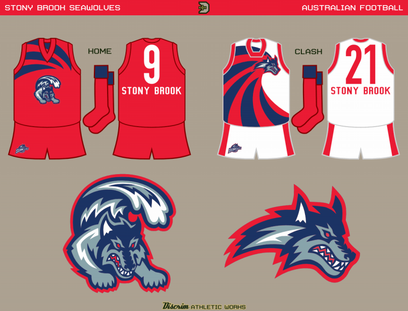
Nowadays, SBU uses a more nondescript SB monogram more often than anything else, but I'd liked the wave/wolf for a while now, and finally got around to using it. Both jumpers have a wave theme, somewhat similar to Gold Coast, though not as detailed, admittedly.
Yet another that rarely sees much use in concepts, Western Carolina
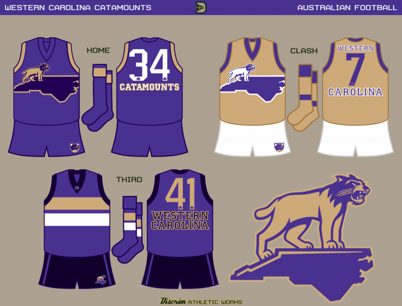
WCU used to have one of those identites that seemed to be trying too hard. At what, I still wonder in a car wreck kind of way. So I was a bit late to the party in finding out about their upgrade. The big cat standing atop North Carolina seemed like something I could center a jumper around, so with a slight modification, that's what I did.
WesternFootscray's design is the basis for the third, simply because it's one of my personal favorites.Finally, some little school down in Austin...
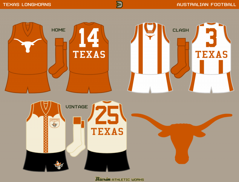
If UT had a footy squad, their first choice would more than likely look something like this. Aside from the longhorn, burnt orange from neck to toe. Burnt orange braces adorn the clash white, while the fauxback here, like GT's, borrows from the 1890s, off white with cowboy shirt-style reinforcing, and the added touch of a pocket on the chest, an idea I got from the 1900s St. Louis Browns.
-
Some new rags for ya...first up, Akron
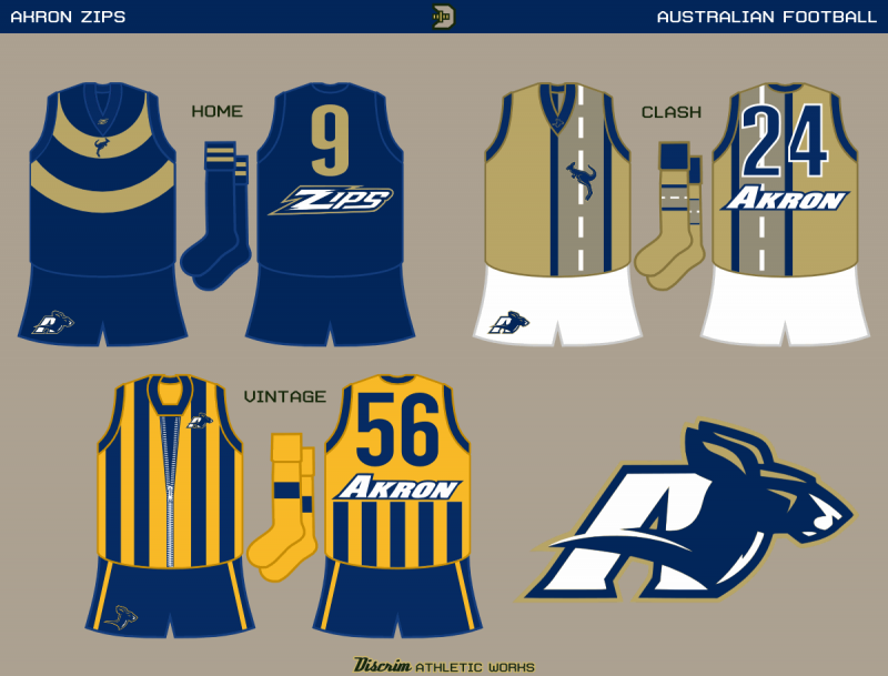
The home jumper's circular gold rings represent a tire, given Akron's historical association with rubber in general, and Goodyear tires in particular. As tires are usually foundon motor vehicles, I figured the clash would be a good time to cause one to wonder about roos crossing roads. For a fauxback, I'd initially had a simple blue/yellow striped jumper. Then, remembering that Zips was originally short for Zippers, I thought about redoing it, but making a good zipper design would be a mother. In typical fashion for me, I discovered thhat zips football had already had a similar idea...granted, I only found out half a day ago, WELL after the season's over, but still. May as well use their existing helmet zipper....and that's the end of that.
The Ramblin' Wreck from Georgia Tech
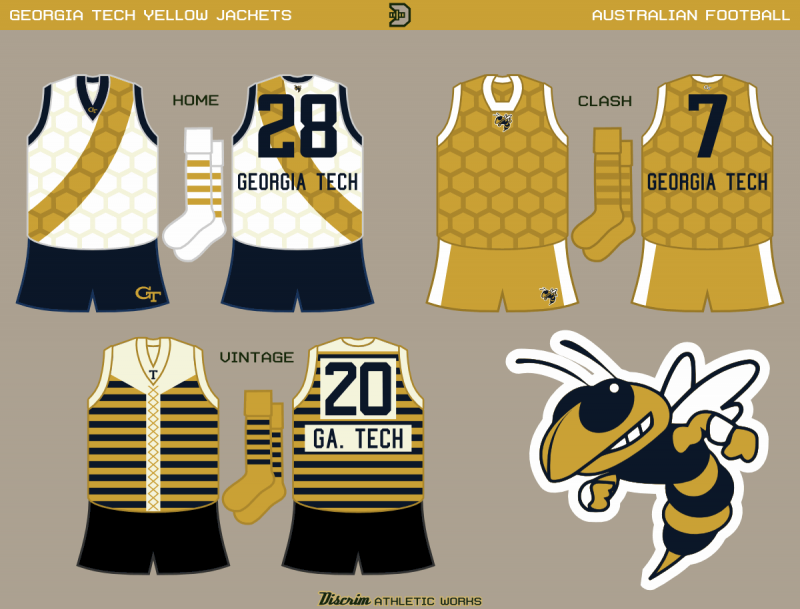
Time aint on my side due to technical issues, so I'll keep it short: white w/gold sash, honeycombs, and a fauxback based on 1890s footy. I'll probably have more words for ya later on.
-
Alright, here goes a new batch. First up. Louisville
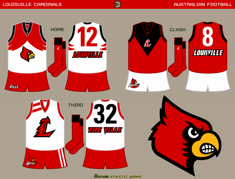
The home's based on the West Coast Eagles' wings, naturally, while the clash is basically an inverted Melbourne, with the added bonus of resembling a cardinal's face somewhat. The one-off is loosely based on the sweater worn by the old dunking cardinal...true, that had a block L and sleeves, but same principles.
Second up, Seton Hall
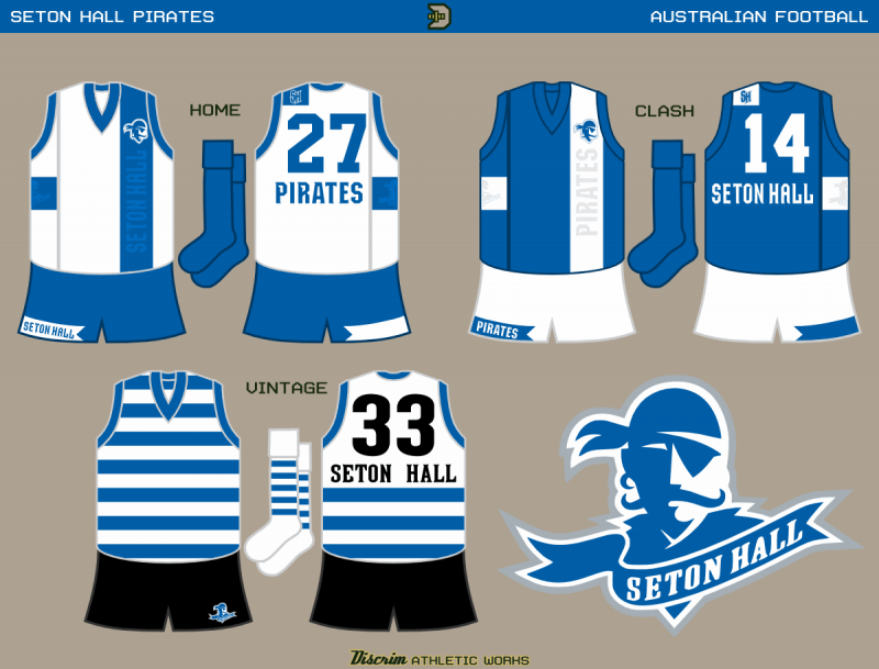
While checking out Historical Futbol Kits a few days ago, I noticed a number of English clubs sporting their own variations on a rather nice Nike shirt. The home and clash are based on that, with a tweak or two. The lettering on the front is meant to be akin to shadow stripes, i.e. only really visible when the light hits right, unobtrusive. The third, well, you aint a pirate without hoops, am I right?
Number three, Lehigh, private eye
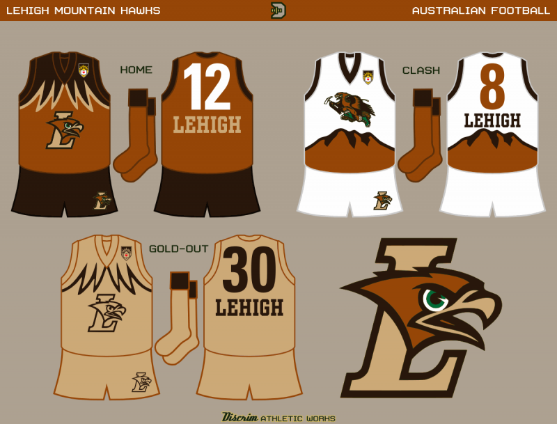
The home...well, St, Pauli's made two-tone brown work, why not Lehigh? The clash, if it vaguely reminds you of a hockey jersey, then I've largely succeeded. For :censored:s and giggles, I bring you a goldout for the third.
Fourth up, East Carolina....raise up...take your shirt off, twist it round your head, spin it like a helicopter
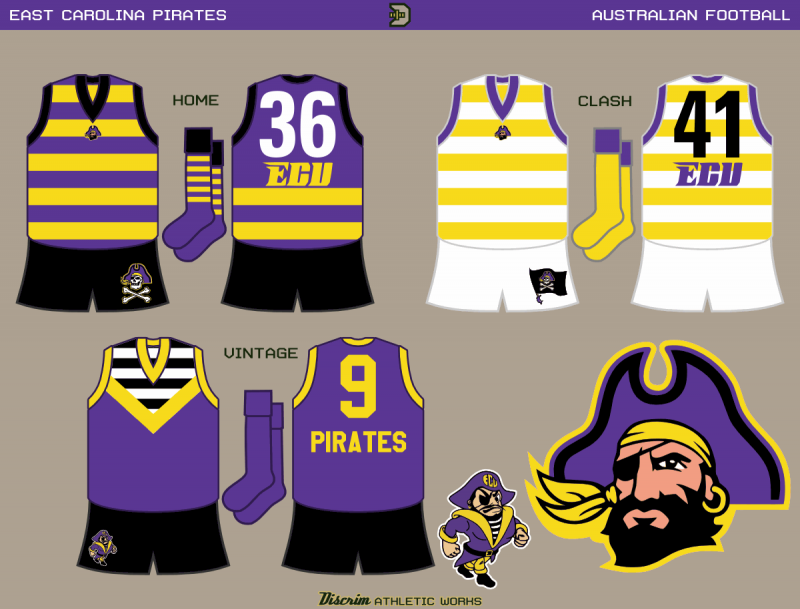
Purple/gold at home, white/gold for clash, hoops all the way. The third is based on the old strutting pirate.
Last up, Fresno State
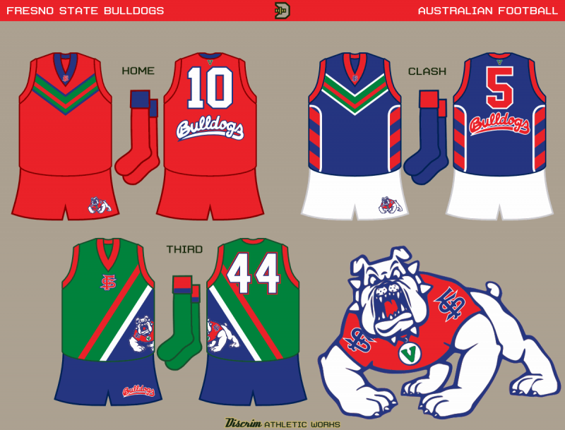
For those unaware, one of Fresno State's football quirks is the green V on the backs of their helmets, representing the San Joaquin Valley. Here, I take it a step further and use it as the basis of the main design. The third goes further, being green with a wedge of blue on the bottom left, something I based on one of capn89's old Rangers concepts (yeah cap, one of those from way back when we were at NHL Depot...thus, I'm referencing a concept I figure almost no one here will ever see. I gotta stop doing that.)
-
Decided to get back into the swing of things, and I commemorate last weekend's Stagg Bowl with jumper sets for UW Whitewater and Mount Union
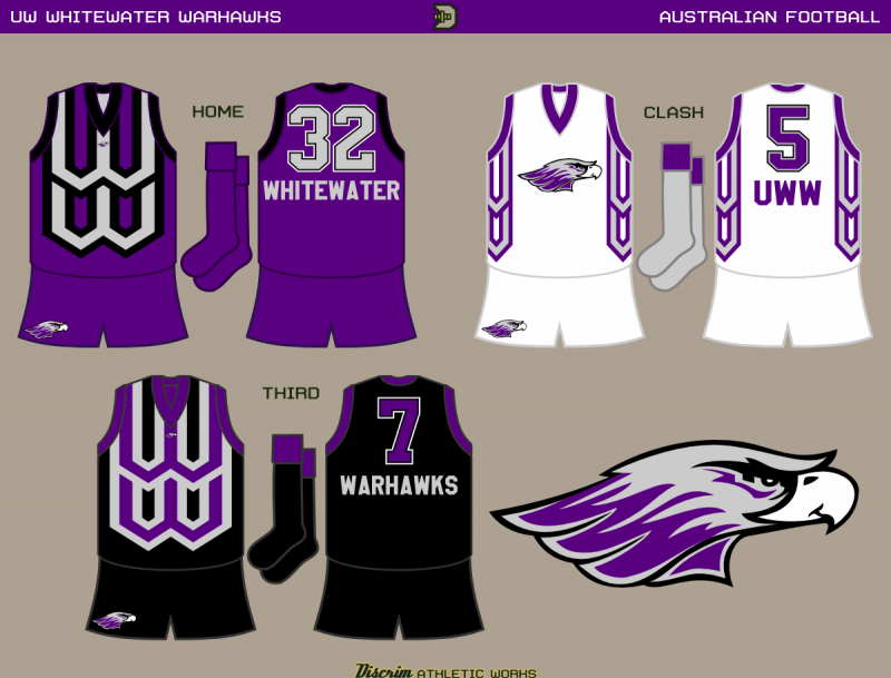
The idea of a double W motif popped in my head, and for the purples and blacks, I used it in a manner similar to stripes, while for the clash, I decided to go with using it as side panels.
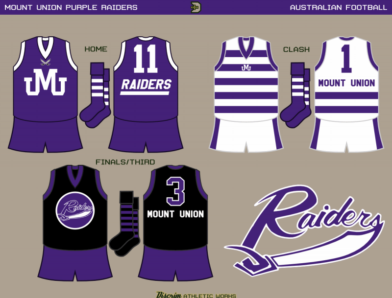
For Mount, I went with a basic monogram jumper for the first choice, and hoops for the second choice (for those wondering if this gets handled like soccer, not really. The white back is considered a sufficient clash). The monogram itself, I'd actually cobbled together for my current sig, and I've no idea if Mount actually uses anything similar to it. Third choice is based on the black jerseys UMU football frequently wear in the postseason.
-
*shakes cane* whatever happened to the good old days when if you wanted to update a vintage logo, you did it your own damn self?

joking aside, I'd like to see how ren's running Cardinal update compares to my own.
-
I've said it before, and I'll say it again: I'd only accept a gold Packers jersey if white pants came with it. And before you ask, yes, I've seen North Dakota State's unis (hell, I know a guy who played for the Bison when they were in D2).
I like it when the same teams enjoy success, I also hate all mid-majors in college basketball(examples: Butler, VCU, FGCU, George Mason).
heh, you'd love this year's Stagg Bowl (D3 championship)...Mount Union and Whitewater played for the D3 championship for seven straight years (2005-11), to the point that the 2011 game was a true Game 7 (UWW had won 3, Mount had won 3). I wanna say that's some kind of record, but I'm not sure. Discount it if you want, but keep in mind Mount produced Pierre Garcon and Cecil Shorts. Man I hated Garcon. Anyway, later this week is Game 8.
-
I know one thing, this would be a great complement to the traditional longhorn.
-
The NFL needs to allow multiple alternates like College Football
In truth, the NFL needs to tweak its rule regarding what alts can look like. Right now, they're restricted to two options: a throwback uniform, or a recolored version of the home or away jersey. I know, edgy, right? Compare that to the NBA, while there are many recolors (Bulls, Cavs, Pacers, Lakers, Heat), a good number of thirds don't look like the home/away at all (Celtics, Nuggets, Spurs, Rockets, Bucks). Likewise, what with differing home/away designs traditionally being more acceptable in baseball, you have colored jerseys (A's green, Brewers blue, Rays, Rangers, Mariners teal, Giants), home/away blends (White Sox black), stuff that doesn't look like the home/away (A's gold, Pirates, Cubs, D-backs black) as well as throwbacks (Brewers, White Sox, Pirates). Hockey, recolors (old Blackhawks, pre-edge Panthers, pre-edge Kings) seem to be the least common, NHL teams tending more towards different designs (mid-90s and post-edge Blues, Blue Jackets, Sabres, Senators, Avalanche, Ducks, Coyotes, among several others), straight throwbacks (Leafs, Habs, post-WC Penguins, Buffaslug-era Sabres, post-WC Blackhawks) or fauxbacks (Rangers, Penguins). Hell, in soccer, it's common for the change shirt to look nothing like the main shirt, even down to the collar.
The NFL? Barring some teams bending the rules (like the Redskins' 70th anniversary uniform, or the Cowboys' throwbacks being navy instead of royal blue), the selection's limited to recolors (Bears off and on, Broncos, Titans, Texans, Cardinals, Eagles, Seahawks, Panthers, Ravens, Bengals, Browns briefly, Saints once, Patriots briefly, Chargers, Jaguars) or throwbacks (Cowboys, Falcons, Bucs, Packers, Bears, Bills, Rams, Chargers pre-overhaul)...and with the new helmet restriction, a number of throwbacks like the Bucs and Patriots' are off the table (good riddance to the latter) due to their team colors having changed over the years. :censored:, now would be a good time to begin allowing thirds to have different designs...so for instance, the Bears might consider an alt based on the Chicago flag for a year or two, or the Pats might revive the Bledsoe-era style, but in red with the current font, something like that, rather than the routes previously traveled. Hell, it'd be a good way to gauge interest in a possible new uniform (as happened in the mid 90s with the Blues and Stars).
The NFL needs a team whose primary/home jersey is yellow.
The Rams could be that team...hell, the Saints could be that team. Had they kept the navy helmets, I would've liked to have seen a yellow Chargers jersey, though IIRC their owner's not a huge fan of the color. The Steelers and Packers could concievably look sharp in yellow jerseys, provided they add white pants (or in the Steelers' case, black pants).
-
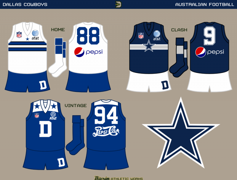
It's been a long time, and this has actually been done for a few weeks. If you ever wanted to see a Dallas Cowboys jumper set, you can die happy now.
-
Never heard that one...the story I recall is shortly after being hired, and given the OK to redesign the uniforms, Mike Dunleavy decided on Lakers purple and Celtics green (though he really kept the longstanding forest green and demoted it to the secondary color). Either case, my main gripe wasn't really purple's presence, so much as the fact that it'd become the main color.
-
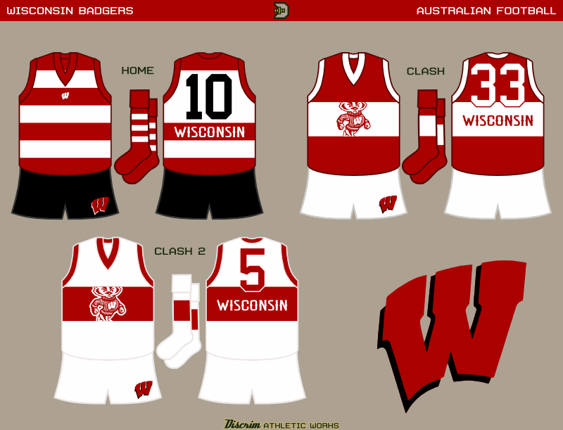
Here goes nothin...not one, not two, but FIVE new sets!
First, Michigan
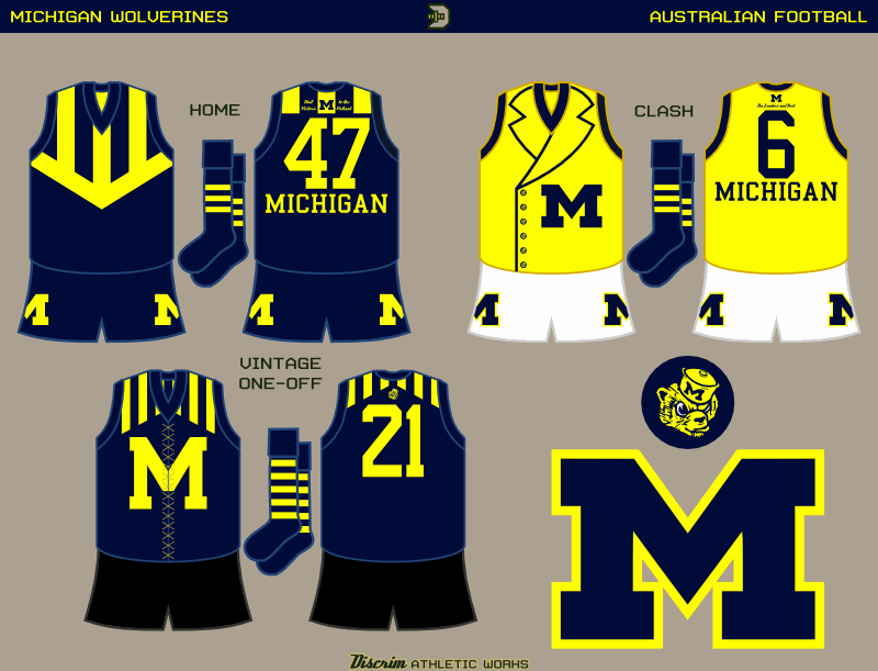
When I've done Michigan in the past, I've simply gone the Carlton route and slapped a big M on the front and called it a day. This time, I decided the blues should mimic the famous helmet somehow, so here it's a simple merger of stripes and a vee. The clash design is based on the costume of one of the lesser known Green Lanterns, Guy Gardner. Why? He's a fictional Michigan alum, of course. Finally, a fauxback based on the Under the Lights uniform, complete with the older M and printed laces.
Second, Wisconsin
Honestly, I could've just as easily gone with stripes instead of hoops for the home, but it is what it is. The two clashes have a broad wraparound stripe and use a cutout Bucky on the front.
Now I dip into some of the more obscure probrams, starting with Nebraska-Omaha
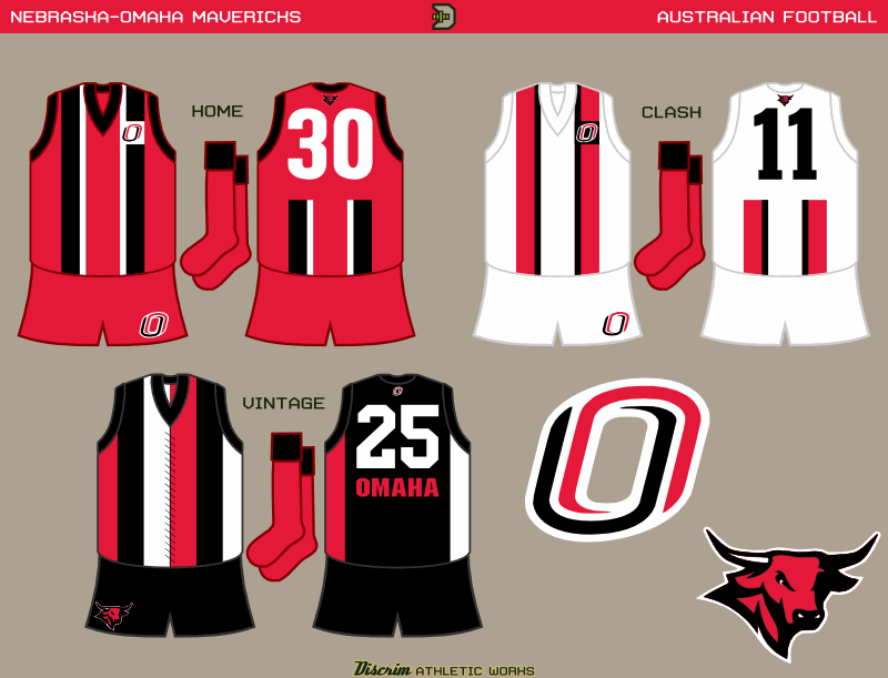
The home and clash use the same design I'd used for Notre Dame's green jumper. An old St. Kilda design, WWI era IIRC, inspired the third.
Fourth up, Michigan Tech
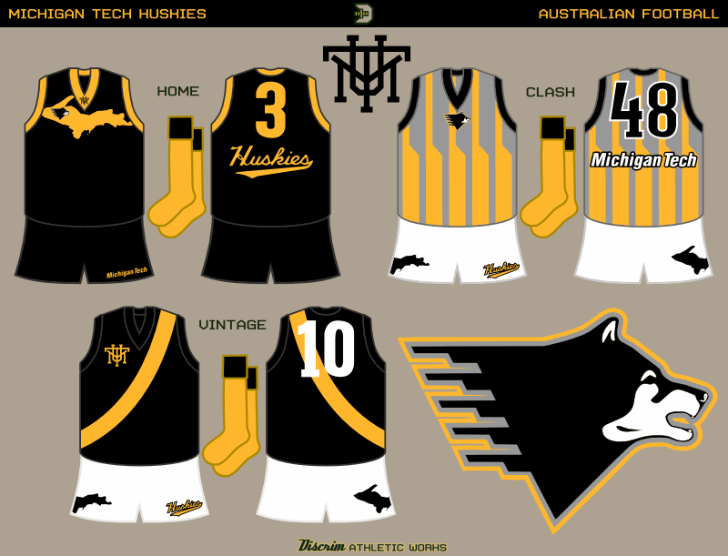
The home jumper...I was originally gonna have a chest panel stylized to resemble Upper Michigan, where MTU is located. Then I said screw that and went with an actual map. The clash...see those bits on the back of the husky logo? Yeh, they've given it the nickname "Piano Dog." I thought stripes resembling them would look at least somewhat okay, so here you go. The third...honestly, I could've seen Richmond donating a set of old jumpers to a program trying to get on its feet, if I were inclined to create a faux alternate history.
Lastly, Ooey-Pooey IUPUI
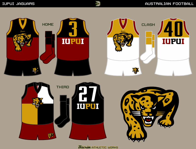
An old friend of mine played basketball for the Jaguars, his number's on the gold/white. Overall, the home and clash are based on the classic Fitzroy/Brisbane design, the home being black and crimson, the clash being gold and white. The third seemed like a good place to sneak in a harlequin jumper for the hell of it.
Your two rusted Lincolns are welcome here!
-
I'll do ya one better...Jim McMahon, Packer

In the same vein, Jerry Rice in his very brief stint in Denver

futbol example: Alessandro Del Piero, who was with Juventus seemingly forever in an era when star players being afflicted with wanderlust is generally accepted...and now he plies his trade in Sydney
And the recently retired Grant Hill...his lost years in Orlando, when the sight of him healthy was a rarity

-
Well, speaking from experience, house cats do whatever the hell they want. Hell, stray cats tend to do whatever the hell they want (I frequently see the neighbor's cat in my yard, there used to be a huge white stray there every now and then, and a few summers ago there was another stray that would hang around the front porch and meow incessantly). House cats don't care.
-
Geelong...bear with me, admittedly this is one of the weirder ideas I've had. Anyway, here goes nothin.
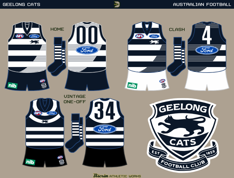
Sorry for going the Collingwood/North route here, anyways about a week and a half ago I was doodling possible concepts and this was basically the result...an odd take on the hoops. Opted for the full cat rather than the cat face, as I feel the former is underused and the latter overexposed. Honestly, I've grown to dislike the cat face somewhat. The heritage one off, I figured historical precedent was a good enough reason to break my personal rule about using black with navy (the vintage jumper's shorts are black, rather than the normal set's navy)
Queanbeyan...most of my footy concepts have been either fantasy sets or AFL sets. Years ago though, I'd spend hours perusing Full Points Footy (which reminds me, I don't visit its successor, Australian Football.com nearly as much as I'd like to) and due to that, I'd been inspired to post concepts for several defunct clubs from across Australia, like Camberwell, Sunshine, and Melbourne City of the VFA, Woodville of the SANFL, and Acton of what would become AFL Canberra. Among the few active non-AFL clubs I've done before is Queanbeyan, a club whose history I found very interesting. Funny thing...if St. Kilda and Footscray, for example, had decided to merge temporarily, and had anywhere near the unbridled success of the Queanbeyan-Acton Combine, those squads would've beed deified to this day. Hell, up here they wrote a book about the one season the Steelers and Eagles merged during WWII, and they weren't nearly as successful. I digress though...here go the Tigers
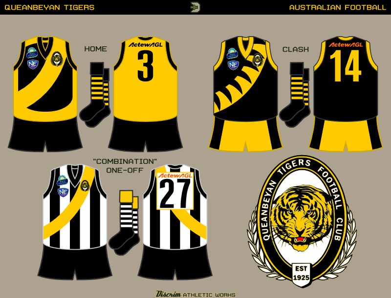
Basically, if Richmond's clash resembled this in any way, calling it an improvement wouldn't do it justice. Hell, far as I know, they don't even have Essendon's excuse to fall back on. Anyways, I'd recalled seeing an older pic of Queanbeyan in action years back, and took inspiration from that. The clash...might be overkill, but you won't know if a tiger striped sash will work til you try. Lastly, in honor of the aforementioned Combine, a heritage one off.
-
Aside from that Rockies set, and its tweaks, I haven't done much in the way of concepts lately. Memorial Day, for instance, snuck up on me. In any event, every season since I've joined the WAFA, I've rolled out a patriotic jumper for Memorial Day and the 4th of July (the former day is largely because ironically like the Cubs, the Robins tend to be on the road on 4th weekend, so I usually push for a Memorial Day weekend home game to compensate). Though I'm considering breaking the pattern next season, the first seven were mainly teal, and so is #8.
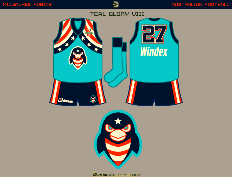
Like I said, Memorial Day snuck up on me. I considered a few other ideas before settling on a flag-like variation of the Robins' usual wings.
I have a couple more ready to go, I just need to ad em up: a rather different-looking Geelong, and Queanbeyan from the ACT (Australian Capital Territory)...all I'll say for now is you might find what I've done to Geelong's hoops weird, and that one could say the direction I went with Queanbeyan's home is what I wish Richmond's clash resembled instead of the train wreck it is.
-
1
-
-
I know one thing, Don Mattingly doesn't look like Don f'ing Mattingly without a mustache. It's like with Alex Trebek, he still looks wrong without a mustache.
-
2
-
-
An unpopular opinion among those that follow Aussie football: I think the Fitzroy/Brisbane Lions' traditional leo is ugly as hell.

Sadly, they whiffed rather badly with the new lion....they were so
 close to hitting it out of the park, but that head is

-
the Big Dog will always be a Buck to me...jury's out on the Little Dog, but it'd be nice if he becomes a Buck in the future
Sheed...most of his memorable moments were in his Blazers and Pistons days...but who can forget his Bullets days?
Or his one night as a Hawk?
You know, other than almost everybody?
-
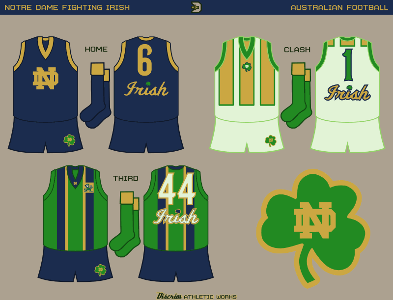
St. Patty's day for real now...fittingly, I unleash the Irish upon you
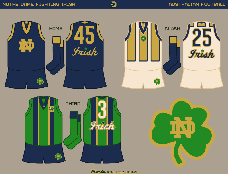
Rather basic home jumper...though it's possible ND would be willing to go somewhat more avant garde for the first choice, if you look beyond football...anyways, the clash is beige, rather than white, a Digger Phelps shoutout (I'd read on Uni Watch one time that in the late 70s, somebody'd told him the Irish's home whites didn't look good on TV, so for a few years ND's homes were pale green, and then beige after that before returning to white). The striping is modified from one of the shirts the Columbus Crew wore right before they adopted the all-piss I so despise. The green uses gold and blue braces, a striping style I feel is somewhat underused in sports. Of course, "suspenders" is kind of a lame word, which is why I'm using the British/Aussie terminology.
And now...the same thing, but with mint green clash


 close to hitting it out of the park, but that head is
Discrim's Australian Football Concepts
in Concepts
Posted
My PC's been acting up for the better part of the last two weeks, and the aggravation involved generally sapped a lot of my desire to start or work on any concepts. The fact that I haven't updated Inkscape in a couple years didn't help. In any event, here goes yet another of those schools no one ever posts concepts for: Texas-Pan American
Decided the main design would utilize a two-tone racing stripe, with the anachronistic addition of a pocket. Hey, you never know when you need noseplugs after a failed mark, am I right? In any event, then, the fauxback is more 60s-70sish fare, the previous bronc silhouette on front, and the school name sandwiching the number on the back....with contrasting nameplates, no less.