


Pizzaman7294
-
Posts
1,254 -
Joined
-
Last visited
Posts posted by Pizzaman7294
-
-
Peoria Chiefs (while affiliated with the Cubs)

Peoria Chiefs (while affiliated with the Cardinals)The name of a local afilliated ball club can hold a lot of brand identity, if the team has existed for many years. This was a fantastic way of incorporating the major affiliate into the look and feel.
-
 6
6
-
-
On 4/17/2019 at 12:30 PM, Gothamite said:
I would prefer the opposite approach, where minor league teams create their own identities and then tie the design to the parent club. Like the Buffalo Bisons do, or the old Appleton Foxes.
No doubt their affiliates, but Appleton fans still had an unblemished Foxes legacy that spanned generations.
Let OKC take a name that means something to OKC, paired with a uniform that reflects the great visual legacy of the Dodgers.
100 percent.
-
1
-
-
On 3/30/2019 at 12:18 AM, PepMan33Conde said:
Just me or is the outline on the number different?
-
1
-
-
-
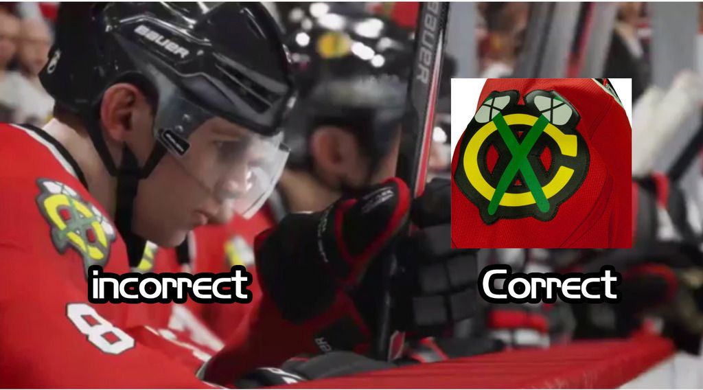
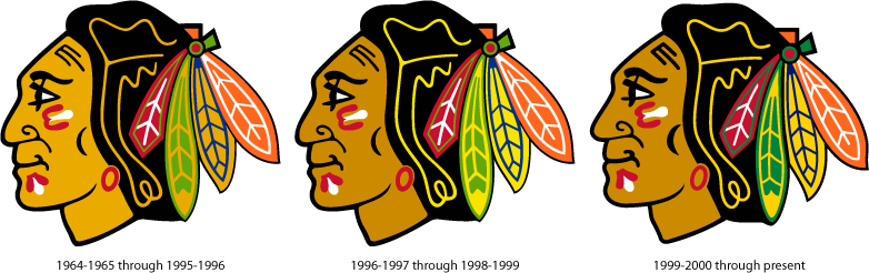
Sorry if this has been mentioned already, but the shoulder tomahawk "C's" is still incorrect on the Blackhawks
-
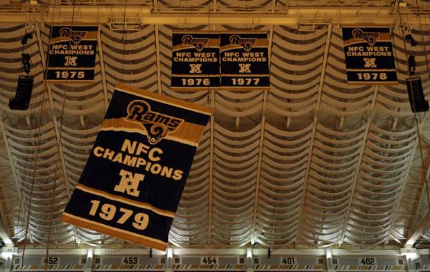
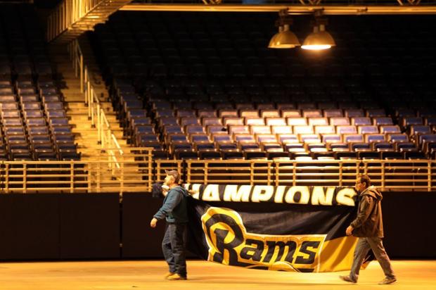
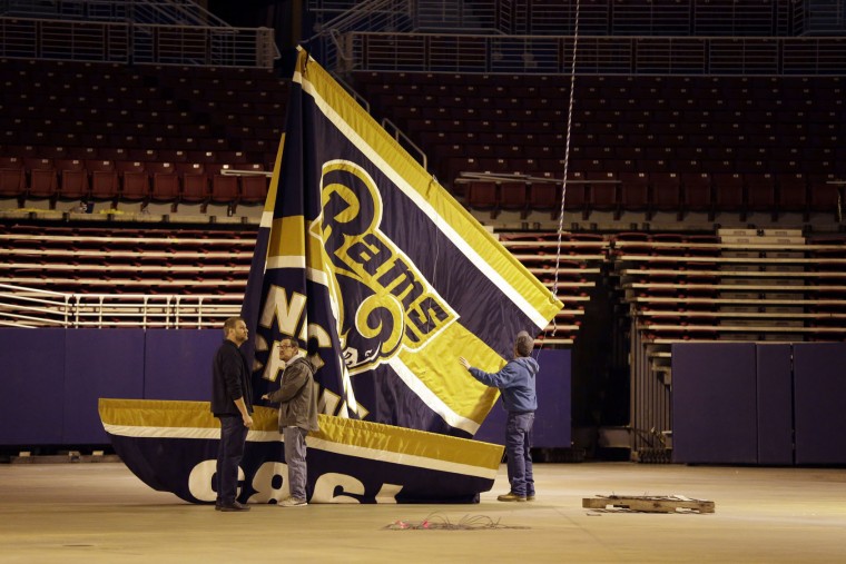
Any thoughts on where the Cubs could put a new "banner"?
Think theyll honestly put up another flag on the roof that no one can see?
-
-
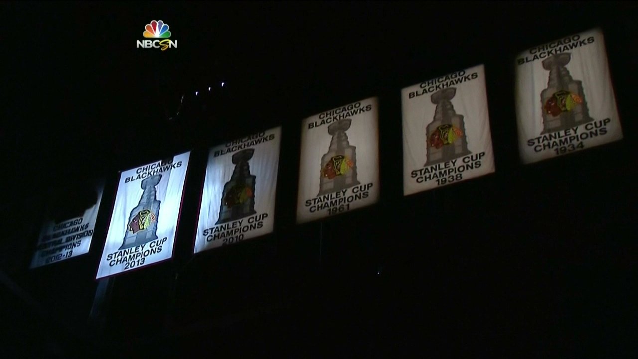
While looking,I found this phantom merch:
Could the Blackhawks banners get any uglier? You'd think with 3 championships in 6 years they'd at least get the colours of their logo correct on one of them...
Are you insane? They're beautiful. They're sewn by hand with classic materials. Personally I think they're fantastic. Much more classic looking than something printed by a printer with gradients, etc.

-
I wouldn't be surprised if the conference logos are gold. May want to update that.
Great work!
-
NHL 15 and still to this day:
-
In reality, the "One Day" uniforms would have looked like this:
Wait. So you mean to tell me that they would've introduced a logo with even more black in it than the one they use now, yet run with a jersey set completely devoid of even a hint of it?
What is it with this franchise and their apparent inability to use black correctly?
You forgot their black-included unis first used in 1993 or 1994.
Actually they used those long before the 90s
-
...
The lettering looks different here to me, mostly in the corner of the G, but it could just be a case where the official graphics don't match the real-life stuff. I've been trying to get to the bottom of the Blackhawks' logo thing and it's just a great big mess. I don't think they finally standardized the well-drawn half-smiling Indian Head until 2000 or so.
I agree re: official vs. actual.
I addressed some of the Blackhawks logo issues a few years ago; I'll try to find what I came up with.
Found it.
-
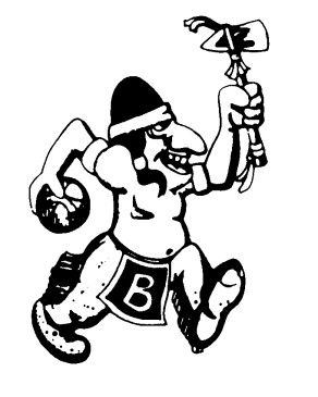
If you get a chance, I'd love to see my school's (Bradley University) old native american logo redone.
Thank you very much!
-
I'd love to see my school's (Bradley University) updated if possible.
-
I dare someone to find something correct with that jersey
-
Anyone know this player? No cheating and looking at ring name
Definitely Don Beebe, who actually graduated from the same high school as me
-
-
Stitching isn't as crisp as it should be and the material isn't the same as it should be. Not a bad fake though.
-
Here's my jersey review.
!That seems very, very accurate, to the point where I wonder if Nike's getting ripped off in-house at one of their overseas factories. I know the Steelers' sleeve stripes used to be a sewn-in insert - anyone know if that's carried over to the Nike overhaul?
Im pretty sure it is. Along with Detroit.
-
The team clearly loses money if someone buys a counterfeit. There's no question about it.
-
A guy at bowling comes over to tell me he's getting a couple dozen authentic Pats jerseys, everything stitched "like the real ones."
And because he's getting so many, he's getting them for the "awesome low price of $24.99 each!!!"
He went to the pro shop to compare and they are "around $220. I started laughing because of the deal I was getting!"
He then tells me he'll sell me one for $40 cus he knows me.
I told him he was getting fakes.
He does not believe me.
I'll see Wednesday night. This ought to be good.
cant wait to hear
-
^^^ Reasons 1,2,& 3 as to why I hate Josh McDaniel. Great draft pick, buddy.

im sorry, but he's the only reason you made the playoffs this year
-

Saw this on Borntrade. I guess they used the wrong Moss' font from some of Randy's Pats jerseys.
On a side note, anyone know what the best looking Redskins fakes are? My roommate is a Skins fan and I want to get one for him for his birthday which is relatively soon. No, I am not a scumbag, we just really only exchange gifts of about $25 or so and I am sure he wouldn't care if it's fake. I'll tell him, but honestly he probably wouldn't know anyway.
25 bucks and guaranteed to be good looking
-
i like when teams keep to the actual fabric look, idk maybe im just used to my Bulls and Hawks


College athletics identity changes
in Sports Logo News
Posted
Definitely will never unsee that. Coolest pirate in college athletics.