


DeFrank
-
Posts
2,923 -
Joined
-
Last visited
-
Days Won
1
Posts posted by DeFrank
-
-
Here's what I've been able to find for a Colgate athletics logo from the past. Seems to exist on sportslogos.net, some custom neon sign website, and in grainy videos of the Andy Kerr stadium in the 1990s. Thanks so much!


-
On 2/18/2017 at 4:23 AM, Bucfan56 said:
Actually, I don't find that one to be strange. If memory serves, when the set was first announced, they were planning on wearing the navy caps and socks with the home set, and the red caps and socks with the road set. Somewhere along the line though, that was swapped, and I think it took place relatively late in the process, too.
Very interesting. Didn't know. Thanks!
-

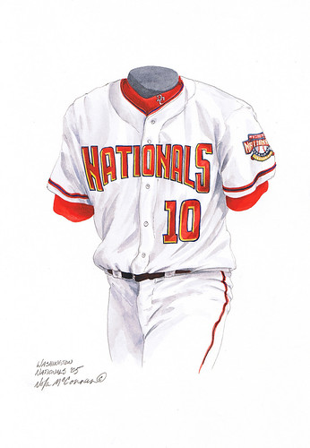
Wrong belt and undershirt color from the inaugural season MVP Baseball 2005 game. They also had high blue socks at home which was very strange. One of my first uniform-related memories.
-
 1
1
-
-
6 hours ago, Chawls said:
I think with their full pant stripe, it's not as egregious
Agreed, but it would be wonderful if they could just use a white striped sock.
-
6 hours ago, SabresRule7361 said:
The one-year only Cleveland Browns 1984 uniforms against the Archie-era New Orleans Saints in the second-to-last year of those unis
I had no idea the Saints had been messing up their pant/sock options for so long.
-
Realized that many Giants road games from 2000-2004 qualify as a rare matchup considering how short-lived this road uniform was. Here's the only appearance it made against the Packers, in 2004.
-
2
-
-
2 hours ago, Dolphins Dynasty said:
*sigh*
I miss that logo so much...
And the uniforms as well... I feel you.
-
The Nationals should have stuck with their "monumental" uniforms from the 2005 inaugural season in Washington. They should have dumped the "curly W" early on rather than quadrupling down on it in 2010. The never-worn "block W" prototype referenced in this Uni Watch entry would have been a fantastic mark to center the uniforms around, especially with the strong primary logo from 2005-2010.

-
4
-
-
-

The only time this happened was 2012.
Woah. This already looks incredibly dated.
-
Team names on the back of shorts aren't the end of the freaking world. People act like it's some sort of assault on human decency when in reality it's in the arch of the back and you can't even see it most of the time.
-
The font that Nike uses on shirts such as

-
Black shoes are a bigger eyesore in the NFL than the Flywire collars and sweat stains
-
I can't stand the Detroit Lions number font.
Yeah, i can understand that. The breaks into the solid part go to far. If they were like the Bengals or Bears numbers, it'd look good.
I don't think thats such an unpopular opinion though. I would actually post the opposite, because I LOVE THEM, in this thread.
-
I like this look the best

Maybe with white socks it wouldn't be so abysmal.
-
The problem with the logo is that the tiger head is just so much better. That logo is my favorite in football. And the whole B v. C thing is very valid. C would be a much better mark to represent the team.
-

Split P?
-
Other than the out-of-place black alts, grey facemask and black shoes, dammit I LIKE the Arizona Cardinals uniforms. I just can't bring myself to dislike them.

Completely agree
-
-
The Rams blue and white is one of the worst "OMG BRING IT BACK" ideas in the world. ITS SO DRAB.
-
Split P?
-
comicsanscriminal.com
-
REALLY looking for a stencil font like in Army's pro combat.
Not perfect, but very close.
http://www.dafont.com/aero-matics-stencil.font?text=WEST+POINT
Thanks, but if anybody has a varsity style, it'd be MUCH appreciated.
-
REALLY looking for a stencil font like in Army's pro combat.


Oldschoolvikings' NFL concepts - Commanders concept added
in Concepts
Posted
With the Cardinals color rush, I think it would be ideal for eliminating white and going all out on the two tone red, especially with the numbers. Great work on some of these. Big fan of the Eagles. Really don't like that new Bucs logo though. Keep the flag red.