


frosty06306
-
Posts
524 -
Joined
-
Last visited
Posts posted by frosty06306
-
-
I'm gonna suggest some Hornets stuff without the honeycomb sublimated on the court. That's one part of the old identity that definitely doesn't need to be nodded to in 2014.
You mean this?
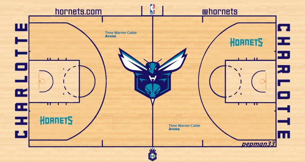
Closer, if it were me. The courts wood tone all around (Not two shades) The outside painted teal, the lane purp-le with white markings. The MAIN logo at midcourt with the side hornet in place of the hornets wordmark.
-
I'm gonna suggest some Hornets stuff without the honeycomb sublimated on the court. That's one part of the old identity that definitely doesn't need to be nodded to in 2014.
-
Not sure if unpopular but I hate logos above the nameplate. Or replace a nameplate altogether.


Unpopular Opinions
in Sports Logo General Discussion
Posted
Silver makes the look.