


NH4
-
Posts
778 -
Joined
-
Last visited
-
Days Won
5
Posts posted by NH4
-
-
EASTERN ILLINOIS PANTHERS

DESIGN
- Used the partial logo as the primary to eliminate the light blue which the team doesn't use
- Used silver instead of black to harken back to the Romo days and the logo uses silver
- The stripe comes from the wordmark logo which makes a triple stripe at the top
- Kept the same font and added a matching number font
HELMET
- Silver helmet with blue facemask
- Added the new stripe
- "EIU" on the front bumper and "PANTHERS" on the back bumper
JERSEY
- Added the new stripes
- Updated the number font
- "EIU" on the chest instead of the logo
PANTS
- Silver, blue, and white pants
- Added the stripe
Up next will be Chatanooga. Thanks for looking and as always C&C is greatly appreciated!
-
 3
3
-
LAFAYETTE LEOPARDS
LOGO
- Removed the serif in the L to match the font
UNIFORMS
DESIGN
- Lafayette had very plain uniforms but spiced it up last year (added , collar color and chest text, and a black alternate uniform)
- However, I wanted to create something more unique so I created what I call the Lafayette Stripe
- The stripe's colors are taken from the L in the logo
- Kept the same font
HELMET
- White helmet but brought back the maroon facemask
- Added the new logo and stripe
- Full Leopard logo is on the front bumper and "LAFAYETTE" is on the back bumper
JERSEY
- Added the new stripes
- Updated the number font to match the wordmark font and added outlines
PANTS
- White and maroon pants
- Added the stripe
Up next will be Eastern Illinois. Thanks for looking and as always C&C is greatly appreciated!
-
3
-
HOWARD BISON
DESIGN
HELMET
- Silver helmet but replaced the gray facemask with navy
- the BISON wordmark on the front bumper and "HOWARD" on the back bumper
JERSEY
- Kept the stripes the same colors throughout the uniforms (just like Florida)
- Went back to the old number font that matches the school font
- Added a red jersey
PANTS
- Silver, navy, and white pants
- Added the stripe
Up next will be Lafayette. Thanks for looking and as always, C&C is greatly appreciated!
-
4
-
NICHOLLS COLONELS
DESIGN
HELMET
- Silver helmet with red facemask
- Added the new stripe
JERSEY
- Added the stripe
- Updated the number font and re-added the primary logo to the chest
PANTS
- Silver, red, and white pants
- Added the stripe
Up next will be Howard. Thanks for looking and as always, C&C is greatly appreciated!
-
2
-
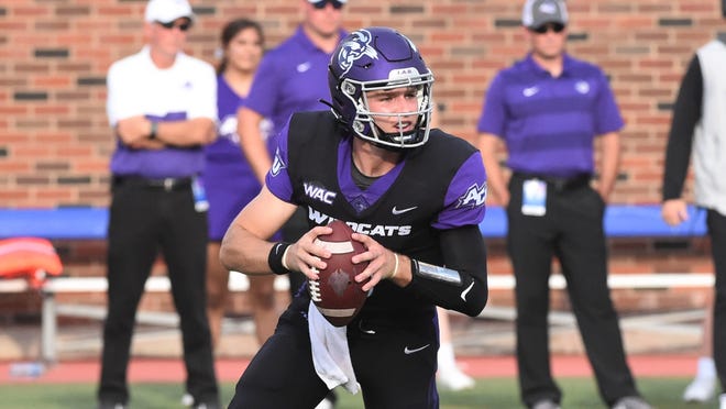
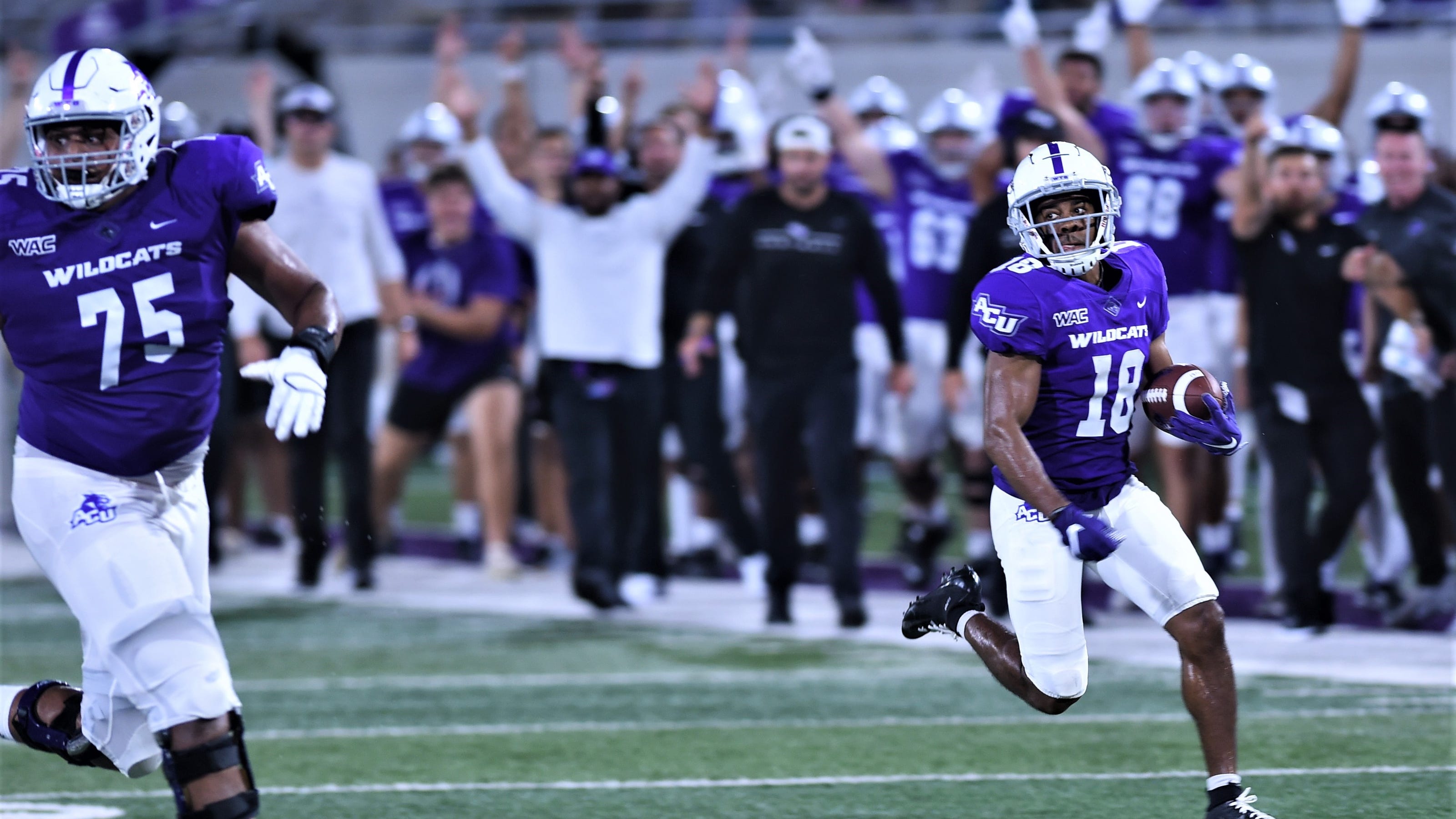
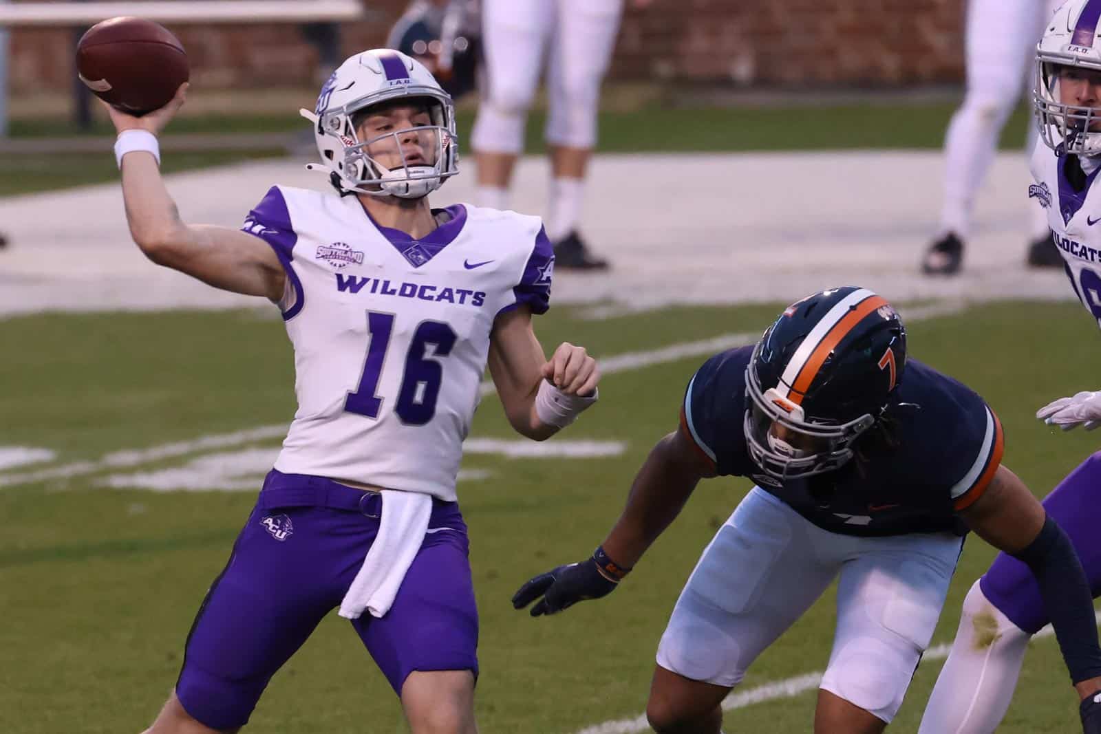
ABILENE CHRISTIAN WILDCATS
DESIGN
- Took the pants stripe and made that the stripe throughout
- Kep the same font but made the numbers wider
HELMET
- Purple and white helmet with black or purple facemask
- "ACU" on the front bumper and "WILDCATS" on the back bumper
JERSEY
- Instead of the stripe, I kept the colored sleeve caps and added the claw marks there
- Switched the chest text to ACU
PANTS
- Purple, white, and black pants
- Kept the stripe
Up next will be Nicholls State. Thanks for looking and as always, C&C is greatly appreciated!
-
2
-
On 2/8/2023 at 2:45 PM, ItzDrew25 said:
When will you update the conferences ?
I'll update the teams when they officially enter their new conferences, so July 1st.
On 2/8/2023 at 8:35 PM, -Akronite- said:I'd be curious how Austin Peay looks with the full logo on the helmet. As is, feels a bit slight.
How about something like this?
-
3
-
-
AUSTIN PEAY GOVERNORS
DESIGN
- Took the Northwestern stripe from the helmet and made that the stripe throughout the uniform
- Kept the same font
HELMET
- White, red, and black helmet with black facemask
- "PEAY" on the front bumper and "GOVERNORS" on the back bumper
- AP logo on the back
JERSEY
- Added northwestern stripes to the sleeve cap
- Added chest text and switched the number colors on the black jersey
PANTS
- Red, white, and black pants
- Added the stripe
Up next will be Abilene Christian. Thanks for looking and as always, C&C is greatly appreciated!
-
2
-
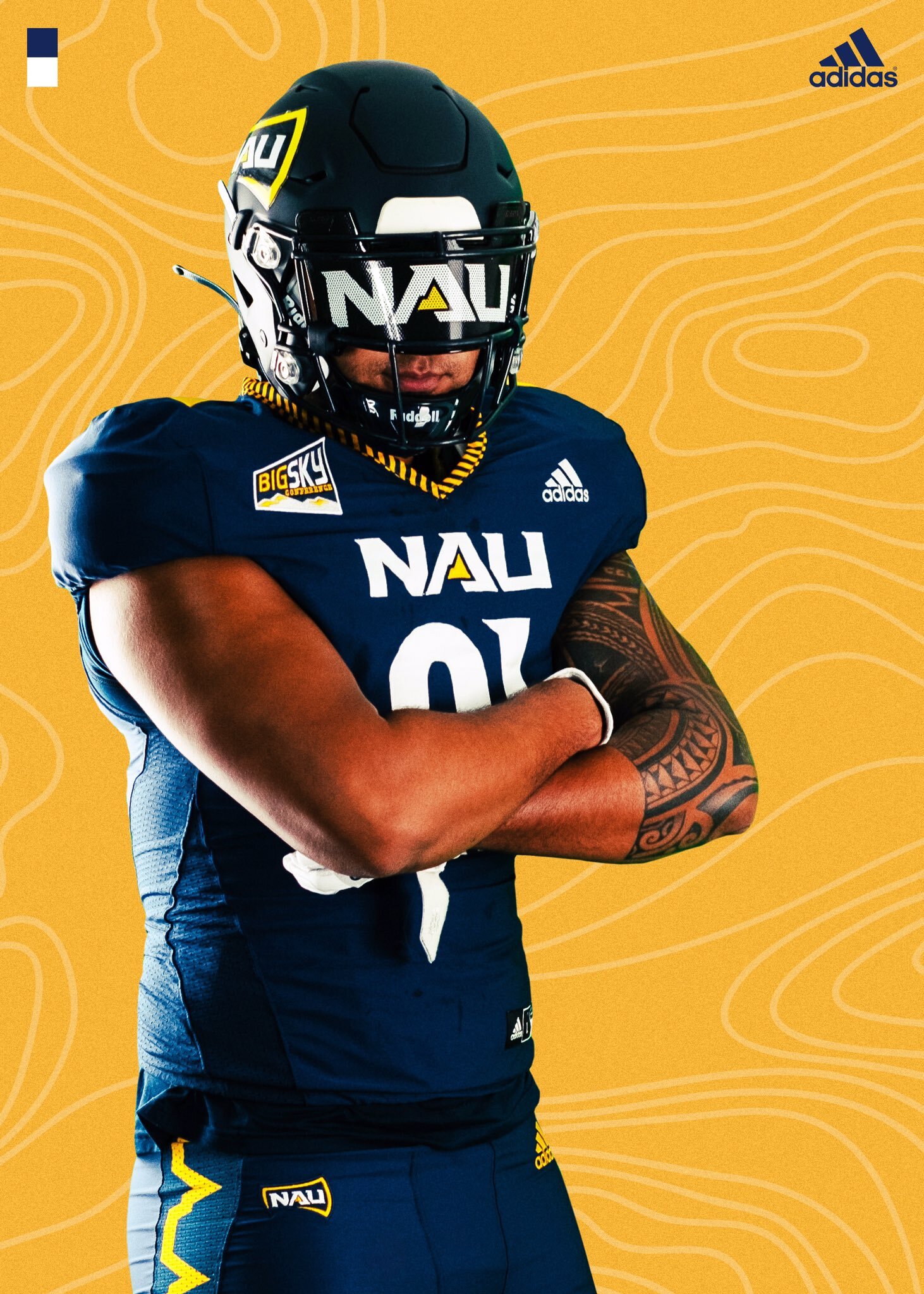
NORTHERN ARIZONA LUMBERJACKS
DESIGN
- I had 2 options for the design for NAU; the diagonal stripe that's on the collar or the mountain stripe that's on the pants
- I went with the diagonal pattern because it looked more like a traditional football stripe
- Based the new font from the chest wordmark from the old jerseys
HELMET
- Kept the navy helmet but made it glossy and introduced a gold helmet
- Added the stripe
- "NAU" wordmark on the front bumper and "JACKS" on the back bumper
- Arizona state silhouette with the mountain from the logo on the back
JERSEY
- Moved the stripes from the collar to the sleeve cap
- Added a new number font to match the wordmark
PANTS
- Navy, gold, and white pants
- Added the new stripe
Up next will be Austin Peay. Thanks for looking and as always C&C is greatly appreciated!
-
8
-
VILLANOVA WILDCATS
DESIGN
- Took the lines directly from the logo and made them into stripes
- The jersey stripes are in the shapes of a V
- Kept the same font
HELMET
- Same navy helmet with navy facemask
- Added the new stripe
- Philadelphia flag on the back
JERSEY
- Added the new stripes
PANTS
- Navy and white pants
- Added the new stripes
Up next will be Northern Arizona. Thanks for looking and as always C&C is greatly appreciated!
-
5
-
 2
2
-
 1
1
-
On 1/29/2023 at 8:49 PM, kb105 said:
One small suggestion is to round the end of the bottom jaw, right now the sharp point doesn’t flow with the rest of the logo and I don’t know quite how realistic it is. Otherwise it is an amazing update, I know creating realistic snake logos can be a challenge.
Yeah it was more difficult than I thought but I looked at a ton of other snake logos to try to get it right. As for the bottom of the jaw, I actually did try a curve instead of a point but it didn't look the best with the sharp points of the bottom of the neck. Thank you for the comment though!
-
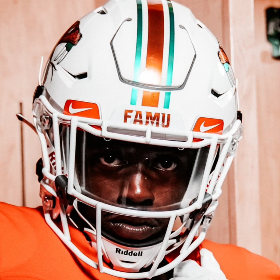
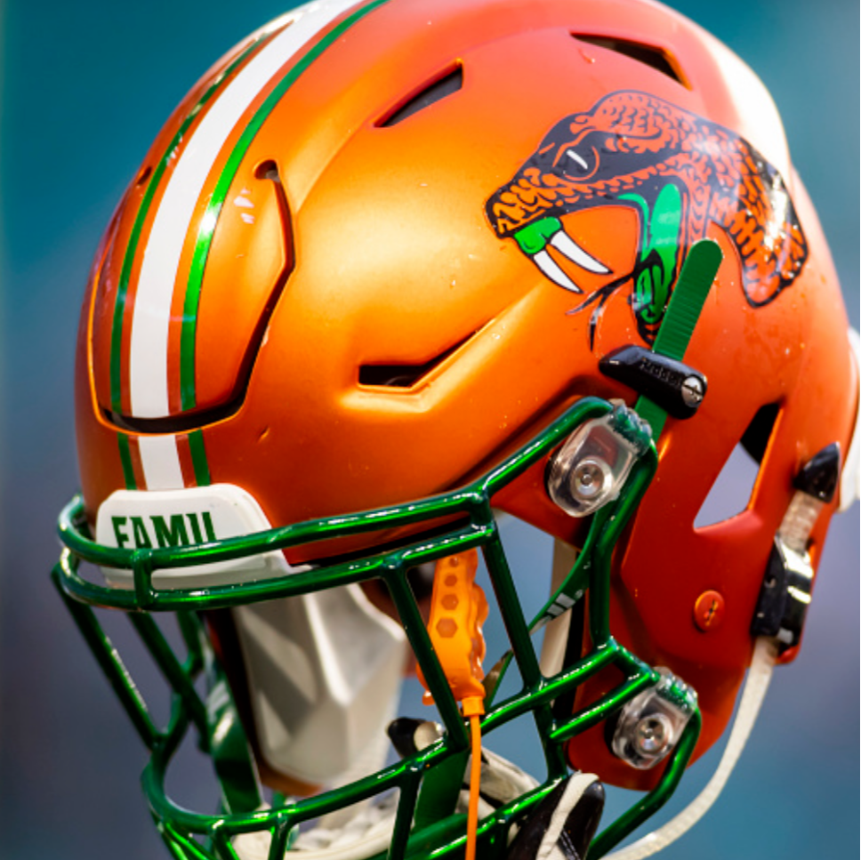
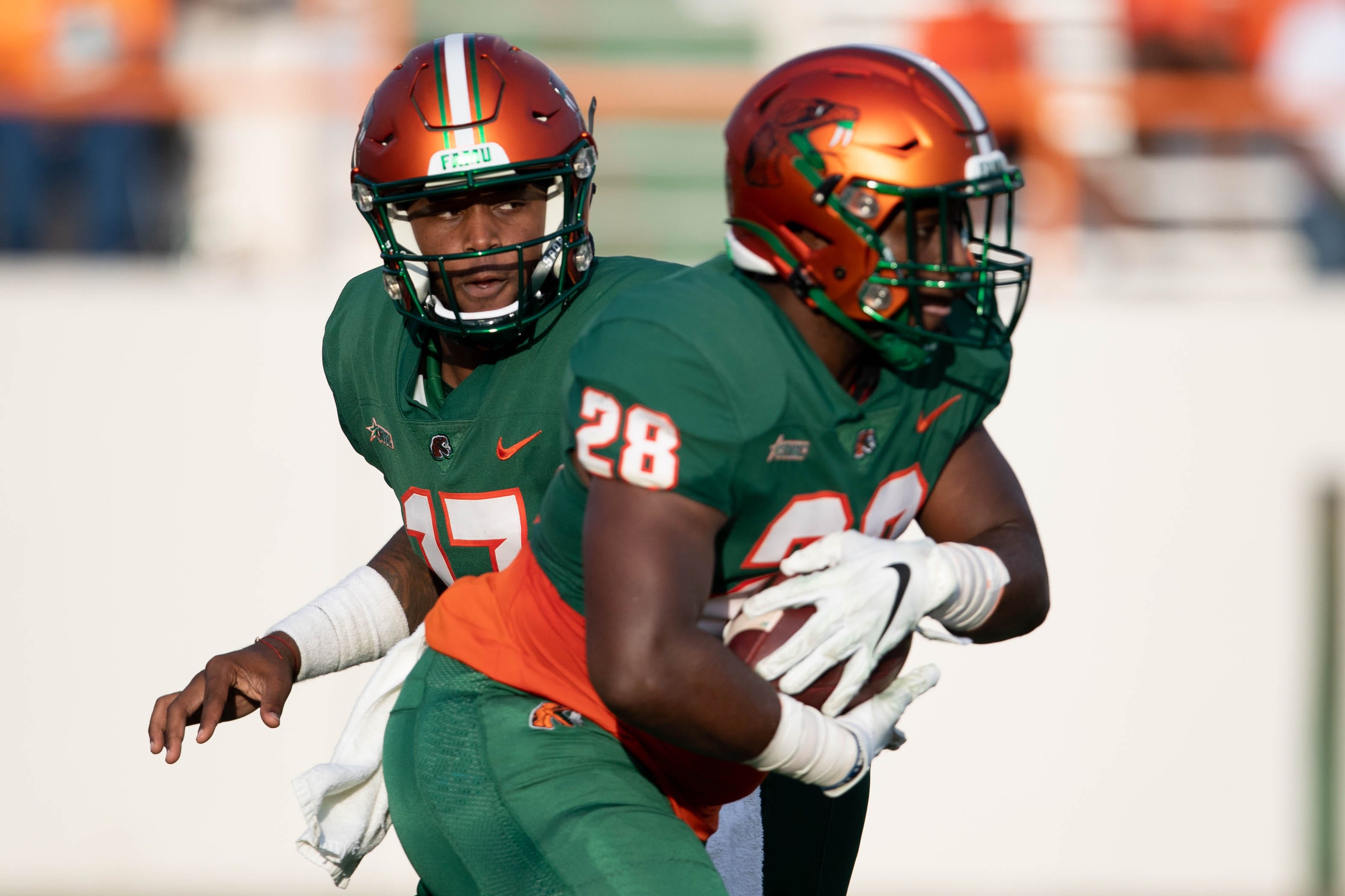
FLORIDA A&M RATTLERS
LOGO
- Removed the intricate details (just like my first version)
- Changed the black to green
- Redid the tongue so it flows with the logo better than just sticking straight out like the current logo
- Updated the perspective to a side profile view as @mamiller99 suggested by updating the jaw, mouth, and fang
- Made the eye more visible so it won't get lost as @Jay_Mellowed suggested
- Changed the angle of the fangs for a more menacing view
- Sublimated the scales
UNIFORMS
DESIGN
- Took the northwestern stripe from the helmet and tapered the stripes
- Also added subliminated scales to the larger stripe (just as I did in the logo)
- Created a custom font based on the current number font (which is just Michigan State's font) and added "fangs" to the serifs
HELMET
- White helmet with white facemask and orange helmet with green facemask
- Added the new logo and new stripes
JERSEY
- Updated the number font
- Added the stripes to the sleeve caps
PANTS
- White, orange, and green pants
- Added the stripes
Up next will be Villanova. Thank you for looking and for helping out with the logo. As always, C&C is greatly appreciated!
-
3
-
15 hours ago, mamiller99 said:
I think the issue with FAMUs logo (imo), is that it’s got multiple perspectives going on at the same time. The skull and neck are both at a profile while the lower jaw, mouth and teeth are at a skewed 3/4 perspective. If you make the perspective consistent across the entirety of the logo, I think you’ve got a winner. I appreciate your ability to change an illustration to an actual logo
I never noticed that but I'll try to fix it and see what I can come up with. Thanks for the feedback!
-
I'm updating Florida A&M's logo and I just wanted to get some feedback if I need to fix anything.
New Logo:
Just like the TCU logo, I removed a lot of the intricate details but retained the same look, including scales but now they are subliminated. Thank you!
For reference here's the current logo:
-
3
-
-
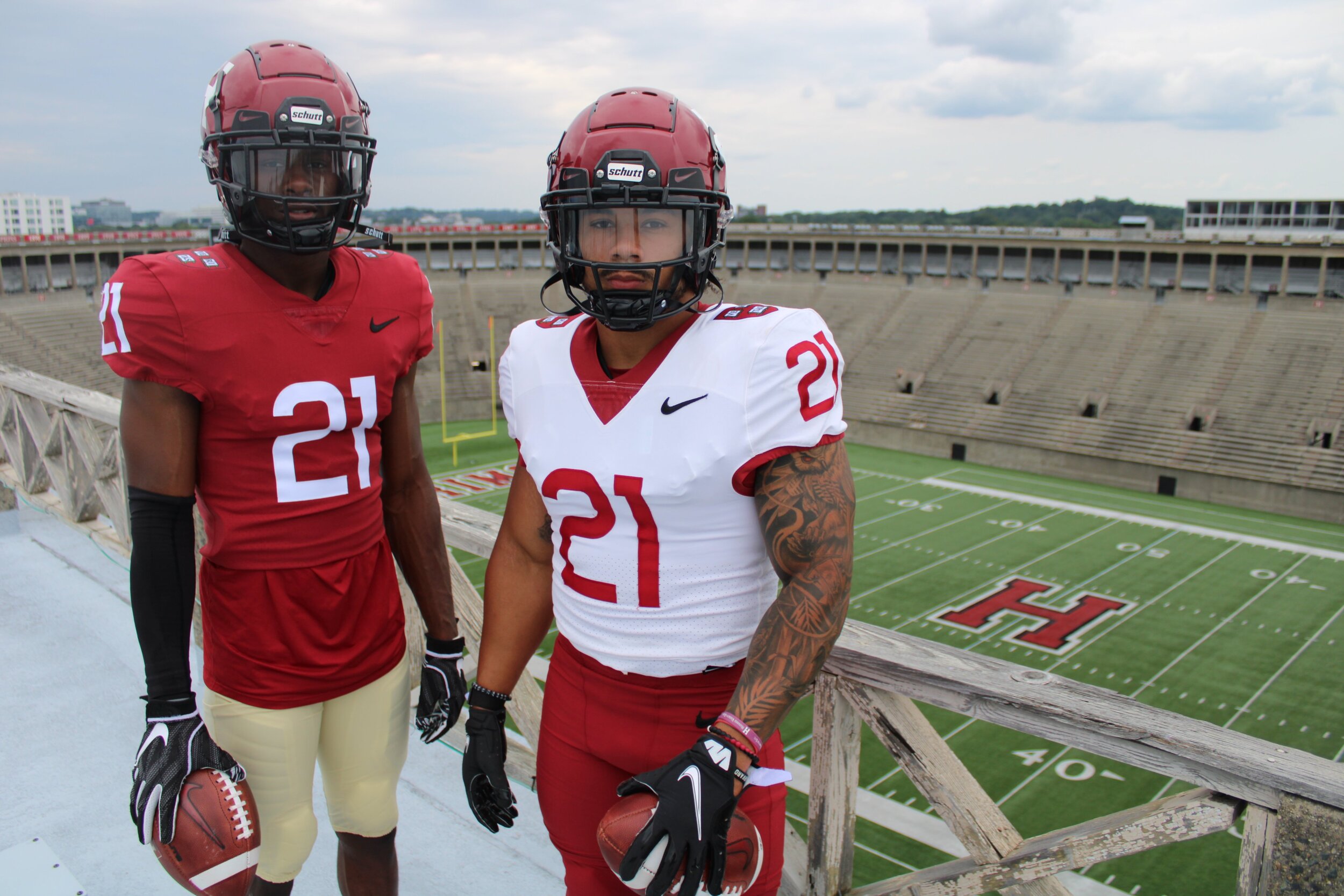
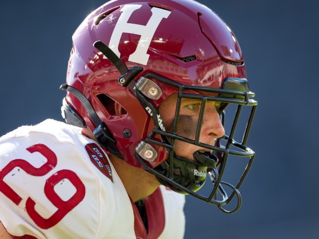
HARVARD CRIMSON
DESIGN
- The classic uniform remains unchanged except for the number font
- I like the new logo and font Harvard introduced a few years back but the number font doesn't fit with the Harvard vibe and is way too skinny
- Changed to a number font that's half rounded and half block
HELMET
- Crimson helmet with black facemask
- Added a black outline to the logo
JERSEY
- Updated the number font
- Re-added a black outline to the numbers
- Added a white outline to the school shield on the home jersey
PANTS
- Tan and crimson pants
Up next will be Florida A&M. Thank you for looking and as always, C&C is greatly appreciated!
-
5
-
19 hours ago, -Akronite- said:
I really like this concept! I think shoulder stripes like that can really work for teams but are rarely used (effectively, at least). It's a great way to make the lightning bolt separate itself from the various other bolt-centric identities out there (obviously they use the Chargers logo now because it's the cream of that crop).
Thank you! I like vertical shoulder stripes too and really think more teams could really benefit from them.
-
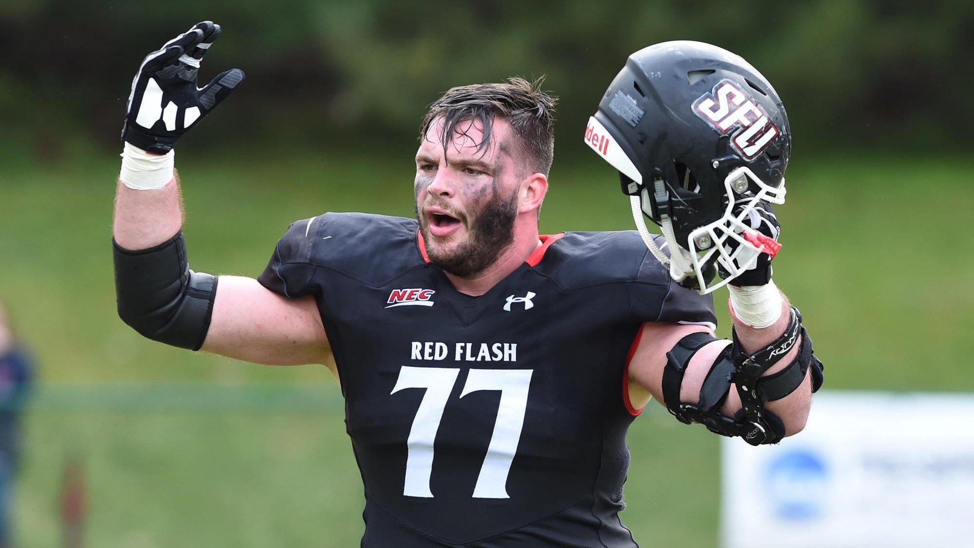
SAINT FRANCIS RED FLASH
DESIGN
- SFU's uniforms now are basically just black and white so I put the red in Red Flash
- Made the lightning bolt from the logo the stripe
- Used the font from the logo
HELMET
- Red and black helmet with black facemask
- Primary logo on the helmet instead of the old Chargers logo
- New stripe added
- "SFU" on the front bumper and "RED FLASH" on the back bumper
- Pennsylvania state silhouette with lightning bolt on the back
JERSEY
- Added the new stripes as racing stripes for a vertical look
- Updated the number font to the school fonts
- Primary logo on the chest
PANTS
- White, red, and black pants
- Added new stripe
I made this before the recommendation of using a different black so the template will show better but I will use it in the future. Up next will be Harvard. Thanks for looking and as always, C&C is greatly appreciated!
-
6
-
1
-
4 hours ago, Djruggs said:
I love almost all of what you've posted, my only real piece of advice would be to maybe use a black with a bit more grey in it as the details of the template get kinda lost when you use #000000
Thank you! I have trouble putting designs in the correct spot in reference to the template when it’s black design and that’s a good idea.
-
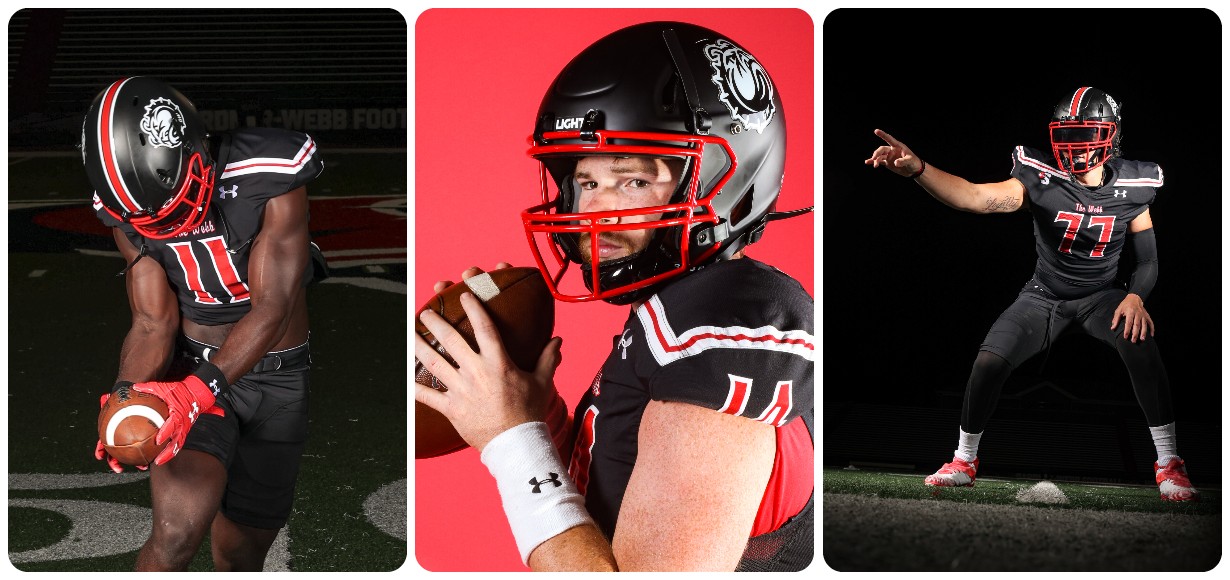
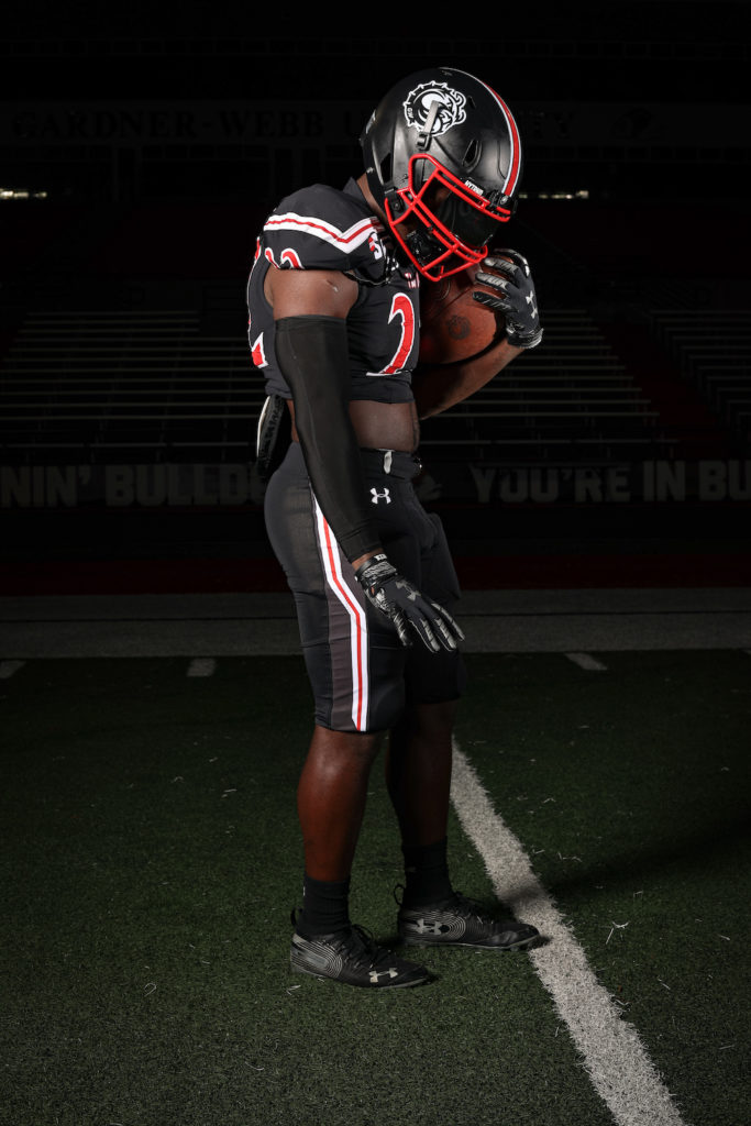
GARDNER WEBB RUNNIN' BULLDOGS
DESIGN
- Took the thinner Northwestern stripe from the helmet and made that the stripe throughout the uniforms
- I wanted to do something different with the name "runnin' bulldogs" so I put the bulldog logo on the sleeve and the stripes acting like speed lines. This is also a nod to the old helmets from the early 2000's
- Same font
HELMET
- White helmet with white facemask and black helmet with black facemask
- Runnin' bulldog logo on both helmets
- "'DAWGS" on the front bumper and "GARDNER-WEBB" on the back bumper
JERSEY
- Added the new stripes and logo on the sleeves
- Added the school font for the chest text and numbers on the jerseys
PANTS
- White, red, and black pants
- Added new stripe
Up next will be Saint Francis out of the NEC. Thanks for looking and as always C&C is greatly appreciated!
-
3
-
Army released their uniforms for the Army/Navy game.
The gradient jersey reminds me of the Atlanta Falcons’ alts
-
2
-
1
-
-
Kentucky going with the alternate logo on black helmets
I still can’t get over that this logo looks like 2 birds mating
-
1
-
 9
9
-
-
Tennessee is debuting orange helmets
-
16
-
3
-
-
ILLINOIS STATE REDBIRDS
DESIGN
- Took the design from the bottom of the wordmark logo and used it as the stripe
- Even though I took elements from the wordmark, I did update the font
HELMET
- White helmet with black facemask
- Added the new stripe
- "BIRDS" on the front bumper and "ILLINOIS STATE" on the back bumper
- Illinois flag on the back
JERSEY
- Added the new stripe and new fonts
PANTS
- White and red pants
- Added the new stripe
Continuing with the red and black teams, Gardner-Webb will be next. Thanks for looking and as always C&C is greatly appreciated!
-
2
-
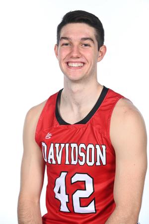
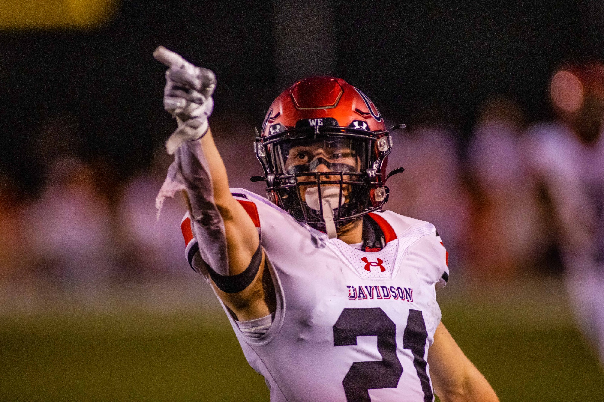
DAVIDSON WILDCATS
DESIGN
- Went back to a Northwestern stripe and added claw marks from the secondary logo for a unique twist
- Kept the same wordmark and added the matching number font
HELMET
- White, red, and black helmet with black facemask
- Replaced the secondary logo with the primary logo
- Added the new stripe
- "CATS" on the from bumper and "DAVIDSON" on the back bumper
JERSEY
- Added the new stripes
- Replaced the block font with the school font
- Removed the drop shadow from the chest text
PANTS
- White, red, and black pants
- Added the new stripe
Up next will be another red and black team, Illinois State. Thanks for looking and as always C&C is greatly appreciated!
-
5
-
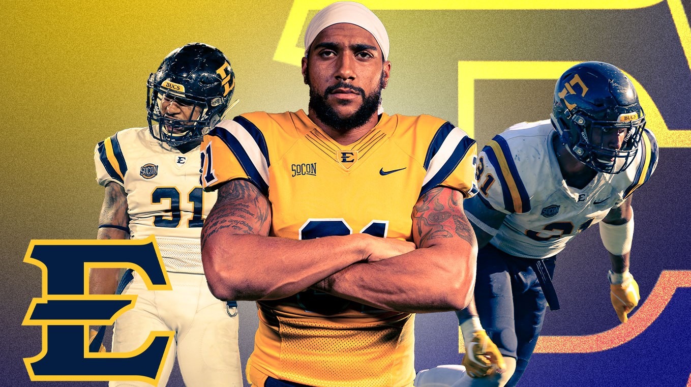
ETSU BUCCANEERS
DESIGN
- I like ETSU's uniforms but I wanted to add a little bit more to them
- Added a spoke in the middle of the stripe and a curve at the ends to replicate the font
HELMET
- Navy helmet with navy facemask
- Added the new stripe
- "ETSU" on the from bumper and "BUCCANEERS" on the back bumper
- Tennessee silhouette from the logo on the back
JERSEY
- UCLA stripes stay but with a spoke added in the middle
- Added the Buccaneer head logo on the sleeves instead of the numbers
- I love that logo and thought it should be prominently placed on the jerseys like the Panthers jersey logo
- New number font based on the type font is added
PANTS
- Gold, white, and navy pants
- Added the new stripe
Up next will be Davidson. Thanks for looking and as always, C&C is greatly appreciated!
-
4


/cdn.vox-cdn.com/uploads/chorus_asset/file/11705491/Florida_Jordan_Unis.jpg)
/cloudfront-us-east-1.images.arcpublishing.com/gray/UU7BXMWUVNAZ7G74H4G3GDMAXU.jpg)
College Football Uniform Concepts FBS, FCS, D2 & D3- Lehigh Mountain Hawks
in Concepts
Posted
CHATTANOOGA MOCS
DESIGN
HELMET
JERSEY
PANTS
Up next will be Marist. Thanks for looking and as always, C&C is greatly appreciated. Thanks!