


NH4
-
Posts
778 -
Joined
-
Last visited
-
Days Won
5
Posts posted by NH4
-
-
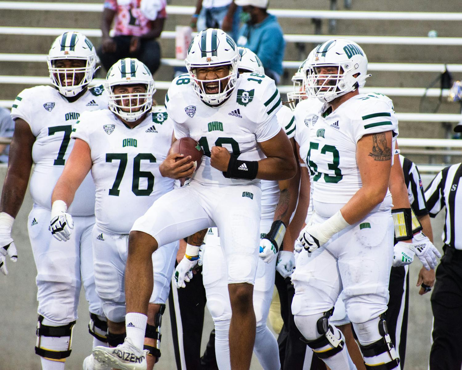
OHIO BOBCATS
LOGO

- Just as a lot of schools I edited their logos for, I removed unnecessary colors from Ohio's logo
- White replaces tan and green replaces black
UNIFORMS
DESIGN
- Stayed true to the double stripe uniforms but made a few changes
- Moved the jersey stripes back to the shoulder as Ohio previously had
- Added pants stripes
- Created the new nickname and number font based off the font in the logo
HELMET
- White helmet with white facemask
- Extended the stripe to the bottom of the helmet
- Bobcat logo on front bumper and "BOBCATS" on back bumper
JERSEY
- New stripes added
- Numbers moved to the sleeve cap
- Straightened out the chest text
- New number font added
PANTS
- White and green pants
- Added the stripe
Up next will be Wyoming. Thanks for looking and as always, C&C is greatly appreciated!
-
 4
4
-
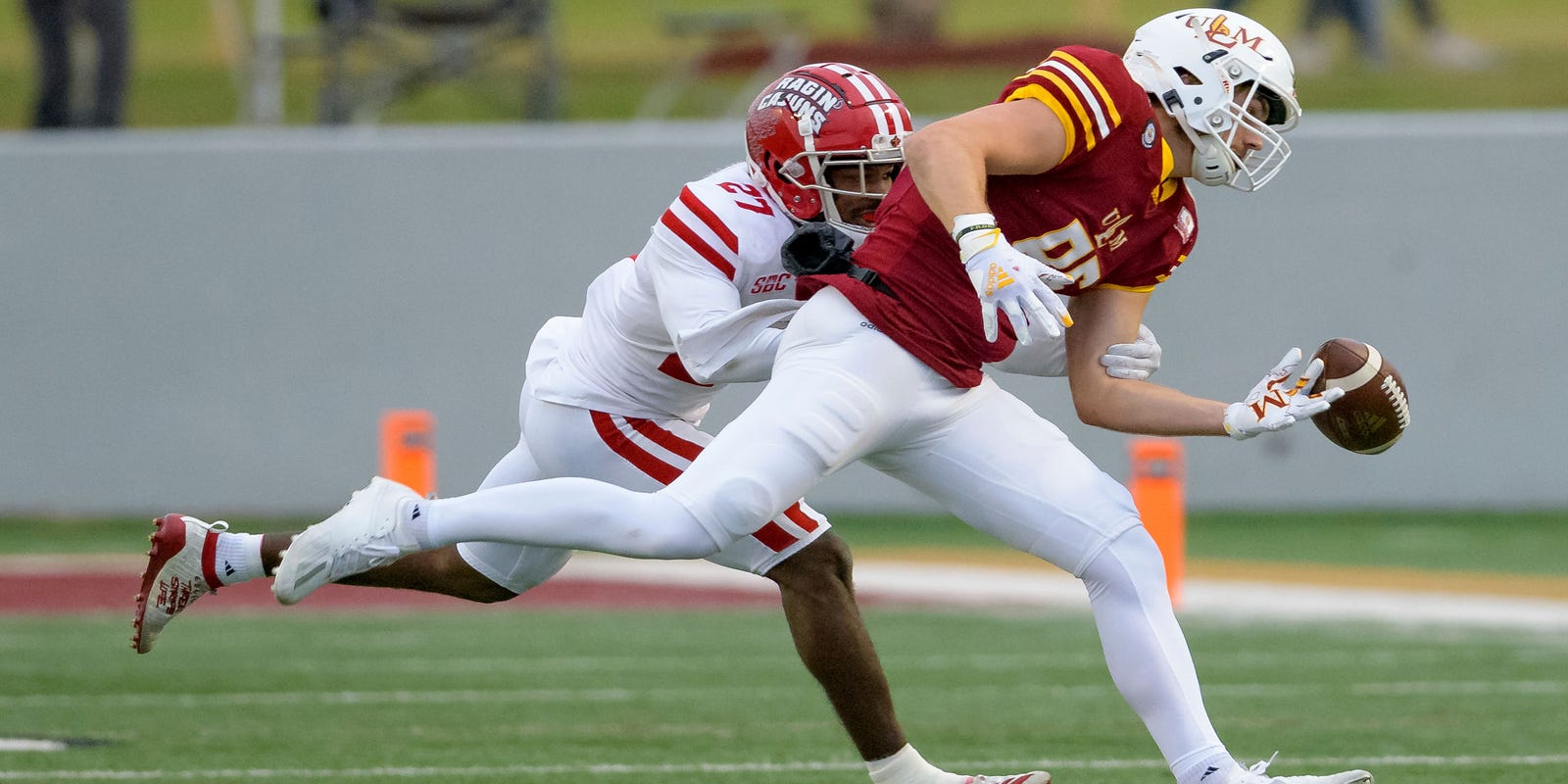
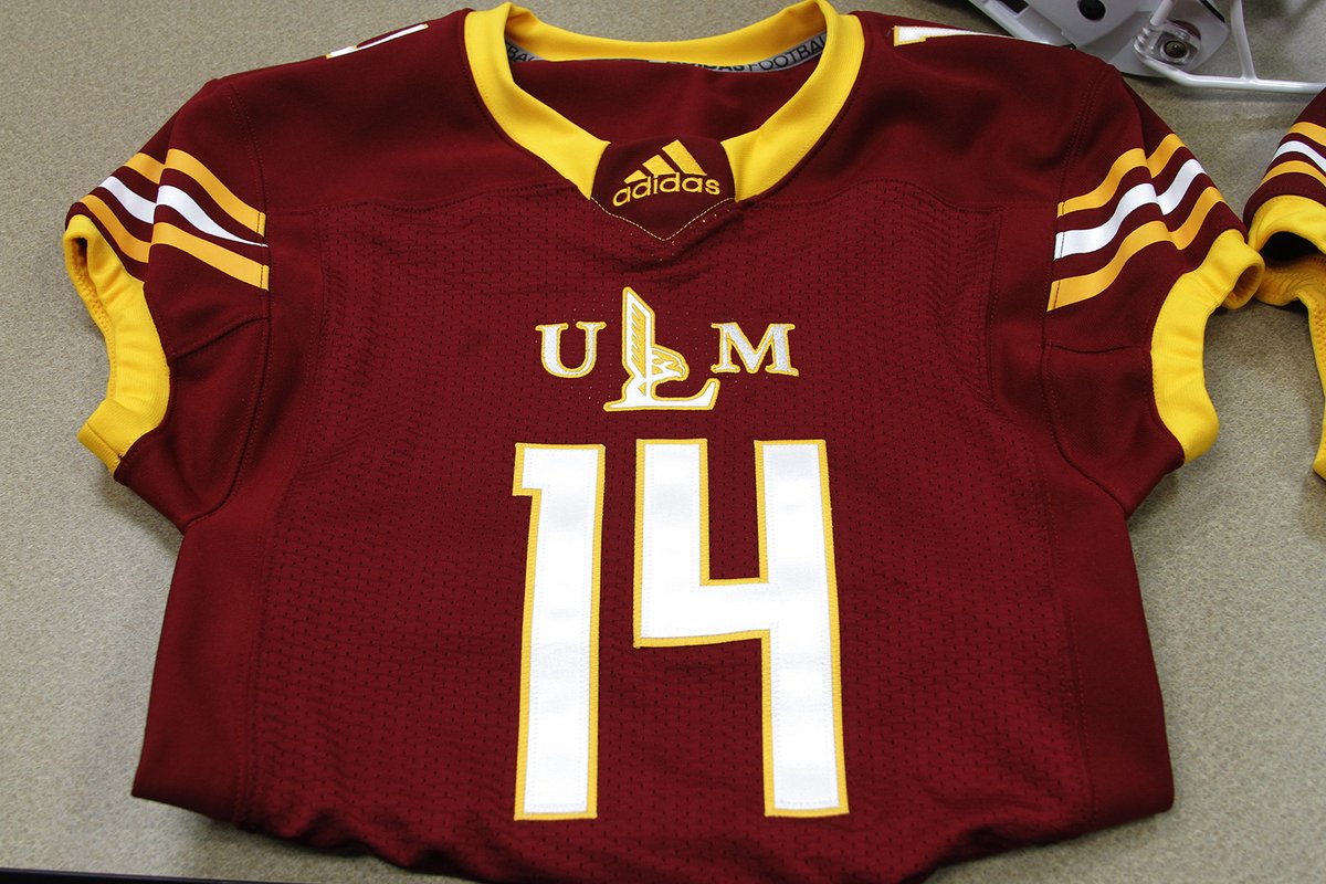
UL MONROE WARHAWKS
DESIGN
- Used the jersey stripes as the basis from this design
- Changed the font from a rounded font to a block font
HELMET
- White helmet with maroon facemask
- New stripe added
- Primary logo on front bumper and "WARHAWKS" on back bumper
JERSEY
- Updated fonts added
- Removed the collar and cuff colors
PANTS
- Gold, maroon, and white pants
- New stripe added
Up next will be Ohio. Thanks for looking and as always C&C is greatly appreciated!
-
4
-
26 minutes ago, aawagner011 said:
Minnesota has devolved into looking like trash the last 5-10 years.
Ever since PJ Fleck took over. Their uniforms in the mid 2010's were really good imo
but once Fleck took over, it's very little gold but a lot of chrome, white, and black (or anthracite)
-
5
-
 2
2
-
-
New black and white uniforms for Minnesota. Very little maroon and no gold for the GOLDEN Gophers…
-
 2
2
-
 1
1
-
 1
1
-
-
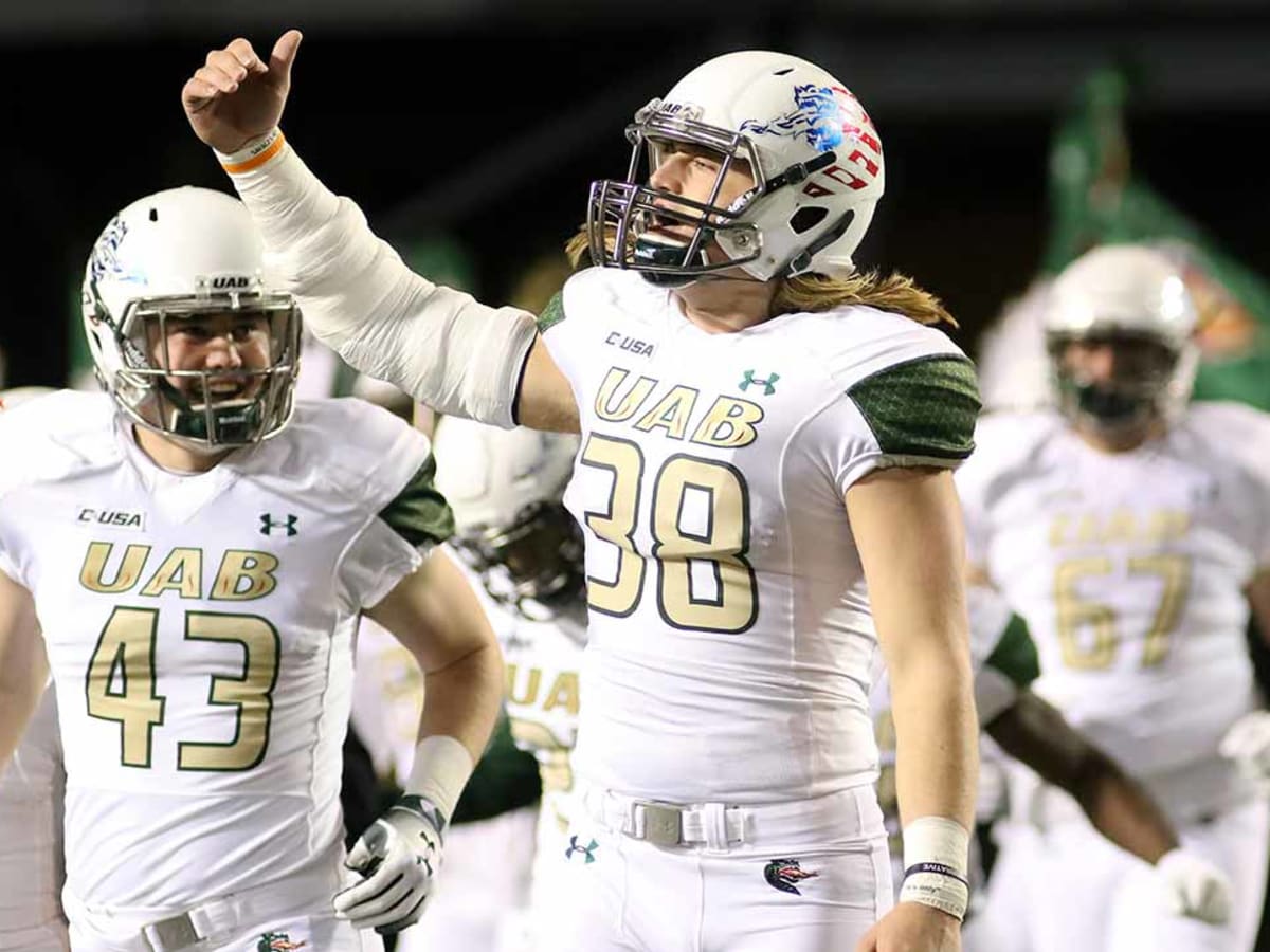
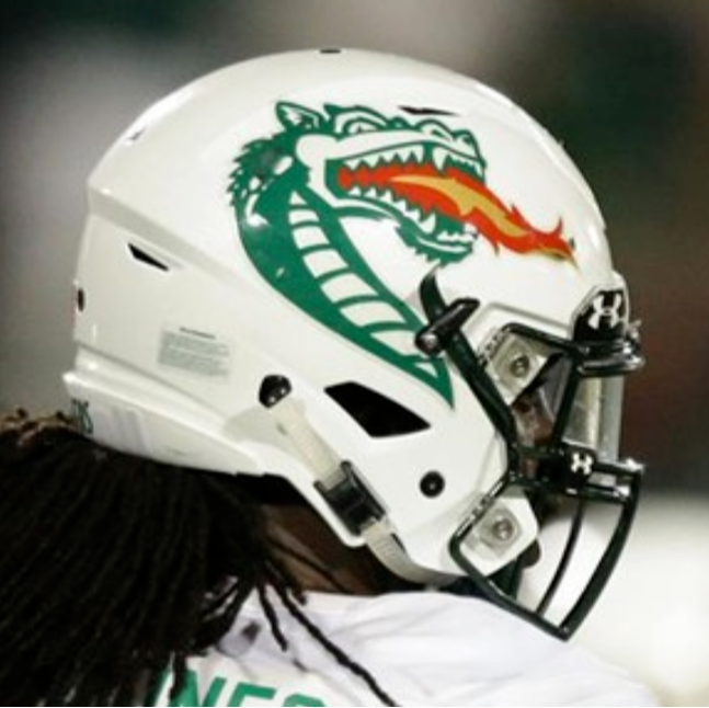
UAB BLAZERS
LOGO
- I really liked the re-colored logo used on their gold helmets so I used that as the new logo
- Removed black and replaced it with green
- Replaced the green with gold
UNIFORMS
DESIGN
- I really like the dragon scale pattern on the sleeves and I think it's very unique so I kept it but made it a little more visible
- Used the font from UAB's official branding
HELMET
- Gold and white helmet with green facemask
- New logo added
- Birmingham flag and a flame on the back
JERSEY
- Updated fonts added
- Changed the away number and chest text colors to green with a gold outline
PANTS
Up next will be Louisiana-Monroe. Thanks for looking and as always C&C is greatly appreciated!
-
4
-
 1
1
-
News on Tennessee’s Smokey Gray uniforms
-
1
-
-
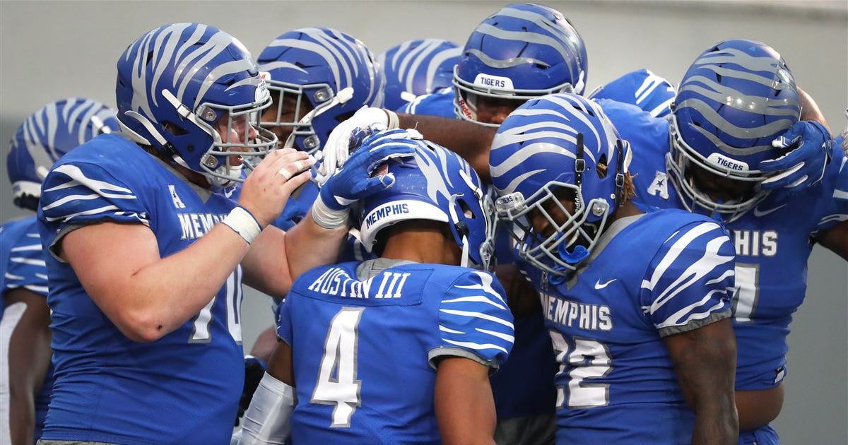
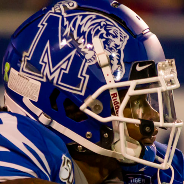
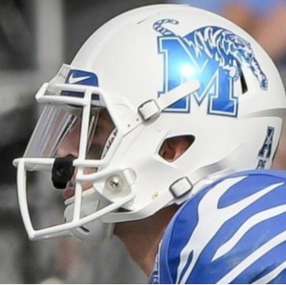
MEMPHIS TIGERS
LOGO
- I love that Memphis updated their logo but I don't like all the gray when there is very little gray on the uniforms
- Changed gray to white
UNIFORMS
DESIGN
- Kept the sleeve cap tiger stripe design
- Updated the font so that they're not using Michigan State's font
HELMET
- Blue and white helmet with white facemask
- Memphis flag on the back
JERSEY
- Updated fonts added
PANTS
Up next will be another team with a pattern on the sleeve cap, UAB. Thanks for looking and as always C&C is greatly appreciated!
-
4
-
22 hours ago, -Akronite- said:
CMU: Really like the concept of using the motion stripes. Only things I'm not convinced by are the helmet stripes. Maybe it'd be dumb but perhaps the logo stripes should connect in the back?
FAU: Think the owl makes a better helmet logo but can't really complain overall.
Penn State: Perfection. They could stick with what they have forever and I'd be fine but tweaking toward the throwback full time would absolutely elevate the look to the highest plane of football aesthetics.
Thank you! The side helmet stripes for Central Michigan was actually my first design but the side looked very cramped and busy so I put them on the front.
For FAU, I actually had concepts with the owl on it but I didn't post. But here they are:
Thank you for the comments!
-
2
-
1
-
-
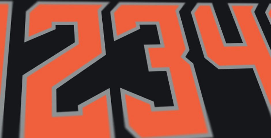
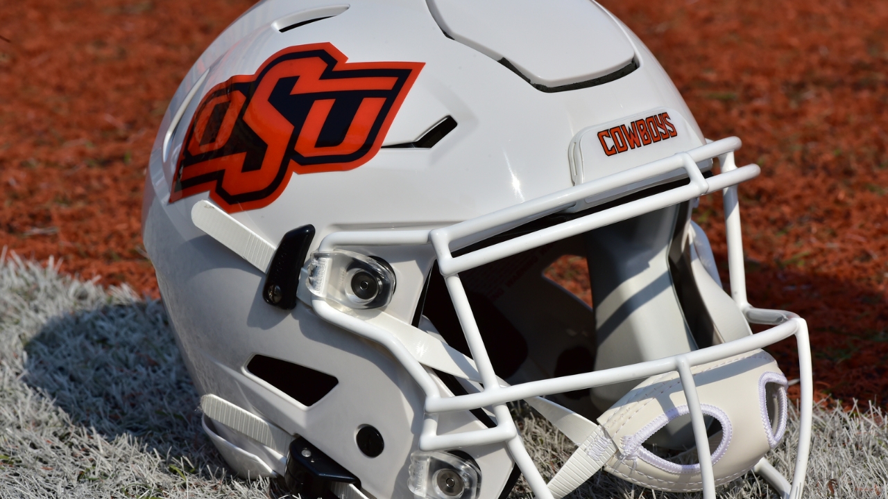
OKLAHOMA STATE COWBOYS
DESIGN
- I think Oklahoma State hit it out of the park with their recent uniforms so I kept it basically the same but cleaned it up a little
- They have 3 different fonts, the numbers and pants text, end zone text, and Cimarron font. I like the numbers and pants font the best so I used that as the only font
HELMET
- White, black, and orange helmet
- Primary logo is the only helmet logo
- They've had a ton of different helmet logos but I wanted to clean it up and I really like the OSU logo
JERSEY
- Kept the pattern on the collar and cuffs
- Changed the black jersey number outline from silver to white and flipped the orange jersey number colors
PANTS
- Removed leg text
Up next will be Memphis. Thanks for looking and as always C&C is greatly appreciated!
-
2
-
PENN STATE NITTANY LIONS
DESIGN
- A traditional team stays traditional but with 2 changes
- Changed the font to match what they have been using in promotional material and the number font from the throwback uniforms
- Added a pants stripe from the throwback uniforms to match the helmet stripe
HELMET
- No change
JERSEY
- Updated the number font
PANTS
- Added stripe
Up next will be Oklahoma State. Thanks for looking and as always C&C is greatly appreciated!
-
4
-
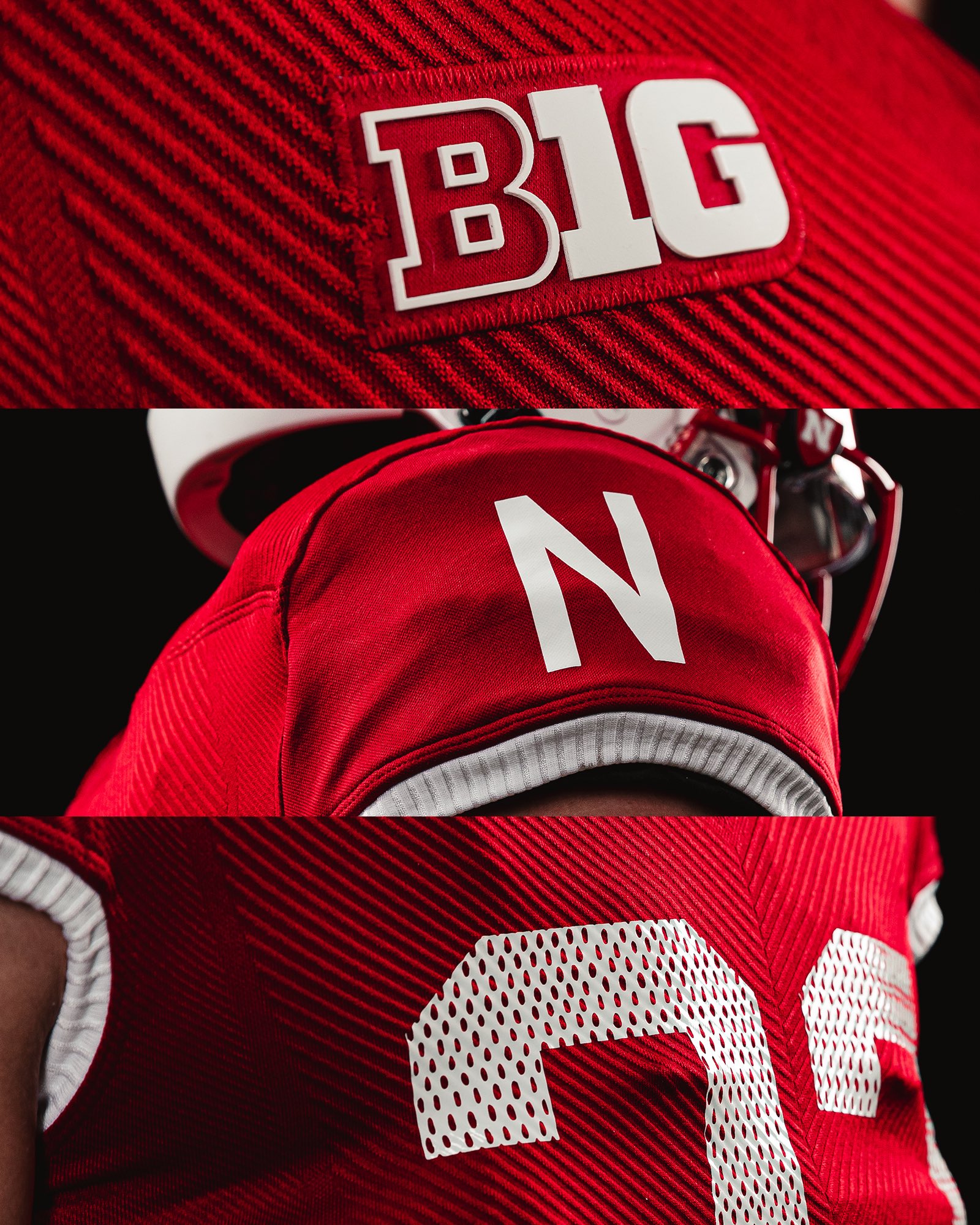
3 minutes ago, Germanshepherd said:
New Husker throwbacks, presumably for Oklahoma game. Always had a soft spot for the Sleeve N.
Adidas would be amazing if they just stuck to throwbacks, these are really good. One very little thing I'm interested in seeing is if the rubber conference patch will come off like the Dodgers rubber helmet logo did
-
2
-
 2
2
-
-
Throwbacks for Mississippi State. Adidas finally did something good
-
10
-
-
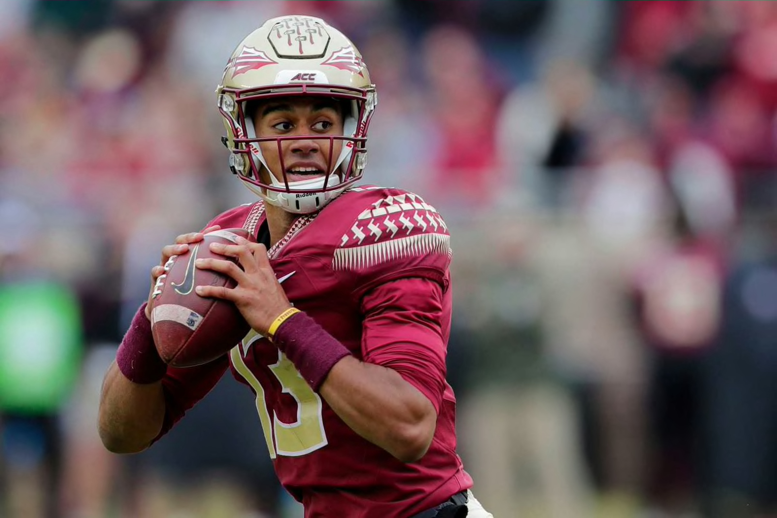
FLORIDA STATE SEMINOLES
DESIGN
- I like the pattern Florida State uses but I think it's a little too much on the sleeve caps
- So, I moved it to the sleeve cuffs like the uniforms from '98-'13
HELMET
- Changed the back bumper to "FLORIDA STATE"
JERSEY
- Stripes moved to the cuffs
- I thought about moving the shoulder numbers to the sleeves but the old uniforms had shoulder numbers with nothing on the sleeve caps, so I kept them
PANTS
Up next is another traditional team, Penn State. Thanks for looking and as always C&C is greatly appreciated!
-
5
-
On 8/13/2022 at 3:15 PM, Discrim said:
Given how boring I think CMU's logo is, I've never done a concept for them (and I actually know a guy who pitched for the Chips in the mid 2000s)...but you've overcome that blandness in a way that requires busting out this little dude

Haha thank you! Who would've thought a block C with some lines would be the inspiration but I'm glad I could make it look good.
-
6 minutes ago, MJWalker45 said:
UCF wasn't using a custom font. I like this new font for what it is, but the comparison to Syracuse is spot on. Having a slight diffference in the size of both halves of the 8 would be ok, but this is too big a difference.
Wait I thought the number font they used was their custom font? Unless Nike uses it as a catalog font now like Michigan State
-
1
-
-
3 hours ago, Germanshepherd said:
UCF refreshes its look. Not a fan. The number font looks like Pitt mixed with Eric Dungey era Syracuse which is not a good thing and that pants stripe is miniscule.
UCF has a great custom font and they just threw it away for some thin numbers that, I agree, remind me of Syracuse’s old ones. Huge downgrade
-
2
-
-
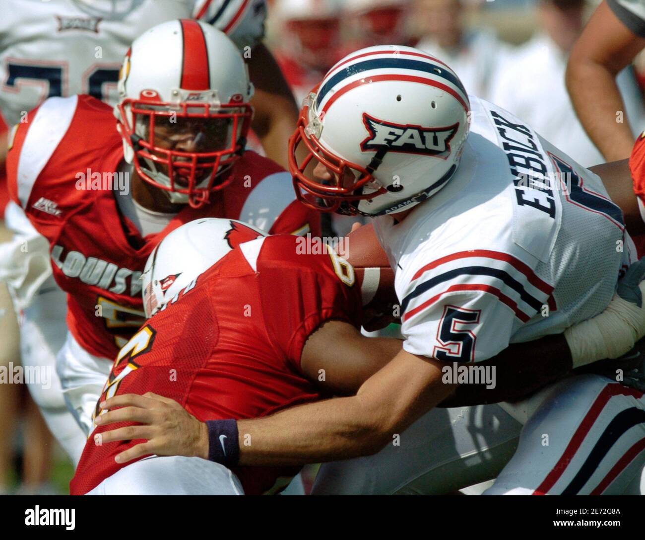
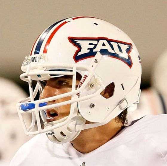
FLORIDA ATLANTIC OWLS
DESIGN
- Combination of eras with the striping from the 2000's uniforms, current font, and white facemask from 2012.
HELMET
- White helmet with FAU logo only
- Florida state shape/ATLANTIC logo on the back
JERSEY
- New stripes added
PANTS
- White pants only
- Stripes added
Up next will be another team from Florida, Florida State. Thank you for looking and as always C&C is greatly appreciated!
-
5
-
Bucks released their purple throwbacks
-
11
-
-
3 hours ago, CaliforniaGlowin said:
I am happy to report a NAVY AND RED DEATH!

That new color scheme is gorgeous and the new blue makes way more sense than red
-
2
-
-
10 hours ago, GriffinM6 said:
I'm honestly surprised I've never seen what you've done with the motion lines before on a CMU concept. It looks fantastic!
9 hours ago, Hawkeye15 said:Agreed. Very well done. I love the asymmetric helmet it creates.
Thank you guys! I was also shocked no one has used the motion lines as stripes because I thought it was the perfect design for Central Michigan. I looked all over for a concept like this and nothing came up so I’m glad it was unique
-
1
-
-
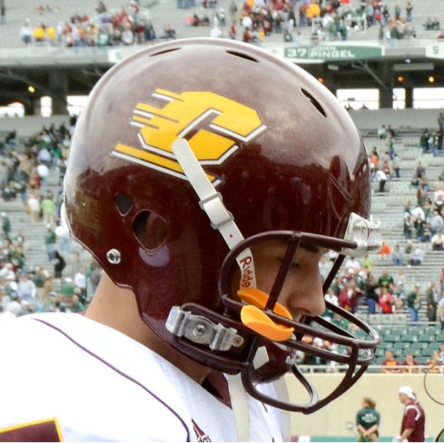
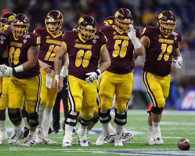
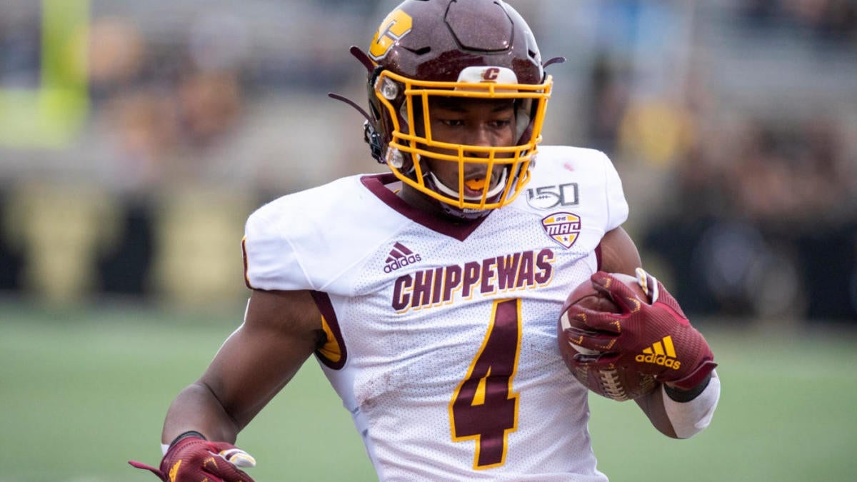
CENTRAL MICHIGAN CHIPPEWAS
DESIGN
- New 3 stripe design comes from the motion lines in the logo
- I thought the stripes worked well especially since Adidas is their sponsor and the 3 stripes is their thing
HELMET
JERSEY
- New stripes added
- Updated the numbers to the same font
- The numbers are similar to what they had in 2021 but with a drop shadow on the numbers instead of an outline
PANTS
- Gold and maroon pants
- New stripe added
Up next will be Florida Atlantic. Thanks for looking and as always, C&C is greatly appreciated!
-
6
-
1
-
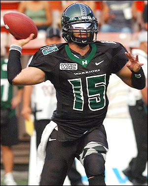
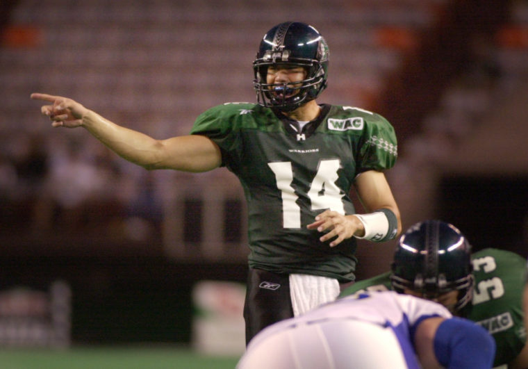
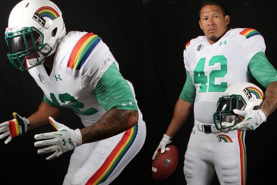
Now these are the amazing Warriors uniforms instead of the bland navy ones.
-
8
-
2
-
-
3 hours ago, mahnkej said:
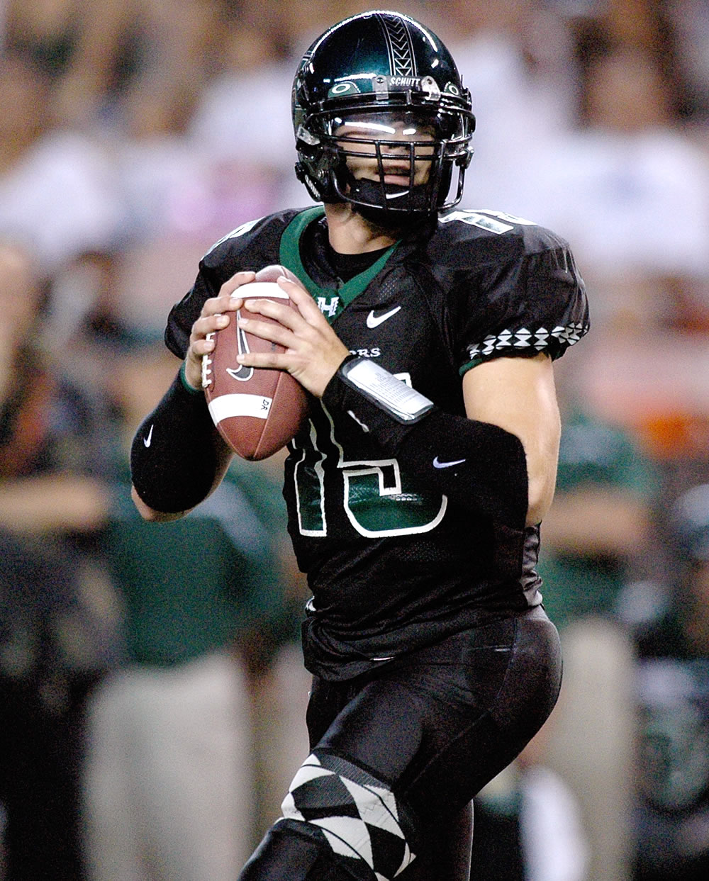
Hawaii looks great! Usually I kinda hate assymetrical designs, but with Hawaii it just works. Fits the vibe and plays on tradition. Yours is like a cleaner version of their look from the Colt Brennan days.
Thank you! I feel the same way about asymmetrical designs but it works with Hawai'i
On 8/2/2022 at 10:36 AM, GriffinM6 said:I like the design with the asymmetry, but I think the right side of the uniform feels pretty blank. Maybe put the sleeve stripe on the right side and leave the leg stripe on the left to offset this?
Ok so something like this?
And because I like the asymmetrical design for Hawai'i, I wanted to see how it looked like with the number on the right sleeve
Let me know what you think!
-
1
-
-
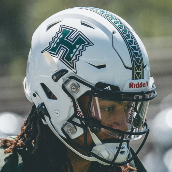
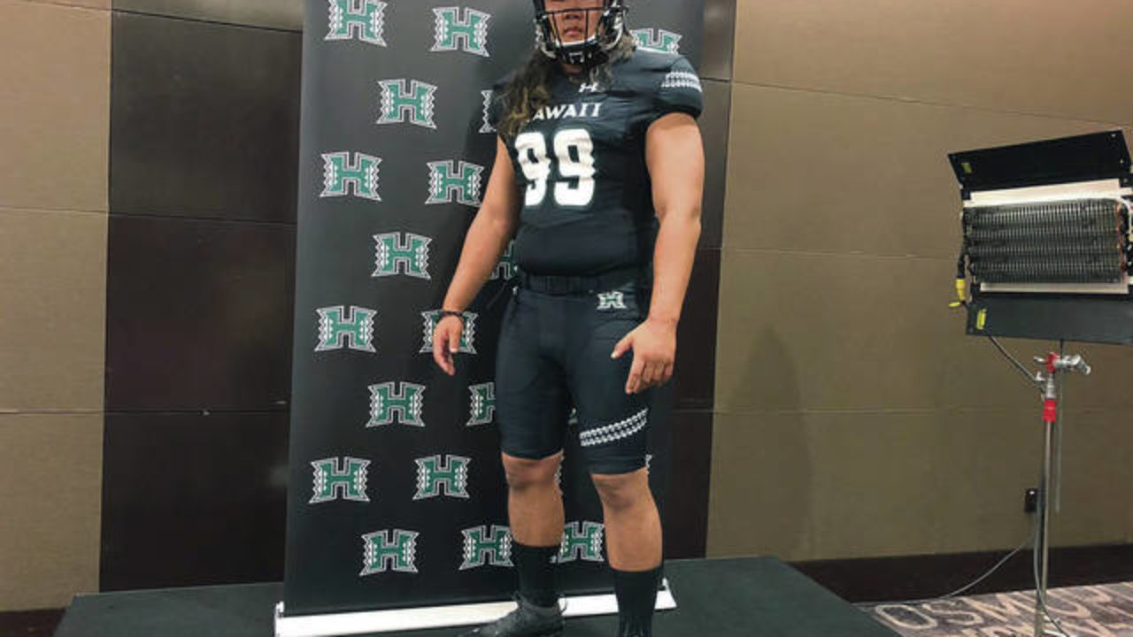
HAWAI'I WARRIORS
DESIGN
- Took Hawai'i's famous helmet stripe and made that the stripe throughout the whole uniform
- I'm very surprised they've never done this given the numerous amount of jerseys they've worn with the helmet
HELMET
- Green, black, and white helmet
- Primary logo on front bumper and "HAWAI'I" on the back
- Hawaiian island silhouette on the back
JERSEY
- Stripe is added to the left sleeve cap continuing the tradition
- Sleeve numbers move to the shoulders
PANTS
- Stripe wraps around the left leg
THROWBACKS
- Hawai'i's throwbacks are some of the best so I had to continue them
- I created both a home and away throwback uniform because why not? They are fantastic
- Kept it basically the same except changed the facemask to white
Up next will be Central Michigan. Thanks for looking and as always, C&C is greatly appreciated!
-
5


:format(jpeg)/cdn.vox-cdn.com/uploads/chorus_image/image/51756121/usa_today_9655978.0.jpg)
/cdn.vox-cdn.com/uploads/chorus_image/image/48718779/usa-today-8134593.0.jpg)

/cdn.vox-cdn.com/uploads/chorus_asset/file/10262931/New_Gopher_Football_Uniforms.jpeg)
:no_upscale()/cdn.vox-cdn.com/uploads/chorus_image/image/70323199/usa_today_16777155.0.jpg)


:quality(70)/cloudfront-us-east-1.images.arcpublishing.com/tronc/T2MCFM2YCJC4FNRHBIBNEHW6XM.jpg)


/cdn.vox-cdn.com/uploads/chorus_image/image/71152652/usa_today_16824145.0.jpg)
/cdn.vox-cdn.com/uploads/chorus_image/image/56823035/844514732.0.jpg)
/cdn.vox-cdn.com/uploads/chorus_asset/file/23104404/1236738875.jpg)
/cdn.vox-cdn.com/uploads/chorus_image/image/69778792/usa_today_15246370.0.jpg)
/cdn.vox-cdn.com/uploads/chorus_image/image/65347223/1175633093.jpg.0.jpg)
:format(jpeg)/cdn.vox-cdn.com/uploads/chorus_image/image/46366290/usa-today-8239098.0.jpg)
/cdn.vox-cdn.com/uploads/chorus_image/image/47160782/Screen_Shot_2015-09-10_at_4.48.12_p.m.0.0.png)
College Football Uniform Concepts FBS, FCS, D2 & D3- Lehigh Mountain Hawks
in Concepts
Posted
WYOMING COWBOYS
DESIGN
HELMET
JERSEY
PANTS
Up next will be Virginia Tech. Thanks for looking and as always C&C is greatly appreciated