


phutmasterflex
-
Posts
3,353 -
Joined
-
Last visited
-
Days Won
2
Posts posted by phutmasterflex
-
-

I can see their attempt to combine past fonts into a new one but it doesn't work for me.
-
 4
4
-
-
31 minutes ago, DNAsports said:
I’m warming up to the idea of 32 FC.
Just call them the “Thirty-Twos”
We don't need another team with numerals in their team name.
-
5
-
-
^ PETA won't like that
-
3
-
-
Leaked draft caps. Not confirmed if these are the designs but if they are, they're just ok. Not great but not bad.
-
5
-
-
Looking back at the Jags photos, it made me realize how for Reebok, they've messed around with a different placement and design of collars for the NFL shield/Equipment logo.
Reebok initially had the NFL logo right at the tip of the black collar, a carryover from Nike.
Then they would change it with the NFL Equipment logo on a separate colored fabric and taper the collar (teams like DEN and BUF also had this).
Then when they had the uniform change, the NFL Equipment logo was placed lower onto the mesh of the uniform body which actually wasn't on the collar. (SF, SD were a couple teams who did this too)
-
2
-
-
What works for the Jags in all black was the other black pants without stripes. That really in a sense brings cohesion to the set making it a primarily black and gold uniform. So if it was a standalone uniform that emphasizes those two colors, it works mostly.
And when they changed the number on the white jerseys to black, it matched that cohesion.
But changing from the number from teal to black was a mistake. Teal should always be the color of the number on the black jerseys. And I feel that they don't need anything other than white pants.
-
3
-
-
11 hours ago, MNtwins3 said:
That set was so stupidly clean and inoffensive, PLUS they won a title in it, and they decided to change it for some reason to the current monstrosities
Actually, they won a title wearing these and this launched their whole effort in making black a thing.
-
6
-
-
Always hated that they went with the orange jerseys as their primary. I didn't even like them as an alternate because that blue side horn thing on the jersey doesn't match the one on the pants.
-
2
-
-
2 hours ago, WSU151 said:
Dolphins also wore both throwbacks in 2020.
If the 49ers are going to wear the correct socks for the red throwbacks, hopefully they'll wear them for the white throwback too.
Oh yeah they did do that last season.
Obviously, red socks completes the look so much better. They did kind of tease it.
-
3
-
-
1 hour ago, Cujo said:
Was unaware tv numbers are a safety concern like the one helmet rule..

That's how the NFL is justifying the one helmet rule: a safety issue.
But does another helmet worn by the same player during a season actually make a difference? Depends on who you ask.
-
2 hours ago, Gothamite said:
The two don’t really have anything to do with one another.
No directly but it just could mean that if they are relaxing the rules on one uniform thing, they could be making changes for another.
-
It is rare for a team to bust out two different throwbacks for the same season. The Dolphins did it two years ago so MAYBE it could be the case.
This is the Niners' 75th season so it would be nice if they had a patch to go with it. Much like in 1994 when they had a patch for the NFL.
-
1 hour ago, Gothamite said:
No.
But when the Chargers and Patriots introduce brand new uniforms without TV numbers, we know they’re not always required, as once they were.
Technically the Chargers still have TV numbers.
TV numbers probably were a required thing but likely the NFL is starting to relax on that rule. Probably the elimination of the one helmet rule is another part of that. High def TVs are def having a major impact and hopefully broadcasters and media type can still do their job if TV numbers were eliminated.
-
2
-
-
This full body logo I love. I know it is way too detailed to work on a uniform but it would have been cool to see it used in some form.
-
9
-
 1
1
-
-
On 2/24/2021 at 9:03 AM, PaleVermilion81 said:
The black pants were debuted with the flake helmet. The helmet did not work with the away set.
I think it did. Yeah you see the flakes but the helmet still for the most part was a black helmet with some teal on it, like the black pants with some teal on it.
-
4
-
-
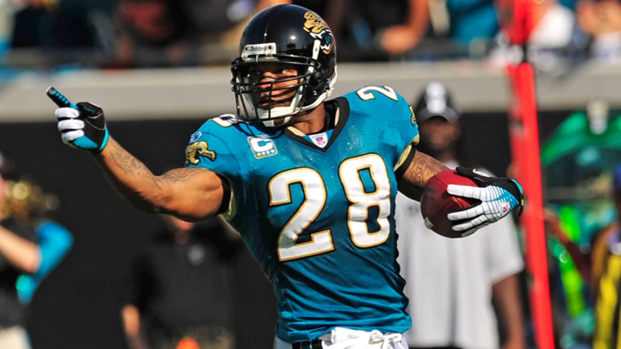
14 hours ago, Sport said:
Hated it, still hate it, have never understood the praise for it. Had the unintended effect of catching the sun and appearing dark blue or dark green in certain lighting. In this photo Blaine Gabbert's helmet does not match the rest of his uniform. That's dumb.
Well, the black unis didn't come until Nike/Khan decided to add it. The helmet worked with the initial set IMO.
-
The teal flaked helmet to me was the only good part of that awful set. I think because the helmet was essentially black. And when some teal was seen under the sun, it wasn't such a drastic change that it wasn't that big of a deal. With that said, having a solid black helmet is still better. The teal flake was just a cool thing -- a nice paint job to an ugly car.
-
8
-
-
2 hours ago, MJWalker45 said:
They look more like a college team than a pro team.
That's the whole purpose of the Jags design. Tom Coughlin drew inspiration from Penn State's uniform.
-
The issue with that aquafresh piping was that it went through so many changes under Reebok depending on what kind of template was used. And for players like MJD, he wore all three. A design function that can't translate well through different players on the same team is not good.
-
21
-
-
5 minutes ago, Sec19Row53 said:
Who are they? That's Dallas, where they STILL play on astroturf (however named).
They don't. It's a form of field turf, not astro turf.
-
5
-
-
3 hours ago, fouhy12 said:
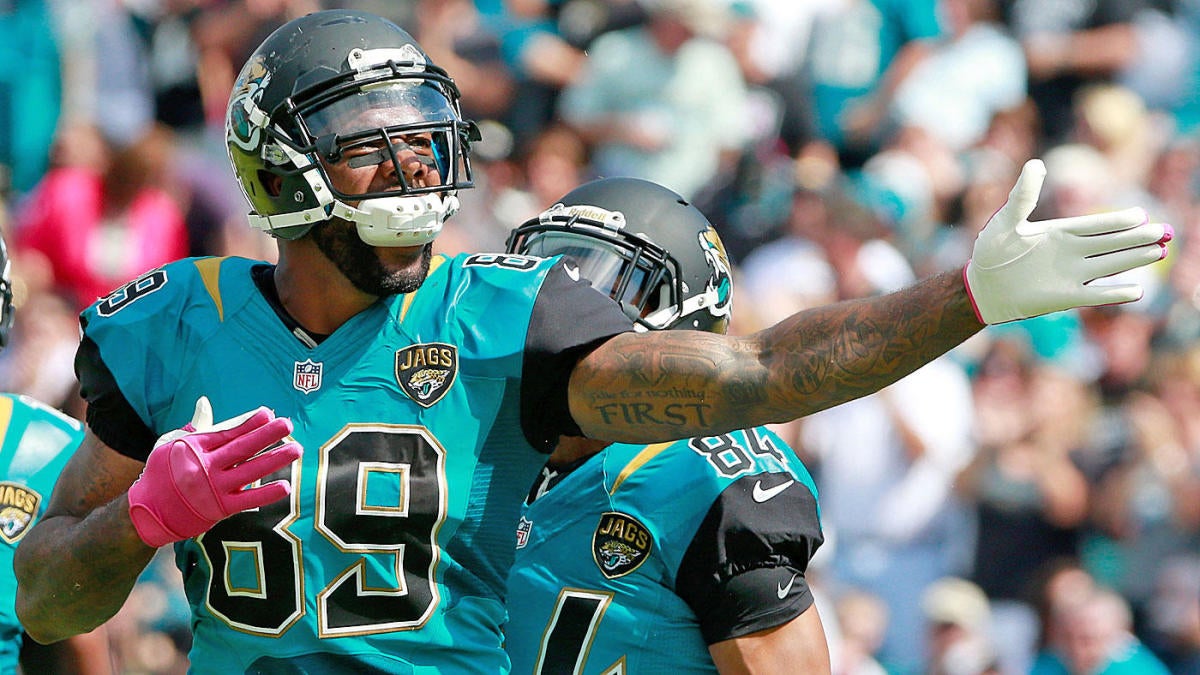
I didn't realize just how similar Jacksonville's teal and Philly's midnight green are until I saw this pic. They're really not that different.
Not really. Here's two photos of the uniforms under a bright sun. You can easily tell that these two are not that similar at all. One is more blue while the other is more green.
-
9
-
-
1 hour ago, PaleVermilion81 said:
The problem is that the "gold" would be just a mustard color. We've already seen how Nike translates the Jaguars gold to jerseys.
The gold trim on the number looks more like gold (matching that patch) versus the one on the shoulder which is more mustard. I do think that if it is part of the number like this, then adding it as a trim to the jersey number can work. It sucks that they had gold prominently featured in their identity in their last and to basically now having no gold except for the helmet logo.
I wouldn't be surprised if after the 5-year waiting period is up the Jags will change their uniforms again. Their current set was the brainchild of Tom Coughlin's desire to simplify and kinda be like Penn State. Maybe the team wants to move away from that era and hopefully embrace the teal as the primary going forward and bring back some more gold to their uniform.
-
7
-
-
40 minutes ago, WSU151 said:
Are the sleeves not black?
I mean...it's noticeable in the sun. Not as noticeable in the shade.
I think it's more noticeable on sleeves because the pads make the number curve, which makes it stand out more versus the number on the jersey where it's flat mostly. My point is that it blends better because it's black.
-
4 minutes ago, PaleVermilion81 said:
Raiders do this too.
What works well for the Raiders is that it is noticeable on the sleeves but not so much on the body part of the jersey because it's black.
-
1
-


/cdn.vox-cdn.com/uploads/chorus_asset/file/16327781/72847015.jpg.jpg)
/cdn.vox-cdn.com/uploads/chorus_asset/file/9165111/116605538.jpg)


/cdn.vox-cdn.com/uploads/chorus_image/image/1073261/uspw_6643232.0.jpg)
/cdn.vox-cdn.com/photo_images/5119969/136319809.jpg)


NFL Changes 2021
in Sports Logo News
Posted
Don't think so. Look at the Jags over the past couple of seasons. The all white tights/socks is their new norm.