

.png.2416a81b5a2f3a1ad9757bec6b2d644c.png)
StevenGrant94
-
Posts
350 -
Joined
-
Last visited
Posts posted by StevenGrant94
-
-
I love the colour scheme and the use of the updated pattern for the Coyotes!
-
 1
1
-
-
Dallas Stars

The socks paired with the Stars' green star jersey didn't use any black, which made them a good choice to use for this series. I also chose to use their original Texas-state-outline logo as the primary.
Tomorrow's concept uses socks worn by the old Detroit Cougars!
-
4
-
 1
1
-
-
Columbus Blue Jackets
I've never been a big fan of Columbus' cannon logo, but their fans seem to love it so I used it here (without the outlines though). The Blue Jackets wore this style of socks until 2017.
Check back tomorrow to see what I have in store for the Stars!
-
4
-
1
-
-
Colorado Avalanche
For the Avalanche I used their 2020 Stadium Series socks, and their state flag C logo as the primary logo.
The next concept uses the Blue Jackets' cannon logo on a white jersey!
-
3
-
-
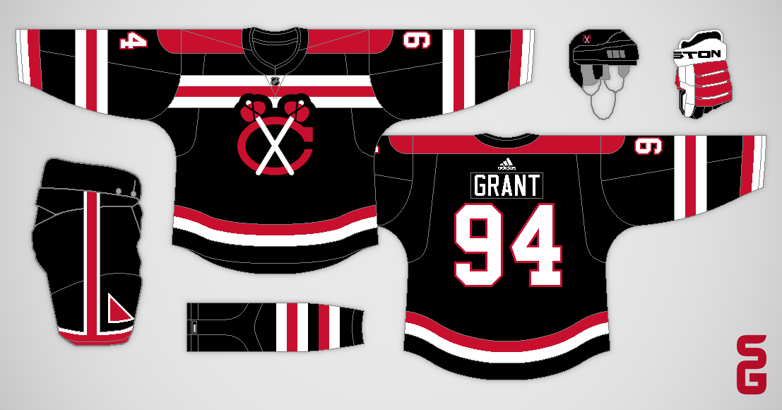
Chicago Blackhawks
This faux-back Blackhawks concept uses the socks they wore in the late 1940's. I also brought back the pant design from their 2009 Winter Classic uniform.
The Avalanche are up next with a steel blue jersey!
-
2
-
 1
1
-
-
Carolina Hurricanes
I brought back the Hurricanes original socks and number font, and used their original flag logo as the front crest, but I went with side panels and a sleeve length yoke for the striping pattern.
Come back tomorrow to see a Blackhawks concept using a sock design from the 1940's!
-
4
-
1
-
-
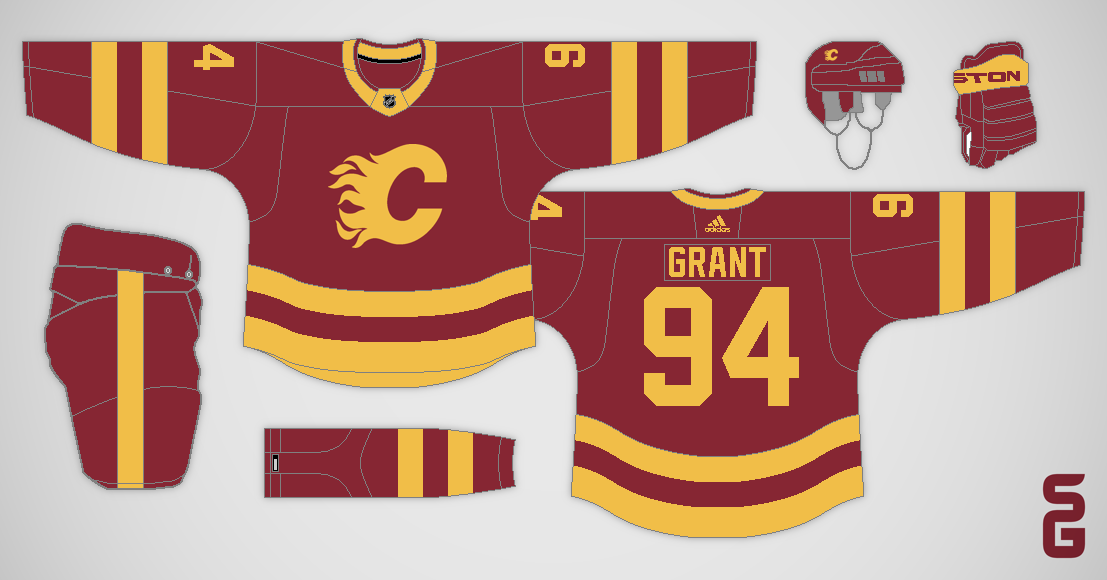
Calgary Flames
I loved the darker shade of red the Flames used for their 2011 Heritage Classic jersey, so I used those socks as the basis for this concept.
The Hurricanes are up next using a design with side panels!
-
3
-
-
Buffalo Sabres
I decided to go with a chest stripe for this Sabres concept, using the pattern from the home socks they wore in the 80's and early 90's.
Check back tomorrow to see a Flames concept that doesn't use any white!
-
7
-
-
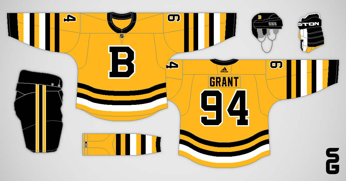
Boston Bruins
The Bruins used the same sock design from the 30's through the 60's (which they paired with several different jerseys), so it was an easy choice to bring it back for this concept.
Tomorrow's concept is a Sabres jersey featuring a chest stripe!
-
4
-
1
-
-
That third jersey for the Extreme is fantastic!
-
3
-
-
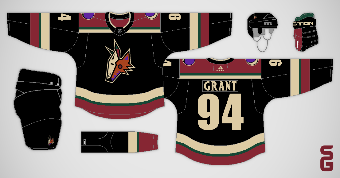
Arizona Coyotes
This concept uses the Coyotes dark Kachina socks, but ditches the Kachina pattern on the jersey for a more traditional design.
The Bruins are up next with a yellow jersey to match their traditional yellow socks!
-
4
-
-
I love the state flag inspired alternate jersey! The home and road look good too.
-
1
-
-
I'm back with an all new concept series! Here's how it works, each concept in this series will reuse a sock design the team has worn at some point in their history. My challenge is to make something new that still matches the chosen sock design.
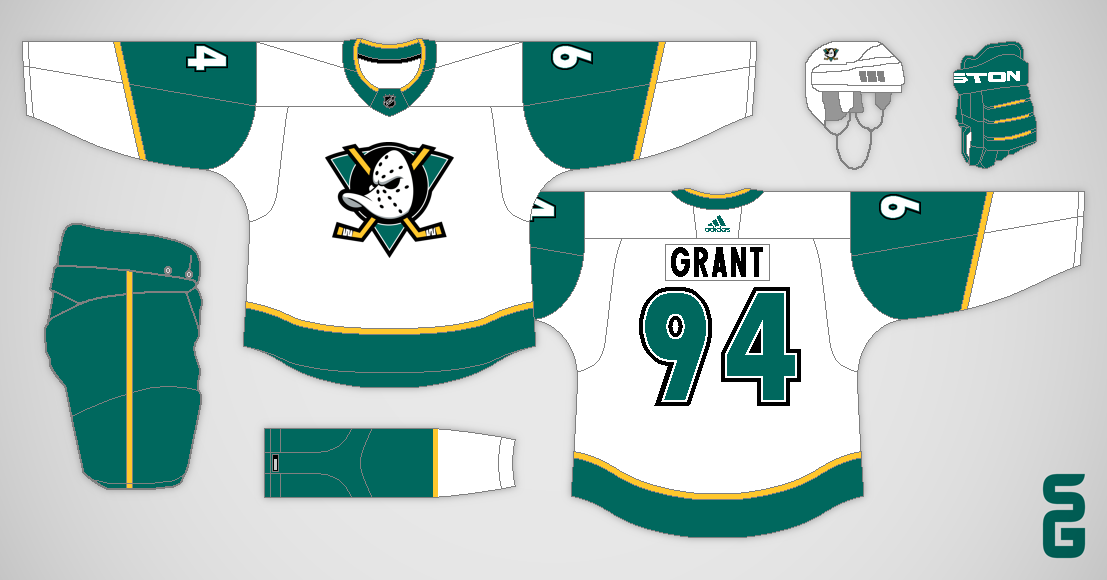
Anaheim Ducks
For the Ducks I went with their late 90's white third jersey socks, which didn't feature their eggplant colour at all. I also used the number font from that third jersey.
-
6
-
1
-
-
Just a quick post to wrap up this series. I donated $100 CAD ($25 each or $19 in USD) split between the four charities.
Here are links to the four charities if you want to join me in making a donation.
Come Back Alive: savelife.in.ua/en
Partners In Health: pih.org/maternal-center-excellence
Rocky Mountain Conservancy: rmconservancy.org
Sarcoma Foundation of America: curesarcoma.org/technoblade-tribute
-
2
-
1
-
-
On 11/12/2022 at 11:19 AM, DTConcepts said:
This is a pretty cool idea. I'll chip in a concept for a great organization that I've donated to many times, and whose work I especially value.
The Rocky Mountain Conservancy is an organization based out of Estes Park, Colorado that works to preserve the natural beauty and prestige of Rocky Mountain National Park. Through education programs, research grants, and conservation work in the field, the Conservancy does work that will enshrine RMNP's splendor for generations to come.
Click here to donate! And thanks once again for starting such a cool series!
Great looking concept, and looks like a great cause too, I'm looking forward to donating to them! Thanks for submitting this!
Here are my final two concepts...
Partners In Health Sierra Leone
Partners In Health (PIH) is building a Maternal Center of Excellence in Sierra Leone, which has one of the highest rates of maternal mortality in the world. "The new center, which broke ground in April 2021, will provide advanced maternal and child health services in Kono District and beyond."
The main PIH uniform uses orange from head to toe. The second uniform uses the shield from Sierra Leone's coat of arms as the logo, and uses their flag as the stripes on the upper arm.
Link to donate: pih.org/maternal-center-excellence
Sarcoma Foundation of America (in honour of Technoblade)
I chose the Sarcoma Foundation of America (SFA) in honour of Technoblade, a 23 year old Minecraft Youtuber who passed away from cancer earlier this year. The SFA's mission is "to advocate for sarcoma patients by funding research and by increasing awareness about the disease. The organization raises money to privately fund grants for sarcoma researchers and conducts education and advocacy efforts on behalf of sarcoma patients."
Both jerseys use a simple striping pattern, and I used the Minecraft font for the name and numbers. The collar inserts are Technoblade's Twitter and Youtube profile photos, and I used the yellow sarcoma cancer ribbon as the logo on the SFA jersey.
Link to donate: curesarcoma.org/technoblade-tribute
-
Hello! Do you want me to donate money to your favourite charity? Well you're in luck, because I've decided to create a concept competition called the Concepts for Charity Contest! Here are the full details...
Here's the first entry from me...
Come Back Alive - Ukraine
Since they were founded in 2014, Come Back Alive has "raised over UAH 4,5 billion or over USD 130 million for the needs of the Armed Forces of Ukraine and trained over 10,000 highly qualified military specialists."
I went with a very plain design for the main concept, which matches the branding for Come Back Alive. The second jersey is a half and half design based off of the flag of Ukraine.
Link to donate: savelife.in.ua/en
Thanks for checking this out, I hope you decide to submit a concept!
-
1
-
-
On 9/8/2022 at 2:25 PM, ClevelandBaronsNHLfan said:
Is this post dead?
It's dead for now, but it might be revived at some point in the future.
-
5 hours ago, ClevelandBaronsNHLfan said:
Could you do any what ifs for teams that never existed such as the Nashville Devils or the Hampton Roads Rhinos?
Maybe, but probably not. Right now the Whalers are the only team I have any ideas for. I'll keep trying to think of ideas for other teams though (including teams that never existed).
-
1
-
-
This looks great! I agree with CDCLT about the curve on the star, it matches the rounded corners on the N better.
-
1
-
-
3 hours ago, Silence of the Rams said:
Forgive me for asking but are the California Golden Seals going to be in this whole series
At this point in time I don't have any plans for the Golden Seals.
-
Adidas Adizero Era
2017-22
The jerseys were unchanged during the Adidas Adizero takeover.
2021 Reverse Retro
The North Stars brought back their "arrow" design for their 2021 Reverse Retro jersey, this time with green as the primary colour. Xcel Energy sponsored Minnesota's helmets this season.
2022 Winter Classic
The North Stars once again faced the Blues in a Winter Classic game, this time in Minnesota. They wore the green version of their previous Winter Classic jersey.
2022-Future
The previous year's Winter Classic jersey becomes the full-time third jersey for the 2022-23 season. Also TRIA Orthopedics is introduced as the team's jersey sponsor, with Toyota sponsoring the helmets.
-
8
-
-
Reebok Edge Era
2007-09
A new road jersey, which matched the green home jersey, was introduced during the league wide switch to Reebok Edge jerseys.
2009-15
The North Stars added a black third jersey, featuring a similar striping pattern to a rejected prototype jersey from the 80's.
2015-17
The North Stars unveiled a new look in the summer of 2015, featuring an updated "N-Star" logo and a forest green and gold colour scheme. If you look closely you'll notice the upward (aka northward) facing notch in the sleeve stripes.
2017 Winter Classic
With both teams celebrating their 50th anniversaries, the North Stars headed to St. Louis to face the Blues in the 2017 Winter Classic. Minnesota brought back their 1978-81 white jersey for the occasion.
-
5
-
-
I'm back with the fourth and possibly final installment of my this series (I'll probably make a Whalers version, but I haven't started it yet). This is my take on what the North Stars would look like if they had never left.
Pre-Edge Era
1991-95
With relocation rumours swirling, the North Stars redesigned their uniforms by removing any reference to the "North" part of their name. A relocation to Dallas almost happened in 1993, but that deal fell apart at the last minute. The North Stars were then sold to local owners who kept them in Minnesota.
1995-97
The "N-Star" logo returned as a shoulder patch, and gold was added to the names and numbers.
1997-2000
After six seasons on the sidelines, the "N-Star" logo became the primary logo once again. The jerseys featured an arrow on the sleeves, pointing up (aka North).
2000-2003
The North Stars moved into the newly completed Xcel Energy Center in Saint Paul for the start of the 2000-01 season. They also introduced a new green third jersey, their first green jersey in almost ten years.
2003-07
The green third jersey became the new home jersey when the NHL switched to dark jerseys at home before the 2003-04 season.
2003-04 Vintage Jersey Program
The North Stars took part in the NHL's Vintage Jersey Program, wearing replicas of their 1969-72 jerseys. Unfortunately, they didn't bother to use matching equipment (neither did the Kings or Blues).
-
5
-
-
That Sabres alternate looks so good, I love the yellow pants!


.png)


.png)
.png)


.png)


NHL Sock Series
in Concepts
Posted
Detroit Red Wings
Detroit's home and road socks have been the same since they became the Red Wings in the 1930's, so I went back further and chose the design they used back when they were called the Cougars.
Check back soon to see what I did with the Oilers orange socks!