

.png.2416a81b5a2f3a1ad9757bec6b2d644c.png)
StevenGrant94
-
Posts
350 -
Joined
-
Last visited
Posts posted by StevenGrant94
-
-
What would the Atlanta Thrashers look like if they had never left? That's the focus of part three of this "What If? series.
2011-17

A new local ownership group purchased the Thrashers in 2010, and one of the changes they made was the introduction of new uniforms for the 2011-12 season. Ice blue became the undisputed primary colour, with the stripes making use of the rest of the colours from the logo.
2017-18
The sleeve stripes were straightened during the switch to the Adidas template. Also, the thrasher-head logo was added to the back of the collars, and ice blue was further emphasized by being used for the helmets and gloves.
2018-22
A navy blue third jersey was added in 2018 which used the Thrashers' T-bird logo on the front, and stealth numbers. The players would choose to use this jersey in the playoffs.
2021 Reverse Retro
Atlanta's Reverse Retro jersey took their original road jersey and swapped the navy and maroon colours. This jersey was popular with fans, who in general prefered the T-bird logo. Also starting this season, The Home Depot began sponsoring the team's helmets.
2022-Future
Navy blue becomes the primary colour, and the T-bird logo becomes the main logo when the Thrashers unveil new jerseys prior to the 2022-23 season. The previous primary logo is ditched altogether, but ice blue remains fairly prominent being used for the pants, gloves, and road jerseys' numbers. Delta Air Lines is introduced as the team's jersey sponsor.
I'll be back soon with a "What If?" for the Minnesota North Stars!
-
 10
10
-
-
On 8/1/2022 at 8:27 PM, Bomba Tomba said:
So if the North Stars return, what will the Stars be called instead? Or would they be another team entirely?
The Stars wouldn't be called the Stars if the North Stars never left, they'd probably be an expansion team with a western theme (e.g. Wranglers) or named after an animal (e.g. Armadillos) or both (e.g. Stallions) or named after a weather phenomenon (e.g. Twisters) or have a wacky 90's name (e.g. Freeze) or something else.
-
1
-
-
12 hours ago, johne9109 said:
I think he said the Thrashers are next, but I'm eagerly awaiting Hartford
Yup, Thrashers are next followed by the North Stars. I haven't started on the Whalers yet.
-
4
-
-
6 hours ago, Blindsay said:
So if both of these things happened, what would’ve become of the Avs, Yotes and Thrashers? And by extension Vegas and the Kraken?

I'm guessing the Avalanche and Coyotes would exist as expansion franchises, and the Thrashers would relocate somewhere else but I have no idea where. Then maybe the NHL expands to 34 teams to fit the Golden Knights and Thrashers.
6 hours ago, raysox said:These look good so far, I would say that you're missing one step in the rebrand process however. I've kind of worked on a theory of rebrands where teams go two steps away from the lovable original logos. The Buffalo Sabres are an example for hockey, but here's sort of what I mean.
I think the Jets could use a middle rebrand with a modern fighter jet that everyone hated and bought the throwback logo merch for. The Nordiques have the husky logo which would work, but I think the igloo logo would at least have a minor facelift to modernize it like the Bruins did.
That aside, I think you've nailed the aesthetics for the eras represented !Thanks for the feedback, I hadn't noticed that pattern before! I guess a couple of other similar-ish examples would be the Canucks using two different colour schemes before they returned to blue and green, and the Penguins robo-penguin and vegas gold sets before they returned to their throwback jerseys.
I would love to include more logo redesigns in these concepts, but creating logos isn't my strong suit.
-
1
-
-
All five teams look good! I like the red equipment option for Calgary, but the black is probably more realistic.
-
2
-
-
17 hours ago, VampyrRabbitDesign said:
Any reason why the Jets got rid of shoulder logos?
No reason in particular, it just seemed like what might happen at that point in the timeline.
-
This is a fun idea for a series, and all the concepts look great so far! I especially like the three Vipers jerseys.
-
These are all very well done! My favourites are San Jose with the shark breaking through the ice, and the Gateway Arch design for the Blues. I also really like the creativity of the three specialty games (All-Star, Winter Classic, Stadium Series).
-
1
-
-
2017-18
No changes were made to the design during the switch to Adidas jerseys.
2018-22
The Jets made a bold choice by adding a "whiteout" third jersey, complete with white gloves and grey pants. The striping pattern brought back the sleeve stripes from their 1979-90 jerseys.
2019 Heritage Classic
Speaking of their 1979-90 jerseys, Winnipeg brought the blue version back when they played the Flames in the 2019 Heritage Classic in Regina, Saskatchewan.
2021 Reverse Retro
For the NHL's Reverse Retro program, the Jets swapped the red and blue on their 1990's road jersey. Also, they added Bell as their helmet sponsor.
2022-Future
The whiteout third jersey is retired after four seasons. In its place the Jets introduce a grey third jersey which is partially inspired by the 1948 RCAF Flyers' Olympic jerseys. Additionally, SkipTheDishes is introduced as the Jets first jersey sponsor.
That's all for now, but I'll be back soon with a What If? for the Atlanta Thrashers!
-
4
-
-
2007-11
A few changes were made to the jerseys during the switch to the Reebok Edge cut. Front numbers were added, the collar changed, and the armpits became grey.
2011 Heritage Classic
The Winnipeg Jets hosted the Montreal Canadians in the 2011 Heritage Classic. They wore replicas of their 1976 WHA uniforms, the first year they won the Avco Cup.
2011-14
The previous year's Heritage Classic jersey became their full time third jersey.
2014-17
The Jets introduced a brand new set of jerseys in 2014, which brought back the wordmark and jet from their 1973-90 roundel. Also grey was ditched from the colour scheme, and a new name and number font was introduced.
-
2
-
-
I'm finally back with my What If? for the original Jets. As was the case with my Nordiques concepts, this is an update to a series I did exactly ten years ago (so everything up to the 2012-13 season was decided by me in 2012).
Also, this is a separate timeline to my Nordiques concepts (the Avalanche exist in this timeline, the Nordiques do not).
Let's get started...
1990-99
The set of jerseys the Jets introduced in 1990 would stick around unchanged until the end of the 1998-99 season.
1999-2007
The Jets updated their uniforms before the start of the 1999-2000 season. The blue became navy, grey was added to the colour scheme, and the striping pattern was altered.
-
1
-
-
7 hours ago, ClevelandBaronsNHLfan said:
Can you do a what if for the Cleveland Barons? You can do a version where the ahl team successfully joined the nhl in the 1950s or a version where they never merged with the north stars in 1978.
I have no ideas for the Barons so I probably won't be doing them. I'll keep trying to think of something though.
-
Once again, thanks for all the comments!
On 6/15/2022 at 7:33 PM, StevenGrant94 said:I think you're thinking of someone else, I haven't posted one of these concept evolutions here before (I'm trying to remember who it was though, because those concepts were great).
Finally remembered, it was hockey week. Here's his series What if the NHL absorbed 8 teams from the WHA?
23 hours ago, VampyrRabbitDesign said:Two things that come to mind, and both related to the city flag. I wonder if crenelation patterns would have appeared (I can see them as the hangar effect), and would gold have found its way into the palette over time?
Do you have any ideas for the Whalers?
I hadn't even thought about the city flag but I should have, those are both good ideas! I don't have any ideas for the Whalers yet, but I'll keep thinking.
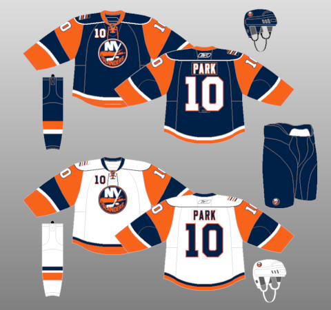
23 hours ago, JerseyJimmy said:this all feels like a very similar arc to the Islanders' uniform history, though that might just be because I'm an Isles fan. still, these all look great! the '13-'16 black alt is a sleeper pick for my favorite of the bunch.
The Islanders were one of the main teams I referenced when making this, especially for the wolf jerseys (Islanders fisherman jerseys) and the 13-16 black alt (Islanders 11-14 black alt).
-
Thank you all for the comments! I'm working on a Jets version, and I also have some ideas for the Thrashers.
2 hours ago, Bomba Tomba said:OP are you the one who did all those uniform evolution concepts years back? I loved those, glad to see them back and hope for more!
I think you're thinking of someone else, I haven't posted one of these concept evolutions here before (I'm trying to remember who it was though, because those concepts were great).
-
This entire series has been superb so far, the Hawaii and New York plates are especially awesome!
Your Ohio plates are a big improvement over their current design.
-
This is a very cool and creative series! My favourites so far are the Coyotes and the Senators.
-
1
-
-
Adidas Adizero Era
2017-19
Only minor changes were made to the Nordiques jerseys during the league-wide switch to Adidas, including ditching the outlines on the numbers, and using a different sock stripe. Also three fleur-de-lis were added to the inside of the collar as a hanger effect.
2019-22
A "stealth" third jersey, with no white at all, was added to the rotation. The third shade of blue (baby-blue) comes from their 2016 Heritage Classic jersey.
2019-20 Throwback
To celebrate the 100th anniversary of the lone NHL season of the Quebec Athletics (aka the Bulldogs), the Nordiques wore throwbacks of their jerseys for a handful of games throughout the season.
2021 Reverse Retro
For the NHL's Reverse Retro program, the Nordiques brought back their "Wolf" design from the 90's, this time with teal as the base colour. In stark contrast to 25 years prior, fans welcomed these jerseys back with open arms. Also this season, Videotron became the team's helmet sponsor.
2022-Future
Due to declining jersey sales, the Nordiques decide to ditch their classic set. The "stealth" jersey becomes the new home jersey, and a matching white jersey is added which features ghosted fleur-de-lis (white on a white background). Also, the Nordiques announce Desjardins Group as their official jersey sponsor (Videotron remains the team's helmet sponsor).
Thanks for checking this out, it was a lot of fun making these concepts!
-
10
-
-
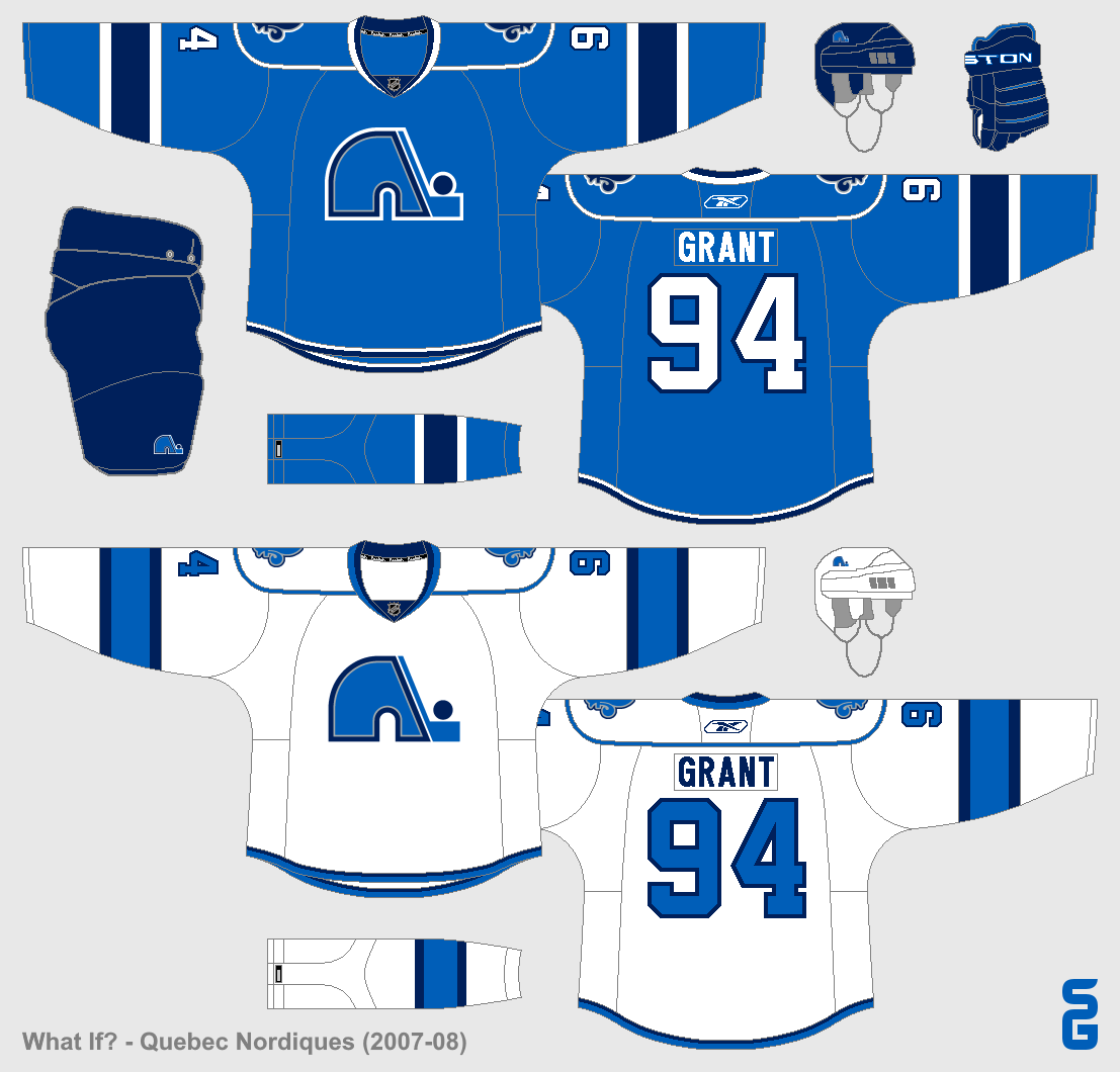
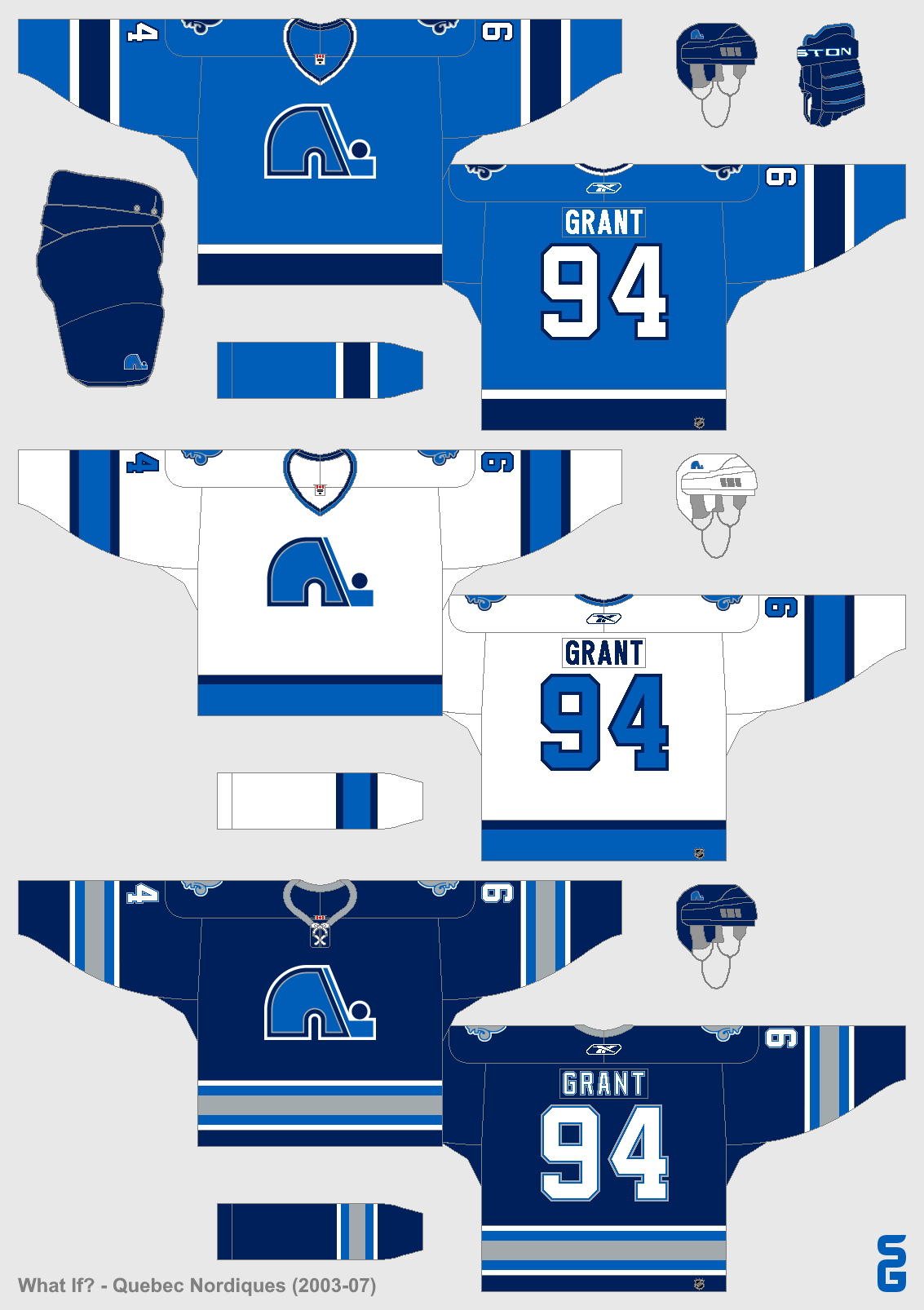
Reebok Edge Era
2007-08
Slight changes were made to the jerseys during the switch to the Reebok Edge cut. A phantom shoulder yoke was added, and the hem-stripes became smaller. These changes weren't well liked by fans, who still wanted to see a return to the classic set.
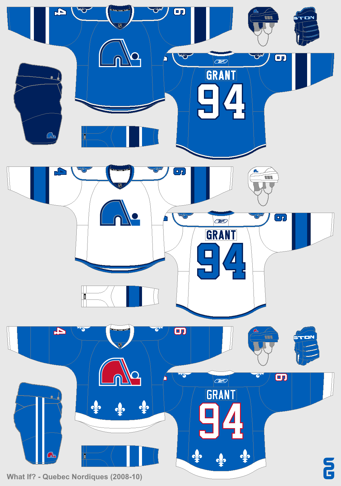
2008-10
When the third jersey program was re-introduced in 2008, the Nordiques finally listened to their fans by adding a throwback jersey based off of their classic blue jersey.
2010-12
The third jersey became the home jersey, and a matching away jersey was added. The previous home jersey stayed on as a third jersey.
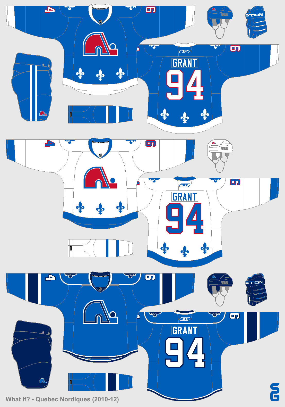
2012-13
On June, 15th 2012, the Nordiques announced that they were scrapping their third jersey and would only have the two throwback jerseys for the next season.
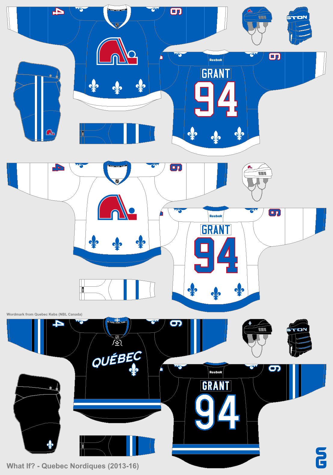
2013-16
A black third jersey was added that didn't feature the Nordiques classic Igloo logo at all. The inside of the collar used a Quebec flag as a hanger effect, and the proportion of the stripes were also taken from the Quebec flag (3-2-3).
2016-17
The Nordiques faced off against the Winnipeg Jets in the 2016 Heritage Classic, wearing a baby-blue jersey based off of their inaugural WHA look. The jersey would be worn several more times throughout the season, replacing the black third jersey which had been retired after three seasons.
-
9
-
 1
1
-
-
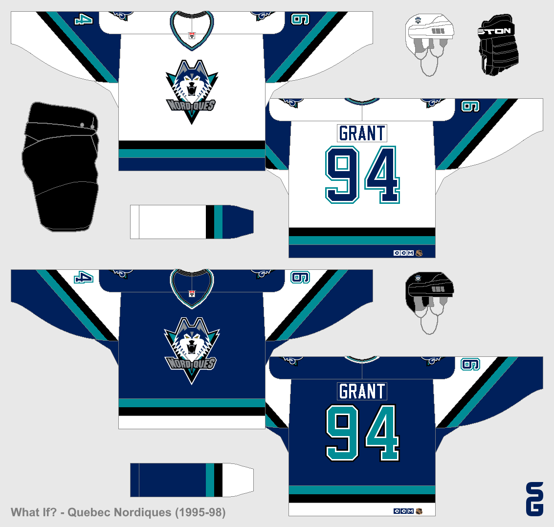
Back in 2012 I made a series of Quebec Nordiques concepts, a fictional timeline of what they might have looked like if they had never left. Since it's been ten years, I thought it would be a good time to add onto the timeline. We begin in 1995...
Pre-Edge Era
1995-98
In 1995 the Nordiques completely redesigned their uniforms. The colours changed, and a wolf (or husky?) became the primary logo. These jerseys weren't well liked by most fans, and as a result they only lasted three years.
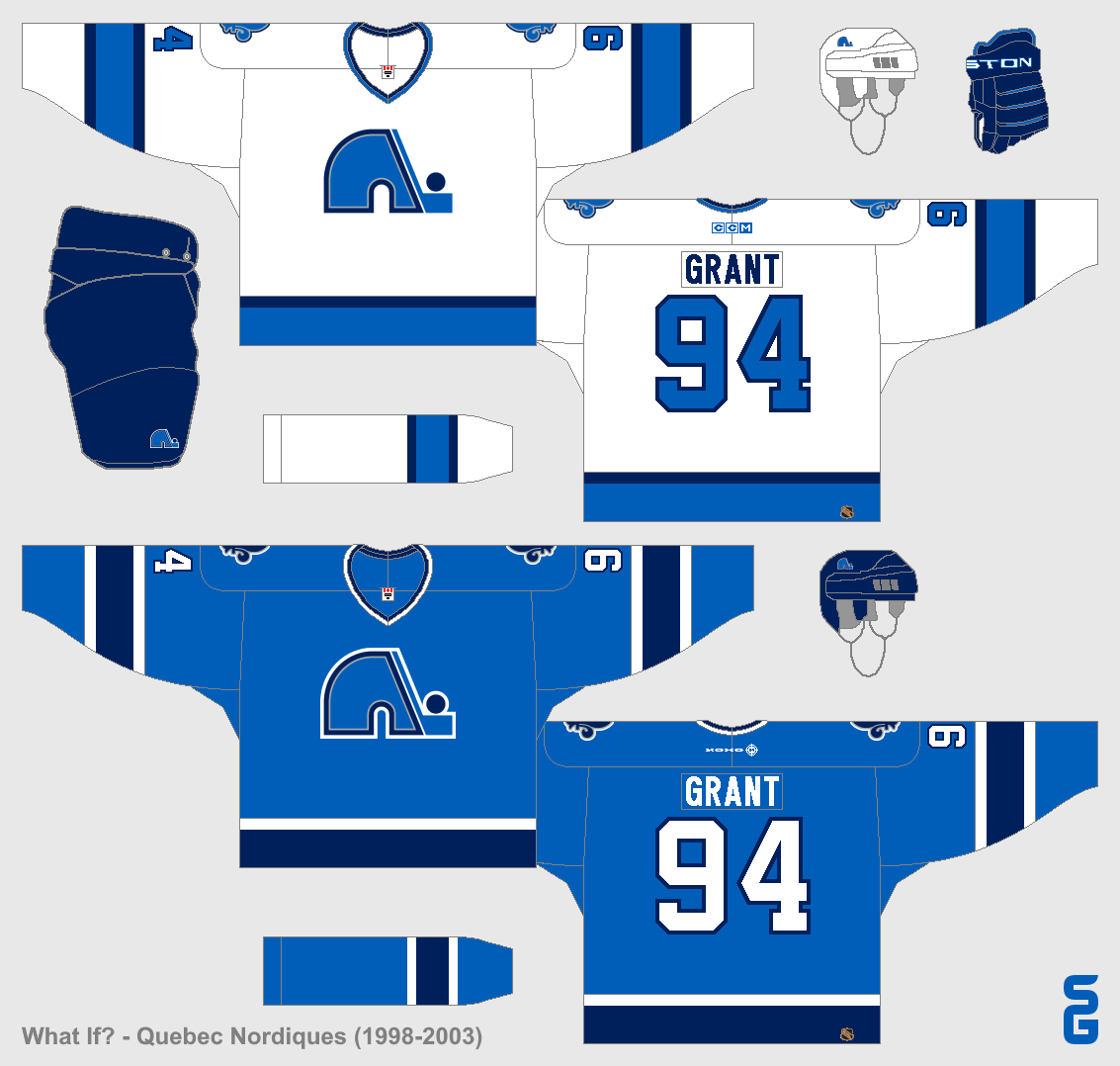
1998-2003
In the summer of 1998, the Nordiques announced that their unpopular "Wolf" jerseys were going away. Most fans were hoping for a return to the classic logo and jerseys. They did get the Igloo logo back, but the jerseys were new, with navy and silver added to the colour scheme. Many fans liked these jerseys, but some were disappointed that the classic jerseys weren't back.
2003-07
The Nordiques added a third jersey in 2003, which would last until the switch to Reebok Edge jerseys in 2007. The jersey was navy blue with lots of silver.
-
2
-
-
Would make a great Winter Classic jersey!
-
3
-
-
Is there any way to switch back to the old format? Photobucket lacks the ability to copy/paste which really doesn't help people using paint, which is detrimental to this thread.
Just switch back to using the old format of Photobucket. Solves any copy and paste issue with it.
How do you do that?
It asked me when they switched my account if I wanted to keep the new look or not, so I didn't.
Of course as I log in to Photobucket tonight it says that they're switching everyone's accounts in 20 days, so something else than Photobucket may have to be used sooner then later.
To copy and paste, try right-clicking near the bottom of the image. I can't copy and paste when I click near the top of the image, but it does work for me near the bottom.
-
Also, I quite liked these:
I still think their current set is far superior, however.
I agree 100%. They were good jerseys, but the new jerseys are better.
.png)
.png)
.png)
.png)
.png)


.png)
.png)


.png)


.png)
.png)


Winnipeg Jets concept
in Concepts
Posted
That wordmark logo looks really good without the outline! I also like the aviator blue set, especially the third jersey.