


The Mojo Maniac
-
Posts
701 -
Joined
-
Last visited
Posts posted by The Mojo Maniac
-
-
Sacramento's entry in the collegiate summer Great West League has been dubbed the Sacramento Stealth.

Colors work fairly well for a team called the "Stealth," dark and subdued. But the logo's execution just seems...off. The script doesn't stand out at all against the "S," and the "Baseball Club" font is much too basic.
-
Looks like I'm in the minority, but I actually like the new Bowling Green set. My only beef with it is that they look way too much like the Astros, when they aren't even an Astros affiliate.
But speaking of college wood-bat leagues, here's the primary logo for the Lodi Crushers of the new Great West League:

I personally love it. Purple and green, the color of grapes in a region known for wine. And the sun plus the contour lines evoke images of California's fertile Central Valley. The logo, as a whole, strikes me as the beautiful love-child of the Big League Chew slugger and the Sun-Maid raisins girl.
This logo could absolutely work for an affiliated single-A or short-season team, and I can't wait to see the uniforms and the rest of the logo package.
-
That was unexpected, but very nice to see. Their identity had really grown stale and dated.
This...

...is a terrible logo to begin with, and the fact that it served as their primary cap logo is even worse. Hopefully the Beloit Snappers or Lansing Lugnuts are next in line.
-
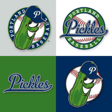
Merch is out for the Portland Pickles, and per the team's Facebook page, there appear to be two game caps:

The darkly-colored pickle logo, while kitschy and fun, seems to get lost on the navy cap. However, the gray cap is very clean and seems to hearken back to the Portland Beavers. No look at the full unis yet, but overall, not a bad start IMO.
-
So this happened yesterday...
Here's the mascot, "Dillon the Pickle":
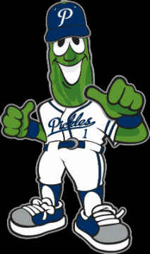
A news article where the full mascot concept was found suggests that the uni Dillon is wearing is indeed the home uni. My thoughts: clean, classic, but wish there was a little something more left-of-center to it. Still, I'll take it and I'm eager to see what a possible alt may look like.
The official colors are green, navy and gray. The script and the "P" logo seem to pay homage to the last Portland Beavers uni set, and the green squatchee on the cap is an interesting touch.
Either way, it's great to have some form of baseball back in a Northwest city that's had to say goodbye too many times.
-
Great. Hope they can do something really fun with the name.
Looked over the e-mail again...actually, it's this Saturday the 10th.
I have some pretty high expectations...
Dang, I'll miss it by just a few days. Someone should provide some Persicope action for us during the unveil.
-
Still miss the Beavers. They had gorgeous uniforms.
And this is just bad, even by Collegiate summer league standards:

The exclamation point is nice, but everything else is a wasted opportunity.
I'm not entirely sure those logos are official. They may just be place-holders. I'll reserve all judgment until the full set comes out.
The Beavers did indeed have gorgeous unis though. I hope that, despite the eccentric name, they draw at least a little influence from the Beavers' final uni set (i.e. flowing script lettering, classic thick placket piping/shoulder stripes).
-
It's been official for several months now: the Portland, OR club of the collegiate-summer Great West League (beginning play next summer) will be called the Pickles.
http://portlandpicklesbaseball.com/
My reason for bringing it up now: the team website at one point said that there would be a "fan fest" at the still-being-renovated ballpark some time this month, but I can't seem to find the article anywhere. Anyone in the area able to investigate further? This could easily be one of the more intriguing collegiate-level baseball uniform/logo unveils of recent years, given that it's in a major market that would normally have a high-level minor league team, at the very least. It's been five years since the triple-A Portland Beavers left.
-
The Ogden Raptors (short-season rookie Dodgers affiliate) appear to have new caps lined up for next season. Per the team's Facebook page:

Clearly better than the very dated still-current logo (nicely cleaned-up "O"), but something about this dinosaur still screams "90s cartoons" almost as much as the current one. Thoughts?
And I might add...here we go again with the wrong-colored squatchee issue (far right cap)

-
The Holy City nickname usage is a good idea, but the halos in the resulting alt logos are deceptive. It comes off as suggesting the club is an Angels affiliate.
-
Per Uni Watch and WACH Fox, the name and logos for the new MiLB team in Columbia, SC (the soon-to-be-relocated Savannah Sand Gnats) will be unveiled next Tuesday, August 4th: http://www.wach.com/sports/story.aspx?id=1236397#.Vbj8vvlVhBd Any guesses on a team name?
Was there any type of name the team voting for this one? Or is this going to be a complete surprise to everyone?
A complete surprise would be nice for a change. If Brandiose is in charge of the logos again, I'm really hoping to see another well-done branding effort like that of the Yard Goats.
-
Boise Hawks (Short-Season Class-A of the Rockies) new purple uniforms.


Is this an alt or is it their new home? Because their website still features their green look for pretty much everything?
Also while I'm not huge on the purple (like the green better), I have to say the logo on the cap is a huge upgrade over the previous(current) home logo cap which is just hideous.

It was doubly a shame because it replaced this absolute beauty. Which is still available for sale from their website for only $10 for a 5950.

The purple is just an alt, and I think it looks decent. I was never a huge fan of the vaguely B-shaped hawk-with-bat logo, but you're right in that it looks eons better than that awful "scratch" logo. The claws-clutching-baseball logo has been in their repertoire for many years, kind of off-and-on home/road/alt/BP, but they've had it in at least some capacity for awhile and I think it's their best.
Also, their road unis...woof.
-
The High Desert Mavericks have stepped back onto the positive side of uni news. They've added a Rangers blue alt to their rotation now to be worn for "Texas Tuesday" and Saturday home games:

Looks simple enough but still nice. Only thing I don't like is that it's a two-button. It's good to see them put "High Desert" back on a jersey, which they haven't since these days:

But with as good as the new blue alt looks, they need to make the right decision and pair it with the solid red BP cap; it's the only one in their set that would make sense paired with the jersey. It would complete the "Rangers" look. The other three hats all involve black, which wouldn't look great.

(Current BP cap looks like this, but is regular Diamond Era).
-
The High Desert Mavericks have once again done something notable on the uni front.
The Mavs' home city of Adelanto, CA has a large percentage of native Spanish-speaking residents, and the team holds "Domingos Latinos," or Latino Sundays, for every home game. Bilingual in-game/PA announcements, special music, etc...as well as jerseys that say "Los Mavericks":

Pretty harmless, right? They look almost exactly like their long-time home jerseys that were apparently "retired" halfway through last year.
The problem: upper brass, for some reason, couldn't get their hands on any red pinstriped pants. So this afternoon against Lancaster, the Mavs wore solid white pants (with black stripe on outside of pant leg) with these jerseys.

-
I'm getting a bit of a Hillsboro Hops vibe. But they do look nice.
On the other hand...the West Coast (collegiate summer) League's Kitsap BlueJackets (Bremerton, WA) new duds...


-
The High Desert Mavericks have work this black jersey for literally every single game of the season so far:

From what I've heard, they got these midway through last season, along with solid white pants. So apparently they fell in love with the solid white pants and ended up ditching the home pinstripes as a result. The red alts, meanwhile, are nowhere to be seen.
They more or less alternate between just two caps: the solid black former "alternate" with the cowboy logo known in inner circles as "the dude":

...and its solid red Diamond Era equivalent. The classic "M" cap and the faux blast-from-the-past "HD/sun/mountain" cap are also MIA. The "dude" cap, from what I've seen and been told, was rarely used in the past. What gives?
Strange things happening in the High Desert...or is it all just a mirage?
-
No words for this. Brian, painfully-contrived is absolutely right. I shudder to think of their justification had "Whirlybirds" been the winner.
-
The summer-collegiate Great West League, which is set to launch in 2016, has announced the addition of a team in Portland, Oregon. The team, to be based at an upgraded Walker Stadium in Lents Park on the city's east side, has launched a website featuring the obligatory "Name Your Team" contest. The candidate identities are...
Portland Pickles
Portland Red Dogs
Portland Pliers
Portland Mud Hounds
Portland Pixels
Portland Posse
The contest runs through April 10, 2015.
http://portlandbaseballteam.pointstreaksites.com/view/portlandbaseballteam/home-page-822
Saw this moments ago. I eagerly clicked on the name-the-team and got ready to submit my own answer, but was quite angry to find several terrible predetermined options.
I mean really...the Pliers? The Pickles? Pretty sure Portland is nothing close to Wild West either, so how does Posse make any sense? Someone is seriously going ga-ga over mindless alliteration.
-
Looking like a Rangers team? It's red and navy, not red and royal.
And as much as I loved the navy and teal Rainiers (beautiful), not every minor league team has to look like its parent club. Having been to Cheney Stadium multiple times, the Rainiers are a club very much in tune with their past, and the red is a great symbol of that. The move to the "R" as the primary cap logo was the icing on the cake because, as the club confirmed, it was much more popular among the fans than the TR-compass logo or the T-mountain logo.
Side note: if anything made this team look like a Rangers affiliate, it was the previous road cap:

Yes, it's navy and not royal, but whenever I saw that red-outlined white "T," the Rangers always came to mind, without fail.
-
The Tacoma Rainiers, Seattle Mariners triple-A affiliate, have made an (unexpected?) uniform change.
The full rundown here: http://www.milb.com/content/page.jsp?ymd=20150306&content_id=111556470&fext=.jsp&sid=t529&vkey=
Solid choice to go with the "R," it's been an iconic mark for quite sometime, despite it being pretty much limited to the "Rainiers" wordmark for most of the past.
The red alternate top is gorgeous, the road jersey is meh, and the BP hat is a head-scratcher. I like the idea there, but hate how big and awkward it looks in the picture of the hat itself in the team store online.
Edit: And what's this with two different number fonts?
-
The Kitsap BlueJackets baseball club (West Coast League) are still listed on the site under their old logos:
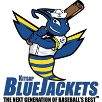
...but they've since switched to:

The above appears to be the new primary logo; the bee is also a standalone:

-
Brandiose did a pretty good job with this one. The "scorched" red fits Texas quite well, and the blue complements it nicely in a package with a true Lone Star state flavor.
Yes to whoever it was that mentioned the wordmark's similarity to the Reading Fightin Phils, but I think it's still solid. I didn't even realize until the past few days just how dated the previous logo set was. And Teddy looks sharp to boot!
-
The Kitsap BlueJackets (based in Bremerton, WA) of the West Coast League (collegiate summer wood bat league) will soon unveil a new logo.
Old:

A draft of the new logo is on their Facebook page. I've been told it's not quite the finished project.
"BlueJackets" has a double meaning: a take on the insect (yellowjackets) and Bluejacket referring to someone who is in the Navy. Bremerton is the home of the Puget Sound Naval Shipyard, hence the anchors and sailor cap on the "newer" logo.
Sorry to bring back a dead topic, but I did what you could call an "internship" with the Kitsap Bluejackets over one summer while in college. In the process, i found out some interesting stuff about the logo.
The team's owner told me that when he adopted the team, he borrowed the 'Bluejackets' name from the minor league team that resided in Bremerton in the early 1900's. However, what he overlooked is that the Bluejacket is not some type of bee, but actually slang for someone in the navy. Bremerton is a navy town, hit it's boom during WWII, and is home to two naval bases. He was not aware of the naval reference until well after this logo had been designed, and the design for the mascot had been submitted. While I was working with the owner, I suggested that he update the brand and even threw a few design concepts his way, and he was not at all interested. Fast forward a few years, and it looks like he is still content to use the bee.The new design is better, but still the worst logo in their league.
You really think so? I agree in that it technically doesn't match up with the true meaning of the term (I too knew that beforehand), but I honestly believe this...
...looks much better in context of a baseball uniform than any iteration of something like this guy:

But with that being said...do you still have those design concepts you mentioned, or parts of them? Inquiring minds want to see!
(Side note: FWIW, ownership has actually changed hands for this season and was part of the reason behind the revamp).
-
The design is smooth and fits in fairly well with the region (as they intended), but it makes for an awful disconnect with the team name. It just doesn't scream "Knights" like the previous logo. The dark, sleek aura of the last one fit perfectly:

But as per usual, I'll reserve all judgment until the unis are unveiled.


Minor/Independent/Collegiate League Baseball Logo/Uniform Changes
in Sports Logo News
Posted
Well played. But actually it's a collegiate summer league, and they'll play in top-notch facilities. But yeah, I can see how this logo might make people wonder...