


The Mojo Maniac
-
Posts
701 -
Joined
-
Last visited
Posts posted by The Mojo Maniac
-
-
Apparently this is an unpopular opinion:
This is the best the Astros have ever looked

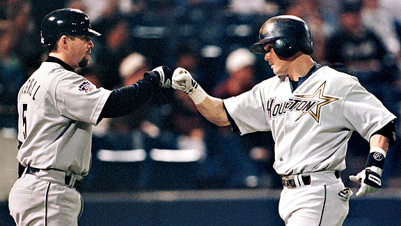
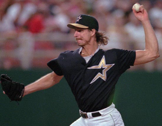
You'd be surprised how few images of the Astros '90s home jersey there are.
I can't understand why this set is so universally hated. The only thing wrong with it IMO was the horrible number font. Maybe it's the fact that it was what replaced the iconic blue and orange scheme, which I do have to say is my favorite of theirs.
-
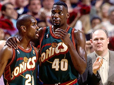
On the topic of the Sonics' uniforms, I actually think they were among the best in the NBA before the relocation, and certainly better than the Kemp/Payton era ones.
Those unis were everything that was bad about '90s NBA unis. The big slanted wordmark, the insanely thick drop shadow around the wordmark in addition to all the outlining, plus they just had to awkwardly tack the Space needle onto the primary logo. Way too much going on. Probably second only to the Spurs '90s primary.


-
The Mariners' set is terrible.
Care to elaborate? I respect that you have your own opinion, but is there any particular reason why you think they are terrible?
-
I love the stretchy jersey trend going on, as well as the different panels on the jerseys that sometimes alternate between mesh and stretch fabric. I think it's pretty cool, although the numbers do get messed up too easily.
Contrasting panels were kind of cool at first:

But I think they have gotten WAY out of hand lately:

And as far as the stretchy jerseys go, I hate how they don't allow for full shoulder stripes (case in point: UCLA).
-
I always liked both of these:

That said, ironically enough I hated the jerseys that were matched with both of them. The Pirates red sleeveless unis were especially atrocious (RFRS anyone?), and the Dodgers should never wear an alternate other than those gorgeous light blue Brooklyn throwbacks they currently use.
-
I think the Mets look better with some black and the drop shadow
I hope you get drenched in the semen of 14 elephants, 6 horses, and maybe a woodchuck.
Normally I would tell someone who posted this to grow up, but I have to admit I laughed hard at this. Especially considering it's about something as little (in the grand scheme of things) as black in the Mets' color scheme, as much as I also hate it.

-
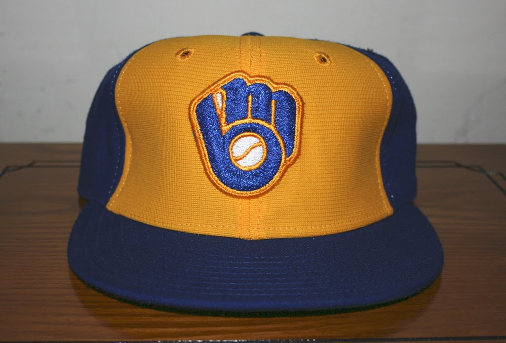
For some reason I feel as if I'm in the minority when I say that I love baseball caps with contrasting front panels. It's strange because they seem to be back in style at the present time:


Unpopular Opinions
in Sports Logo General Discussion
Posted
Agreed. Two things for me though: 1) The white script on the gray road uni looks terrible. Needs to be changed to black. 2) I reeeeally hope they actually do wear the orange cap with the orange jerseys. The fact that the orange cap was nowhere to be seen at the unveiling is rather alarming to me.