


The Mojo Maniac
-
Posts
701 -
Joined
-
Last visited
Posts posted by The Mojo Maniac
-
-
Not sure if it was mentioned before, but the San Antonio Missions did a redesign. They went from black and gold to red, white and blue. The hats feature Davy Crockett's cap and a jalapeño in the shape of a S. I don't like the new wordmarks either.
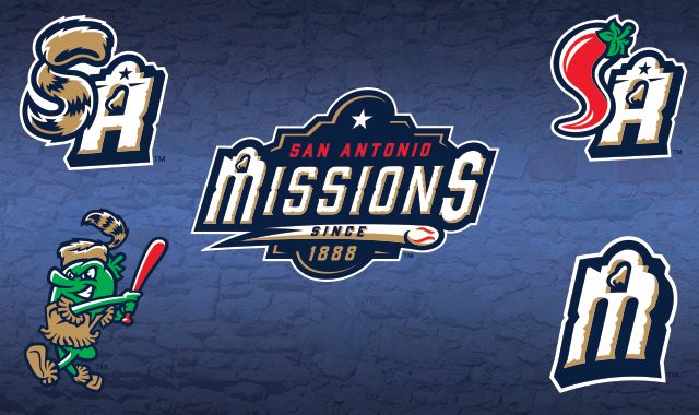
Yes it's been mentioned, but I'll reiterate that I am not a fan of the change either. The old primary definitely could've used some sprucing up, but this one just follows the now well-established Brandiose blueprint: a couple of logos that look too similar to coexist, a cutesy character swinging a bat (or bat-like item) and italics...italics everywhere.
Far from terrible, but they definitely went fishing on a changeup in the dirt here.
-
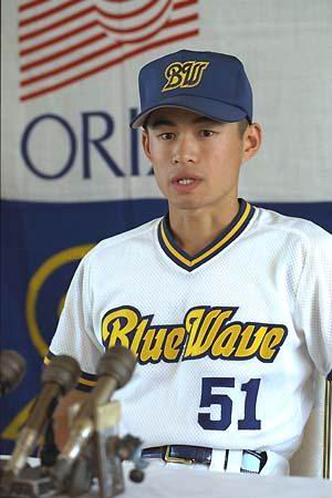
His Japanese unis were indeed a bit out there...

-
That's outstanding. Especially refreshing to see after all the crappy Adidas sunrise knockoffs invading college baseball right now.
-
I don't like the fact that the cap stays exactly the same, home/road/alt, except for the letter on the logo. Same solid black cap, same guitar pick logo, only different letters, which can't even be distinguished from afar. Woof.
-
 1
1
-
-
It still looks good, but they ruined the neon sign vibe that the original updated logo had. I preferred the orange as well. Disappointing.
Being that they're now the A's AAA affiliate can't say I'm worry to see the orange and black go. It didn't feel right having their top minor league team wearing their cross town on and off field nemesis' colors.
Nemesis? They're not in the same league. I understand there's a rivalry, but it's far from Yankees-Red Sox or Cubs-White Sox, isn't it?
-
I hate the new scheme. The neon-looking orange looked perfect on that beige guitar pick. Now if you look at the whole website, the alarming red makes it look like the city of Nashville is in a state of emergency and total chaos. Bad move.
-
The summer collegiate Prospect League's Jamestown Jammers have unveiled their logo and uniforms.

They carried over the MiLB name? Good for them.
-
Gotta agree with you Buc, it's strange indeed how so many teams go "mute" at home and more colorful on the road. Another example is how these days you'll often see teams with a two-tone cap on the road, with a plain solid color at home (i.e. Astros, Twins). Used to almost always be the other way around, if anything.
Back to the Volcanoes for a moment, their set still works alright IMO, even though it's almost 20 years old. The uniform scripts are unique and have enough lasting power, and the caps, while "backwards," work just as well. I'd even go so far as to say the circa-2003 armpit panels even add a little something to the home whites:
And I rarely say this, but that custom number font is sweet!
-
Not a "change" per se, but something a little different: the Salem-Keizer Volcanoes (Short-season A affiliate of the Giants)...
...have this cap (charcoal gray/black) as their home cap:

...with a jersey that's white with red script and trim.
And they wear this cap...

...with a road gray vest that has black sleeves and a red script. Any other MiLB/indy/collegiate teams that have their caps and jerseys almost "backwards" like this?
While I can't address other teams, I can safely opine that the Volcanoes identity is a complete cluster-fluff. Has been from day one. Could anyone who wasn't here when the team moved to town tell you that the abstract volcano has a "K" shaped plume for Keizer and an "S" shaped lava flow for Salem? Yup...
Does it need a Brandiose treatment? Hell no! But it could use a little freshening up, something to make it look a little less 1996-ish, IMO.
I actually like the Volcano logo. Believe it or not, I picked up on the "S" early on, but never saw the "K" until you mentioned it...and even, now, I feel like it's barely there as a stretch.
I've since found photo evidence that they do mix and match, even though the way I originally listed them is still the "standard." As is, it looks much better:
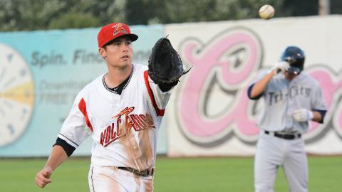
Side note: the charcoal cap works for a team called the Volcanoes, but its logo seems outdated IMO.
-
Not a "change" per se, but something a little different: the Salem-Keizer Volcanoes (Short-season A affiliate of the Giants)...
...have this cap (charcoal gray/black) as their home cap:
...with a jersey that's white with red script and trim.
And they wear this cap...
...with a road gray vest that has black sleeves and a red script. Any other MiLB/indy/collegiate teams that have their caps and jerseys almost "backwards" like this?
-
So nothing for Lake Elsinore?
Nada. I was there for a short while and it was just a big after-party hosted by them and Brandiose, nothing really going on business-wise.
-
Agreed 100 percent. Although honestly, I don't hate their current set as much as most people seem to. Sure, it needs tweaking--change the script/numbers on the navy alt to white, and work in the BP caps more often for that extra splash of color. Oh yeah, and maybe actually put a stylized "Tampa Bay" on the road grays.
-
There's an irony to it for me...it doesn't make sense, but then again it does. I've only ever seen a few around in my life, but it doesn't surprise me in the sense that it's truly one of the more iconic hats in MiLB. Lots of people draw blanks when they see many other minor league caps, but quite often when they see those eyes, they say "hey, the Storm!"
And for some background: Lake Elsinore is a popular place for extreme sports--motocross, BMX, skydiving, etc. To me at least, that cap just screams "extreme sports," with the fierce look and black and red colorway. That's how I see it, at least. I'm willing to bet that more than a few kids at the bike track or skate park wear those caps, it just "fits."
-
Just tweeted at Bradiose asking if their Winter Meetings after-party will involve a rebranding. Their answer: "We don't mess with the #1 selling cap in MiLB!"
I wonder if that's code for "new alternate logos coming" or something of the sort. But glad to hear the cap is staying at least, one of my favorites.
-
No swinging bear? What madness is this?
And I agree with Gothamite, two great ones in one day. I too like the SB logo, and this one avoided looking overly cartoonish. Well done.
-
And perhaps best of all...one game cap, one BP cap, one primary logo and two alternates. What a concept! I really do like this identity, very well done.
It also helps that in my five years of taking Spanish classes, "tortuga" was one of my favorite words to say.

-
Not sure I'll ever get over how horrid the "OKLA" wordmarks are. The rest of the identity, IMO, wouldn't look so bad if it weren't for that contrived shortcoming.
-
Thank God there's an actual home jersey.
All things considered, I say this rebrand is decent overall. There are no longer too many teams in the high minors that share the MLB club's name, so there's that. And a very nice choice on that sleeve patch recognizing a local landmark in a smoothly flowing manner. Home and road both look clean, and the BP is actually kinda fun.
It's not without its faults though. The all-blue alts would look much better with just a solid blue cap, instead of the out-of-place 70s-80s white panel. And five caps? When will they be wearing the gray front panel and the "D"?
-
So the announcement on the homepage shows a pic with all the uniforms.
Home(?): turn-of-the-century style blue jersey AND pants(!) with giant "OKC" across the front, and a blue with white front panel cap. Please tell me that's not the default home look.
Road: gray with "Oklahoma" (strange to leave out "City") in Dodgers-style cursive, and gray cap with blue bill. Yuck to that being the default road cap.
Alt/BP: blue jersey with number on one side of chest and "OKLA" logo on other side. Looks like a pullover, either that or a button-up with neck trim.
Why oh why would you pair a white front panel cap with a turn-of-the-century type uniform? Do they even have a "traditional" home uniform in the lineup? So many questions...too many.
-
The fact that there is grey in this logo scares me!
I'd take that with a grain of salt. At most it could hint toward a gray alt/BP cap. Nothing too crazy I wouldn't think, given the overall conservative look.
-
Ugh

Lame. Classy, but in the dullest of ways. And that "OKLA" logo looks horribly forced and contrived.
-
Great, no online feed or anything for OKC rebrand. Guess we just sit tight for a few minutes...
But good point Lamprey, Nashville could (and should) be coming soon. I like the looks of it so far, but at any rate I really hope the vest jerseys are gone for good. Way too many of those in MiLB.
-
PackerFan, the Lake Elsinore promo piece says December 10...do you know something about Thursday that we don't? Already know about South Bend and Daytona, but did Lake Elsinore's date change?
-
Umm...

...via Benjamin Hill on Twitter. I'm not liking the sound of this. The Storm have one of my favorite single-A identities. They could stand for some minor uniform set tweaks, but with Brandiose coming along, one of the fiercest clubs out there is about to get cute and cuddly.


Minor/Independent/Collegiate League Baseball Logo/Uniform Changes
in Sports Logo News
Posted
There's a good chance I'll be working in fairly close proximity to the place this summer, and a buddy of mine is working for them this season so I'm going to try to make a road trip there, 100+ degree temperatures and all.
Judging by the pics and reviews at least, there definitely is a charm to the desolate setting, and I'd like to check it out in person. Rumor has it they're trying to move the club (Ventura, Irvine and Palm Desert are the supposed frontrunners), so I want to see what it's really like there before it's no more.