


gosioux76
-
Posts
4,886 -
Joined
-
Last visited
-
Days Won
13
Posts posted by gosioux76
-
-
1 minute ago, TBGKon said:
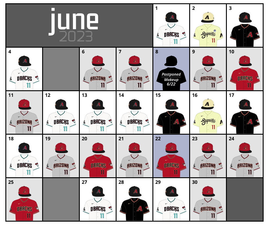
Agreed, the turqupise accented unis are far better. Going by their schedule on Uniform Lineup, they kept the turquoise uni for the home whites and dropped the road equivalent for the original grays. Below is their June 2023 uniform selections.

Not having followed them all year, I had no idea that this had become their defacto home uniform. It makes no sense for them to to be a mostly red and black team on the road and mostly black and turquoise at home.
-
 1
1
-
-
19 hours ago, SCL said:
The DBacks need to return to these full-time, so superior to the rust red look.
After watching the DBacks play the Twins all weekend, for the life of me I can't understand why they don't wear the turquoise version of the current uniforms.
They are, in every way, the superior version of the current uniforms. The look on its own is pretty good, especially since removing the weird sublimation patterns a few years ago, but the color scheme makes it forgettable. The addition of turquoise changes that.
-
 2
2
-
-
8 hours ago, Dilbert said:
Apparently Sunday is the Chicago Bears Family Fest and first practice at the stadium. I believe SeatGeek is still their practice facility and is the home of their MLS Next Pro team. Charlotte meanwhile played their home game in Frisco, because Beyonce took over their stadium. Im surprised they didnt try to find another suitable venue in North Carolina or even South Carolina.
This isn't a good look. It goes to show that, even under shared ownership, the MLS team will always be the second (or third) priority tenant in an NFL venue, no matter how much growth the league exhibits.
-
Looking at this from a different perspective, this continued alignment of big schools into a super conferences really transition of so many DII schools into FBS, or Division 1-A, seem somewhat farcical.
It doesn't matter what label you give it, they're still essentially DII schools in the grand scheme of things.
-
On 8/2/2023 at 9:10 PM, Dynasty said:
As much as I want to say they are an upgrade from the previous set, I'm still convinced that the Suns will never find something that is better than the 90's sunburst.
And it holds up! That's what's remarkable about it. It could just be the nostalgia talking, but that '90s set doesn't feel like a '90s set.
-
2
-
-
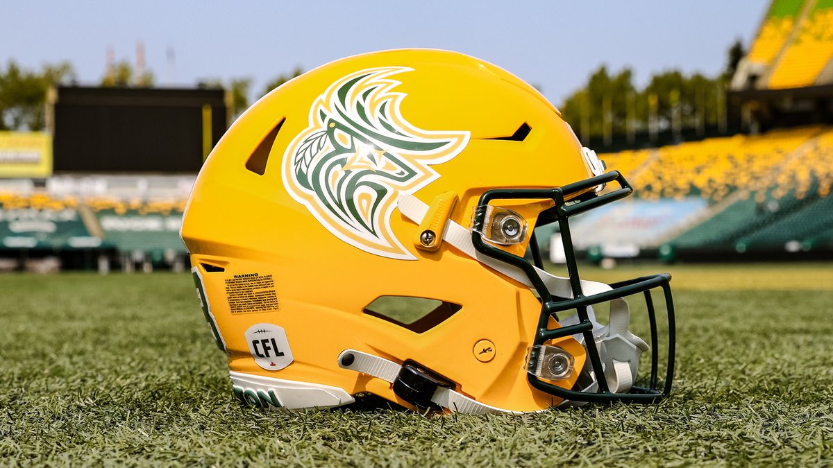
On 8/2/2023 at 3:55 PM, spartacat_12 said:
The Elks unveiled a new logo for their Indigenous Celebration game next week. It might be the nicest logo they have.
This is a really nice piece of artwork, but I worry it gets lost on the yellow helmet. The yellow outline seems like a slightly different shade. And there seem to be too many keylines.
I'd like to see what it looks like without the white border and placed on a green helmet.
-
4
-
-
18 hours ago, the admiral said:
I'm glad someone is finally honoring "the 1968-69 Las Vegas team." Who can forget icons of the game like Bob "Brooksie" Brooker, Don "The Casket" Woodbury, and Roland "Accounts Receivable" Payment. People still talk about scoring a "Floyd Conrad hat trick."
I hear Roland might take the day off from working at the pawn shop to go to the game.
-
Spotted a guy wearing a Pete Rose Montreal Expos jersey at the Twins/Cardinals game at Busch Stadium last night. (It was also full of mistakes, so it was likely a low-quality knockoff.)
-
This is almost certainly generalizing, but I have to think that whether you like or dislike the current Panthers uniforms is in proportion to how much you like or dislike their attempt at military cosplay.
-
1
-
 1
1
-
 7
7
-
-
43 minutes ago, 8BW14 said:
I’ll toss in my $.02 for what it’s worth (as a Cardinals fan). Did mikolas need to hit Happ? No he did not. I’m not really sure why he thought he had to hit him. Is Happ known for clipping catchers with the long backswing or something? Mikolas obviously hit him on purpose, but it was about as innocent of an intentional HBP as you’ll see, if there is such a thing. At that point, it was over for both teams. Instead of issuing warnings and moving on, the umpires made a mountain out of a mole hill when they inserted themselves into a situation that had apparently already been resolved. They changed the whole outlook of the game and probably created some bad blood that could spill over into games 2, 3 and 4.
I don't know if I agree with this. If the umpire crew determines that the pitcher intentionally hit the guy -- I mean, he did the brush back, and then right for him, so it was pretty clear it was intentional -- are they really supposed to let that go?
Was it really resolved if it was clear that Happ's clunking of the catcher was accidental and Mikolas doinked him anyway? You're pretty much asking for the Cubs to come back and continue the beanings.
If the intentionality was clear, then they should get tossed. That's the only thing that ends it.
-
2
-
-
33 minutes ago, McCall said:
They could've at most issued warnings and nothing more would've happened. The Cubs never responded until basically laughing at the situation after Mikolas was tossed. Happ took it with no issue. Basically the most casual, non-aggressive retaliation. It was done and over with. The umpires were the ones who decided to make it into something bigger.
And that's 100% within their right.
The outrage over this seems really overblown. These retaliatory beanings is another one of those sacred cows of baseball that the game doesn't really need. The situation yesterday says to me that MLB — or maybe just this umpiring crew? — is starting to see it the same way.
I don't disagree that the example here seemed pretty benign, but Mikolas and the Cards could've also exercised better judgement in realizing ejection was a possible outcome of this, to the continued detriment to the team. And if they didn't, they certainly will next time, which is exactly what the league is probably hoping for.
-
2
-
-
In general, I'm pleased that the Suns are taking some cues from the Barkley-era uniforms, which is the best that franchise ever looked. I'm always a big fan of taking a classic look and evolving it. That said, these still feel inferior to the '90s throwbacks, which hold up incredibly well, far more than I'd have ever thought they would.
-
4
-
-
7 minutes ago, kimball said:
I agree. For a city as eccentric as New Orleans their brand plays it REALLY safe. As a lifelong Utah Jazz fan I must admit it'd be interesting to see how the evolution of the team's brand would have gone if they stayed in New Orleans.
The Pelicans are kind of weird this way. Because generally, I think their brand is really nice. I like the typefaces they use and I think the symmetrical pelican carrying the basketball is a fantastic logo.
Yet despite that, they somehow feel really boring and forgettable. You could blame it on the colors, but I don't even know if that's really the issue. Reminds me a lot of the Houston Texans in that sense. They have a nicely executed modern brand that's just really easy to ignore.
-
8
-
-
13 hours ago, DG_ThenNowForever said:
I've seen some complaints that MLS has turned itself into Messi League Soccer, but that's dumb. It's the GOAT! Playing close to his prime in our domestic league. I want nothing but Messi coverage until he's not good anymore.
I'm okay if Miami never loses again with Messi. He's the greatest ever and he's delivering on everything promised and it's awesome.
Also, DeAndre Yedlin is a wonderful player and a Seattle native, and I'm rooting for him.
If anything, I'd like to see other leagues -- baseball in particular -- play up their stars like this. MLS is doing exactly the right thing in this case.
-
2
-
-
On 7/23/2023 at 4:50 PM, SFGiants58 said:
My favorite cap logo of the Angels basically tells the Big A to piss off:
The Angels, to me, have one of the most visually interesting histories. Their early years, with actual halos stitched into the caps, were really incredible.
I wouldn't advocate they go back to that. I only throw it out there to suggest that they have a lot of elements to play with. I also love the lower-case "a" with halo monogram. I'd love to see a look built around the lower-case letters like this.
It's hard to disagree with those of you who point out that the Angels in navy and red would look too much like other teams. You're right. But that color scheme looks so much better, to me, than red-on-red. Their current look just feels forgettable, which being forgettable -- even with Otani and Trout -- seems to be a hallmark of this franchise.
-
6
-
-
7 hours ago, throwuascenario said:
First of all, a lot of people that watch football are in their 20's. Second of all, I've seen the uniforms. That doesn't mean it fits their current brand. They currently wear navy and neon green. When I turn on a Seahawks game, I'm expecting to see navy and neon green. Them not wearing that makes them not look like the Seahawks.
This is a strange hill on which to plant your flag.
It's not as if the royal/green of the 80s and 90s is such a vast departure from navy/neon green that you can't see the evolution from one to the other. This isn't like, say, the Broncos wearing their original brown and yellow uniforms, or the Eagles wearing powder blue/yellow throwbacks like they did once upon a time.
Cut it down to its roots and you essentially have a team that's always been blue/green. Seeing them play in different shades of those colors won't lead anybody to believe that they aren't still the Seahawks. (The giant wraparound hawk on the helmets might also give people a hint.)
It's OK to prefer the current look to the old one, but this point just doesn't make sense. Also, a team's brand shouldn't exist in a single place in time. These are organizations that carry their histories with them, and suggesting the throwback look doesn't fit the current brand is just false.
Personally, I just feel like the league has become too drab and these throwbacks highlight that point. I'd love to see the Seahawks return to a more vibrant blue. It's also why I will always love the Bucs' Creamsicles and the Oilers uniforms.
Looking back, you can pretty much map out a 25-year timeline of teams ditching bright colors for darker ones, starting with the Chargers in late '80s gradually shifting to darker and darker shades of blue before letting Navy take over. The Broncos, Patriots and Buccaneers soon followed, joined with three expansion franchises (The Panthers, despite incorporating a touch of brightness, still leaned into the black and silver.) and later with the Seahawks shifting to darker blues with both of their uniform redesigns.
The transition of the L.A. franchises back to brighter colors seems like an indication that the trend may be shifting. I hope this new batch of throwbacks convinces some current franchises to follow suit.
-
11
-
3
-
-
9 hours ago, spartacat_12 said:
I'm still confused about this take. It's old-timey enough to seem like a name that's been used for a century, combines the team's mascot with the inoffensive portion of their old nickname, and presents a lot more branding opportunities than names like the Packers, Steelers, or Browns.
I don't see how that's comparable to names like Sauerkraut Balls or Flying Chanclas.
I completely understand where @Lights Out was coming from with this take. I'm not sure I'd equate "Pigskins" with the silliness of minor league baseball names, but there's still something unsophisticated about it that makes it feel ill-fitting with the NFL. And it's not a whimsical, tongue-in-cheek sort of thing; it just feels campy.
-
4
-
-
Washington F.C.
-
1
-
 3
3
-
2
-
-
Spotted in the parking lot of a southern Indiana amusement park: A car with a Connecticut license plate commemorating the Hartford Whalers.
-
1
-
-
I guess I don’t see what many of you are seeing with the Vikings throwbacks. They’re fine, but they feel like a Halloween costume, a team playing 1970s dress-up.
I’m generally the type to prefer throwbacks over the modern look. Seattle, for example, should absolutely ditch the drab navy for the much more vibrant throwbacks.
But the Vikings are one of the few franchises that succeeded in blending classic with modern, which should be the goal in any new uniform design. This should be celebrated.
My suspicion is that any suggestion to replace the current look is more about wanting change for change’s sake than actually preferring an inferior (though still very nice) set to what they have now.
-
14
-
 1
1
-
-
I like the Vikings throwbacks, but I can’t help but think they feel a little heavier on yellow than the originals. It might have something to do with the more compressed jersey cuts of today.
-
1
-
-
1 hour ago, BBTV said:
I wonder how many people that love these are old enough to remember when they were a complete laughing stock in them. Team performance shouldn't have anything to do with how we evaluate a uniform, but even all these years later, I can't separate the look from the joke of a team they were before they changed to the red/pewter.
It's a fun thing to see every now and then (though I mostly remember them in white tops, not orange... I wonder what the stats are on that, but I feel like they went WAH a lot in those days) but I think a full return would get old quick. With the exception of the mono-pewter, they're in their "forever" look right now.
Oh - and they can wear them every game... if they put in the papers and change in two seasons. So let's not get on the league's case here.
I remember it vividly, yet I still don't care that they're associated with terrible teams. (They're also associated with a very good team that made it to the NFC Championship game in the franchise's third season, but that's treated, perhaps justifiably, as an anomaly.)
A good-looking uniform is still a good-looking uniform. The Bucs are the rare franchise to have had a top-notch visual identity for most of its history (I'm intentionally omitting the short-lived alarm clock era, which most people despise), so I'm not suggesting these are better or worse than the uniforms they wore during their Super Bowl victories.
I'm just pointing out that, if they were to switch to these full time, I'd be perfectly fine with it. They're gorgeous uniforms, no matter what Vinny Testaverde did in them in 1989.
-
3
-
1
-
-
Good lord, those Buccaneers uniforms are gorgeous.
-
12
-
-
14 hours ago, Ferdinand Cesarano said:
I don't see how this league expects to return when the names that are most closely associated with it (Arizona Rattlers, Iowa Barnstormers, Orlando Predators) are now playing in other leagues.
Unless the AFL intends to revive the Tampa Bay Storm, the Albany Firebirds, and the San Jose SaberCats, it cannot have name recognition of even a fraction of what it formerly had, or near what the other leagues currently have. We can be pretty sure that the latter two teams are not happening, as Albany until a few weeks ago had a team in the NAL (until that team was kicked out on account of Antonio Brown's knuckleheadedness), and San Jose currently has a team in the IFL (led by former SaberCat head coach Darren Arbet). I have heard nothing about plans regarding Tampa Bay.
Maybe it's just me, but I don't see the Arena Football League as something with such rich history that its success or failure depends on keeping some of its old teams. Certainly, I recognize the Arizona Rattlers, San Jose SabreCats and Philadelphia Soul as being some of the league's franchises, but so many have come and gone over time with the league's various iterations that starting from scratch really seems inconsequential to me.
-
1
-


MLB 2023 Uniform/Logo Changes
in Sports Logo News
Posted
I give them credit though for smartly digging into their past to find a way to do a unique and relevant Hispanic heritage jersey. Using that script and adapting it to Tigres is really clever, particularly for a team that's really only ever had the old English 'D' for most of their existence.