


gosioux76
-
Posts
4,894 -
Joined
-
Last visited
-
Days Won
13
Posts posted by gosioux76
-
-
16 minutes ago, B-Rich said:
Good detective work there. I'm gonna start calling you "Mannix".
Ha! Thanks, man. More of a Columbo, I'd say.
-
 2
2
-
-
17 hours ago, GDAWG said:
It might have to be San Jose for the Invaders because there would be no place to play in Oakland other than the Coliseum and that stadium is on it's last legs.
I've been thinking a bit about this, in particular whether the Spring League's ownership of the old USFL intellectual property limits the league to locations that had previously been part of the old USFL.
In other words, in order to use the Invaders name, would it have to be in Oakland because that's how it's identified in its trademark filing?
What I learned, in digging through trademark filings, is that the league has trademarks for just the names, without city designations. It also filed applications using USFL names but with different cities. For example, in January they made a St. Louis Invaders trademark claim, as well as a Dallas Stallions. In June it filed trademark claims for four different former USFL team names in Austin ,Texas: Austin Wranglers, Austin Renegades, Austin Outlaws and Austin Gamblers.
-
4
-
-
34 minutes ago, GhostOfNormMacdonald said:
I'm surprised the Generals are back, given the brands connection to a certain former social media influencer that caused the league to go under the first time
Considering that Fox owns the league and will be broadcasting games, I'm sure the size of the media market had a big influence on that choice.
-
3
-
-
30 minutes ago, LogoFan said:

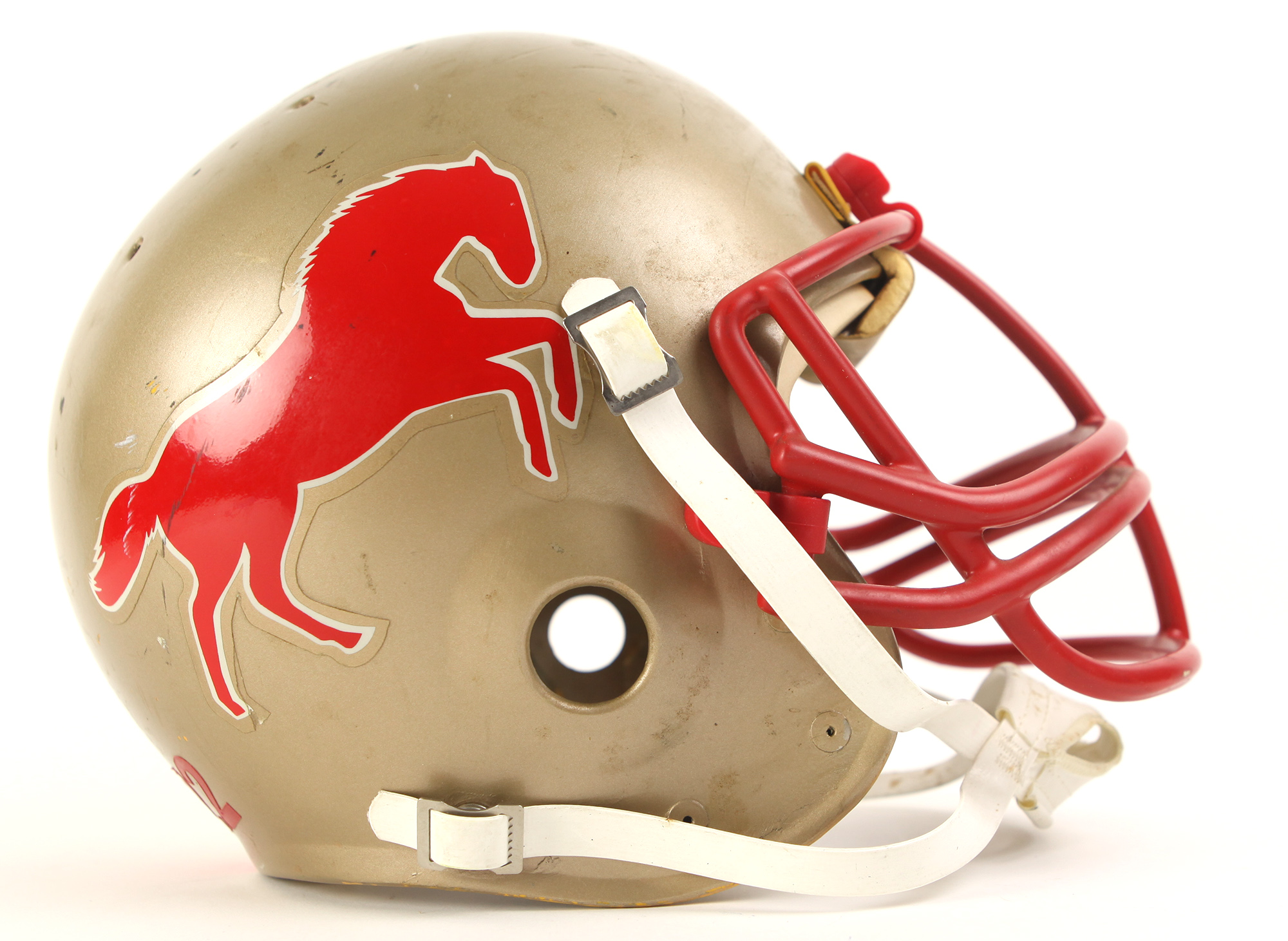
You asked how that Stallion would work on a helmet. If they're trying to go for a full recreation of the old USFL, I would assume they'll end up trotting out a full-body horse that will go on the helmet, much like the original.
-
5 minutes ago, MJWalker45 said:
Probably cheaper to house players in those spots, rather than location.
That's a good point. I wonder if the league at all feels limited by its decision to stick with USFL brands. I'm sure it's cheaper, considering they likely own all that intellectual property. But it makes it harder to then place a team in, say, St. Louis or Columbus or Charlotte where there wasn't an original USFL brand.
-
I'll be curious to hear why they selected the cities they did. I could see them being chosen for geographical reasons, since the furthest west they go is Houston.
-
26 minutes ago, Echo said:
So, what's the Over/Under on how many games this league plays before it suspends operations?
I'd have rather bet on how much time it took for someone to make the tired "how soon will they fold" comment.
-
30
-
-
23 hours ago, SFGiants58 said:
My preferred alternate logo would be the P from the ‘90s wordmark in front of a triangle (recolored, of course).
Whenever I see this wordmark, I want the hook on the P to continue forming the truss of one of the city's yellow bridges. The underline under the wordmark could build into the base of the bridge. It's probably a dumb idea, but I'd like to see it.
-
1
-
-
11 hours ago, seasaltvanilla said:
Re: legibility of long scripts
I saw someone suggest this on here once (with the Dodgers) and it's stuck with me since:
Why not stack the different words? (Old template because it was easily available)
It's a good thought, but to me this feels too out of balance. My brain badly wants something to fill that space under the "Kan." And while I agree with @SFGiants58 that the interlocking letters is a more elegant solution, I've never liked those uniforms for the same reason I don't like the one above. Having the logo on one side always feels out of balance to me.
I'm willing to admit that this could just be a personal nit that I'm picking. I have the same feelings about the National's "W" jersey and the Twins' red alternates. I hate the imbalance.
For the Royals, I much prefer the road script that they ditched, even if it has some minor flaws.
-
1
-
-
Maybe you've addressed this already (and maybe I've asked and forgotten), but the NFL by this time in its history and joined the NBA and MLB in stitching the league logo onto the uniforms. Do you expect your USFL to do the same?
-
Not sure if I'm alone on this, but I have a general dislike for powder blue over white. Go all-in or don't do it at all, I say.
And I'll third (or fourth?) the sentiment on the Kansas City script being better than the block type.
-
11
-
-
I was watching the Bucks/Lakers last night and my impressions of the Bucks' City Edition unis really took a plunge. I thought they looked terrible. Just way too much going on there.
I've always liked the Irish rainbow look of the Bucks, but forcing purple and one tiny little royal blue panel into the mix is overkill. I also hate how the pattern repeats on the shorts. I'd rather they lose the purple from the jersey and let the green continue seamlessly onto the shorts. Instead, it goes green-purple-green-purple. Looks disjointed.
Also, while I recognize that the wishbone collar is an homage to their prior uniforms, it really looks terrible on this jersey. When these were released, I didn't mind them. But watching them in action, they were a real eyesore.
-
7
-
-
1 minute ago, CaliforniaGlowin said:
Yeah. I'm getting conflicting reports that the numbers and texts are either white or pink. Some pictures look white, some pictures look pink.
I fear it'll be another Inter Miami situation: a really great and unique color that just comes off as too light.
-
Fox Sports just announced some details about the league. LINK.
Here's some of the more relevant info:
QuoteHow many teams will be in the league? How will the league be formatted?
There will be eight teams in the new USFL, split into two divisions –– North and South. Each team will play a 10-game schedule, with teams in the same division playing each other twice and teams in the other division once.
The top two teams in each division will play against each other in the semifinals followed a week later by the championship game.
Where will games be played?
In the inaugural season of the USFL, all eight teams will play in one location, which will be announced soon. In the future, the USFL expects teams to play in their own markets.
-
12 hours ago, MNtwins3 said:
Normally we would have full changes announced by now, which has me concerned that the Twins are still going to be wearing the gold set next year
Doesn't the team usually do new jersey unveils around Twins Fest in January?
And was there some expectation they would be dropping gold? Personally, I don't mind the gold as a home-only color. I'm sure I'm in the minority on this, but I kind of like the idea of having a color that ties directly into the palette of the home venue.
-
1
-
-
North Dakota just unveiled a new white alternate. This will be part of their regular jersey rotation. They have yet to announce when it will debut on ice.
As someone who wished they had chosen Nodaks over Fighting Hawks, I love this.
-
1
-
-
Aaaand ... they are underwhelming. Not bad by any means, just not terribly exciting.
https://theathletic.com/2961721/2021/11/17/angel-city-unveils-inaugural-primary-kit-a-timeless-look-to-set-the-tone-for-record-breaking-aspirations/ -
24 minutes ago, Luigi74 said:
Unless they're going to play at Highmark Stadium, I doubt they'll be a Pittsburgh Maulers. Even though the region is football crazy there's no way minor league football will draw more than a few thousand people to games.
I agree. It makes sense, to a degree, for the USFL to start out this way. It allows them to start the league without having to secure stadium leases in cities across the country and eliminates some huge startup costs.
But I also don't know how that works when one of your value propositions involves rekindling brands that are historically tied to specific cities. The stories on this league so far don't really get into how they'll brand these teams or whether they'd be tied to other locales. It would be super weird, though, to launch with a team called the Maulers and then have them end up in, say, St. Louis.
-
1
-
-
On 11/13/2021 at 10:09 AM, the admiral said:
I always thought that was an interesting wrinkle, how the A's screwed Seattle and helped Milwaukee because Symington did "nice antitrust exemption, shame if something happened to it" about Kansas City having to wait. I don't think we've ever had four true expansion teams join the league at once since, have we? The ABA and WHA teams came in fully formed or close to it (I think it was the Jets who got ransacked on the way in). Having one of the four fail in the first year would be a good reason why it hasn't happened since.
You're right. Since the era of league mergers, most expansion efforts have either come in pairs or, like the most recent MLS expansion, staggered one franchise per year over several years.
Of the major leagues, the NBA came closest to having four teams join in short order: Charlotte and Miami in 1988, followed by Minnesota and Orlando in 1989.
-
4
-
-
On 11/11/2021 at 7:51 PM, Geoff said:
That's such a terrible idea. I watched TSL but I didn't care about any team in particular. The location based teams makes it easier for fans to latch on to a team and care about that team. The only way where teams without a location have been successful in American sports is the PLL and that works earlier because it's pretty much the top of the lacrosse world. People have their favorite players and it's more of a player based fandom. No one is a hardcore fan of a D2 wide receiver trying to catch on in the NFL.
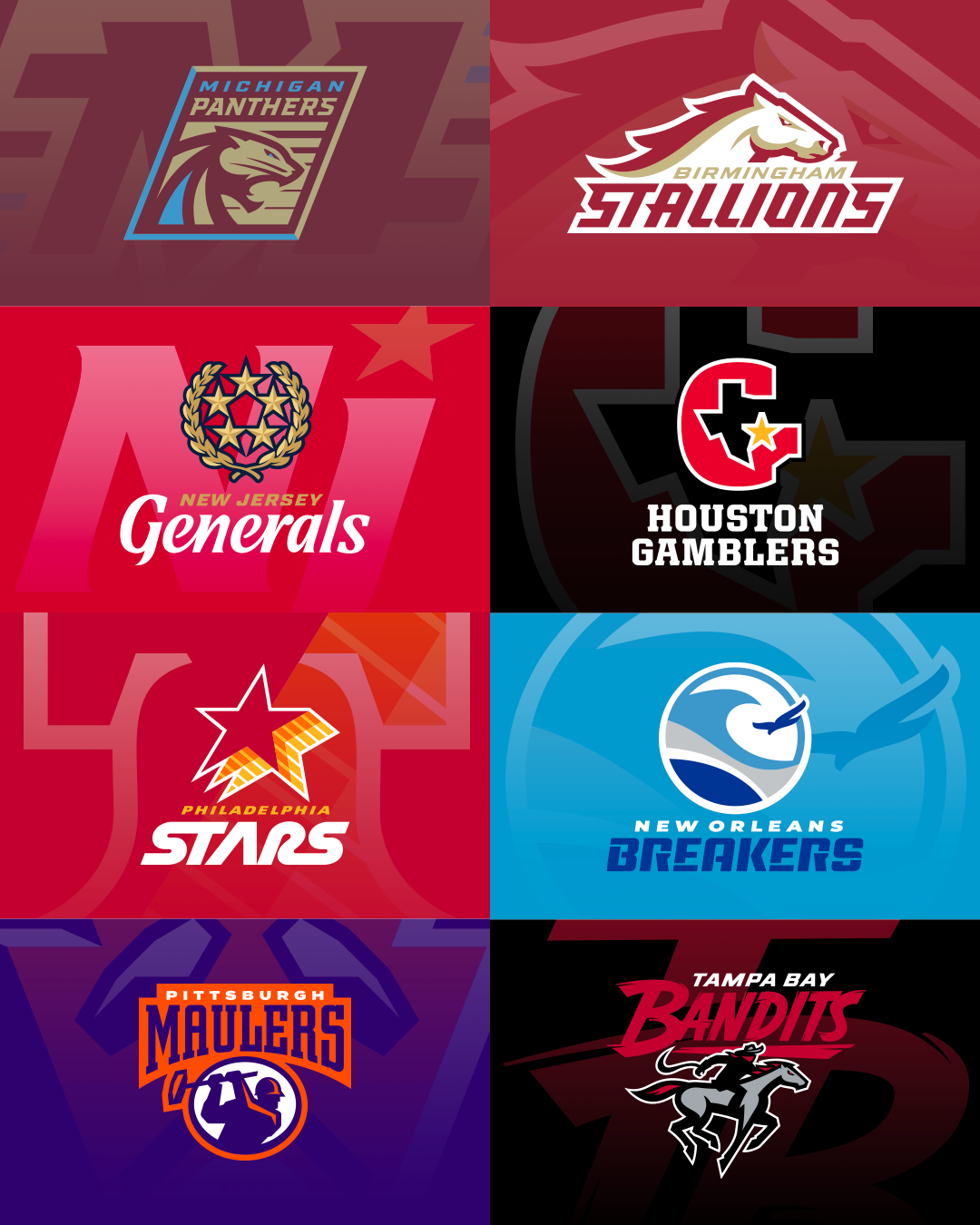
I'm not so sure these new USFL team's won't be aligned with other cities, though. Several of the stories out of Birmingham make the point to say that one of the eight teams will be the revival of the Birmingham Stallions. And while it's not clear about the other brands, the USFL's own website is already selling merch for the Pittsburgh Maulers, New Orleans Breakers and Philadelphia Stars.
Of course, they own the IP to those brands, so they could just be selling stuff out of nostalgic appeal. But it seems like the whole reason for launching a new league under the USFL brand was to capitalize on the nostalgia that still exists for that league and its teams.
-
Apologies in advance for the randomness of this thought, but I was watching the 1987 NBA All-Star Game (it was held in Seattle that year) and was struck with a flood of uniform-related childhood memories.
In particular, what stood out for me was how much I really liked the original Dallas Mavericks look. This was the Rolando Blackman / Mark Aguirre / Detlef Schrempf era of the Mavs. They had a pretty good team in that era, but still didn't seem to warrant a lot of national TV attention. So as a kid I was always drawn to those types of the teams; the Nuggets were another one.
I don't know if this is an unpopular opinion, but the Mavs' old M-in-a-cowboy hat look, along with the unique Western-inspired typeface, has way more character than what they've worn for the past 20 years or so. I also like how it was a green-first look, as opposed to their blue heavy current design.
Anyway, maybe this is just the nostalgia speaking, but I'd much rather see them in something inspired from those early years.
-
10
-
-
4 hours ago, purplrain said:
This typeface was used in the 90s when UND pulled the Sioux logo off their hockey jerseys the first time. It was only used for a handful of years before the program started using the geometric logo seen on the 97 and 2000 championship teams' sweaters.
This is great. Thanks for finding this. I was on campus during the prime years of the geometric logo, so I've never really seen this set.
-
3 minutes ago, CitizenTino said:
“Rip City” is fine. Why the Blazers keep putting out uniforms where it is spelled out “ripcity” with no space, I will never understand. “ripcity” looks like a failed late-90s tech startup that went under when the dot-com bubble burst.
That's a great point, actually. I'd never really thought about the lack of separation in the word on the jerseys, but now I can't unsee it. I'm guessing it was just a design choice, and that making it one word looked better than two small words. But you're right; it doesn't make much sense.
I also don't get why Rip City is getting singled out in this thread. Really, all nicknames are silly, especially if you're not part of the community that adheres to it. I don't see how Rip City is any worse than "Buzz City," "Windy City," "Queen City" or even "the Big Apple." Yet I wouldn't call any of them stupid, because it's an unnecessary insult to the people who do happen to care about it.
And the fact that they're on the front of jerseys is just one of at least a dozen faults I have with the NBA system of alternate uniforms, and I'm not even sure it's the worst of them.
-
I've been rooting around in game notes prior to the UND-Penn State game in Nashville to see if there was a story behind those uniforms. The "NORTH DAKOTA" word mark uses such a classic-looking block font that I wondered whether it had come from the archives. Alas, I can't seem to find any trace of it. So it appears as if they just pulled a new typeface out for looks.
Not that it looks bad, of course. And it's not like their standard uniforms use type that matches with the university's athletics brand.


NFL Changes 2021
in Sports Logo News
Posted
Maybe I'm remembering this wrong, but didn't the Texans initially unveil a white helmet when they were awarded the franchise? I remember playing Madden back then, and they initially included the Texans with a white helmet and generic uniform design. Of course, that's because they had yet to unveil their inaugural uniforms by the time the game was released.