


IceCap
-
Posts
32,589 -
Joined
-
Last visited
-
Days Won
305
Posts posted by IceCap
-
-
All of Pittsburgh's teams going with the same scheme seems more "natural" to me. All the teams eventually came around to using civic colours, and all of the teams found degrees of success in them that allowed them to claim those colours as "theirs" without seeming like one team was copying another. With the Kings and purple and gold/black and silver? It just seemed like they were riding the coattails of more successful operations in the same city. It doesn't seem as "natural" or sincere. Especially since neither gold and purple or black and silver are Los Angeles' civic colours.
As for the purple, black and silver from 1998 to 2011? That abandoned all pretense of civil unity and just copied what a basketball team in Sacramento did. It would be like the Florida Panthers dumping red, navy, and gold and adopting the Carolina Panthers' colours because Cam Newton's popular right now.
-
These guys are just glad they aren't wearing those ugly wannabe-Raiders sweaters:

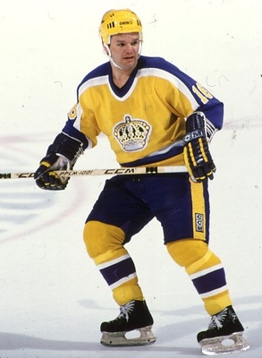
So wannabe-Lakers sweaters are better? The Kings have never had a look that they truly "owned." The purple and gold looked like the Lakers. The black and silver looked like the Raiders. The purple, black, and silver, while a nice attempt to combine both past eras, looked like a hockey version of the Sacramento Kings' look.
If any team should "scrap it all and start over" it's the Los Angeles Kings. They have no championships that immortalize any of their past looks, looks which always echoed those of other teams. Truly taking time to devise a scheme that doesn't belong to another team would be to their advantage in the long run. Seeing as they probably won't do that, though, they might as well go with one of their past schemes. Seeing as the team was its most relevant with Gretzky they might as well try to own black and silver in the NHL.
-
The Coyotes could have a new owner within a week.
So much for that.
-
The funny part? The team described those uniforms as "Baltimore Ravens-like."
In what way do those emulate the Baltimore Ravens' look?
-
These were the best Oilers jerseys of all time.

I agree that navy and copper look better than their blue and orange, but the red really threw it off.
I don't know why a lot of teams in the 90s felt the need to add red.
Not to mention that the Edge redesign royally FUBAR'd this entire design.
Yeah. Reebok really :censored:ed the Oilers. They made a decent, cool uniform look like complete trash. The worst thing is that the Red Deer Rebels currently wear the exact same template.

Yes, that is Ryan Nugent-Hopkins.
Thats a Blackhawks template, not an Oilers one. The Oilers reebok template had the half-sleeve pyjama striping.
He knows. What he's saying is that the template the Red Deer Rebels used could have also been used to successfully Edge-ify the Oilers' pre-Edge sweaters. That they could do a similar design with Red Deer (complete with the outlines on the middle stripe) but not with Edmonton is a shame.
-
The Angels' current scheme is easily their best look.
On a related note the halo caps were terrible.
-
Well NBC had to learn the folly of spending millions on a business venture with the NHL one way or another

-
Larry Jettman?
Devin Dark?
Nah Devin Dark's Jim Balsillie.
Whatever happened to that NHL Guardians nonsense anyway?
FAKE EDIT- Nothing's happened since the 2011 All-Star game. Heck, they still have "The Thrasher."
All that hype and nothing came of it. So much for the "hey if they market it well and it gets kids interested then it's ok" argument.
-
Larry Jettman?
-
Saying that Oilers knock-off is "on par" with NHL fashion sweaters is just flat out wrong.
Not if you've seen how horrendous NHL fashion sweaters can get.
I've seen plenty of examples, thanks. Neither of the two Oilers knockoffs posted here come close to being "on par" with any NHL fashion sweater I've ever seen.
-
Disagreeing is one thing. That's fine.
Saying that Oilers knock-off is "on par" with NHL fashion sweaters is just flat out wrong.
-
So a potential ownership group that's committed to keeping the team in Glendale doesn't actually have the money to buy the team. This seems familiar.
-
Actually its not. That RNH jersey is a counterfeit fashion jersey.
I know, and it's right on par with most authentic fashion jerseys.
No, not really.
-
Legend, I know we've had our differences but you're my favourite poster in this thread.
-
Don't get me wrong, as a Devils fan, this s**t concerns me...
...but we're not even in the same galaxy as the Phoenix or Long Island situations.
You're logic is sound....except that this is Gary Bettman's NHL where teams that are trouble, but not as much trouble as the Coyotes, are sacrificed to save the Great Arizona Hockey Experiment.
-
So that would make three teams under league control if things don't work out for the Devils right? The Devils, Blues, and Coyotes. Four in the last year, with the Stars.
The argument that Gary Bettman is doing a good job gets weaker with each passing revelation.
People were arguing that Gary Bettman is doing a good job?
Amusingly yes. Mostly at HFBoards. Which I only visit because I apparently hate myself.
-
So that would make three teams under league control if things don't work out for the Devils right? The Devils, Blues, and Coyotes. Four in the last year, with the Stars.
The argument that Gary Bettman is doing a good job gets weaker with each passing revelation.
-
One thing that nobody has seemed to acknowledge in this thread is that most people who buy counterfeit jerseys do not realize that what they're buying is fake.
I don't have a problem with those people.
Neither do I have a problem with people who buy counterfeits. I mean it's your money, you're an adult, do what you want. My problem is when people try justifying the purchase of counterfeits with bulls*it "relative morality" philosophy and rants against law enforcement. If you buy counterfeits just be honest about it. Just say "yeah I know they're illegally produced, but I like my jerseys cheap. It's my money don't pester me." That would be fine.
It's when you start trying to justify it as a morally superior activity that I take issue.
-
I guess the "busybodies" in Federal Law Enforcement are "self righteous" according to you.
Yeah, I do think a lot of Federal Law Enforcement is a bunch of self-righteous busybodies. A lot of times they look to make up crimes just to justify their existence. Surely you already knew this? I would hope.
Sounds like someone who found himself on the wrong end of the legal system.
-
The Negro League stuff is a grey area. I get the need to honour the legacies of those players, many of whom were equal to or greater then their Major League counterparts, but at the same time it just seems odd to honour a league that was, essentially, a giant symbol of segregation and social injustice.
-
Another unpopular opinion (it seems). Unless a team actually played in the ABA NBA teams need to stop with the ABA throwbacks. In fact teams need to stop throwing back to uniforms the organization never actually wore all together.
-
The one thing that bugs me about the Blackhawks' set is how one jersey is predominantly red, while the whites are predominantly accented with black. I'll admit that if I had the authority to make changes, I'd be hesitant to, but I almost think red numbers outlined in black would be perfect for the home whites.
The New Jersey Devils are the same way.
The Devils, though, are completely consistent when it comes to what colours are swapped between sweaters. The Blackhawks have two different striping patterns between their sweaters. Which isn't a bad thing. Despite that they still look like they belong to the same uniform set, which is all that really matters. It's kind of a holdover from an era when making sure each individual sweater looked its best was the goal, rather then obsessing over complete consistency.
The Packers had the same kind of thing going on in the 60s. The striping pattern from the green jerseys wasn't carried over and inverted for the white jerseys because the powers that be decided it didn't look as good on the whites as a simpler design did.


-
Yeah, an outline is definitely needed... but no ugly vintage white is a plus.
That wasn't vintage white on their old thirds/throwbacks. The uniforms they were based on really did use a tan colour.
-


These are my favorite NHL jerseys that were rebranded in the Edge switch.
I don't know why, but the Senators' home and road uniforms went from eyesores to "hey, these are pretty cool" as soon as they switched from the Edge sock pattern to a more traditional sock pattern.
In fact I would say the Sens' home/road set works better then the Penguins' home/road set. Maybe it's the dullness of the Penguins' khaki, maybe the template just looks better in red and black. I'm not sure.
Unpopular Opinions
in Sports Logo General Discussion
Posted
Well I suppose I should say that I'm never a fan of the "blow it up and start over" approach. Just that the Kings are, in my (unpopular) opinion, one of the teams that it applies most to. I'd still prefer that they not, and run with the black and silver (with a better logo though), but if any team had to "blow it up and start over" it would be them.
What would I go with if they did? Purple and white, a simple two colour scheme like admiral suggested would be unique. Red, purple, and white would also work. Purely hypothetical, but black, white, and old gold would have been perfect had the Penguins and Ducks not jumped on it.