


mad43dog
-
Posts
476 -
Joined
-
Last visited
-
Days Won
1
Posts posted by mad43dog
-
-
-
I don't know if Dan Uggla is good enough to have a "wrong" uniform, but nonetheless it still is a little odd seeing him as a Giant:

The wrong part about it is that it isn't a boys medium
-
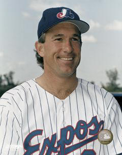
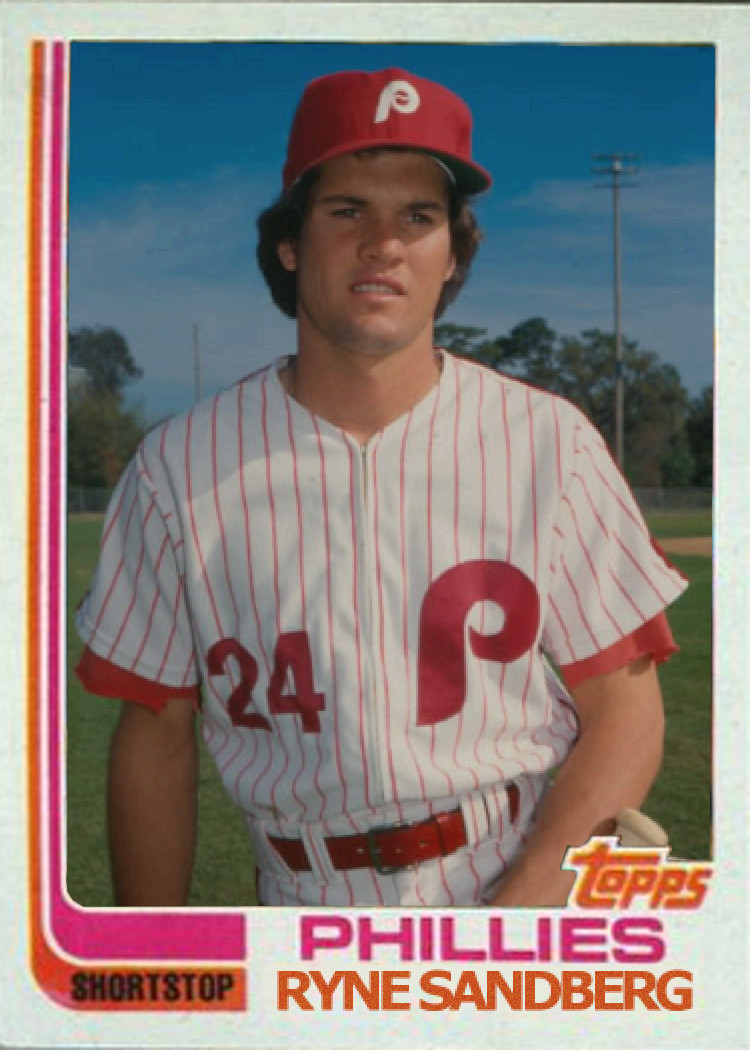
I know people say that a Brewers jersey is the wrong one for Hank Aaron, but thinking about how much he meant to Milwaukee during his years as a Milwaukee Brave, I think it's kinda cool that he got to finish his career in the city in which he began it.
If you had to pick his "wrong" uniform, it would be his #5 jersey he wore only as a rookie
.jpg)
-
 2
2
-
-
Apparently unpopular opinion of mine...
"Stick in rink" is a terrible logo that absolutely screams 1970s.
My unpopular opinion is that there is nothing wrong with screaming 1970s
-
1
-
-
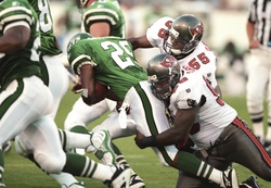
Kelly Jets vs Pewter Bucs
-
Only time the Kelly Jets played the Midnight Eagles
-

Wait... what? Maybe you meant to post the version of the Dolphins unis that came right before the Oilers move to Tennessee, but these uniforms were in circulation together for quite some time.

This is more like it
-
Stirrups should be an option to wear if they aren't already.
If I played in the major leagues I would wear stirrups (and a tight uniform).
I'm with you on the tight uniform
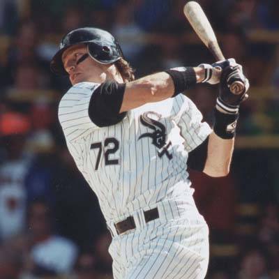
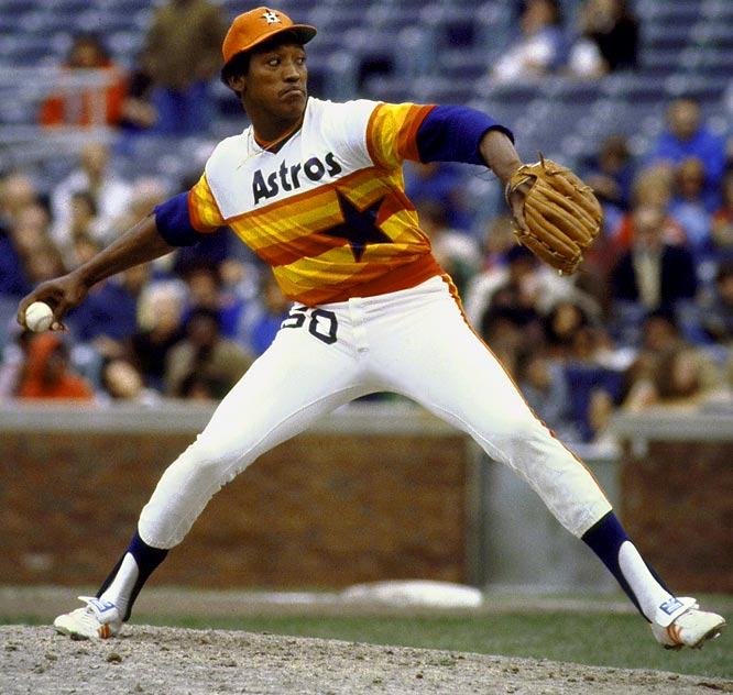
Dan Uggla wears the 1980s cut
-
Sure, but with better designs. (though a couple of the TATC were actually really good)
I disagree. Over-sized logos as the centerpiece are never good.


Never!

Exception?
-
-
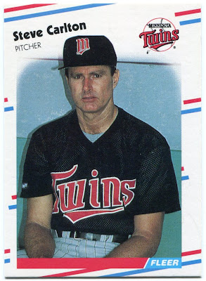
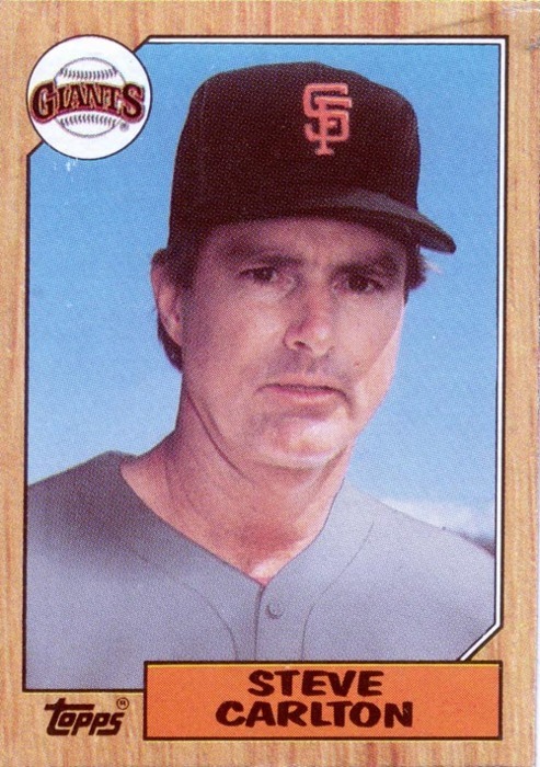
It's true that the original topic of this thread used "the wrong uniform" to mean "the wrong team". Still, it is perfectly valid to broaden the concept to add "right team but wrong uniform", especially as the original theme had long ago run its course.
BgMack already mentioned Robin Yount wearing the wrong Brewers uniform. Others that qualify in this category are:


Each of these guys is pictured with a team that feels right for him, but in a uniform from outside the eras with which each is typically associated with that team.

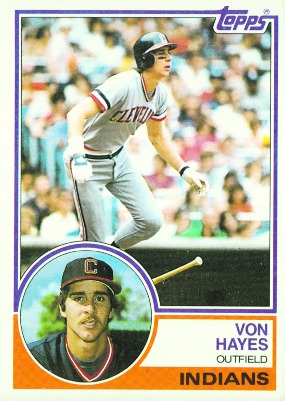
Mike Alstott belongs on this list
-
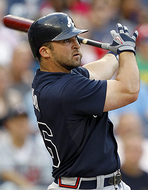
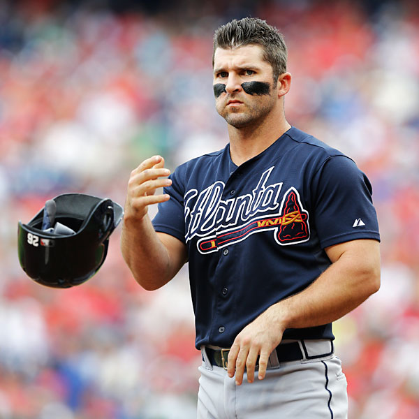
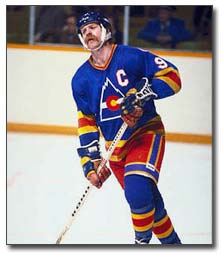
Who is that, he looks so familiar but I cant put my finger on who it is
John Smoltz
-
Wyoming's yellow (or gold, I don't know what they call it) and brown is my favorite color scheme of any jersey. There, I said it.

-
Speaking of '90s logos, St. John's should go back to this logo

Ugh. I'm not sure if this is an unpopular opinion or not, but all 3 primary colours should not be used together. It almost always looks bad.
-
Still pains me to see this, although, I still wish him the best.
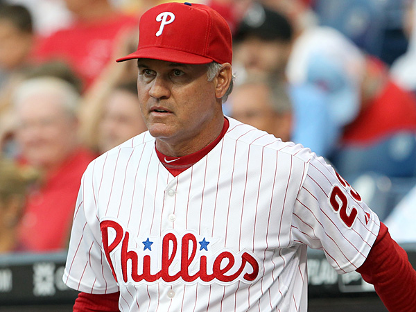
It's where he started
-
It would look so weird having it go from big bulky pads to skin tight sleeves on players like receivers that dont have big arms, and would look bid on lineman that have too big and flabby arms. The only ones it would look kind of good on and I'm not even sure about it is rb and lb
yes football
You are talking about football right? If so no this couldn't worki would love for every team to have jerseys that had sleeves all the way to the wrists like they used to waaaay long ago. they would be tight which players seem to like and we could see real stripes again
you already see fat players wearing long sleeves under pads it would look a lot like that
-
You are talking about football right? If so no this couldn't worki would love for every team to have jerseys that had sleeves all the way to the wrists like they used to waaaay long ago. they would be tight which players seem to like and we could see real stripes again
yes football
-
i would love for every team to have jerseys that had sleeves all the way to the wrists like they used to waaaay long ago. they would be tight which players seem to like and we could see real stripes again
-
Eagles vs. ANYONE in a Super Bowl is a rare match-up.


-

This is a great look, but it wasn't a good look for the Warriors. I think it could actually make a good look for the Thunder.
I completely forgot there was a time when NBA jerseys had shiny material. I liked it on some jerseys.


-
I love grey facemasks.

woo hoo
-
I love the pullover jersey look in baseball. I really don't know why it didn't catch on, it looks cool, and as Paul Lukas said, it makes sense from a practical standpoint.
-
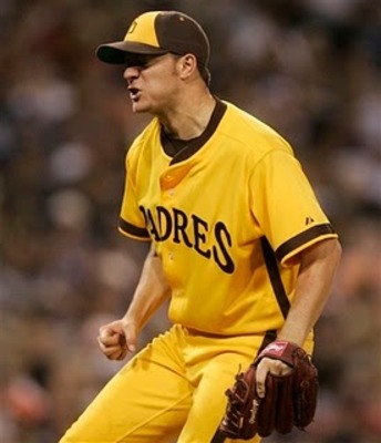
For some reason, several friends of mine have a thing against yellow baseball jerseys, such as the A's home alt. I never had a problem with these myself and I actually think they look nice...
-
I hate white face masks. They just seem to stand out too much. IMHO...

The chiefs pull it off perfectly


Unpopular Opinions
in Sports Logo General Discussion
Posted
The Mets and Giants shared a logo as well...but they never coexisted