


Bomba Tomba
-
Posts
963 -
Joined
-
Last visited
Posts posted by Bomba Tomba
-
-
Reminds me a little of a broken heart. Dunno if that's a good thing, like they're breaking their opponents' hearts, or the opposite.
-
You could call it Vegas Athletic Club so then the inverted V would be seen as an A and have meaning.
-
I've said it before and I'll say it again: the XFL's Bolts has a good helmet, logo and scheme
-
 1
1
-
-
This looks like a successful team, only to change into an "edgy" killer clown/Joker type look, suck, then go back to this look and start winning again
-
 1
1
-
-
International fans would probably just call them "CC" anyway.
-
NY looks good, but I'd probably hate them IRL
-
1
-
-
On 8/23/2022 at 2:31 AM, gosioux76 said:
Of all the various novelties we've seen applied to helmets over the years, this has been the most useless. It also makes me think of a bowling ball:

If there's someone who should have been using the flake it's the Ravens
-
3
-
-
Love that peach color
-
1
-
-
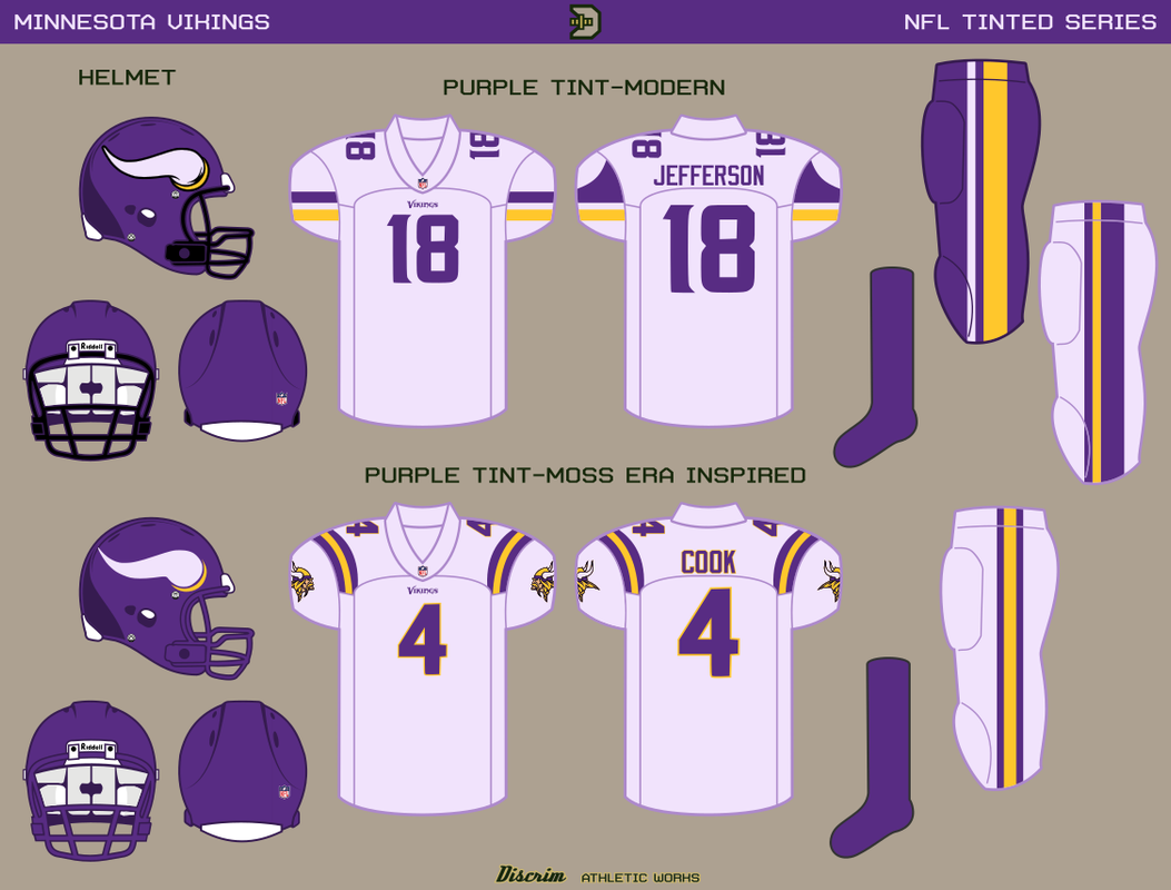
17 minutes ago, Discrim said:
Yeah, that's probably coming.
Tonight, though, the Vikings, in both the modern look and the first concept-like thing I'm electing to do, not counting the mint Saints helmet-a tweaked version of the Moss era roads, in that the current viking head and number font are used. If I'd used a yellow cream, I probably would've changed the sleeve stripes on the modern set to match the pants stripes, in case you're wondering.
Think a light yellow or maybe a steel gray would look good here
-
On 8/7/2022 at 12:36 PM, Discrim said:
I debated with myself on whether I should skip this next team or not, and curiosity won out, so here go the Steelers. The tints used here are both intended to hint at steel in a couple disparate states...on top, a warm, molten tint...granted, actually trying to capture the distinct hues of molten steel would probably require a gradient, thus the talking up of a standard, yellow-orangish cream (though not as completely orange as the Bears version); on the bottom, a blue-gray tint, steel in its cooled, ready to build state, if you will. Oddly enough, I like the warm cream here a lot more than I thought I would, mostly because gold doesn't get as lost here as it has a maddening tendency to when paired with warm cream shades.
I prefer the gray one here, just really gives that steel vibe
-
1
-
-
15 hours ago, NFLfan10 said:
Didn't see this coming!
The Tïtans should really bring back light blue as primary
-
4
-
-
Love this idea! More teams should really go "light" and "dark" instead of just colored and white.
-
Switching to navy is a downgrade, the light blue is much better
-
1
-
-
So if the North Stars return, what will the Stars be called instead? Or would they be another team entirely?
-
1
-
-
That hypothetical fanbase must be high or something, because that gunsmoke gray is amazing.
How would it look as the primary, replacing the black, and then bringing back their original silver as the secondary color?
Also for the Seahawks I think they should have kept the Seahawk blue (applies to real life as well)
-
I'm in love with that royal blue. Pairing it with either the white or light blue pants would be a solid look imo.
-
1
-
-
Dude, it's a concept. If OP wants to imagine that the Texans can use the Oilers trademarks, let him.
I agree with the shoulder numbers though. Wider shoulder stripe so they can fit, and how about change it to red on the home, white away, blue on the alt, just so all three colors are represented on the whole shoulder thing? White is also more visible against red than blue is on the away.
-
22 hours ago, WideRight said:
32 teams on one template would be quite a challenge. I am not going to attempt that, but feel free to try yourself.
Might take a crack at it over the weekend, emphasis on might.
-
Nice!
Are you making one for the NFL? Or if not, would you allow me to?
-
The team probably couldn't be bothered to make @12, so they just slapped a 2 on an existing #1
Reminds me of how ARCA teams change their cars' numbers
-
On 6/30/2022 at 2:04 PM, Chawls said:
the losing season is the only one they’d have while wearing each jersey iteration.
If only they can change jerseys every season

-
 2
2
-
-
I meant the entire set, not just the alt.
Wonder how the Cowboys in your universe reacted to another team using a star logo though?
-
8 hours ago, MDTrey4 said:
Up until the moment that you mentioned that, I never even considered making Dunder Mifflin the kit sponsor lol. I just always wanted to stick with real companies and that never even crossed my mind.
You can always say that it's actually NBC and/or Staples (who used to make actual DM paper to tie in with the show) who's paying for the sponsorship

-
1
-
-
Agree on cream on the road, it's light enough as to be different from the home.


Alternative Football Universe: Lega 1 (Summary)
in Concepts
Posted
The 1919 shirt with white shorts would be a good away or alt for another season I'd say