-
Posts
1,008 -
Joined
-
Last visited
Posts posted by Bomba Tomba
-
-
On 5/8/2024 at 9:54 AM, Green27 said:
Easily throwback of the year for me. Great colors, sharp edges, and sweet tribute to the Aussie/Kiwi bond.
I agree this is nice
But I've always hated the 9 in Petty font, even when it first ran
-
Your links are busted, just saying
-
Not so sure on the colors, the last new look to enter the league (the Kraken) already had that light blue shade
-
5 hours ago, logo-maker said:
For your Indianapolis Colts concept, I feel like it's a missed opportunity to turn the horse shoe on the helmet sideways to create a 'C' on the front or is that too on the nose.
I've always wanted to see them do that in real life and have the Bears use the bear head (to reduce confusion)
But then again, I'm the kind of person who spits in the face of tradition, so it admittedly would be an unpopular move
-
-
If not for the plane theme I'd have done black home, mint away, zero traces of white
-
 1
1
-
-
-
3 hours ago, Carolingian Steamroller said:
"One of these things is not like the others, one of these things just doesn't belong..."
Lions doesn't contain an R
Also, I like the Titans' old look better with light blue as a primary, if only because navy is overused in all of sports
-
 4
4
-
-
On 5/5/2024 at 2:59 AM, PascalHugo said:
Thanks mate!
I create by myself but it's a very mess, at the moment i'm thinking about a new template for the American League and next leagues.Please let me know, I would love to try these out
-
"Brownie King" sounds more like a sponsor name than a driver name lol
-
 2
2
-
-
Would have loved to see the duck head turned into a helmet instead of a hockey mask
-
Okay.... so the Cowboys do blue at home now?
-
PANK
Such a fine scheme, shame the merger means that these colors will soon be gone from the skies
-
 1
1
-
-
So.... all NFL teams do white at home now?
-
-
-
On 4/24/2024 at 10:17 PM, heavybass said:
A @WideRight concept that didn't win..
Did he, like, allow you the use of the name and logos?
-
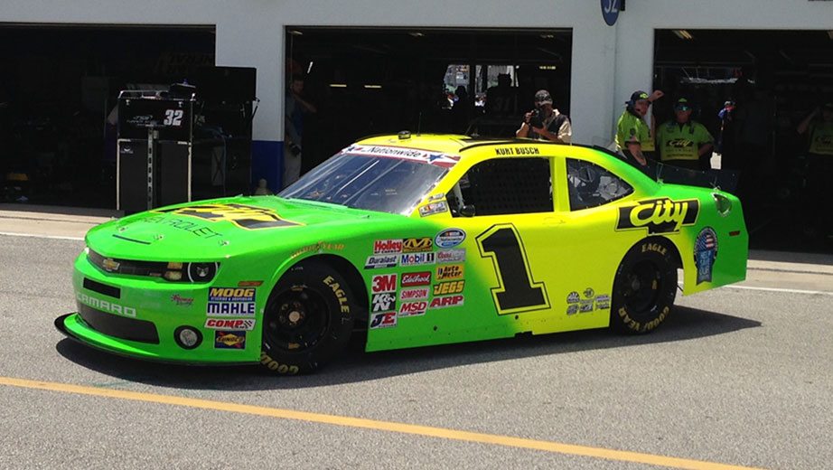
Dunno if this has been posted, but during the NASCAR Cup race on 07/07/07, car #07 finished 7th
https://www.racing-reference.info/race-results/2007_Pepsi_400/W/
-
 2
2
-
 2
2
-
-
5 minutes ago, johne9109 said:
Yeah I think in all honestly I would drop the gray and put the gold or the purple as the away
White: Home
Gold: Away
Purple: Alt 1
White with Los Angeles text: Alt 2
-
 1
1
-
-
On 4/25/2024 at 9:44 AM, edjb93 said:
SPIRIT AIRLINES
3 very different looks? We entering soccer territory now boys
-
 1
1
-
-
I'd have loved to see them be the "break tradition" kinda team and use the gold as an away
-
 1
1
-
-
What exactly is a skipjack? That could influence your decision
-
This looked nicer than the all black car tho

-
 1
1
-
-
On 4/23/2024 at 11:31 AM, mcrosby said:
Baltimore Ravens:
I liked the 2020 logo, but wanted less gold. I've kept it to the outline and the eye. I've also opted for a more lavendary purple to add some contrast and to make the colorway unique.
Home: A complete departure from previous sets, the shoulders feature an iridescent Maryland/Baltimore flag pattern. The iridescence carries into the pants stripe and the helmet. I've included a similar gradient in the socks to avoid the unitard look. The helmet keeps the Ravens unique striping, but in a more contrasting gold.
Away: Instead of a more subtle shoulder pattern in light grey or keeping shoulders in black, I opted for keeping the iridescent pattern on the shoulder and pants. I also brought it into the name/numbers.
Alternate: Leaning further into the purple gradient and a bunch of gold outlines. It's not going to be everyone's favorite, but I think the Ravens could pull it off.
Hall of Fame: There were some classic looks around the league in 1996 when a team came to Baltimore. I didn't want to lean into the Browns history for inspiration, because the Ravens don't deserve the Browns storied history. Instead we've got a completely new creation. I've used a diamond motif on the jersey. Diamonds graced some uniforms in the early days of the NFL, and they aren't so far off from the flag motif. I've also used the winged helmet for this winged team.This would be sick if the home was an extremely dark purple instead
They own that color in the AFC, plus the division has 2 black teams already, including their rivals
-
 1
1
-


Airline Football Uniform Concepts - Tù Decides Tu Destino
in Concepts
Posted
That's a fine scheme for an airline that I discovered at the age of today years old