


pokecat12
-
Posts
209 -
Joined
-
Last visited
Posts posted by pokecat12
-
-
9 hours ago, FiddySicks said:
Yes they did! But anyone clamoring for them to go back to these full time is nuts. They may look real cute now, but just try to imagine these on the back end of four consecutive ten loss seasons (something this franchise is very capable of at any point) where they wear nothing but the creamsicle throwbacks. It quickly goes from a fun little thing to a pirate with a dagger in its mouth winking at you in baby puke orange and a slightly darker shade of orange. For years. People really can’t quite grasp just how much that look was HATED by the time they changed it. Those old orange unis had such a putrid stench of failure caked into them by 1996. They had to go.
These are fun strictly because they so rarely make an appearance. They’re a fun little treat on special occasions. Once a year is enough, and like I’ve said before, I’d like to see it even more infrequently than that, even. Once every five years, give or take, and only for really special occasions.
THANK YOU!!!!!! As much as I love them, they went to Pewter Power for a reason. The Pewter/Red dominant made a difference in their attitude. Just listen to Warren Sapp as he grew up with them down the road from his home in Orlando. The Yucks! If they make an appearance a couple times a year I'm happy. But it's obvious that after the Alarm Clock number uniform mistake, they went back to a winning uniform. AND won a Super Bowl in them twice (yes there are slight differences, but the same concept.)
-
 2
2
-
-
1 hour ago, oldschoolvikings said:

I'm SO glad someone got the reference. My wife and I are quoting that line as well as others.
-
On 8/14/2023 at 10:34 AM, namefornamesake said:
I think it would be funny if the Titans made them intentionally design these uniforms to be as ugly as possible so as to instinctively turn people off to a Oilers-style rebrand in Houston.
Like in Nacho Libre......"This is the worst lunch....I have ever had."
These went from boring for the last 10 years to WTF!!!!!!!!!!
All the number fonts look the same.
-
11 hours ago, aawagner011 said:
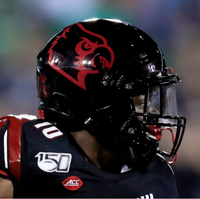
New field design for Louisville.
I wonder if this is foreshadowing new uniforms. Otherwise, it would be very odd to move away from that font which has been so closely associated with the athletic program. Maybe they’ll keep the regular bird on the helmet.
I do not like this change. Louisville has a nice Cardinal head logo and its font was very distinct (at least the wordmark, I never liked it when applied to numbers). Moving to the full body logo feels very retro, something you’d love to see on a throwback ball cap at the bookstore, but past its time for a main logo. This feels similar to the Maryland change that I discussed a few pages ago.
Louisville’s problem isn’t the logo or the wordmark, it’s the hideous way they apply their logos and uniform styles. The on field uniform should use your logo in its intended colors.
Louisville looked best with the classic white helmet, full color logo, stripes, and the drop shadow block numbers. They later released a version with the modern number font. I’d take that now, if they’d at least fix the helmet and stripes.
I can hope Adidas will help make the change from these atrocities the last few years to something along the Schnellenberger/Strong eras. Those were the classics. John L. Smith stripped them down to basics and Petrino 1.0 put a little pizzazz but they outdated themselves after a while. Brohm can keep adding to the positive hype by getting unis back down to basics. When he played, the unis were vibrant and classic.
-
22 minutes ago, Carolingian Steamroller said:
This thread is devolving into @TruColor being forced to play the most tedious game of 20 Questions in the Western Hemisphere.
At least, this time, that the person in the know, actually is very trustworthy and knows his stuff.
-
14
-
-
Can't we just get a jersey pic with a badly drawn neon green phallus on it like the Titans?!?!?!
I enjoy the classics.
-
1
-
 1
1
-
 2
2
-
-
22 hours ago, PERRIN said:
Not the triple-outlined numbers, asymetrical cuff striping, or giant jaguar logo leaping through the players neck? The single TV number fits quite normally considering everything else in the uniform, though it'd be unheard of on any other uniform.
Would love to see this concept be brought back as a throwback just for the memes. It's the most 90's uniform to ever exist, and it's tacky as all hell. I love it. I miss the days when the Jaguars' uniforms had a personality.
I remember when they unveiled the Panthers I was happy. When I saw that monstrosity in USA Today, the next Monday, in COLOR, you talk about getting puckered up. Thank Jaguar Car Co. for jumping on that. That was the definition of "Maybe a little too too much?"
-
1
-
-
13 hours ago, mjarvie said:
That's actually funny. I swear when I was younger and was watching BYU my dad would always ask me why I'm watching Yale.
I noticed when Coach Claiborne took over in 82 that the colors were lightened and the unis resembled the BYU unis. Before that it was a darker royal blue. The stripes on the jerseys matched up. BYU was pretty good back then, maybe he was changing to mojo of the Cats.
-
On the UK subject, If they would bring back for one game, the 82-89 UK uniforms, with the Power K helmet, i would buy that in a heartbeat. That is what a lot of us old UK fans would die for.
-
1
-
-
The Knights unis are everything the Titans redesign should have been. You're on a roll WR. Love it!
-
2 hours ago, nuordr said:
You can see some of the options on this YouTube video:
Actually just seeing the Madden 23 Unis, and the return of the 80's Falcons and the 90's Colts, I'm already CRANKED!
-
This has been out for a few days. UofL is unveiling new unis. Probably more of the Power Wings Shoulder Asymmetrical Gelato Rice stuff.
I did try to lighten it up and it just said "Unveiling 8:11:22" lol. I did see a gray possible version in a couple local stores here in town. Not looking good imo.
-
7 minutes ago, Sport said:
ASS.
and cat food.
-
Is it too hard to just ask for a Gang Green 80's helmet and throwback.
IS IT?!?!?!!?!?!?!?
Must be.
-
1
-
-
1 hour ago, BJ Sands said:
Am I a nerd because I can’t wait to mix and match all the new helmets in Madden?
I'm the same way my friend. I have been waiting since Madden 17 to wait out all the changes to unis to get a new one. I'm nerding out too.
It's going to be Christmas Morning in AUGUST BABY with SANTA MADDEN!!!!!!!!!!!!!!
-
1
-
1
-
-
I like the 2 color Card head just as a throwback before John L. Smith added yellow back into the mix. The Cards have mainly been a Red/Black/White team. The yellow was just on selected logos like the Dunking Cardinal and the Heisman Football Cardinal when Coach Schnellenberger resurrected the program from being moved to 1-AA or being dropped altogether. I personally think it works but if you haven't been exposed to it I understand it looking off.
And yes, I much prefer the Strong era unis. So much more pleasant on the eyes. And looked like a more symmetrical design. I think he was trying to get a Florida look, since he came from there which as much as I hate Florida, they have a nice uniform.
-
1
-
-
4 hours ago, heavybass said:
Dude really? The Outlaws was one of the worst logos in football and whoever created it should be shot.I personally love it since I remember watching the actual team in 1984. And I lived in OKC so they were my adopted team.
But when you add copper to the mix of black and red. Dear Lord that wasn't easy on the eyes. Those unis were so off balance it wasn't funny. The Wranglers 1984 unis and the logo were and still is one of the best logo/unis ever.
-
9 hours ago, PaleVermilion81 said:
I remember this as well. I think you can see it on the front of the strip:
I'll add that I remember this too. Talk about a mythbuster. And it is barely lighter on the navy portion of the decal which was interesting.
-
-
These uniforms are the Sequel Trilogy of the NFL.
-
25 minutes ago, Old School Fool said:
The first ever Raiders uniform had a plain black helmet from 1960 to 1962. In 1962 they added a yellow stripe. I doubt the Raiders ever throw back to this look unless the fanbase really pushes for it and from everything I've seen, nobody is down for black and yellow. The 1970 throwback is here to stay.
I believe #15 is HOF Coach Tom Flores.
-
1
-
-
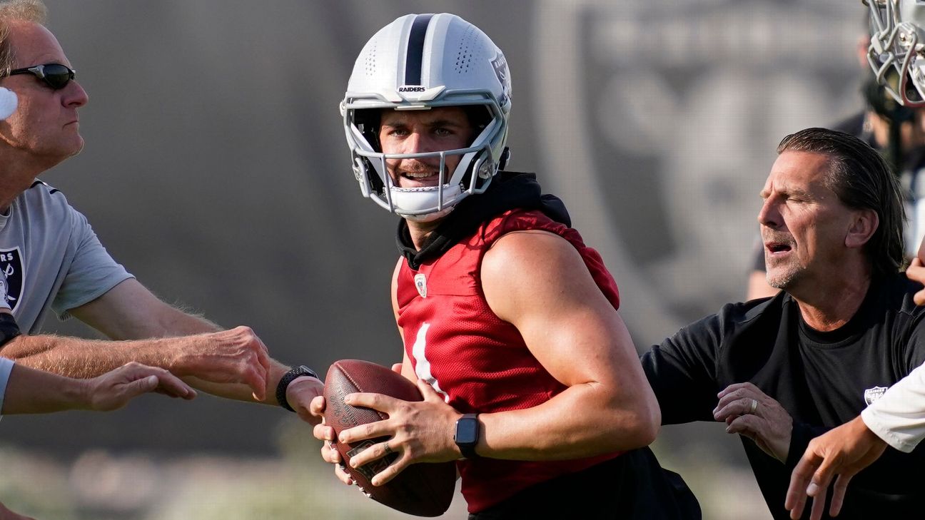
11 hours ago, AgentColon2 said:
Derek Carr rocking this weird new helmet at minicamp.
Vicis has a new model: the Zero2 Matrix which this is what it looks like.
-
4
-
-
19 hours ago, _DietDrPepper_ said:
I do like both of the suggestions made so far for Louisville, I’ve seen them both used in fictional leagues before too. Outside of the more generic Colts Racers or Stallions you could try something like Pioneers, Explorers or Foresters. Daniel Boone has a big impact on a lot of Kentucky, and has his own national park. Kentucky being the 14th state also has a lot of historical sites from the first pioneers who explored west. I've been to countless forts and trails centered around those ideas. A bit more whimsical of an idea could also be Mammoths. Inspired directly from Mammoth Cave.
I am in agreement on Thunder. It is usually something about horses, which is fine, but Thunder has a nice sound to it (or enter any pun you choose because there are tons of them)
-
14 hours ago, TheOatsMustFlow said:
I can’t wait for the oversized helmet logo with the number on the other side look to go away
1000% with you. I guess some people don't like symmetry. I get OCD on non-Symmetry. Except WFT, the Eagles pants, Virginia orange/blue and Arizona Wildcats red/Blue stripes. Those work for some reason.


/cdn.vox-cdn.com/uploads/chorus_image/image/9193787/129903477.0.jpg)


2024 NFL Changes
in Sports Logo News
Posted
I would tolerate those, as long as they put stripes on the pants again. It's not hard Washington AND NIKE!