


Djruggs
-
Posts
765 -
Joined
-
Last visited
Posts posted by Djruggs
-
-
9 hours ago, PascalHugo said:
The sponsor kills me just a bit, but I absolutely love the boca inspiration given our relationship in real life. 3rd kit is a beauty too!
-
Wales
Denmark -
Wales #1 (by gswansea)
Cameroon #3 (by gswansea)
Denmark #2 (by MDGP)
Brazil #2 (by timberwolf)
-
Wales #1 (gswansea)
France #2 (gswansea)
Cameroon #3 (gswansea)
Canada #2 (dsaline97)
Costa Rica #1 (MDGP)
Serbia #1 (dsaline97)
Argentina #2 (lightning25)
Brazil #2 (timberwolf)
-
Man, I'm really hoping for a comeback on this one lol I think it's my best entry.
Regardless of what happens, it was a lot of fun getting to work my creative muscles again and start essentially from scratch. Here's to a great competition!
-
Serbia #2 (by Josef_Bretones)
Brazil #2 (by timberwolf)
Cameroon #3 (by gswansea)
Portugal #1 (by GriffinM6)
Awesome work everyone!
-
18 hours ago, Darth Brooks said:
I'll work up something in a bit. Now I gotta get the six year old to bed. If I can.
edit: he's out.

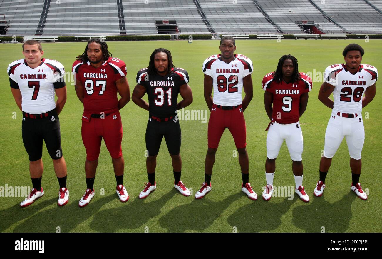
I think that's a great start, but I was envisioning something a little more along the lines of South Carolina football circa 2012
-
42 minutes ago, Darth Brooks said:
The current unis match the jersey and pant colors for dark blue and white, with an orange jersey going with white pants. (There have been variants where the blue goes with white, etc) I wanted blue and blue to go together and then to flip the other two between orange and white. I wanted one color on each pant and one on each stripe so that meant going with the combination above.
I totally understand the thought process, I just don't think it works that well. I think if you were to have two colors on the inserts on the jerseys and pants, it would be much more cohesive of a set.
-
I'm not the biggest fan of the jersey inserts, but if you're gonna stick with em, I think the pants stripes have to be consistent with the jerseys.
-
Dang good work MDGP and gswansea!
Everyone else, we got one more chance lol
-
4 hours ago, NH4 said:
Thank you! I have trouble putting designs in the correct spot in reference to the template when it’s black design and that’s a good idea.
No worries! Usually what I'll use is #1c1c1c. I find it's black enough, but still lets the black elements of the template be present.
-
 1
1
-
-
I love almost all of what you've posted, my only real piece of advice would be to maybe use a black with a bit more grey in it as the details of the template get kinda lost when you use #000000
-
1
-
-
- Spain 3 (Norskie)
- Costa Rica 1 (MDGP)
- Canada 2 (dsaline97)
- Germany 1 (RBronish)
-
-
- Australia 1 (GriffinM6)
- Denmark 2 (MDGP)
- Mexico 1 (Josef_Bretones)
- Argentina 2 (lightning25)
-
2 hours ago, PascalHugo said:
The pattern on that third kit is *chef's kiss*
-
On 11/2/2022 at 4:13 PM, LA Fakers+ LA Snippers said:
Boston Celtics
One of the most iconic and legendary brands in all of sports is the Boston Celtics. That being said, still having a white man as their logo seems a bit dated, so everyhting black becomes dark green, while everything not green becomes gold.
Association/Icon: If it ain't broke, don't fix it. (although "CELTICS" is back on the Icon instead of "BOSTON")
Statement: A green-on-green alt seems more appropriate for the C's than a black one, taking cues from Boston's 2021 Earned edition
City: The City jersey is a tribute to the late great Bill Russell, with the late 50's-60's wordmark on the front, gold striping, and eleven #6 shamrocks representin the 11 championships won during Russell's career.
--switching to @edjb93's template. lmk which one you guys like better.--
Kinda cringe regarding the logo not gonna lie lol
As for the uniforms, City uniform is cash. but could probably use a lighter gold. Also, the fans HATED that earned jersey, so I'd probably try something else.
-
1
-
-
-
- Wales 1 (gswansea)
- USA 2 (MDGP)
- Netherlands 3 (TheGiantsFan)
- Iran 2 (bnjmnmorse)
-
-
-
Oh, I'm so in!
-
1
-
-
On 10/30/2022 at 2:47 PM, NH4 said:
SOUTHERN UTAH THUNDRBIRDS
DESIGN
- Took the lightning bolt from the logo and made that the design
- Updated the font
HELMET
- White and black helmet with red facemask
- Put the primary logo on the black helmet
- Added the lightning bolt stripe
- "SUU" on the front bumper and "THUNDERBIRDS" on the back bumper
JERSEY
- Added the lightning bolt stripe
- Updated the number and chest text font
- Went with a stacked chest text placement
PANTS
- White, red, and black pants
- Added the lightning bolt stripe
Sorry it was so long posting for awhile, life and work got in the way. But, hopefully I will post more frequently now.
Up next will be another red and black team that was in the WAC but for only one year; Lamar. Thanks for looking and as always, C&C is greatly appreciated!
Uniforms look great, but man, that wordmark is huge
-
2
-
Just wanted to drop by and close out this series with some compilations of the uniforms.
Thanks to everyone who interacted in here.
Home Uniforms
Away Uniforms
Third Uniforms
Signature Series Uniforms
Throwback Uniforms
-
1
-


College Football Uniform Concepts FBS, FCS, D2 & D3- Lehigh Mountain Hawks
in Concepts
Posted
perfection.