


TheRicSlick
-
Posts
3,317 -
Joined
-
Last visited
-
Days Won
5
Posts posted by TheRicSlick
-
-
I feel that the "Jazz" nickname is, in many ways, more synonymous with Utah than New Orleans. Stockton and Malone, the '97 and '98 Finals against Jordan's Bulls, and Jerry Sloan's long tenure in Utah have all made it such an appropriate fit.
I don't see how that makes it an appropriate fit. Just because they have more history in Utah doesn't mean that the name makes more sense than it does for New Orleans. Jazz music is one of the things New Orleans is best known for. Utah is about as well known for jazz as Winnipeg is for beaches and bikinis.
People grew up saying "Utah Jazz", so when people say it, they don't give it a second thought, it's just "right" to them. Sure, "New Orleans Jazz" makes more sense when you think about it. Heck, if the Jazz moved from New Orleans to Utah today, I bet they would have renamed to something else.
-
Do you have a specific example?
One I can think of was Oklahoma State this weekend. Wore a throwback helmet, with their current uniforms. (Can't find a good picture).
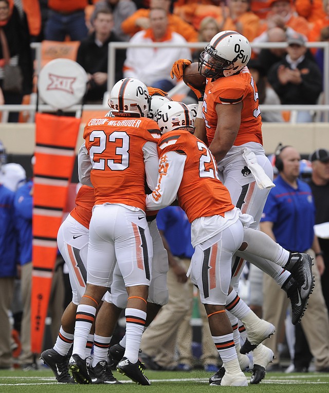
I actually like this look.
-
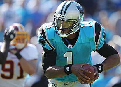 [
[Cam Newton's first year with Carolina was also the last year of the original Panther logo before they updated it AND the last year of Reebok unis
Because the Panthers uniform changed SO much from Reebok to Nike.

-
 1
1
-
-
Don't know how unpopular this is, but I really like the San Diego Chargers number font
I'll take it a step farther, I like their uniforms.
-
Ben Zobrist (again):

-
I think the Marlins need to go back to the old logo,uniforms and stuff. It was so beautiful.
That's not unpopular.
-
Ben Zobrist:

-
OK even though this sounds dumb, I don't feel like going thru 56 pages looking for an answer, but seriously what does that little green box with a number in it mean?
Is it the number of likes a person gets? Is it how many ironic things you post? And why does it have a (usually) positive adjective under it?
Ding ding ding.... we have a winner.
-
Navy is blue....
The shade is too bright. I think it makes the uniform look cheap. If I'm not mistake, the mets have a darker shade. By blue, I mean blue. Not navy.
not to mention, taking blue pinstripe to be any shade of the colour blue, the yankees as well.
Care to explain how blue pinstripes look amateurish? You must think the Mets home looks amateurish too, right?I'm starting to dislike the entire Cubs identity. The home jersey looks really amateur with the blue pinstripes and the whole Cubs in the circle looks... Boring. The vest they wore as a throwback a couple of years ago looks way better IMO. I absolutely hate the road jersey. From the font to the color of the number being different than the script. It just looks bad. I always thought the road jersey with the red line under it was their best look. The alt road speaks for itself. The blue jersey is probably the best of the set.
-
Here's the problem with full-bodied logos: the head almost always looks tacked on.
Yeah, the 1939 helmets were really cool.
Agreed, throwback leather helmets always look cool, no surprise I always really digged the Texas A&M throwback this yearI also like these throwback alts. Even with their current helmets. (I'll catch a lot of heat for this I'm sure.)
Another thing I like that most people don't are these full body animal logos:


That's why I just glance at it and don't think too hard about it
And here I am spending countless hours looking at a logo, when I could just glance at it for a second. Damn, learn something new everyday.
-
I also like these throwback alts. Even with their current helmets. (I'll catch a lot of heat for this I'm sure.)
Agreed, throwback leather helmets always look cool, no surprise I always really digged the Texas A&M throwback this year
Yeah, the 1939 helmets were really cool.
Another thing I like that most people don't are these full body animal logos:
Here's the problem with full-bodied logos: the head almost always looks tacked on.
-
Surprised nobody was upset about the Bucks ditching Red from the colour scheme... Especially in light of how long it was used and the championship team behind it.
You obviously never saw any of my posts on the subject. I'm the one guy who thinks the rebrand was a downgrade.
-
Yeah, I have to agree with you. The killer for me is the number font. It's just way too big and weird.The inaugural uniforms and logos the Ravens used, might be the most overrated uniforms in NFL history.
I can't find any redeeming things in the whole set. The pants have that ugly white stripe, the helmets are a mess, and the jerseys are just plain ugly.
Also, it seems that every picture I find of those uniforms has some player wearing shoulder pads that we about twenty times too big.
Welcome to the '90s.
-
The inaugural uniforms and logos the Ravens used, might be the most overrated uniforms in NFL history.
I can't find any redeeming things in the whole set. The pants have that ugly white stripe, the helmets are a mess, and the jerseys are just plain ugly.
-
1
-
-
I still prefer the old Bucks' set to the current. The old logo actually looked like a buck, and it didn't have that cartoony M. While I do like the uniform set the Bucks' just unveiled, I think the previous are better. The red and green color scheme was original and fit the Bucks' perfectly, and no it didn't remind of Christmas.
-
1
-
-
Do people not need 3 posts to start a topic anymore?
-
Avatar edit thing is not working
Just tested to see, and it isn't working for me either.
Worked fine for me.
-
one season of popcorn without butter


-
I'm trying to 'mark as read' my notifications, but I get this:
Sorry, but you do not have permission to use this feature. If you are not logged in, you may do so using the form below if available.What the hell? I've been able to do this before, and the dynamic notification bubble never, ever, ever works.
Thank you for bringing this up, as I'm experiencing the same problems.
-
The Bucks new primary logo is massive downgrade over the previous version.
Thank you! (clap) (clap)
I prefer everything about the previous set, yes, including the color scheme. The red and green was unique, just because Christmas is also associated with that color scheme doesn't mean it's bad. Those lol Christmas comments get under my skin.
-
You wonder if this is unpopular? Anything blue and orange is miles ahead of that black crap they used to wear...I dont know if this is unpopular but
this
is waaaaaaaaaaaaaaaaaaaaaayyyyyyyyyyyyy better than this, even if it was BFBS
the grey/silver script looks terrible, and makes the entire think look horrid.
still think their grey/white/now gone cream/sky white looks best though
What is sky white?
I think he is referring to the snow whites:
-
Doesn't everyone hate the new Dolphins logo? Seems like it.
As for underrated:

-
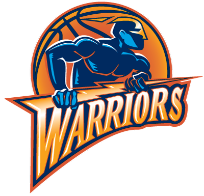
This Warrior set (including the uniforms), were imo, the best look the franchise had. Don't get me wrong, the current look is a beautiful set, but it fails to match this look. Sure this set had it's flaws, like the 90's-tastic wordmark that accompanied it. But it had more highs than it did lows, like this beautiful logo and color scheme.
-

Your Favorite Teams?
in Sports In General
Posted
Can you tell us the story of how you become a Cavs fan? Make sure it does not involve the name "Lebron James".