


TheRicSlick
-
Posts
3,317 -
Joined
-
Last visited
-
Days Won
5
Posts posted by TheRicSlick
-
-
I am surprised that unused Patriots logo gets so much praise everywhere, I think it looks awful.
It looks like a logo for old people insurance that runs ads during The Price is Right.
Because of...

-
These are way overrated!
While these for some reason are very underrated:
-
My problem with Yosef is, they promote it to primary, yet they don't bother to clean it up. It's fitting for 1975 not 2015.
-
 1
1
-
-

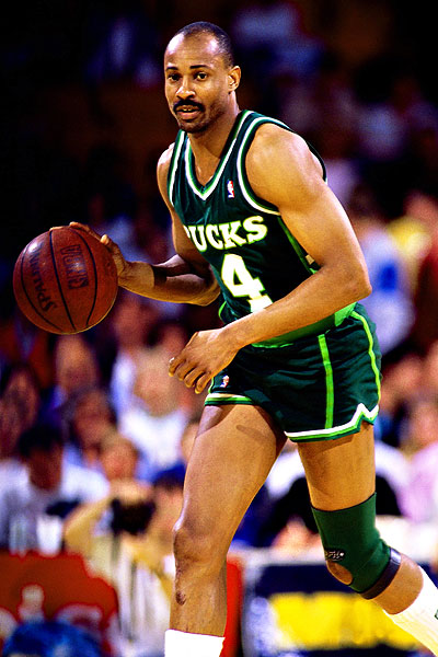
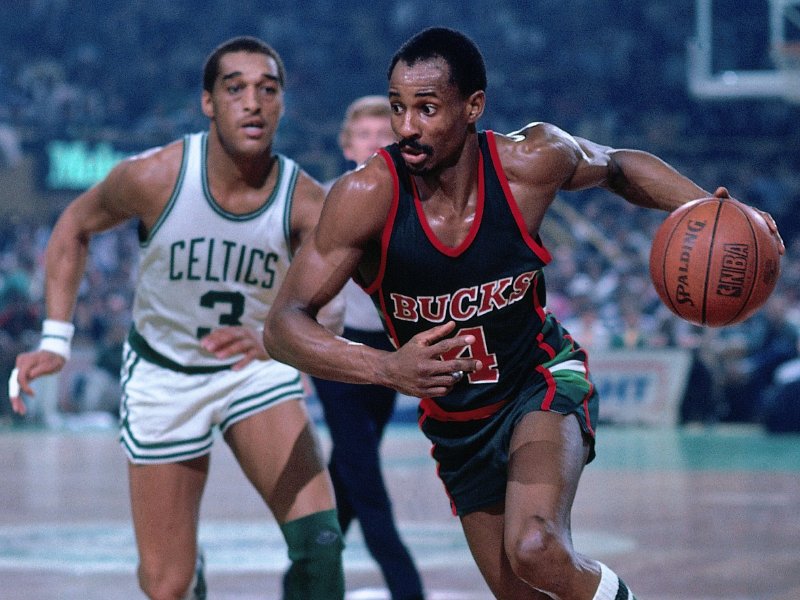
Josh Cribbs, Colts
Any team that's not the Browns for Cribbs:


-
^ Yes.
A true American classic.
-
^^^^ Wasn't that the sprinkler game?
-
^^^ KU to the SEC! Ha, don't make me laugh.
-
The "friendly" version of the primary isn't needed. It's redundant.
-
IMO the South Bend Cubs should have went with Studio Simon, the firm that designed the Tennesse Smokies update, instead of Brandiose
-
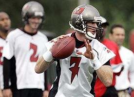
If the Bucs switched fonts to their old Practice Jersey fonts (Keeping the outlines and stuff) and used the Old logos and wordmarks, then their identity would be fine
No, the old practice jersey font is much worse than the current. Look at how terrible the 7 looks:
-
My favorite logo from the new set:
-
1
-
-
The "BS" cap is genius. People are going to by it just because it says "BS".
-
I wonder what happened to Ballapeno's friend, Henry the Taco.
-
He's a jalapeño.
Because....Mexican?
-
@bubba....I can´t, i don´t know them. - But when the habs won alot of cups, there were only a handful of teams, and they got all of the good canadian born players, right ?
You sound stupid. Stop posting.
You sound ignorant. Keep posting it's funny.
-
I like the colors of OKC Thunder
I know there's hate for Memphis's double blue, but most of the hate for the Thunder comes from the logo not the color scheme.
-
I prefer both the Astros and D-Backs in red and sand. Sure both teams looked too much alike when they both wore it. But when the Astros rebranded to navy, it added another navy team to the league, which MLB does not need. As for the D-Backs, the purple/teal look reeked of the 90's and early 00's, it was time for a rebrand.
-

Last year of the Browns uni, first of Bucs.
-
It seems i'm the only one that like KU's Trajan font.
-
unpopular opinion - Too many red white and blue teams in the NBA.
That's not even close to unpopular.
-
Why did "FXFL News" not have to post 3 comments before he started a topic?
-
have you guys ever thought of creating a section on the forums for Jerseys/Uniforms?
There is, it's called the Sports Logos section.
-
1
-
-
Kansas- My brother goes there and it's in my home state, so that's an easy decision.
Michigan State- When I was 5 or 6, I played March Madness 2005 for PS2 a lot, and the team I always chose to play as was Michigan State.
Buccaneers- Kinda of the same as MSU, just sub out March Madness 2005 with Madden 06.
Cubs- I don't know why but I have always liked the Cubs.
-
I think I'm the only one that actually really likes the Jaguars helmet
It's not a great helmet, but I've started liking it a bit more.

Arena Rafters & Banners
in Sports Logo General Discussion
Posted
Well, going undefeated in the regular season is no small feat.