

Ferdinand Cesarano
-
Posts
3,985 -
Joined
-
Last visited
-
Days Won
4
Posts posted by Ferdinand Cesarano
-
-
2 hours ago, MCM0313 said:10 hours ago, tubby34 said:

I think those are underrated.
Dr. Jack's jacket is underrated.
That uniform stinks.
-
 1
1
-
-
On 11/1/2017 at 8:51 PM, Big Yellow Flag said:
They should've moved to Newark, it's just been made 100% official that Bears & Eagles Riverfront Stadium is going to be demolished for condos.
Damn, I miss those Bears.
I do, too.


-
1
-
-
At some time over the past couple of weeks, I seem to have lost the ability to resize a picture in a post made in the mobile interface.
I used to be able to tap twice on the picture in order to call up the dialogue box that allowed me to adjust the image's length and width. But no more.
Now when I tap twice on a picture that I am including in a post, this has no effect apart from highlighting that picture. I can no longer adjust its size.
Some photos and graphics are a lot bigger than they need to be for a post; and so the ability to shrink them down a bit was very useful.
-
17 hours ago, Ray Lankford said:
It's interesting how much LA Dodgers fans embrace their Brooklyn heritage. I can't think of another fanbase that embraces their team's ex-city like that.
The Giants, Braves, and A's all encourage their fans in this direction. The A's use the Philadelphia white elephant logo, and the Braves have a Warren Spahn statue. The Giants have been most vocal about this lately, having brought their three recent World Series trophies to New York for display in their "former home" (in Larry Baer's own words), and having partially paid for the refurbishment of the outdoor stairway that stands near the Polo Grounds site and was installed by the New York Giants' owner.
But the Dodgers, being the biggest of all these clubs, have kept the continuity up the strongest.
It started early, when they filled the Coliseum for Roy Campanella Day in 1959.

In 1972 at Dodger Stadium, they retired the numbers of Campanella and Jackie Robinson, neither of whom ever played in Los Angeles, alongside that of L.A. Dodgers star Sandy Koufax.

(Note the Brooklyn hat on Campy, as opposed to the L.A. hat he sported in 1959.)
In thinking about Kareem, a native New Yorker, who remained a Dodger fan even after the move, I can think of two other famous people who did the same: Larry King and Don Rickles.
(One might be tempted to name Frank Sinatra here also. But in fact Sinatra had been a New York Giants fan as a kid; he started supporting the Dodgers only after they went to Los Angeles, and really embraced them after Lasorda became manager.)
Side note: the Dodgers should take the L.A. logo off the sleeve. It clutters up a classic jersey, and stops the jersey from being identical to the jersey from the Brooklyn days.
-
3
-
-
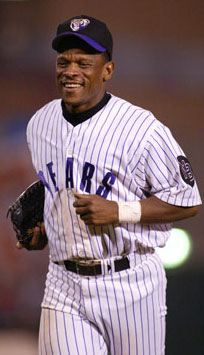
Kareem in an L.A. Dodgers jersey with Jackie Robinson's no. 42 and a Brooklyn Dodgers cap.

You can't see the cap from the front; but that Brand 47 cap uses the better Dodger cap logo with the circular loops in the B.
-
4
-
-
1 hour ago, insert name said:
Mr. Met in a Jets uniform.
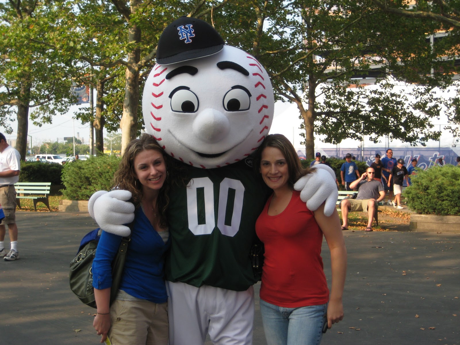
Mr. Jet in a Yankee uniform.

-
2
-
-
On 9/17/2017 at 11:49 AM, Lights Out said:
This is apparently a prototype road jersey for the Yankees:
 20 hours ago, Michael Bolton said:
I like it, but the script was probably too similar to this Mets jersey:

Well, having similar road scripts didn't bother the two teams once before.


Anyway, what is the story behind that prototype Yankee road uniform?
-
6
-
-
15 minutes ago, DG_Now said:
But I think what's most interesting about Griffey is that he was an all-time great with Seattle, and a generally decent player with Cincinnati. I'm sure there are other comparable players like that -- Gary Carter Montreal/New York, Keith Hernandez St. Louis/New York, Dennis Eckersely Boston/Oakland -- but no one I can think of with the stature of Griffey.
If the standard is an all-time great for one team and very good for another team (as opposed to terrible for another team, as many of these late-career "wrong team" guys were), then Ty Cobb fits the bill. After having played 22 years with Detroit, Cobb played two more with the Philadelphia A's. His service with the A's is not long enough to allow him to be considered one of the club's all-time greats; but, still, he hit .357 and .323 for them in those years, at ages 40 and 41.
-
1
-
-
Apologies if the following has already been brought up in this thousand-page thread. As a result of the outrageous expansion of this topic beyond its few true exemplars out to the flimsy standard of "any guy who has ever been traded", as well as the parade of hockey players, all of whom are utterly unrecognisable to me regardless of uniform, I admit that my perception of the topic has become somewhat deadened.
But here is a guy who ranks alongside Namath with the Rams and Killebrew with the Royals as one of the core illustrations of this phenomenon:


-
1
-
-
1 hour ago, chrispw12 said:
Jose Rijo in his Reds comeback

This reminds me of two other pitchers who made comebacks with their teams after those teams had changed uniforms.
Mike Norris with the A's in 1990:

Dave Stieb with the Blue Jays in 1998:

Edited to add Jim Palmer in spring training of 1991:
-
2
-
-
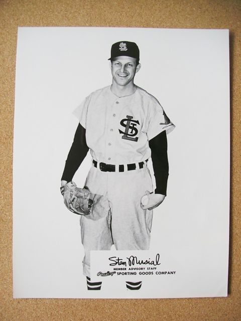
24 minutes ago, SFGiants58 said:
That StL logo really works beautifully as a chest logo.


-
6
-
-
59 minutes ago, mpcincal said:16 hours ago, Ferdinand Cesarano said:
The defining feature of the White Sox for their entire existence was their changing look. It's amazing that this came to a halt in 1987, when they adopted the uniforms that they still wear. The Sox have now completely turned it around, and have become one of the most stable teams, uniform-wise.
Actually, the White Sox started their current look in 1991 (though I believe they jumped the gun a bit and actually started wearing those unis in the waning days of the 1990 season).
Ah, right you are! Thanks for the correction.
-
5 minutes ago, insert name said:
Robin Ventura as Mike Piazza.

Rick Dempsey as Babe Ruth:

Right team, right uniform, right number, wrong ... body?
-
1
-
-
On 2017-6-1 at 1:12 PM, FinsUp1214 said:
Y'know, an interesting case I hadn't really thought about until now is Luke Appling (who may be one of the more underrated baseball players of his time). It's a bit of a different spin on the thread subject, but one I think still applies.
Appling may be a very rare case of a player playing for the same franchise his entire career (20 seasons with the White Sox), but yet not having a "right" uniform set to associate with him iconically. According to what I can find on Dressed to the Nines, the longest he wore any particular uniform set (both home and road together) was four seasons - and that happened three times. The White Sox made some sort of uniform change, major or minor, nine times during his career (1930-43, 1945-50) by my count. The tricky part is that sometimes these changes would only be made to just the home uniform or just the road uniform (more often the home), so the White Sox often had a jumbled, mismatching, inconsistent identity during that period of time.
So, which of those three sets he wore for four seasons would be right? If any? The interesting thing to note here is that he did wear one road uniform for seven years. This one was worn (again, according to DTTN) in some capacity from 1932-38, but - due to that aforementioned tendency to switch things up often - it was paired with two completely different home uniforms over that time:

So an argument could be made that, of individual uniforms, this one could be right. However, regarding particular sets, it's a bit too tricky to pinpoint one in particular.
There's this one, from 1932-35:

This one from 1939-41 and again in 1943:

And this one from 1945-48 (Differences being new piping, different "SOX", and red "C" on home cap):

And if you want to use success as a tie-breaker, he got elected to All-Star games wearing the 2nd and 3rd one, and won a batting title in the 3rd one (but also was wearing the road uniform of the 1st one, albeit in the following set when he won his first batting title), and Chicago never won a pennant during his career. So that doesn't help any break away!
I thus am not sure not only what the "right" uniform set would be for Appling, but the "wrong" ones also (strictly as a player, not counting his time as a manager or coach). It is indeed a very interesting case.
The right uniform for Luke Appling:
Kidding. Though that was a great moment, and probably the one single feat for which he is most remembered. (For you kiddies: at age 75 in 1982, he hit a home run against Warren Spahn in an Old-Timers' Game played at RFK Stadium.)
But you make a great point about Appling's career. This is true for anyone who played a long time for the White Sox in any era, be it Appling, Ted Lyons, or Luis Aparicio. Even Carlton Fisk wore four different styles. The defining feature of the White Sox for their entire existence was their changing look. It's amazing that this came to a halt in 1̶9̶8̶7̶ [edit: 1991, or, more accurately, late 1990], when they adopted the uniforms that they still wear. The Sox have now completely turned it around, and have become one of the most stable teams, uniform-wise.
Indeed, all four of the big uniform changes that came in for 1987 lasted a very long time. Three of them (Sox, Braves, A's) are still with us; and one (Twins) was around until only a couple of years ago. [Edit: @mpcincal has corrected my erroneous assertion that the current Sox uniform debuted in 1987.]-
1
-
-
6 hours ago, anythinglogos said:On 5/22/2017 at 0:24 PM, McCarthy said:
Question I've had for a while: Why do entire soccer leagues all use the same number font and why do they put the league's logo in the numbers?
It's supposed to be so that you can get name+numbering done on any shirt at any shop in the world, since there's only 5 number colors for the whole league and pretty much any shop that customizes will carry the font. Plus it identifies the league, which is why the little logo is there, on top of making it harder for counterfeiters.
personally I'm not a huge fan of it, especially limiting the colors available like the EPL does, which leads to disasters like gold numbers on shirts with volt trim or black numbers for teams that don't use black
I don't like this either, because it seems to me that the choice of number font should be part of a team's look. This is why it is so comforting to see Champions League matches in which the teams' numbers contrast just as much as their colours do.
-
1
-
-
6 minutes ago, rams80 said:
Since Brandiose is involved its going to suck in a vaguely kitschy way anyway, so really "Gwizzlies" is the way to go.
A team in the ABA 2000 is already using that (awful) name.
-
-
4 hours ago, SFGiants58 said:
Hey guys, I'm having issues embedding images from the mothership. Whenever I try to copy a url in, all it says is "The link could not be embedded because content.sportslogos.net does not allow embedding of that image." Is something messed up on my end, or is it the software somewhere? Thanks in advance.
I am getting the same error message when I try to use a URL.
But why don't you just copy/paste the image? I don't mean copy the image's URL; copy the image itself, and then paste it here.
Test:

That is working for me.
-
For some of us, the hammer and sickle is a symbol of justice. I consider it one of the most meaningful and beautiful symbols I have ever seen, which is why I display it prominently at home, at work, on my bike, and frequently on a button affixed to my clothing.
Someone of my ideology should sneer at commodification; but I will not deny that I find it cool to be able to have a hammer and sickle on my keychain or on a bag or on a cap. I wear any logo as a means to express something about myself; and the ability to wear a symbol which I love so much is something I greatly appreciate.


In between the Soviet flag and another flag very beloved by me: the Esperanto flag.
-
19 minutes ago, Zeus89725 said:
We get it- you're a communist who likes big words.
That's me, the prolix proletarian.
-
1
-
-
2 hours ago, the admiral said:
Sakes alive, how did I miss that Cesarano is a class-conscious proletarian?
(Fixed it for you.)

(In the interest of accuracy, I will note that I fly the Soviet flag out of a profound respect for the Revolution, and also out of admiration for the establishment of the world's first workers' state. However, by the time Stalin's descent into madness was complete -- and certainly by the time the term "tankie" was created by apologists for American war crimes -- the workers' state in the Soviet Union had been crushed. Still, even in its degraded post-proletarian-state condition, the Soviet Union continued to do humanity a great service by functioning as a counterweight to U.S. imperialism.)
-
5 hours ago, SilverBullet1929 said:7 hours ago, Ferdinand Cesarano said:
Oops! Marlins, Mariners -- whatever. Call it the "Dave Magadan Syndrome".
What's that mean?
Just a little joke.
When Dave Magadan was traded from the Marlins to the Mariners, this somehow caused me to conflate these two teams that had names and colours that were pretty close. For years I often said "Mariners" when I meant Marlins and "Marlins" when I meant Mariners. Eventually I got over it -- or so I thought!
Blast you, Dave Magadan!
-
1
-
-
15 minutes ago, SilverBullet1929 said:
Woah Piazza was with the Mariners? When did that happen? How come I've never seen pics of this?
Oops! Marlins, Mariners -- whatever. Call it the "Dave Magadan Syndrome".
-
13 hours ago, SilverBullet1929 said:
I'm gonna get ripped a new one for this but I don't think Jordan in a Wizards uniform is "wrong." Of course his right uniform is the Bulls but I feel like there's a middle ground between right uniform and wrong uniform. Like if there's a third level of uniform that's neither right nor wrong. Where it's recognizable and not odd looking even though it's clearly not the right or best uniform. I feel like wrong uniform is one that most regular fans didn't even know existed and in general people do know that Jordan played for the Wizards. To me wrong uniform most fans kinda go "woah when did that happen? I didn't know he played there!" And that's like Hank Aaron in a Brewers uniform, Piazza on the Marlins, and Frank Thomas on the A's. So in that sense, in my opinion, Jordan in a Wizards uniform isn't the best definition of wrong uniform.
This is a good point. I agree with this distinction, that there is a middle ground between a "right" and a "wrong" uniform.
And I also agree that the "wrong" uniform is one which makes you say "whoa, when did that happen?" But Hank Aaron with the Brewers is not a good example of this. Aaron's return to Milwaukee with the Brewers was huge news, and it is a well-known part of his story. He was on an American League All-Star team; and every home run he hit with the Brewers was national news, as it set a new record. Aaron's stint with the Brewers does not compare with Piazza/Mariners, Thomas/A's, Killebrew/Royals, or any of the others that were truly forgettable footnotes to history. I would say that Aaron with the Brewers fits into that first category you identified: neither right nor wrong.
Likewise Charlie Hough with the Marlins. He threw the first pitch in team history, and he was extensively interviewed in the leadup to the club's debut. So, while Hough's right uniform is the Dodgers uniform, the Marlins uniform is not wrong for him.
Finally, in agreeing that the Wizards uniform is not wrong for Jordan (while not being right, either), I will go a step further and say that the same applies to his White Sox and Birmingham Barons uniforms. No one seeing pictures of him in those uniforms says "whoa, when did that happen?" Everyone knows he played for those teams, as there were few sports stories bigger at the time. So those uniforms, while not equal to his right uniform of the Bulls, fall into the intermediate neither-right-nor-wrong category.
-
2
-


Players on the "RIGHT" Team, but "WRONG" Uniform
in Sports Logo General Discussion
Posted
I was referring to the colour of the jacket more than to the fact that it's a suit jacket.
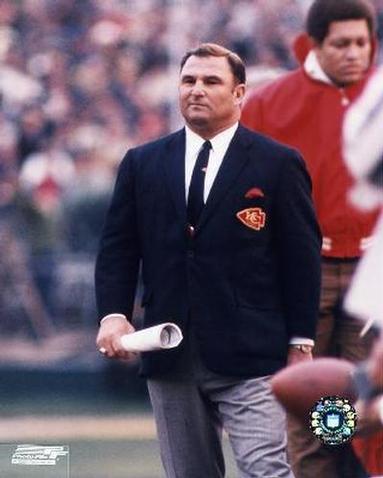
Because NBA coaches wear suits, the jacket should have a team insignia, such as on Hank Stram's suit.
Baseball gets it right by outfitting the manager and coaches in uniforms. But I also like the practice in soccer, where each manager decides on a game-by-game basis whether to wear a suit or casual wear or the team's gear.
And I also think that the Pacers' current uniforms are excellent.