

Ferdinand Cesarano
-
Posts
3,985 -
Joined
-
Last visited
-
Days Won
4
Posts posted by Ferdinand Cesarano
-
-
1 hour ago, chrispw12 said:
I found this photo of Larry Brown on the Nets sideline with the Nets in the stars and stripes uniform although they made the switch to the cursive style uniforms before switching back after he left for Kansas
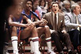
So is this preseason 1981-82?
-
 1
1
-
-
1 hour ago, ImmortalChef said:
NBA all star game in the Houston Astrodome, circa. 1989
Not circa, but exactly.
-
3
-
-
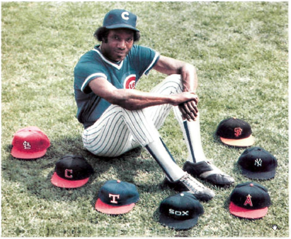
33 minutes ago, Dnice said:6 hours ago, McCarthy said:
Do NBA players change teams more frequently than the other leagues? It feels that way.
Pretty much, I can't think of journeymen in MLB they way some hop around in the NBA for 7+ teams and get decent playing time.
In my day, the great Bobby Bonds got that reputation after his long career with the Giants. From his final season with the Giants in 1974 through to his last season of 1981, he played for 8 teams.

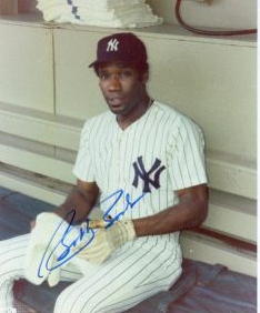


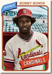
When the song "Talkin' Baseball" came out, it had a line in it "Bobby Bonds can play for everyone".
Here is Bonds acknowledging his many stops (even though that Giants cap is not the style that he wore).
-
1
-
-
3 hours ago, chrispw12 said:
Keith Van Horn

Buck Williams

You got these right. I really hate seeing Net players with the Knicks. (I posted Jason Kidd and Kenyon Martin a while back.) Seeing that stuff not only increases my dislike of the Knicks, it also increases my annoyance with the Nets because it reminds me of what a bad job the team does in embracing its history and its former players.
-
1
-
-
13 minutes ago, MCM0313 said:
Had no clue who Tony Meola even was till this post.
I am happy to have contributed to your education.
(All of the hockey players shown in this thread are completely unknown to me.)
-
2
-
-
46 minutes ago, MCM0313 said:
I'm assuming that was spring training? He never played a regular-season or postseason MLB game.
Tony Meola never played for the Jets in the regular season. But this still counts.

Anyway, this thread jumped the shark long ago, as the recent mention of Shaq in Orlando conclusively proves. I should flog myself for continuing to contribute to it!
The standard should be Namath with the Rams or Killebrew with the Royals -- teams that no one would associate with the player without the pictorial reminder. There are only a handful of such cases.
And, by that standard, Meola would qualify, but Jordan would not, because everybody remembers Jordan in a Sox uniform that spring, especially his hit against the Cubs at Wrigley.
-
2
-
-
6 hours ago, SFGiants58 said:

Maryland's flag is the perfect demonstration of an effective way to incorporate heraldic symbols into a flag without compromising aesthetics. That said, it does not belong on sports logos.
I guess this counts as an unpopular opinion, but I'd say that aesthetics are pretty severly compromised here. I've always considered Maryland's flag to be a big mess, with the shoving together of two disparate elements, and the pointless repetition of these elements.
The flag of Baltimore is more coherent.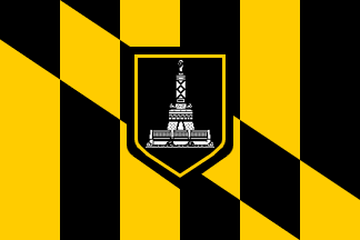
-
3
-
-
13 minutes ago, panthers_2012 said:
The team I worked for this summer, Lake Erie Crushers, got a new stadium name. They're about a month away from releasing the new logo sets for the team.

-
3
-
-
17 hours ago, -Akronite- said:
Also, the draw/drawer thing is funny. Some people, from more rural settings, might say "drawr," as in "I'm gonna drawr something," ADDING an R for no reason. But growing up we never mixed up draw and drawer because we pronounced the latter to rhyme with "roar."
Well, it's evidently not only New Yorkers who conflate "draw" and "drawer".
Tonight I was watching the episode of Match Game that aired last Wednesday, February 8, and Vivica A. Fox (from Indianapolis) gave an answer that was meant to be "droopy drawers". Look how she spelt it.

-
2 minutes ago, smzimbabwe said:
The Port Angeles Lefties of the WCL (summer collegiate baseball). if you're a righty, do you get to play?

I suppose that they get to play as much as do the midfielders and defenders on the Ft. Lauderdale Strikers.
-
1
-
-
1 minute ago, DC in Da House w/o a Doubt said:
Didn't you ever see the word "drawer" written tho? Especially the lawyer, I'm sure drawer has appeared in case studies that they've read. "The bloody knife was stashed in a sock in the drawer." something like that. I'm surprised to hear all this, but it is interesting.
Yes, I am sure I did see that word, for example in a newspaper ad. But it evidently didn't make much of an impression. So when I finally realised that it was indeed a separate word, my reaction was more along the lines of "oh, yeah, that's right".
I am sure that a similar phenomenon took place with my lawyer friend. He surely would have seen and understood the word; but it sort of passed under his radar, and didn't make an impact strong enough to displace the misunderstood sense of "draw".
-
1
-
-
2 minutes ago, DC in Da House w/o a Doubt said:
Just curious, does anyone else pronounce crayon as "crown"? I do. I've gotten a lot of s for it. I've been bullied into just quietly muttering it whenever the rare occasion happens where crayons are brought up.
I have to admit that I have never heard of this pronunciation.
But that reminds me of an interesting lingusitic phenomenon found here in New York: the conflation of the words "drawer" and "draw".
For people outside New York, the difference between the word "drawer" and the word "draw" is the audible R at the end of "drawer". But for us in New York, that difference is minimal, even nonexistent. Our accent makes these words sound so similar that there are many people who aren't even aware that the word "drawer" exists. They think that the noun for the compartment in a cabinet is "draw" -- it's something that you draw, so it's a draw!
I recently talked to a highly educated, highly literate lawyer in my office who thought that; and I admit that I thought that until late high school or perhaps early college. I would have written "chest of draws". This confusion is further encouraged by the existence of the noun "draw" in the context of cards, and in the phrase "luck of the draw".(NOTE: I am aware that this diversion has nothing to do with the ostensible topic of this thread. But, if I am going to be honest, I would say that this thread has lost all its value and can only benefit from any sort of diversion. In all of sports history there are about a dozen players who would qualify as really being odd to see in a uniform other than the one with which they are primarily associated; and all of them were mentioned in the first couple of pages of this thread -- ten years ago! This thread has long since degraded into a place to list any player who has ever changed teams, and then it was further devalued by the listing of players in uniform styles different from their main ones. Oy! So if any place is ripe for a little language-related derailing, it's this thread. Only on account of this will a reader find something worthwhile here.)
-
5
-
-
On 2/5/2017 at 10:20 PM, Gothamite said:
No, they didn't change it. The only thing they did in the 1970s was change the date. "Corrected" isn't really the right word, since even the city historians admit that 1625 is meaningless and arbitrary, chosen more to tweak the British than for any historical justification.
The thickness of the strokes varies a lot from flag to flag, but that's a weakness of using the seal. As is the shield, which changes from white to blue based on the manufacturer. It's why I don't particularly like using the seal on the flag.
While the 1625 date is not precisely correct, it is not meaningless or arbitrary. A better date would be 1624, which is when the Dutch started placing settlers in New Amsterdam; ideally, this is what the flag should say. The most notable thing that happened in 1625 was that New Amsterdam became the capital of the entire New Netherland colony (which extended up the Hudson River to Albany, and also included all of today's New Jersey).
But 1664 was always wrong. The date in the seal was changed from 1664 partly out of hostility to England on the part of an Irish-born New York politician of the 1970s. But, regardless of the motives of this one politician, the fact is that our City was founded not by the English but by the Dutch; and the seal should reflect that. So, the date of 1625 is a tad off; but it is much better than 1664.
And I am happy to report that the City's flag will appear on the jerseys of NYCFC this year.
The team has done a good job utilising the New York City flag. Their corner flags are New York City flags with the NYCFC logo in place of the seal (so City flags with the City logo).

-
3
-
-
3 hours ago, Gothamite said:
They've simplified it in terms of removing the Latin motto (although there are plenty of versions out there with the [m]otto included).
They've done nothing to "sharpen" it, though.
I believe they did. The seal had, by the 1960s and 1970s, come to be drawn with very thin lines. The versions of the flag since then (when the date was corrected from 1664 to 1625) have presented the seal in broader strokes that are more easily discerned from a distance.
-
20 hours ago, ADW77 said:

On account of the fact that "Houndogs" is not a word, I am glad that this team did not materialise.
The colours and helmet are reminiscent of the CFL's Memphis Mad Dogs.


-
3
-
-
4 hours ago, Atomic said:
Got you beat:

That "seal" on a white flag.
This should be your city's flag:

-
5 minutes ago, Gothamite said:
I too have been wishing NYC would just use the tricolor instead of including the city seal.

In our case, it's the city seal minus its Latin inscription, which I guess is a plus.
The tricolour would have been nice if that had been the choice from the beginning.
But the seal is clear enough, with figures representing the Dutch and the Lenape. Also, the seal has been sharpened up since the 1970s, and is recognisable even at a distance. So I don't think I'd want to drop it now, notwithstanding the obvious aesthetic appeal of the simple tricolour.
I tend to think of our flag as pretty much untouchable.
Side note: I wear it on my bike helmet, along with the flags of Philadelphia and Washington, cities to which I have ridden.
-
1
-
-
39 minutes ago, Waffles said:
Well-timed for the recent debate here on whether minor league clubs should be carbon copies of their parent club or have unique identities reflecting the community they play in
In the recent conversation, I don't think the question of "carbon copies" ever came up. (Even though I do admire the teams that take this approach, such as the Paw Sox used to do.)
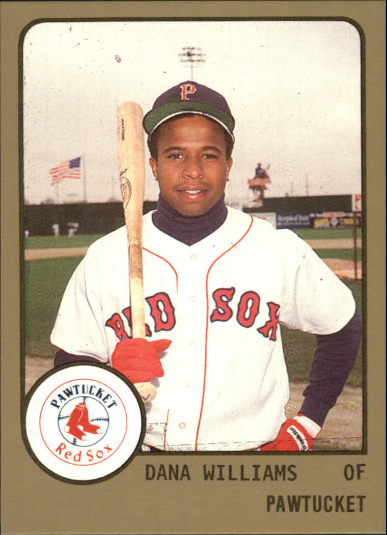
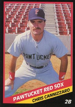
The position that I took up in that debate was that an observer should be able to identify a minor league team's parent organisation at a glance. I further argued that this standard does not prevent a minor league team from having its own identity, supporting this assertion with examples from the histories of the Buffalo Bisons, the Syracuse Chiefs, and the Tidewater Tides.
This Memphis Redbirds uniform set provides more support for that viewpoint. Though we should note that the Redbirds' nickname, unlike those of the Bisons, Chiefs, or Tides, is tied to the parent club's identity. (For a while, the team was actually owned by the Cardinals, Braves-style.)
In the case of this Memphis team, the separate identity resides entirely in the city name, and the inextricable association that that city has with music. This uniform set gives prominence to the thing that ties the Redbirds to the Cardinals (the bird), while also featuring music-related elements (the notes on the M logo; the neon which is reminicent of a honky-tonk bar). And it does this by means of a beautiful wordmark and cap logo. Excellent. -
1 hour ago, MarsHotel said:
Here's another. Giants and Chargers 2005. Only time this one happened:

If we're dealing with Giants-Chargers matchups, then let's go to 1975 at Shea Stadium (the Giants' only year of calling that park home).


The Giants wore that beautiful uniform for only one season; so every game they played that year constituted a rare matchup. And I would submit that anyone who fails to recognise that this is the Giants' best look ever is out of his/her bloody mind.

All of these shots come from This Week in Pro Football for week 7 of 1975.
-
2
-
-
3 hours ago, Cosmic said:
@Ferdinand Cesarano, do you see any irony in the fact that in one thread you yell at someone for saying women aren't oppressed, and then basically tell the Estionian people that they were "civilized" by the USSR and not, in fact, oppressed
1 hour ago, Zeus89725 said:Guys, let's not allow a discussion of flags to devolve into a political debate over communism.
Also, that's by far the weirdest sentence I've ever said.
I will claim the right to answer briefly the question that was put directly to me: there is no irony but a consistency, a commitment in both instances to the accurate description of reality.
I'll note also that my initial comments on the Estionian flag were all design-related, starting with my critical comment about its deviation from vexillological norms, through my comment conceding at the sight of a dramatically stunning photo that this deviation was justified, and going right through to the comment in which I added the hammer and sickle (a symbol which I not only love for its profound meaning, but which I admire for the beauty of its design). My most recent long comment was in response to two question that were put directly to me.
I'll not continue the conversations about history and ideology right here; but, because flags are used primarily to express identity and deeply-held principles (as everyone who likes flags knows), we ought not be surprised that a discussion of flags should include such a detour.
-
-
31 minutes ago, bosrs1 said:
Which faulty premise is that? That the Soviets were oppressors?
Yes.
The Soviet Union liberated Estonia and the other Baltic states from the Nazis after Germany had violated the non-aggression pact by invading those countries. (This should be no surprise, as the Soviet Union ultimately saved the entire world by defeating the Nazis.)
Even though the Soviet Union descended into autocracy in the late Stalin period, and later further degraded into cronyism, it was on the whole a liberating and civilising force. It was the first state not based on any of the traditional evils of crowns, gods, or property, but on self-government by the workers -- by the people who create all value apart from the natural.
In this centennial year of the Soviet Union"s founding, class-conscious proletarians reflect on its proud legacy. This is a legacy which reverberates globally, as the Revolution and the successful decades immediately thereafter inspired workers to unite and to work for our collective interests. Every worker-protection law in the world can ultimately be traced back to social movements that were energised and inspired by the victory of workers in seizing state power in the Soviet Union.
The founding of the Soviet Union as the world's first workers' state will forever stand as the high point in human history. This is why I proudly fly the Soviet flag at home and at work. (In both cases next to the Esperanto flag and the flag of New York City.)
-
5 minutes ago, bosrs1 said:
Not sure the Estonians would go for putting their former oppressors primary symbol on their flag.
That's what happens when one proceeds from such a faulty premise.
-
17 minutes ago, kimball said:
Anything after the Nets is "wrong" with VC, even though you might have an argument for Dallas.

Speaking of the Nets, these are so wrong that looking at them makes me stabby:


Nah, man! Let me get that pollution out of my mind:

Ahhh. That's better.
-
2
-


Rare NBA Getty Images, Google & Internet Find
in Sports Logo General Discussion
Posted
The Knicks did the same thing, in approximately the same seasons.
They had the traditional uniforms up through 1978-79.


They then went to the style with the name "Knicks" and "New York" under the number in 1979-80. (I must say that I like the contrasting numbers on the road.)
Then, in 1983-84, the same season that the Nets returned to their classic uniforms, the Knicks did the same (with the addition of the number to the shorts, and the retention of the Yankee-style NY that they had introduced with the previous set).
[Edit: as @leopard88 mentioned, the NY logo actually came in with the traditional uniform, before the set with the name under the number, when it was placed inside an apple.]
[Edit - I didn't notice that @Discogod and @kimball had already provided this answer.]