


rmered
-
Posts
3,648 -
Joined
-
Last visited
Posts posted by rmered
-
-
Can someone explain how one would go about bevelling/embossing typeface in Illustrator, not unlike the Anaheim Angels 'A'? Bevelling manually, especially for wordmarks, is a long and tedious process and I was just wondering if anyone knew a faster method. I'm relatively new to the program and if anyone would be so kind as to tell me, it would be greatly appreciated.

I think the best way around this would be to make your base woordmark/logo in illustrator. Then, bring it into photoshop and apply some bevel styling to it as a template for re-tracing in illustrator. You would only need to trace the shading part in illustrator and intersect the traaced shading with the original logo outline to make sure that the edges match up. then again, illustrator cs has some 3d effects integrated now. Choose your own adventure. I would go the photoshop route just because there are a number of different contours you can use for the bevel.
I'm responding not as someone who has a definitive answer, but as someone who thinks he might have stumbled across a way of doing it.
What I did was this:
Typed my text (obvious)
Right Click > Create Outlines to change it to a shape.
Then I did an Offset Path. Object>Path>Offset Path Value -2.
I then copied this shape Ctrl-V and pasted it behind the original. Ctrl-B
Then I moved it 2 arrows down, 1 arrow across.
I selected both smaller shapes and did Pathfinder>Subtract
Now I've got the bevelling.
In this particular wordmark I then added a few more Offset Paths.
Then I did Effect>Warp>Arc and made it 25%.
And I reckon this is probably the best wordmark I've ever done.
Now, that doesn't say a lot, because I've put up some real crap, however, I am well pleased with how this turned out.

Thos who have more of a clue might know why this shouldn't work.
Maybe this won't work as well with thinner fonts, or won't work for some other reason.
But here it is. If this works for you. Send money.
-
I have another question, this is probably stupid but how do you add water marks behind concepts?
Technically they're no longer watermarks if they're behind the rest of it.
However, you make background graphics the same way you do them in front, except you move them down the Layers list until it's last.
How do you make them at all, take the graphic you want and reduce the Transparency to 15-20%, depending on the colour it's made of.
-
I know some people were looking for race car templates, I managed to dig up a few...
http://www.fivestarbodies.com/2kMonte.pdf - Chevy Monte Carlo
http://www.fivestarbodies.com/2kTaurus.pdf - Ford Taurus
http://www.fivestarbodies.com/2kIntrepid.pdf - Dodge Intrepid
Can u make them car templates so people can use them in paint? thanks
It should open Acrobat, or an Adobe Toolbar in Explorer.
Either way you can select the Graphics Select Tool and select the whole area.
(It's just next to the Text Select Tool, which is next to the Hand and Zoom icons.)
The Copy and Paste to MS Paint.
-
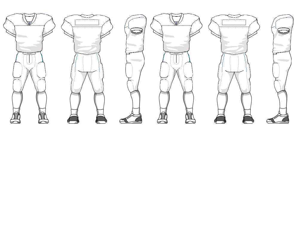
I apologize in advance, but does anyone have a football helmet template? Rmered's is great for the uni, but it doesn't have the helmet. Thanks.
At great expense to the management, I've added the helmet to the Football uniform in my sig.
(I've also deleted the alternate, but I'm guess people know how to Copy and Paste one of the others to create one if they need one.)
-
How about an Australian Football template (vector)?
Do you want a standing player like the baseball above?

Or a footy jumper like my site: http://www.footyjumpers.com ?

The first one is now attached to my sig, see below.
If you'd like the other version, PM me and I'll email it to you.
-
I'd also recommend the following as a basic tutorial.
http://apex.vtc.com/illustrator10.php
(Don't take offence if this is too basic, it's hard to tell how much you already know)
Lil,
Try the tutorial at this site.
I found them very helpful.
-
I need some help with the offset path feature. How exactly does it work? I tried to use it to outline my logo and it's not working well. Any help?
It creates a path around your selected item, be it text or whatever.
But it creates it in the same colour as the other shape, so you may no see it.
Here's the fubar logo I did for KC's request.

When I select all of the shapes, Object>Path>Offset Path you get a little box asking how big you want the Offset.
I went for 1.0

Then straight away click on the swatches to make it a new colour.
You can then also Click Windows>Pathfinder and click on the Merge icon.
This will make the bottom colour appear over the top colour, but you just need to Right Click, and Arrange>Send to Back.
-
How do you make a watermark? Do you even use illustrator to do it? Thanks, and sorry if this was already asked somewhere.
In Illustrator, you create the design you want as a template, then go to Window>Transparency.
If not alrady open, you'll get a little box with Transparenty, Stroke and Gradient tabs.
On the Transparency tab, there's a thing called Opacity.
It will be on 100.
If you take that down to something like 30%. the design will lose colour.
You cover your uniform or logo with the now see-through design.
You exclaim "hey, it worked".
Done.
-
Here's a raster version that's closest to it.
Once again, credit to fellow member themightyspitz for cleaning this template up for paint use. Kick ass to themightyspitz.
Does anyone know where I can find this in .ai form?
http://members.optusnet.com.au/robert.mere...ll-(Display).ai
rmered, would you have that template in svg?
I do now.
I think you'll need to click Save As and save it that way.
It's the same template, just set out a little differently.
2 Meg download.
I've never used avg files before, and all I did was save as one from Illustrator.
Any probs, PM me and I'll see how I can fix it up.
-
i'm having trouble using some jersey templates..i cant seem to figure out how to color them?? the same with the logos..i do not know how to recolor them..
any help would be appreciated
thanks
joey
GJ
Could you be a little more specific.
Are you clicking on the jersey with the Direct Selection Arrow?
If not, do so, then the colours are at the bottom of the toolbox.
Select a different colour from the Swatches and it should work.
I'd also recommend the following as a basic tutorial.
http://apex.vtc.com/illustrator10.php
(Don't take offence if this is too basic, it's hard to tell how much you already know)
-
Anyone have this template as a vector?:

I don't think so, though someone was doing the CFL teams in that template.
I believe it is copyrighted by Craig Wheeler, the guy who drew it in the first place.
You'll find the standard football temaplte is pretty close, the one in my sig for instance.
If you really want it to look like that one, I'd say download the one I've got and change it to suit.
-
not sure if i missed it, but where can i get this hockey template and is it available in Paint?

-
So here's something strange.
It works.
Not only that is strange (and really good, thanks Pat)
But it only works when I Ungroup the text.
Not that I'm disappointed.
Thanks Mate.
-
Thanks. But I might refer you to the FAQs to see the difference between vector and raster graphics.
That would be great for Paint, but I'm looking for the one for Illustrator.
-
Thanks guys.
I tried Pat's way. It does absolutely nothing.
I don't know if it's me, or a corrupt file in my version of Illustrator, but it does nothing at all.
So I'll try Andrew's way, which even I should be able to do.
-
I've looked for tutorial on this this everywhere I can think of, and I can't find out how to do it.
How do I make text run down a jersey, like the RANGERS do on their NHL jerseys using the Text tool?
Is it possible?
Or do I have to Shear, and try to line it up?
-

Does anyone have this template as a vector?
-
Here's a raster version that's closest to it.
Once again, credit to fellow member themightyspitz for cleaning this template up for paint use. Kick ass to themightyspitz.
Does anyone know where I can find this in .ai form?
http://members.optusnet.com.au/robert.mere...ll-(Display).ai
-
Is there an easy way to do this?

I want to fill in the background only in areas behind my drawing...
I guess it requires a masking technique but I am not sure how to do that..
For illustration purposes I drew in the black lines manually but on a large piece of artwork that would become very tiresome.

Any help would be great. Thanks.
I'd be thinking of tracing around just the outline of the top drawing to make one shape.
Then make a black box behind the drawing, then make the drawing a Clipping Path.
When you place this under the top drawing, only the background will show thorugh.

-
Check out the tutorials at The Web Machine. Under illustrator, there is one for fake 3d effects.
Great site quantum, thanks for the tip
-
http://www.brick.net/~illinimom/random/sta...tes/mlbpjb.html
Has anyone vectored this baseball template?
-
Hobogrish, to arc the baseline of text, follow these steps.
Type it.
Select it.
Go to [Type > Create Outlines].
Go to [Effect > Warp > Arc Lower].
Check [Preview] box.
Adjust your values until it looks how you want it.
Click [OK].
Go to [Object > Expand Appearance].
Enjoy.
Do you know, I had assumed I couldn't do it.
I've been trying to find out how to do that for over a year.
Thanks.
-
i dont know if this is still an issue rmered, but i use collegiate for traditional numbers and i have the whole slew of that font, so if you want it, let me know (PM or something), becasue i forget where it was from. i did a search on it on yahoo, and i know it was free, but i dont remember where.
Perfect. thanks guys.
-
Sorry, my bad.
This were NHL, not NFL.
Surely something should be done about that.
Those are too close and too confusing.
You could use the Blackhawks and Canucks numbers for the traditional look.
The other NFL numbers... no idea. Sorry.
.svg)
Illustrator Help
in General Design
Posted
Are you using Illustrator?
And if so, are all the images you're using vectors?
That's pretty easily fixed if you are.